Button Sets
approvedby Ashly Lorenzana
Create custom styled buttons with uploaded animated icons. - This plugin has not been manually reviewed by Obsidian staff.
Custom Styled Buttons for Obsidian
A deliberately simple plugin for inserting styled buttons into notes and giving them icons you upload yourself. Animated GIF, APNG, and WebP icons retain their animation. Button and icon styles are tightly scoped so Obsidian themes cannot add their normal note-image borders, padding, or shadows to uploaded icons.
Install
- Extract the ZIP.
- Copy the
custom-styled-buttonsfolder intoYourVault/.obsidian/plugins/. - In Obsidian, open Settings → Community plugins, reload installed plugins, and enable Custom Styled Buttons.
Use
- Open Settings → Custom Styled Buttons and upload one or more icons.
- In a note, open the Command Palette and run Custom Styled Buttons: Insert custom styled button.
- Choose the label, action, icon, colors, corners, and animation.
- Switch to Reading view or Live Preview to use the rendered button.
Buttons can run an Obsidian command by command ID or open a URL. The inserted block is ordinary JSON, so you can duplicate it and change any value by hand.
{
  "label": "Open settings",
  "command": "app:open-settings",
  "icon": "sparkle.gif",
  "background": "#ff2bd6",
  "textColor": "#111111",
  "borderColor": "#111111",
  "radius": 8,
  "fontSize": 17,
  "iconSize": 40,
  "animation": "wiggle"
}
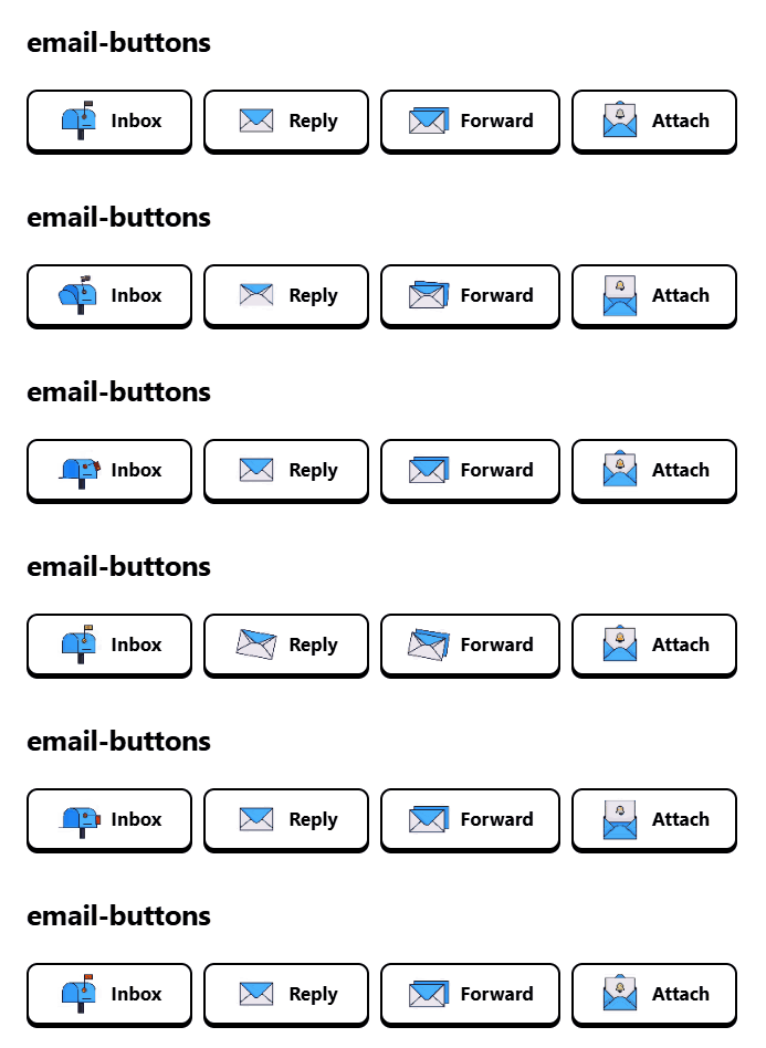
Animation options: none, pulse, bounce, wiggle, float, and glow.
Button rows
The button-row CSS is built into the plugin; no separate CSS snippet needs to be installed or enabled. Put complete styled-button blocks inside a button-row callout and prefix every line with >:
> [!button-row]
> ```styled-button
> {
>   "label": "First button",
>   "command": "",
>   "url": "",
>   "icon": "first.gif",
>   "background": "#ffffff",
>   "textColor": "#000000",
>   "borderColor": "#000000",
>   "radius": 10,
>   "fontSize": 17,
>   "iconSize": 40,
>   "animation": "none"
> }
> ```
>
> ```styled-button
> {
>   "label": "Second button",
>   "command": "",
>   "url": "",
>   "icon": "second.gif",
>   "background": "#ffffff",
>   "textColor": "#000000",
>   "borderColor": "#000000",
>   "radius": 10,
>   "fontSize": 17,
>   "iconSize": 40,
>   "animation": "none"
> }
> ```
The row wraps automatically on narrower screens.
Notes
- Uploaded images are copied to
.obsidian/plugins/custom-styled-buttons/icons/. - Command IDs are the internal IDs Obsidian and plugins register. If you do not know one, use a URL action or inspect the command list with a developer utility.
- A button with both a URL and command uses the URL.
For plugin developers
Search results and similarity scores are powered by semantic analysis of your plugin's README. If your plugin isn't appearing for searches you'd expect, try updating your README to clearly describe your plugin's purpose, features, and use cases.