Cluddle Callouts
approvedby 1ordinateur
This plugin has not been manually reviewed by Obsidian staff. Adds CSS-defined custom callouts to the editor right-click menu and colors callout options.
Cluddle Callouts
Cluddle Callouts is an Obsidian plugin that makes callouts easier to insert, switch, and discover while editing notes.
It adds a searchable callout picker to the editor right-click menu and provides a command to open the same picker from anywhere in Obsidian. The picker includes Obsidian's built-in callouts, a bundled cluddle callout, and custom callouts defined by your enabled CSS snippets.
If you use a lot of custom callouts, this plugin saves you from remembering callout ids or manually rewriting block syntax. You can search, preview, insert, replace, and remove callouts from one place while staying in the editor.
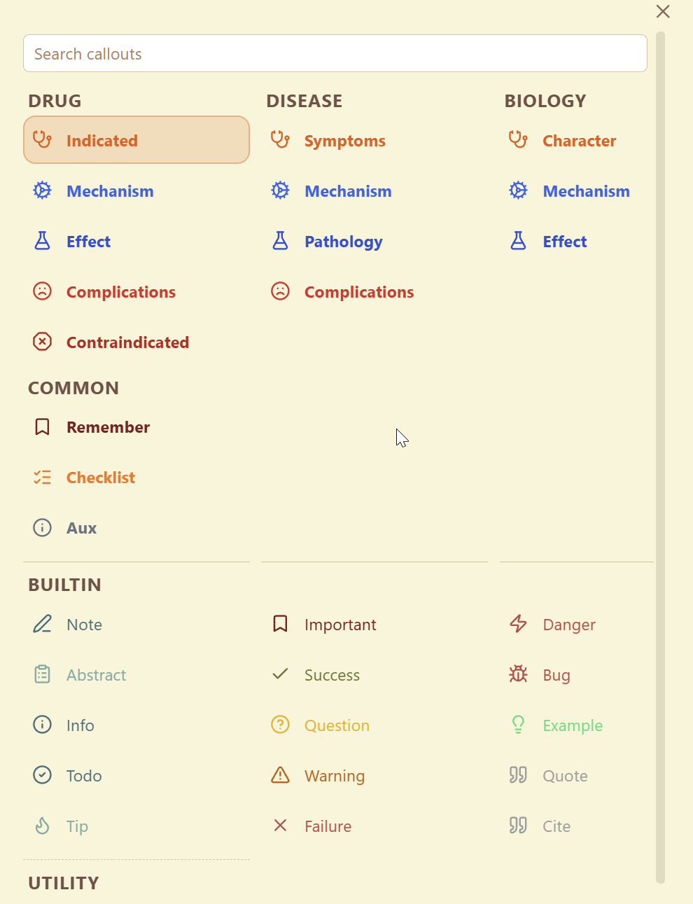
Example
Install From GitHub
Until the plugin is available in Obsidian Community Plugins, install it from the latest GitHub release:
- Download
manifest.json,main.js, andstyles.cssfrom the latest release on GitHub. - Create a folder named
cluddle-calloutsinside your vault at.obsidian/plugins/. - Copy those three files into
.obsidian/plugins/cluddle-callouts/. - Open Obsidian and go to
Settings→Community plugins. - Make sure community plugins are enabled, then enable
Cluddle Callouts.
Development installs from a local clone still work as usual, but GitHub releases are the intended install path until the store listing is live.
What This Plugin Does
- Inserts a new callout at the cursor
- Wraps the current selection in a callout
- Changes the type of an existing callout in place
- Removes a callout from the current block
- Lets you search across built-in and custom callouts from one picker
- Includes a bundled
cluddlecallout in thebuiltincategory - Prefers custom callouts in search results when that setting is enabled
How To Use It
- Open a note in Obsidian.
- Right-click in the editor and choose the callout action, or run the
Open callout pickercommand. - Search for the callout you want.
- Use
ArrowUp,ArrowDown,ArrowLeft, andArrowRightto move around the picker if needed. - Press
Enterto apply the selected result, or click an item directly.
If your cursor is already inside a callout, Open callout picker inserts a nested callout instead of changing the current header. Use Rename current callout type if you want to retag the current callout itself.
The release includes a bundled cluddle callout with a cloud icon. It appears under the existing builtin category and can be disabled in settings.
The picker supports keyboard workflows:
- Bind
Open callout picker,Open callout picker (alternate insertion mode), orRename current callout typein Obsidian Hotkeys - Press
Alt+Enterinside the picker to use the opposite cursor-placement behavior for one insertion
Custom Callouts
The plugin reads enabled CSS snippets from your vault's Obsidian config and looks for .callout[data-callout="..."] definitions. That means custom callouts can show up in the picker automatically without requiring a separate plugin-specific registry.
The format it looks for is:
.callout[data-callout="primary-id"],
.callout[data-callout="alias-id"] {
  --callout-color: 230, 126, 34;
  --callout-icon: lucide-stethoscope;
  --callout-concept: recognition;
  --callout-groups: medical;
  --callout-group-medical: primary-id alias-id;
}
For example, the bundled Cluddle-style callout uses this shape:
.callout[data-callout="cluddle"] {
  --callout-color: 111, 174, 219;
  --callout-icon: lucide-cloud;
  --callout-concept: builtin;
  --callout-groups: builtin;
  --callout-group-builtin: cluddle;
  background-color: #f4f6df;
}
The plugin currently uses these properties:
data-callout="..."selectors to collect the primary id and aliases--callout-colorto color the picker preview--callout-iconto show a Lucide icon in the picker preview and rendered Obsidian callout--callout-groupsto decide which group or groups the callout belongs to--callout-group-<group-name>to define the label shown for that group entry and its aliases--callout-conceptas optional metadata for organizing related callouts in your snippet
A complete real-world example is included in docs/example-medical-callouts.css.
Here is a small example of a CSS snippet entry that this plugin can process:
.callout[data-callout="indicated"],
.callout[data-callout="recommended"] {
  --callout-color: 230, 126, 34;
  --callout-concept: drug-usage;
  --callout-groups: drug disease;
  --callout-group-drug: indicated;
  --callout-group-disease: symptoms;
}
With that snippet enabled in Obsidian:
indicatedis treated as the primary callout idrecommendedis treated as an alias for the same callout- the callout appears in the picker under the
druggroup asIndicated - the same underlying callout also appears under the
diseasegroup asSymptoms - the picker inherits the CSS callout color automatically
You can define additional groups with more --callout-group-<group-name> properties. The alias list for each group is whitespace- or comma-separated, and the first alias becomes the displayed picker entry for that group.
Settings
The plugin includes settings for:
- Whether custom callouts should rank above built-in ones in search
- Whether the default insert behavior should place the cursor on the next content line instead of the header line
- The maximum number of callouts shown in a picker column before spilling into another column
- Whether the bundled
cluddlecallout should appear - The text color used for rendered callout titles after you edit the title away from the default callout label
Press Alt+Enter in the picker to use the opposite cursor-placement behavior from that default insert setting for a single insertion.
There are also commands you can bind in Obsidian Hotkeys:
Open callout pickerOpen callout picker (alternate insertion mode)Rename current callout type
Disclosures
- Desktop only
- No network access
- No accounts, payments, ads, or telemetry
- Reads
.obsidian/appearance.jsonand enabled CSS snippet files from.obsidian/snippets/to discover custom callout definitions - Those files live in Obsidian's hidden config directory, so the plugin uses
Vault.configDirplus narrow read-only adapter access for that discovery path - Does not scan arbitrary note content while discovering callouts
- Stores only its own settings in Obsidian's plugin data store
- Does not write to notes unless you choose a callout from the picker
What Ships
The plugin artifact loaded by Obsidian is:
manifest.jsonmain.jsstyles.css
Development
Source files live under src/. Build the runtime plugin artifact with:
npm install
npm run build
That bundles the source tree into the shipped main.js at the repository root.
Release Process
Releases are tag-driven through GitHub Actions. To publish a release:
- Update
manifest.json,package.json,package-lock.json, andversions.jsonto the same version. - Commit the version bump and source changes.
- Create and push a tag matching the version, such as
0.1.9.
The release workflow runs tests, rebuilds main.js, attests manifest.json, main.js, and styles.css, then publishes those three files as the GitHub release assets. Do not create Obsidian release assets manually unless you also recreate the same artifact attestations.
Notes
- Release assets for Obsidian should contain only
manifest.json,main.js, andstyles.css - GitHub releases should be created by the release workflow so Obsidian can see source-built, attested assets
- The picker layout and size are static in CSS so the plugin does not inject layout styling from JavaScript
- Hidden config-dir reads are isolated to a single helper because Obsidian does not expose enabled CSS snippets through the Vault API
- Desktop only
- No network access
- Reads local Obsidian appearance settings and enabled CSS snippets from the vault config directory
For plugin developers
Search results and similarity scores are powered by semantic analysis of your plugin's README. If your plugin isn't appearing for searches you'd expect, try updating your README to clearly describe your plugin's purpose, features, and use cases.