Extended Properties
approvedby electroluminescent
A configurable sidebar for note properties: arrangeable sections, rich value types, dice rolling, per-type layouts, and toggleable feature modules such as a D&D 5e character sheet. - This plugin has not been manually reviewed by Obsidian staff.
Extended Properties (Obsidian plugin)
A data-driven, fully arrangeable property sidebar that transforms how you organize and interact with note metadata. Activate it for any note whose Type matches a configured type; each type gets its own custom layout defined visually in the sidebar itself. Works on desktop and mobile.
The core is domain-agnostic: it renders sections of property entries with rich value types and extensible features. Domain-specific capabilities-like the bundled D&D 5e character sheet module-plug into the core through registries and can be toggled in settings.
Installation
Community plugins: in Obsidian, open Settings -> Community plugins -> Browse, search for "Extended Properties", install, and enable. Or open the plugin's listing and click Add to Obsidian.
BRAT (beta): install the BRAT plugin, then Add beta plugin with this repository's URL. BRAT tracks the latest GitHub release, which runs ahead of the store while a version is in review.
Manual: download main.js, manifest.json, and styles.css from the latest release and copy them into <your vault>/.obsidian/plugins/extended-properties/, then enable the plugin in Settings -> Community plugins.
Getting started
-
Open the panel. After enabling the plugin, click the Extended Properties ribbon icon on the left, or run Extended Properties: Open sidebar from the command palette (
Ctrl/Cmd-P). The panel docks in the right sidebar and always reflects the note you're viewing. -
Give a note a
Type. The panel activates for any note whose frontmatter has aTypeproperty matching a configured type. Add one in the note's frontmatter:--- Type: Character ---If a note has no matching Type yet, the panel lists the Types you've defined with one-click Set Type buttons. The first time you use a new Type it's adopted with an empty layout — there's no built-in default, so every type starts blank and is yours to shape. (Add or rename Types in Settings → Extended Properties → Types.)
-
Arrange the layout. Click Edit at the top of the panel to enter arrangement mode: add sections and properties, drag the ⠿ handles to reorder, click a section title to rename it, and use the ⋯ / right-click Configure menus to set a property's data type, options and styling. Click Done to keep the changes (or undo the whole session).
-
Use it (locked mode). Out of edit mode the panel is safe to interact with: tick checkboxes, nudge numbers with − / +, drag sliders, double-click a value to edit it inline, and right-click any entry for quick actions. Everything is keyboard-operable too — see ACCESSIBILITY.md.
Typical usage
- Build a sheet fast with section templates: in edit mode the toolbar offers one-click sections (enable the bundled D&D 5e module in Settings → Features for Ability scores, Skills, Vitals, and more). Applying a template also creates the underlying properties on the note.
- Compute values: give a Number or Derived property a list of influences — sum other properties (by name or short form) through formula blocks like Ability modifier. The row then reads like the math (
STR + PRO 2d20 +5). - Roll dice: use the roll button on numeric/derived rows, the dice roller (type
2d6kh1 + DEX + 3), or an inline`roll: 2d6+DEX`in a note body. Results play in the roll dialog and land in the history panel. - Project into notes (reading mode / Live Preview):
`prop: Strength`(live & editable),`val: INT`(a value chip),`vals: HP`(a full interactive card), and charts like`radar: STR, DEX, CON, INT, WIS, CHA`. - See everything at once: run Open type table (ribbon + command) for a sortable, filterable, in-place-editable table of every note of a type.
Every feature can be switched off in Settings → Features — the optional modules (dice, inline projection, the D&D 5e sheet), each optional value type, and interface features like the type table, section pinning, pool editing, sensitive values and snapshots. Disabling never touches your data: properties of a disabled type render as plain text until re-enabled.
Features
Core Sidebar UI
Locked vs Edit Modes. Locked by default for safe interaction: tick checkboxes, nudge numbers with - / +, double-click a value to edit it inline, right-click any entry for quick actions. Click Edit to enter arrangement mode: drag the :: handles to reorder entries within sections, use ... menu or right-click for options (Configure opens the full property editor), click section titles and labels to rename them, add new properties at each section's bottom, create blank spacers for visual separation, or insert table-of-contents entries. Done button offers saving or undoing everything in the session-including value edits made while arranging. Value edits update in place and preserve scroll position during navigation.
Section Styling & Layout
Customize each section independently: name, icon, icon color, collapsibility, transparency, sticky positioning (pins below the header), height presets with internal scrolling, horizontal and vertical dividers, accent color, background color, control button colors, and title font size. Choose from three layout modes to match your data structure:
- List mode: Entries stack vertically, ideal for linear property lists.
- Columns mode: Entries arranged in multiple columns, great for compact grids of related fields.
- Grid mode: Fixed 2D grid with row and column rail controls, blank cells, and precise alignment-perfect for structured data tables and spreadsheet-like layouts.
Each mode is independently configurable per section, and section visibility can be toggled (hiding empty sections outside edit mode is the default behavior).
Rich Value Types
Every property entry has a configurable data type that controls how it renders and edits:
-
Text: Plain text with vault-wide property autocompletion, Obsidian link rendering (
[[note]]support), and multi-line input. -
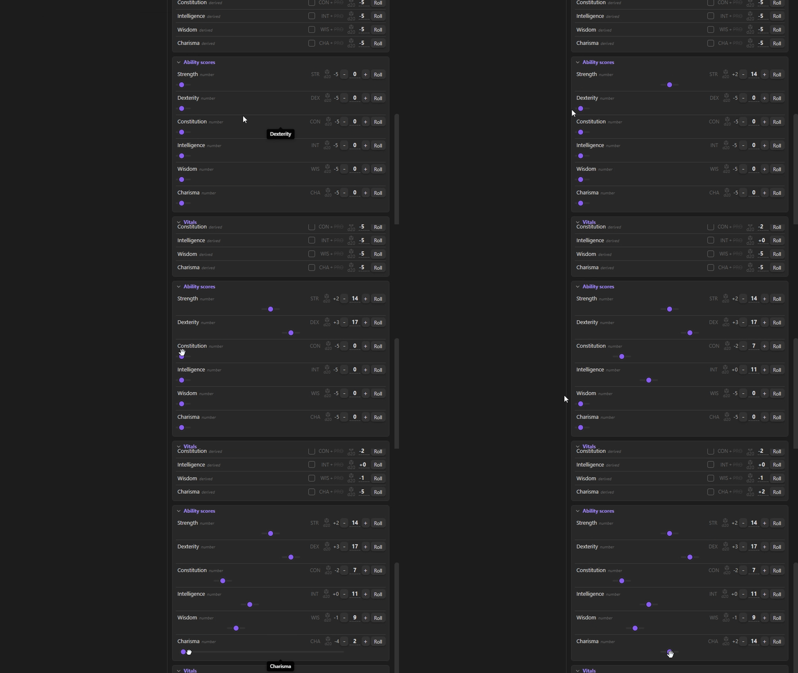
Number: Integer values with toggleable - / + steppers, optional slider (linear, root, or exponential response curve), min/max bounds (blank bounds default to the property's range across all notes), and clamping. Roll buttons integrate with the dice system.
-
Decimal: Floating-point values with step controls and formula support.
-
Derived: A read-only number computed by the influence engine (see below) - the sum of other properties' contributions. Click the value to store a per-note override; clear it to return to the derived sum.
-
Formula: Advanced numeric type-enter an expression like
sqrt(x)orlevel * 2 - 1. The expression maps to a slider, and typing a value solves the formula backwards to update the source property. -
List: Renders as chips/tags. Edit inline or via a modal list editor.
-
Checkbox: Boolean toggles, editable in locked mode.
-
Color: Interactive color picker with multiple color space support (RGB, HSL, OKLCH, OKLab), eyedropper tool, out-of-gamut indicator, and direct hex/input entry. Select your preferred color space globally in settings.
-
Image: Render images from URLs or Obsidian embeds (
![[image]]). Includes a zoomable modal viewer and height preset controls (small, medium, large, unlimited). -
Iframe: Embed external web content with configurable width, height, and scaling.
-
Rating (deprecated): absorbed by the number type - enable Rating icons under a number's slider settings (any Obsidian icon, user-set maximum via the range Maximum, multi-row wrap, red fill for negatives). Existing rating properties keep rendering.
-
Link: An internal
[[note]]reference rendered as a clickable link, with[[-triggered note autocomplete while editing. -
Unit (deprecated): absorbed by the number type - a number carries a unit suffix and an optional display factor (stored canonically, shown multiplied). Existing unit properties keep rendering.
-
Datetime (deprecated): The legacy native-picker date/time value. Superseded by the date type below; existing properties keep rendering, but the type is no longer offered for new ones.
-
Date (custom calendars): A date under a per-property format you define with tokens (
MM/DD/YYYY,D MMMM, Y E, ...). Each property can carry its own calendar - months per year, days per month, days per week, month names - and an era suffix pool (BCE,CE, or anything you type; each note picks its era from the pool via a chip, and typing a new suffix grows the pool). An optional timeline plot marks every other note's value for the property as reference points (it never edits the value): hover a point to see which notes carry that date, click a name to open the note (Ctrl/Cmd for a new tab), with the range configurable or taken from the vault's earliest/latest occurrence - the date analog of the number slider. Input is lenient: the property's format wins, but month names (full, short forms, unambiguous prefixes), reordered numeric dates and pooled era suffixes translate too, and always display back in the configured format. All of it is shared vault-wide per property, so two notes never disagree about the calendar. Time of day is optional per property - with a custom number of hours per day and minutes per hour - written withHH/mmtokens and re-encoding serials at minute resolution. Under the hood a note stores a calendar-independent integer: entered text is translated text → parts → integer through the property's format, system and era, and displayed integer → parts → formatted text. Because the integer is the ground truth and the calendar only the lens, changing the system (or removing an era) automatically re-encodes every note's value so each date keeps its interpreted meaning - clamped to the closest representable date when the new system is smaller.
Entry Types
Beyond properties, the sidebar supports several entry kinds for extended functionality:
- Property (prop): Standard frontmatter key-value pairs.
- Blank: Invisible spacer for visual separation during arrangement.
- Table of Contents (toc): Auto-generated entry that links to all headings in the current note. Respects collapsible sections and updates dynamically.
(The former bespoke "computed" entries are gone: proficiency bonus, initiative and the like are now ordinary derived properties built on the influence engine.)
Derived Values & the Influence Engine
Any numeric or derived entry can carry a list of influences - terms summed into its modifier. Each term is built from user-editable blocks:
- Source: a property, referenced by name. Chains resolve through other derived properties (a derived value feeding another derived value) up to a configurable depth (default 8, set in the plugin settings).
- Derivation: "value as-is", a named formula block from settings (seeded with Ability modifier and Proficiency bonus - rename, edit or delete them freely), or a custom formula in
x. - Expression: a full expression over many properties -
floor((STR + DEX) / 2) + max(PB, 2)- referencing them by name or short form ([Quoted Names]for spaces). Functions:floor,ceil,round,min,max,clamp,abs,if, comparisons and&&/||; your derivation blocks are callable too (abilityMod(Dexterity)). A typo degrades to "-" with a tooltip and reference cycles are detected explicitly, never breaking the sheet. - Sign: added or subtracted.
- Toggle: a list property that switches the term on/off per note - the generic form of proficiency. The row gets a checkbox, and the term in the chain can be double-clicked to toggle it.
Rows display the chain as short forms (INT + DEX - AGE), the dice breakdown (2d20 with a die pictogram) and the total. Short forms are configured per number property (in its options), kept unique across properties - setting one already in use prompts to overwrite, and the previous owner is re-derived by walking the name (Dexterity -> DEX, Dexterous -> DET). A property's name and its short form are interchangeable wherever you reference it, and both autocomplete as you type (chains, expressions, the dice roller, inline val:/roll:). The data-type tag, chain, dice and die icon each have their own show toggle, and whatever is enabled is shown or hidden dynamically as the sidebar is resized.
Cross-note references & aggregates. Expressions can also read other notes: [[Note]].Prop (and .s for its modifier), this.Prop, and prop("LinkProp", "Key") to follow a link property. Aggregate functions roll up a whole note type - sum, avg, count, min, max("Type", "Key") - so a property can total or average a field across every note of a type. These reads use raw stored values (no cross-note cycles), are backed by the vault-wide property index, and can be disabled with a settings kill-switch.
Dice & Rolls System
Enable the rolling feature (default-on; toggle in Settings -> Features) for full dice support:
-
Roll buttons on numeric and derived properties roll the configured dice plus the entry's influence sum; the row reads like the roll (
STR + PRO 2d20 +5).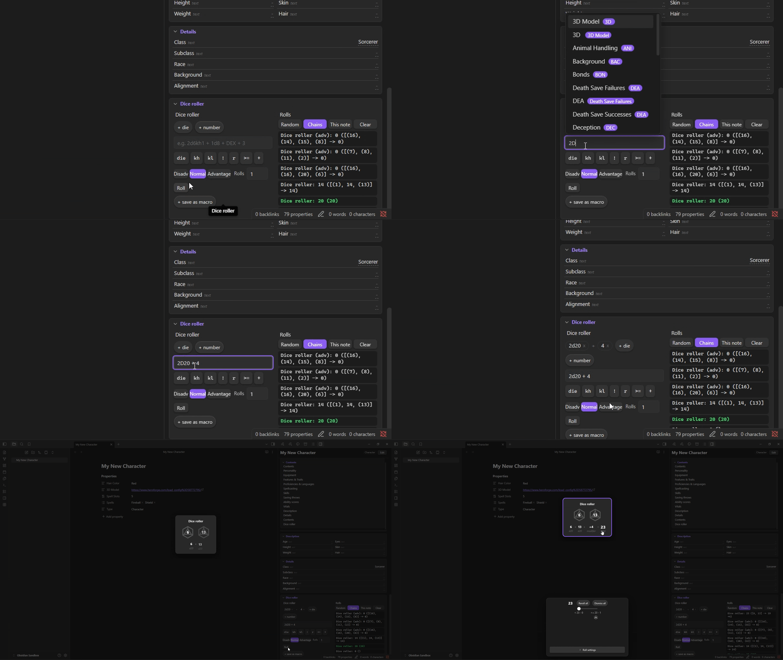
-
Preset dice: d2, d4, d6, d8, d10, d12, d20, d100, or custom die sizes with any quantity - with isometric die icons in the dice menus and inline before the notation (sources in
assets/dice/). -
Dice notation: Type any roll in the dice roller -
2d6kh1 + 1d8 + DEX + 3- with keep/drop (kh/kl/dh/dl), exploding (!/!N), reroll (rN/roN), success counting (>=N,>N,<=N,<N,=N) and property references (by name or short form). The chips and the text field are two views of one roll. A function bar inserts notation (die picker, keep/drop, explode, reroll, success), and references autocomplete as you type. Crit thresholds per die size and the fail-on-1 rule are configurable in Settings -> Dice. -
Roll history panel: A durable, plugin-wide log that survives note switches and reloads (capped, configurable in Settings -> Rolls). Toggle the full chain vs. label & result, filter to the current note, clear it, and re-run any in-session roll by clicking it. Export roll history to a note writes it out as a Markdown table.
-
Saved rolls (macros): Reusable "custom roll objects" - name a chain like
2d6 + 1d8 + 3, then roll it from the dice roller, from the command palette (one command per macro), with optional per-type scope. Build one in the roller and save as macro, or manage them in Settings -> Rolls. -
Roll modes: Normal, advantage (roll twice, take higher), and disadvantage (roll twice, take lower)-selectable per roll.
-
Roll animation & on-screen dialog: Rolls play out as cards in an on-screen dialog rather than a plain notice. Choose the per-die animation style - classic cycling numbers, a spinning icon, or true 3D polyhedra (d4/d6/d8/d10/d12/d20, built from real solid geometry) that spin on a single axis, decelerate quickly with a slight bounce, and settle showing the result face - and set its duration. Cards can be kept (click to pin) or dismissed, and several rolls resolve side by side. While the dialog is enabled it is the result display, so the redundant result notification is suppressed (turn the animation off for a plain notice instead). On mobile, multiple roll cards wrap into as many columns as fit the screen and scroll vertically. Honors
prefers-reduced-motion(the die lands without the spin).
-
Skills value type (removed): The record-based list type was removed in v4.0. Existing data renders read-only - nothing is lost - and a one-click Convert to property entries turns each record into a derived property (proficiency becomes a togglable influence backed by a list property). New layouts use sections of derived properties instead.
Inline Rolls & Properties
Enable the inline feature (default-on; toggle in Settings -> Features) to project the sidebar's engine into note bodies (reading mode):
- Inline rolls:
`roll: 2d6+DEX`becomes a clickable roll chip - full dice notation and property references, with`roll(adv):`/`roll(dis):`for advantage/disadvantage. Rolls go through the same animation and history as the sidebar, with no view open. - Inline properties:
`prop: Strength`shows the note's live value and is click-to-edit, writing back to frontmatter. - Inline values:
`val: INT`renders a property (by name or short form) as a chip styled like a roll - with the property's icon, if it has one.`val: INTs`(the modifier suffix) shows that property's modifier instead of its value. Link values are clickable to navigate, with a right-click Edit value action. - Inline value cards:
`vals: Strength`renders the property's full sidebar value-type card inline (interactive - steppers, sliders, pickers, roll buttons), with a right-click Configure menu and a per-reference options store, so a body line edits exactly like the sidebar. - Modifier references: append the configurable suffix (default
s) to any reference to use a property's modifier rather than its value - in expressions,`roll:`(2d6 + INTs), and`val:`. If a property's modifier is overridden, that override is used. - Statblock block: an
ep-sheetcode block projects the note type's sections as a compact read-only statblock (derived values computed, roll buttons included). List section titles inside the block to show only those. - Inline charts: small SVG visualizations of property values -
`spark: STR, DEX, CON`(sparkline),`bar: ...`,`radar: STR, DEX, CON, INT, WIS, CHA`(great for ability scores), and`progress: HP / MaxHP`(a progress bar; the max can be a number or a property). For a larger chart, anep-chartcode block takes atype/props/max/titleconfig. References resolve through the same engine (short forms,Xsmodifiers, cross-note refs), charts theme via--ep-*, and each carries anaria-labeland a screen-reader text fallback.
Values resolve against the note the code lives in, so embeds and hover previews stay correct. Chips render in both reading mode and Live Preview. In Live Preview, moving the caret just before, into, or just after a chip reveals its raw text for editing; on a roll chip, right-click for the usual roll menu (advantage/disadvantage, number of rolls) plus an Edit source action.
Type Table View
Open type table (command + ribbon icon) opens a workspace view that lists every note of a chosen type as rows, with the properties you pick as columns. Choose the type, pick the columns, filter by text, and click a header to sort (ascending -> descending -> none). Cells render a compact, type-aware widget - checkbox, rating pips, colour swatch, internal link, image thumbnail, right-aligned numbers, list chips - and edit in place on double-click; rollable columns get a die button that rolls the cell value through the dice system. Rows click through to the note. Columns drag to resize, and the column set, sort order and widths persist per type. Rows above 150 virtualize, so a type with thousands of notes stays responsive.
Conditional Formatting
Colour a property by its own value. Palettes are made once in Settings -> Palettes and pointed at from a property's Formatting block, so the sidebar, the type table and inline chips agree on what a value looks like. A palette also carries the finishes its values wear, and a property can borrow a palette's colours while writing its own points and bands - in values, or in per cent of that property's own range, so one scale fits a skill out of twenty and a fortune out of ten thousand. Three ways of reading a value: a wheel sweeping a hue across the property's range, a scale of points and bands - a point is one value wearing one colour, a band holds a colour flat between two edges, and either can be added anywhere on it (with linked edges, a tick to say which side wins a shared edge, and your choice of what happens in the gaps and beyond the ends) - and words with colours of their own. The colours are a list of their own beside the scale, so a colour can be moved without moving the numbers. Every blend travels through OKLCH, so red to blue passes through the purples rather than through grey, and a fill takes a foreground picked by measured contrast.
The colour lands on the value's text, on the value in a tinted pill, or on the whole row; a list colours each chip by its own value and gives the row the blend of them. Dates, derived values and formulas are coloured as the numbers they are - a palette can even be written over a calendar, its edges typed and read as dates in the property's own format.
Over the top go finishes - sheen, mirror, prism, opal, nebula, beacon, glitter, crackle, satin, weave - applied to everything, to named values, or to a band of numbers. Each is a material rather than a picture of one: the light follows your pointer, and every value is lit from where the pointer stands on IT - so a sheet of rows catches the light one row at a time as you cross them, and fades behind you. It travels at a speed with a ceiling on it and eases back to rest when the pointer leaves. All of it is gradients and blend modes; nothing is downloaded, nothing is an image, and nothing runs on a timer. The light also wanders slowly around the pointer, so a still hand still breathes. Reduced motion keeps the materials, stops the wandering and drops the speed limit to a crawl; Windows High Contrast stands the whole layer down.
A palette set to Words knows a few hundred English words out of the box (colours, elements, materials, weather, states, outcomes) and reaches more by stemming. For the rest of the language, drop a word-vector file named glove.txt into the plugin's folder - GloVe's pre-trained vectors, or anything in the same word n n n ... shape - and press Build from glove.txt in Settings -> Palettes. Every word takes the colour of the anchors it sits nearest to; the result is kept as semantic-en.json beside it and reused from then on, and rebuilt only if the vector file changes or you ask. The work happens once, on your machine: no model runs in the plugin, no weights are bundled, and nothing is ever downloaded.
Validation & Conditional Visibility
Validation & constraints. Any entry can carry constraints - required, numeric range, regex pattern, allowed values (element-wise for lists). Invalid values get a non-blocking invalid style (the data is never rejected), and numbers can optionally clamp to range on commit.
Conditional visibility. Entries and sections accept a showWhen condition - a boolean expression over the note's own values, e.g. Class == "Wizard", Level >= 5, with && / || / ! and string or numeric comparisons. The condition is evaluated live; matching content shows, the rest is hidden outside edit mode (and shown dimmed inside it, so the rule stays reachable). Condition fields give live parse feedback in the entry and section options.
Export & Import
Share a layout or a single section as a portable JSON snippet. Export on a type, or Export section... on a section menu, copies a versioned snippet to the clipboard - carrying the layout/section plus a dependency manifest of just the derivation blocks it references. The import dialog pastes (or auto-reads the clipboard), lists any missing derivation building blocks and offers to create them, then appends the section(s) to a chosen type with freshly generated, collision-free ids.
Obsidian Integration
Property panel sync: Properties displayed in the sidebar can be automatically hidden from Obsidian's own properties panel (default behavior). A right-click menu on Obsidian's properties panel shows a "Hidden properties" list, and you can toggle visibility per property without removing data. Disable this behavior entirely in settings if preferred.
Property index: Vault-wide search for all properties across your vault, enabling autocompletion suggestions in text properties and helping you discover available fields.
Customization & Accessibility
Per-property styling: Icon, icon color, label text override (alias), label size, value size, label color, value color, and show toggles (label, data type tag, when empty, modifier chain, dice, die icon, per-term chain visibility and checkboxes, Obsidian panel).
Tabbed section options: A property's settings open inside its section's options modal, which has one tab per property plus the section itself. Ctrl/Cmd-click toggles tabs, Shift-click selects ranges, and dragging across tabs sweeps a selection - multi-selections show only the shared settings (identical across data types and sections), and only the settings you change are written to every selected tab. Tabs can be grouped by column, by row, or by data type.

Typography controls: Set global font family, base font size, and separate sizing for labels, values, list items, and section titles-use 0 for theme defaults.
Theme colors: Customize accent, background, and control colors per section, with overflow and contrast-aware displays.
Keyboard navigation & screen readers: Sidebar entries form a roving-tabindex group - Tab into the list, then Up/Down/Home/End move between entries and Enter/Space opens the focused entry's context menu, so reorder/edit/remove (the drag alternatives) are reachable without a mouse. Every custom control is keyboard-operable and screen-reader labelled: editable values open with Enter/Space, the rating and slider are role="slider" widgets adjusted with the arrow keys (and Home/End), checkboxes toggle from the keyboard even in locked mode, list chips have a labelled Remove button, and section titles are aria-expanded disclosures. Visible :focus-visible rings appear across the sidebar, table view and popups; custom popups close on Escape; roll buttons, steppers and the entry menu carry aria-labels; a polite aria-live region announces roll totals; a forced-colors (Windows High Contrast) block keeps state perceivable without relying on colour; and prefers-reduced-motion is honoured across the animations. See ACCESSIBILITY.md for the full support summary.
Touch friendly: The sidebar is fully responsive for mobile - long-press opens context menus on chips, value cards, rows and roll buttons; option and colour modals become bottom sheets; sliders are scroll-safe.
Localization & Text Override
Translatable strings: The UI ships in English. Missing keys fall back to English at runtime (resolution order: per-string override -> active locale -> English -> humanized key). Additional languages can be registered by feature modules through the plugin's module API.
String overrides: Override any UI text string individually via a searchable editor in Settings -> UI text, without touching code. Useful for domain-specific terminology or personal naming preferences.
Advanced Features & Domain Modules
Extensible Architecture
The plugin's architecture is built around registries, allowing feature modules to extend the core without modifying the codebase. Any module can register:
- Value types: Custom data renderers and editors (e.g., the rating type).
- Entry kinds: Custom entry renderers (e.g., the roll panel).
- Cluster addons: Extra UI cells appended to numeric rows (e.g., roll buttons, modifier badges).
- Derivations: Modifier math blocks (also user-editable in settings).
- Section templates: One-click section presets in the edit toolbar to build common layouts.
- Layout presets: Full default layouts for new note types.
All feature modules can be toggled on/off in Settings -> Features without breaking existing layouts or data.
Public API: The same FeatureModule contract is published as a stable, versioned API on window.ExtendedProperties (and the plugin's .api), so third-party plugins can register their own value types, entry kinds, derivations and locale strings without forking.
D&D 5e Character Sheet Module
A complete D&D 5e character sheet built entirely as a feature module on top of the core:
Ability scores & modifiers: Standard six abilities (Strength, Dexterity, Constitution, Intelligence, Wisdom, Charisma). Scores automatically compute ability modifiers using D&D 5e rules. Roll buttons on ability modifiers let you make ability checks with advantage/disadvantage support.
Saving throws & skills: Sections of derived properties - one per save/skill - combining the ability modifier with a proficiency term toggled through the classic Saving Throw Proficiencies / Skill Proficiencies list properties. Legacy entry kinds are migrated automatically on first load.
Initiative & proficiency bonus: Ordinary derived properties (Dexterity -> ability modifier, Level -> proficiency bonus) with roll integration - no bespoke widgets.
Character vitals: Hit points, armor class, speed, proficiency bonus, and other standard fields.
Section templates: The module includes pre-built sections-Contents, Details, Vitals, Ability scores, Saving throws, Skills-all available as one-click templates in the edit toolbar. Applying a template also creates any missing modifier-source properties as real entries and writes the template's properties to the note (empty, hidden from Obsidian's panel).
No default layout: New note types always start empty; add the template sections you want. The full character sheet remains available as a layout preset.
Data storage: Everything is stored as plain note properties (frontmatter), making it searchable and portable. No proprietary formats or hidden data.
Settings & Configuration
Global defaults: Set default data type for new properties, default section layout mode, default color space, typography (font family, sizes for labels/values/titles/lists), section appearance (transparent, sticky, collapsible, dividers, size limits).
Features toggle: Enable/disable every feature — optional modules (D&D 5e, dice rolling, inline), individual value types, and interface features (type table, section pinning, pool editor, sensitive values, snapshots) — without deleting data.
UI text: Override individual strings via a searchable editor. English is the built-in language; module-registered dictionaries fall back to English for missing keys.
Property hiding: Manage which properties are hidden from Obsidian's properties panel. Sidebar-shown properties can be auto-hidden (default), and you can manually hide additional properties.
Note type activation: Select which Type values activate the sidebar, and define a unique layout per type. There is no default type - give any note a Type value and it is adopted with an empty layout.
Layouts as vault files (optional): Store each type's layout as a JSON file in a configurable vault folder, so your configuration syncs, diffs and shares with the vault instead of living only in data.json. The files win on load and data.json keeps a backup copy, so a sync conflict becomes an ordinary file conflict rather than a silent overwrite. A toggle, folder field and Reload from files button live in settings; enabling exports your current layouts, disabling reabsorbs them.
Modifier building blocks: Named formulas (in x) that influences apply to source values, plus the modifier chain depth and per-property short forms - all editable.
Sound effects: Optional Web Audio cues for clicks, dice rolls and crit/fail, with a master toggle, volume, and independent per-category toggles (UI / dice / crit). The roll-animation style (classic, spinning icon, or 3D polyhedra) and duration are configurable too, and while the on-screen roll dialog is enabled it replaces the result notification.
Data safety: Frontmatter writes are batched and debounced per file (so a held slider drag is one write, not a burst). An optional Guard against edit conflicts watches each file's modification time and, if a note changes on disk mid-write (sync, another pane), performs a field-level three-way merge - your edits and the external edits are combined automatically when they touch different properties, and the Keep mine / Take theirs prompt only appears for properties both sides changed differently. Settings upgrades run through a versioned, idempotent migration runner, and the pre-upgrade data.json is snapshotted to the plugin's backups/ folder (last 5 kept).
Configuration snapshots: Save a timestamped snapshot of your types, layouts, derivations and settings to a snapshots/ subfolder of the layout folder, and restore any snapshot later (a restore backs up your current settings first). Available from the command palette or the settings buttons, with an optional once-a-day auto-snapshot and a retention cap.
Encrypted (sensitive) properties: Optionally encrypt a text property's value with AES-256-GCM under a session passphrase. Right-click the property and choose Encrypt value; it is stored as a self-describing envelope and shown as locked until you Unlock encrypted properties with the same passphrase. The passphrase is held only in memory and never written anywhere - if you lose it the value cannot be recovered - and a wrong passphrase always fails safely, never overwriting the ciphertext.
Theming
Every plugin surface reads its sizes and colours from --ep-* CSS variables, each falling back to the current Obsidian theme value, so themes and the Style Settings plugin can restyle Extended Properties without !important. A Style Settings panel (Extended Properties) is bundled; you can also set any variable yourself in a CSS snippet, e.g. body { --ep-radius: 12px; --ep-accent-default: #c678dd; }.
| Variable | Default | Controls |
|---|---|---|
--ep-accent-default | var(--text-accent) | Section title / icon / drop-marker accent (per-section colours still win) |
--ep-control-default | var(--interactive-normal) | Stepper / control button background |
--ep-section-bg | var(--background-secondary) | Section background fill |
--ep-section-border | var(--background-modifier-border) | Section border colour |
--ep-section-title-bg | var(--background-secondary) | Sticky section-title background |
--ep-radius | 8px | Corner radius of sections, cards and chips |
--ep-section-gap | 10px | Vertical gap above each section |
--ep-section-pad | 4px 8px 6px | Section padding |
--ep-chip-bg | var(--background-modifier-hover) | List / tag value-chip background |
--ep-chip-fg | inherit | Chip text colour |
--ep-chip-radius | var(--ep-radius) | Chip corner radius |
--ep-rating-color | theme accent | Rating stars / pips |
--ep-font, --ep-size-base/-label/-value/-title/-list | theme | Typography (also set from the plugin's own settings) |
Toggle Flat sections in Style Settings (or add the ep-flat-sections class to body) to drop section borders and backgrounds for a borderless look.
Backward Compatibility & Data
data.jsonwritten by v1 loads unchanged-the data model is stable.- Persisted data is plain YAML frontmatter, fully compatible with Obsidian and other tools.
- Feature modules extend entries using open-ended field storage; disabling a module preserves its data (displayed as "Unavailable" stubs until the module is re-enabled).
- Migrations are applied automatically for schema updates, via a versioned, idempotent runner; the pre-migration
data.jsonis backed up first (last 5 kept). - Customizations carry across plugin versions: settings written by a newer version (or by a third-party module) are preserved rather than dropped on load, and any version change snapshots
data.jsonso an upgrade can always be rolled back.
Credits
Word colouring can be extended with pre-trained word vectors. The plugin bundles none, downloads none and runs no model - it reads a file you provide and builds a word-to-colour table from it once.
- GloVe: Global Vectors for Word Representation - Jeffrey Pennington, Richard Socher and Christopher D. Manning, Stanford NLP (EMNLP 2014), with the 2024 vectors. Released into the public domain under the Public Domain Dedication and Licence (PDDL) v1.0.
License
MIT
For plugin developers
Search results and similarity scores are powered by semantic analysis of your plugin's README. If your plugin isn't appearing for searches you'd expect, try updating your README to clearly describe your plugin's purpose, features, and use cases.