Special Callouts
unlistedby ahseyg
Advanced callout styling with grid layouts, custom colors, gradients, glow effects, and multi-column support.
Special Callouts for Obsidian
Transform your Obsidian notes with premium, dynamic, and fully customizable callouts.
Turn boring generic boxes into magazine-quality layouts, code terminals, or neon-glowing alerts. Customize everything directly from your markdown — or create reusable presets in the visual settings panel.
Open source · MIT License · Contributions welcome!
What's New in v1.0.2
| Feature | Description |
|---|---|
| Center Alignment | (center) to center everything, (title:center) for title only |
| Compact Mode | (compact) for dashboard-style dense layouts |
| Typography System | Five fonts: mono, serif, sans, hand, marker |
| Font Size Scale | font-size:1 (tiny) → font-size:5 (huge) |
| Neon Glow | Color-based neon borders: neon:#00f2ff |
| Text Borders | text:dark-border / light-border for readability |
| Border Styles | dashed, dotted, double with custom radius |
| Column Engine Rewrite | CSS Grid-based reliable multi-column lists |
| Dataview Support | Column layouts work with Dataview task/list queries |
| Reading Mode Fixes | Multi-callouts no longer overlap in preview |
| Random Style Generator | One-click random style in settings |
Features at a Glance
- Infinite Customization — Background, text, borders, icons — all from inline markdown
- Advanced Layouts — Multi-column lists, side-by-side grids, dashboards
- Typography Control — Switch fonts and sizes per callout
- Visual Effects — Gradients, neon glows, custom borders
- Center & Compact — Center-align content or shrink padding for dense views
- Dataview Integration — Column layouts work with Dataview tasks and lists
- Visual Settings Panel:
- Live Preview while editing styles
- Visual Icon Picker with fuzzy search
- Random Style Generator
- Import/Export styles as JSON
- Standard callout customization (note, info, warning, etc.)
- Custom named color palette
Full Usage Guide → — Detailed documentation for every feature.
Quick Start
1. Inline Customization
Add parameters inside parentheses ( ) right after the callout type:
> [!note] (bg:#2ecc71, text:white) Hello World
> This is a green callout with white text.
2. Custom Style Presets
Create a style in Settings → Special Callouts, name it (e.g., terminal), and use it anywhere:
> [!terminal]
> System ready.
> Waiting for command...
Or apply it to any standard callout:
> [!info] (style:terminal)
> This info box now looks like a terminal!
Metadata Reference
Customize any callout: > [!type] (param:value, param2:value2) Title
Colors & Visuals
| Parameter | Example | Description |
|---|---|---|
bg | bg:blue / bg:#ff0000 | Background color |
text | text:white | Content text color |
title | title:cyan | Title text and icon color |
link | link:orange | Link color inside callout |
gradient | gradient:blue-purple | 2-color linear gradient |
neon | neon:#00f2ff | Neon border + glow effect |
no-icon | (no-icon) | Hide the default icon |
Borders
| Parameter | Example | Description |
|---|---|---|
border | border:red / border:none | Border color |
border-width | border-width:4 | Thickness in pixels |
border-style | border-style:dashed | solid, dashed, dotted, double |
radius | radius:20 | Corner roundness in pixels |
Typography
| Parameter | Example | Description |
|---|---|---|
font | font:mono | mono, serif, sans, hand, marker |
font-size | font-size:4 | Scale: 1 (tiny) → 5 (huge). Default: 3 |
Text Readability
| Parameter | Example | Description |
|---|---|---|
text:dark-border | text:(white, dark-border) | Dark stroke on content text |
text:light-border | text:(cyan, light-border) | Light stroke on content text |
title:dark-border | title:(yellow, dark-border) | Dark stroke on title |
link:dark-border | link:(orange, dark-border) | Dark stroke on links |
Layouts
| Parameter | Example | Description |
|---|---|---|
col | (col:3) | Multi-column lists |
center | (center) | Center title + content |
title:center | (title:center) | Center only the title |
compact | (compact) | Reduce padding (dense mode) |
| Grid | (1:2) | Position in grid: (pos:cols) |
| Grid Row | (1:3:2) | (pos:cols:row) for multi-row |
Examples
Each example below shows the exact markdown syntax used to create it. Copy-paste into Obsidian to try!
Colors & Backgrounds
Change background, text, and title colors using Hex codes, RGB, or named colors.
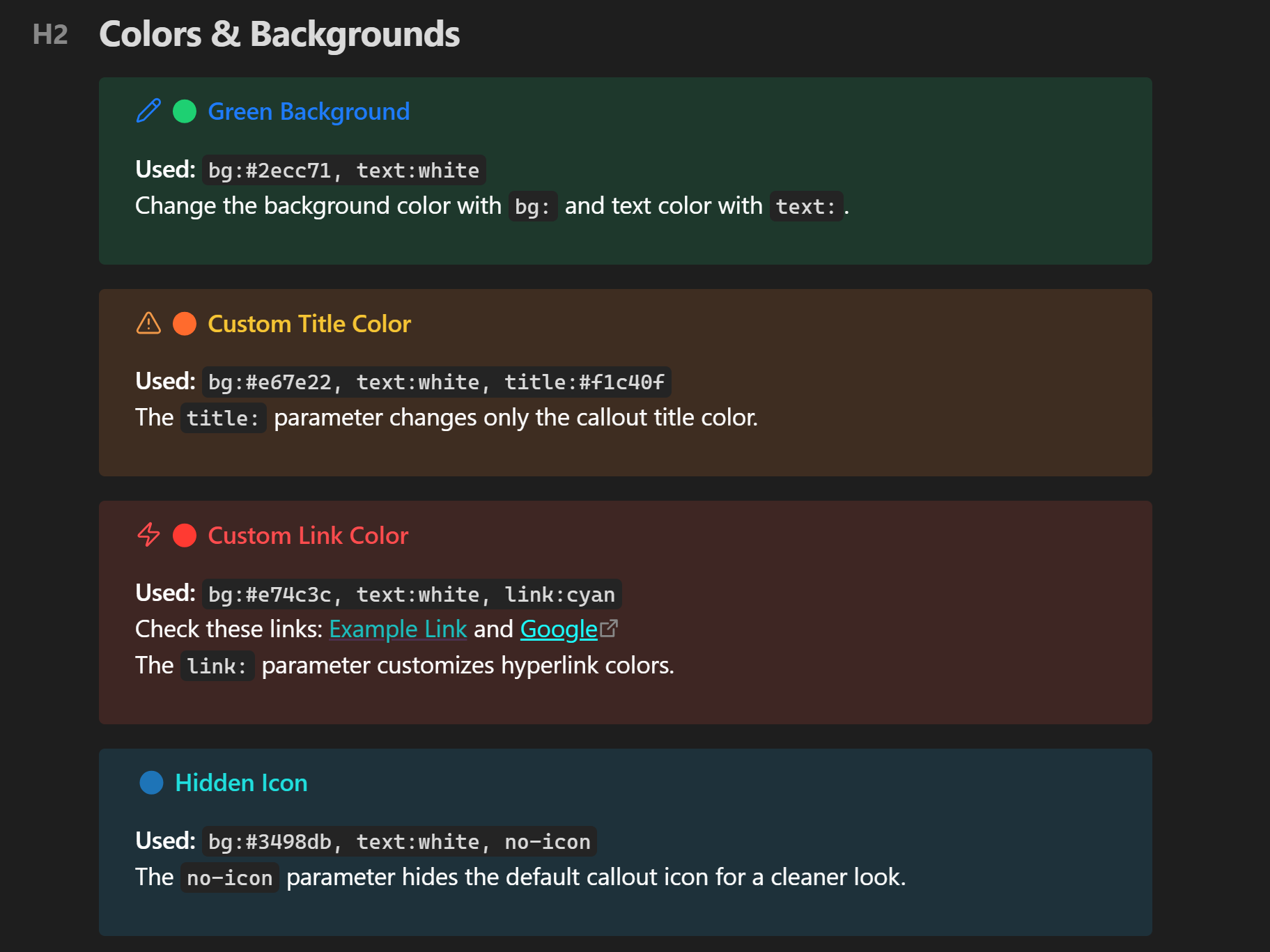
> [!note] (bg:#2ecc71, text:white) 🟢 Green Background
> Change the background color with `bg:` and text color with `text:`.

> [!warning] (bg:#e67e22, text:white, title:#f1c40f) 🟠 Custom Title Color
> The `title:` parameter changes only the callout title color.

> [!danger] (bg:#e74c3c, text:white, link:cyan) 🔴 Custom Link Color
> Check these links: [[Example Link]] and [Google](https://google.com)
> The `link:` parameter customizes hyperlink colors.

> [!tip] (bg:#3498db, text:white, no-icon) 🔵 Hidden Icon
> The `no-icon` parameter hides the default callout icon for a cleaner look.
Gradients
Create stunning gradients by separating two colors with a hyphen -.
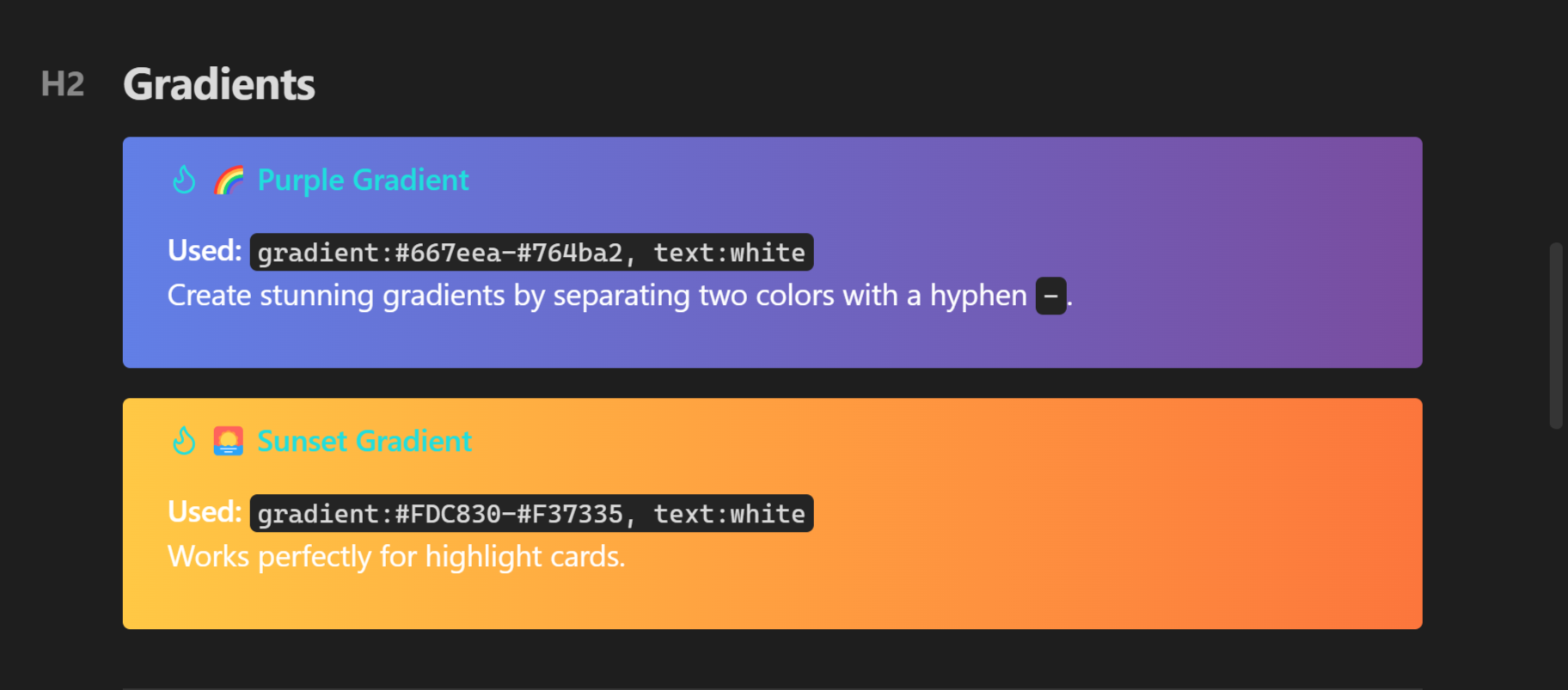
> [!tip] (gradient:#667eea-#764ba2, text:white) 🌈 Purple Gradient
> Create stunning gradients by separating two colors with a hyphen `-`.

> [!tip] (gradient:#FDC830-#F37335, text:white) 🌅 Sunset Gradient
> Works perfectly for highlight cards.
Typography & Fonts
Change the font family of your callouts to match the content.
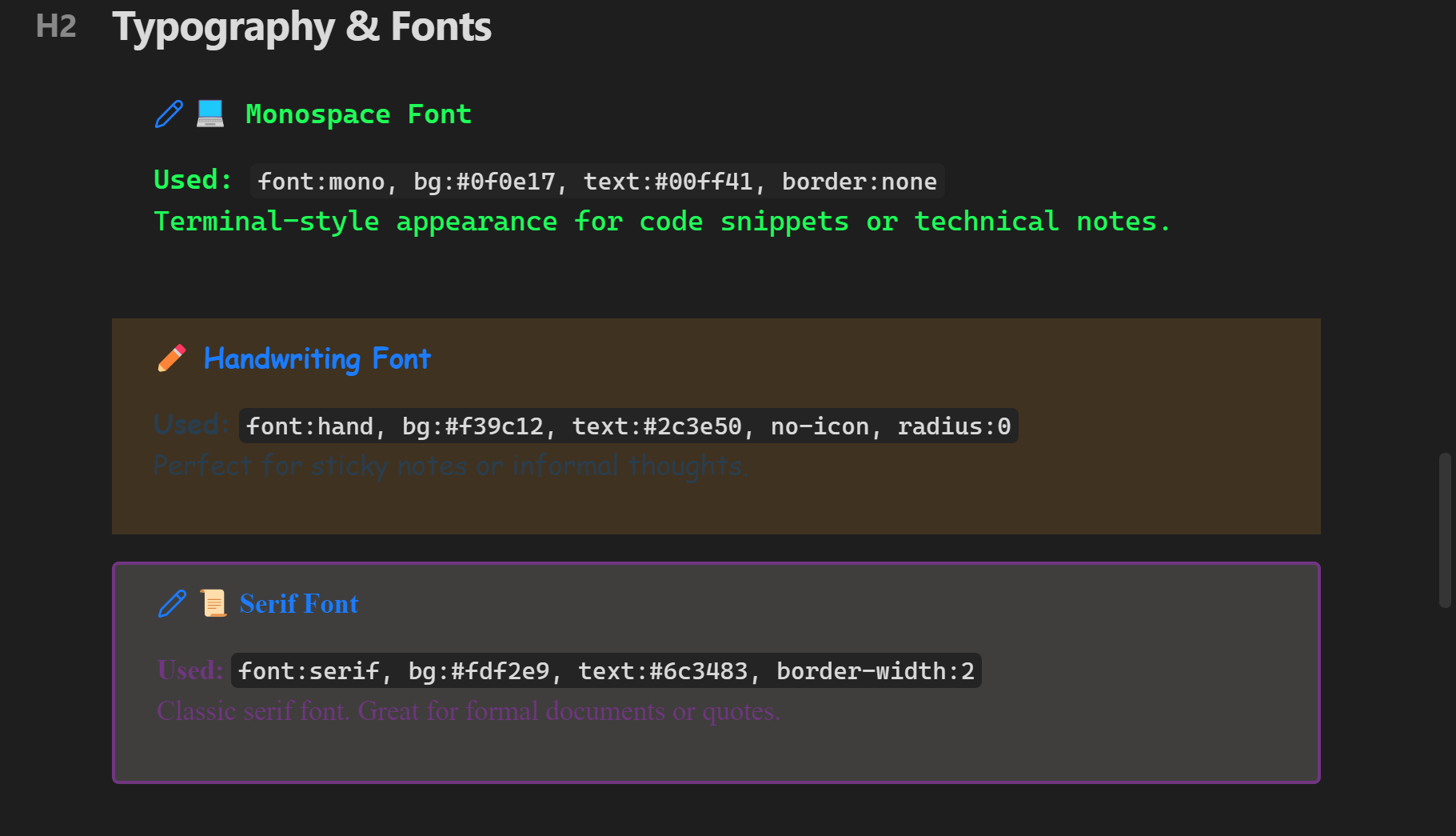
> [!note] (font:mono, bg:#0f0e17, text:#00ff41, border:none, title:#00ff41) 💻 Monospace Font
> Terminal-style appearance for code snippets or technical notes.

> [!note] (font:hand, bg:#f39c12, text:#2c3e50, no-icon, radius:0) ✏️ Handwriting Font
> Perfect for sticky notes or informal thoughts.

> [!note] (font:serif, bg:#fdf2e9, text:#6c3483, border-width:2) 📜 Serif Font
> Classic serif font. Great for formal documents or quotes.
Font Size Scale
Scale text from font-size:1 (tiny) to font-size:5 (huge).
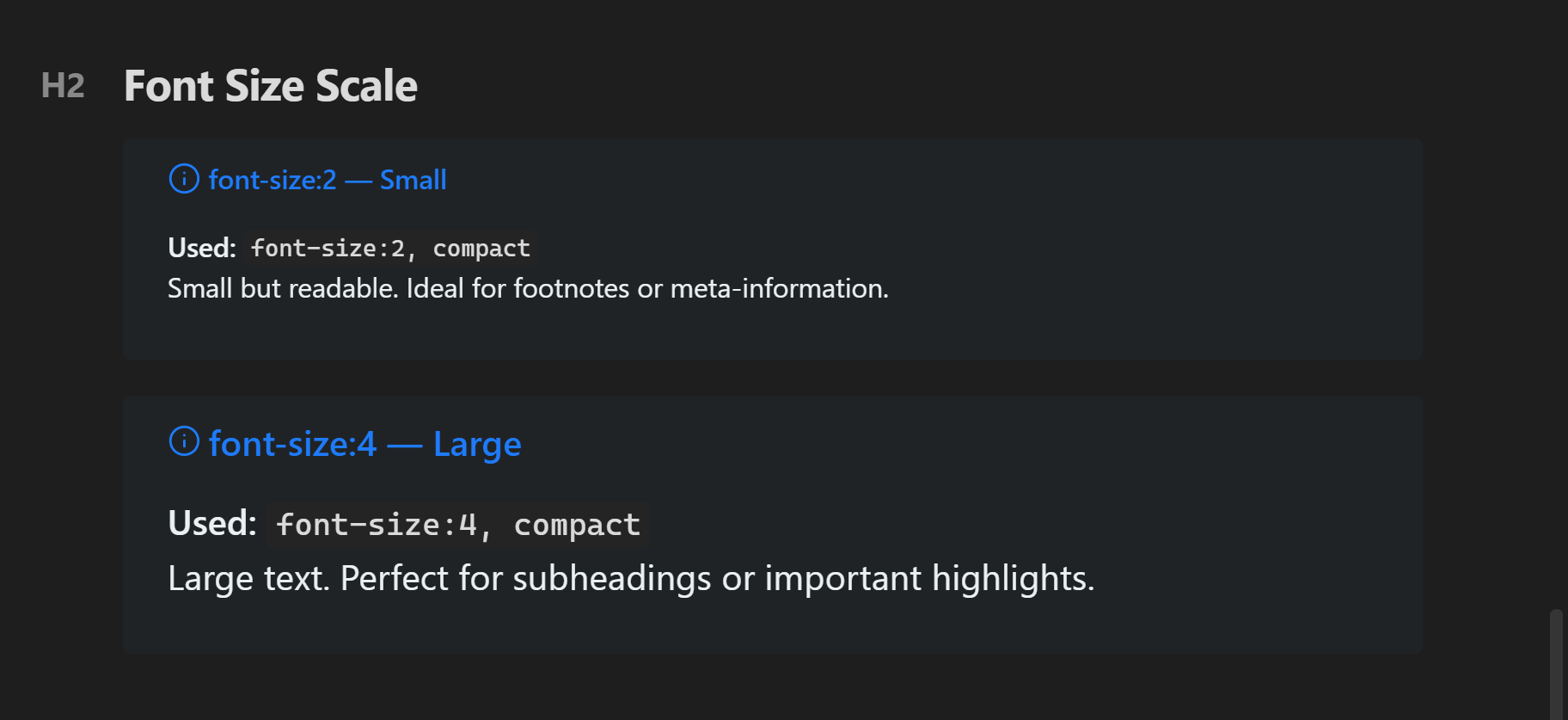
> [!info] (font-size:2, bg:#2c3e50, text:#ecf0f1, compact) font-size:2 — Small
> Small but readable. Ideal for footnotes or meta-information.

> [!info] (font-size:4, bg:#2c3e50, text:#ecf0f1, compact) font-size:4 — Large
> Large text. Perfect for subheadings or important highlights.
Layout Controls
Center alignment and compact dense modes.
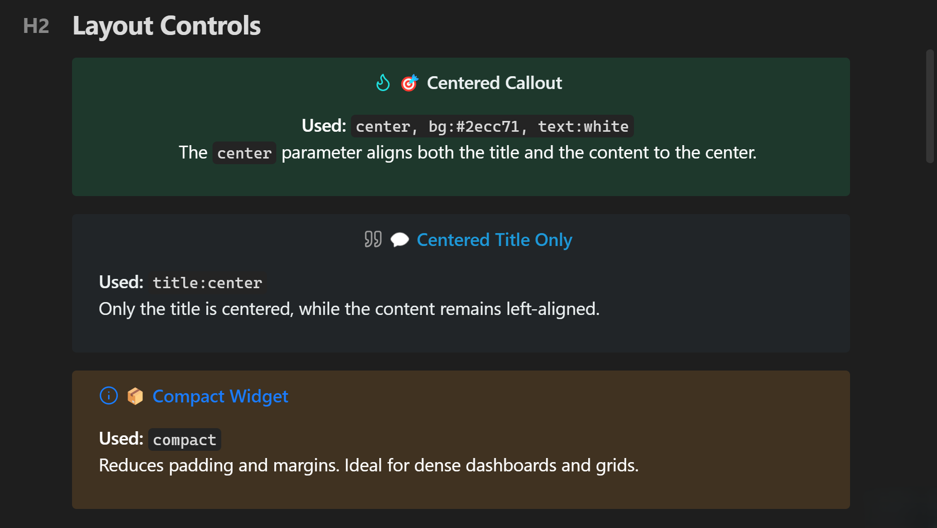
> [!tip] (center, bg:#2ecc71, text:white, title:#ecf0f1) 🎯 Centered Callout
> The `center` parameter aligns both the title and the content to the center.

> [!quote] (title:center, bg:#34495e, text:#ecf0f1, title:#3498db) 💬 Centered Title Only
> Only the title is centered, while the content remains left-aligned.

> [!info] (compact, bg:#f39c12, text:white) 📦 Compact Widget
> Reduces padding and margins. Ideal for dense dashboards and grids.
Border Styles
Customize border style, width, and radius.
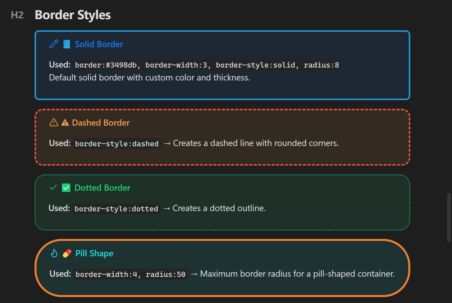
> [!note] (border:#3498db, border-width:3, border-style:solid, radius:8) 📘 Solid Border
> Default solid border with custom color and thickness.

> [!warning] (border:#e74c3c, border-width:3, border-style:dashed, radius:15) ⚠️ Dashed Border
> `border-style:dashed` → Creates a dashed line with rounded corners.

> [!success] (border:#2ecc71, border-width:2, border-style:dotted, radius:20) ✅ Dotted Border
> `border-style:dotted` → Creates a dotted outline.

> [!tip] (border:#e67e22, border-width:4, radius:50) 💊 Pill Shape
> `border-width:4, radius:50` → Maximum border radius for a pill-shaped container.
Neon Glow Effects
Add futuristic neon borders and glowing box-shadows.
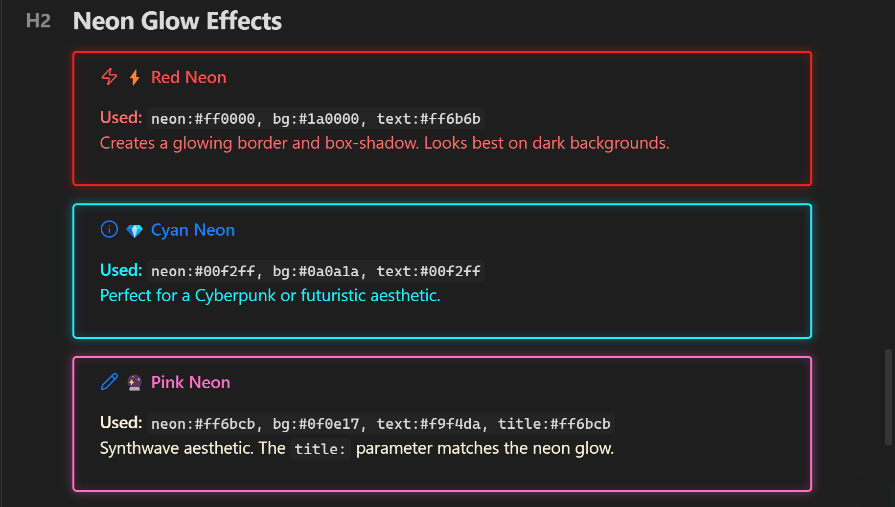
> [!danger] (neon:#ff0000, bg:#1a0000, text:#ff6b6b) ⚡ Red Neon
> Creates a glowing border and box-shadow. Looks best on dark backgrounds.

> [!info] (neon:#00f2ff, bg:#0a0a1a, text:#00f2ff) 💎 Cyan Neon
> Perfect for a Cyberpunk or futuristic aesthetic.

> [!note] (neon:#ff6bcb, bg:#0f0e17, text:#f9f4da, title:#ff6bcb) 🔮 Pink Neon
> Synthwave aesthetic. The `title:` parameter matches the neon glow.
Standard Columns
Automatically split list items and checkboxes into multiple columns.
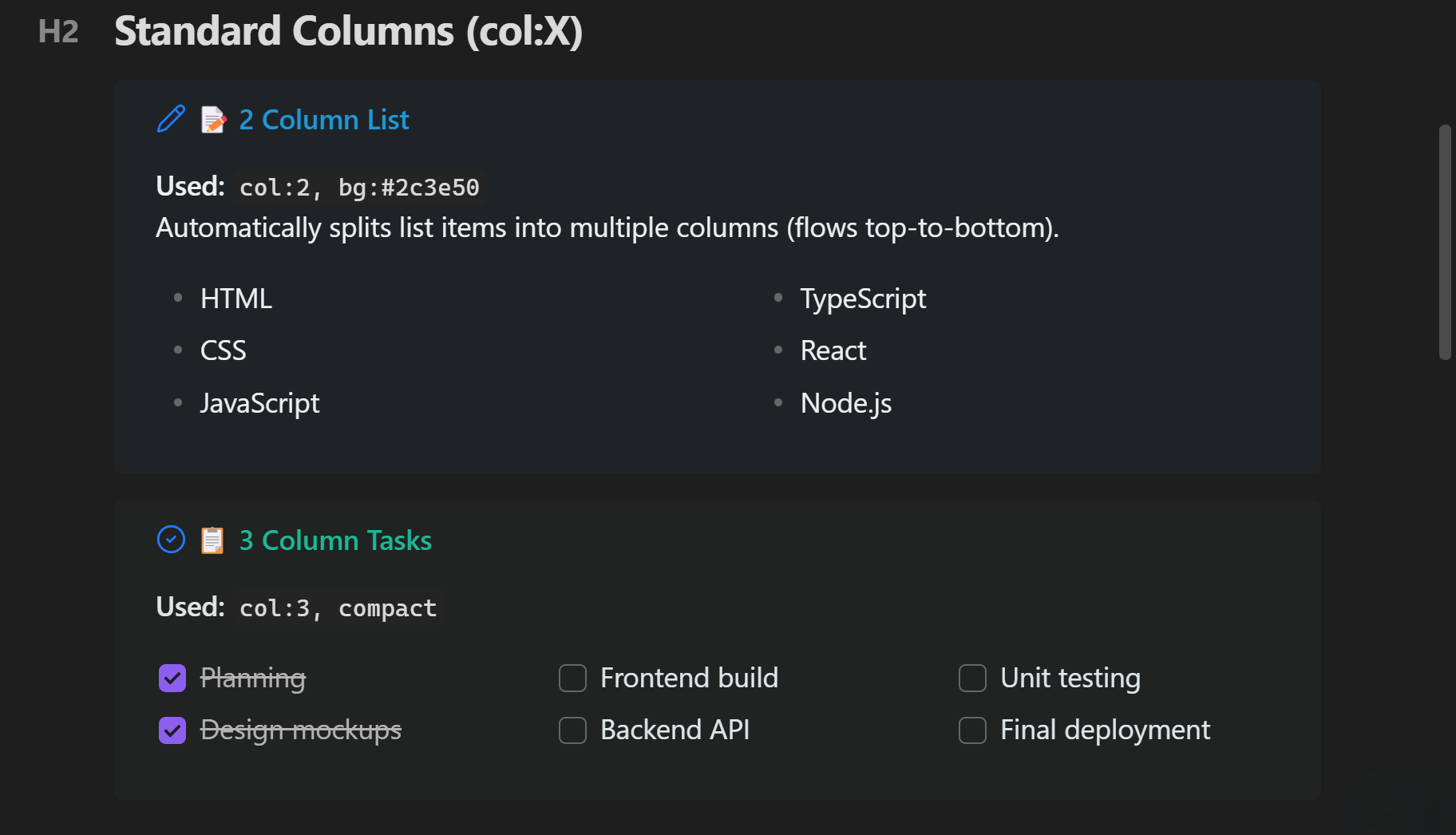
> [!note] (col:2, bg:#2c3e50, text:#ecf0f1, title:#3498db) 📝 2 Column List
> Automatically splits list items into multiple columns (flows top-to-bottom).
> - HTML
> - CSS
> - JavaScript
> - TypeScript
> - React
> - Node.js

> [!todo] (col:3, bg:#2d3436, text:#dfe6e9, title:#00b894, compact) 📋 3 Column Tasks
> Task lists (checkboxes) work flawlessly inside column layouts!
> - [x] Planning
> - [x] Design mockups
> - [ ] Frontend build
Dataview Integration
Column layouts perfectly support asynchronous Dataview queries!
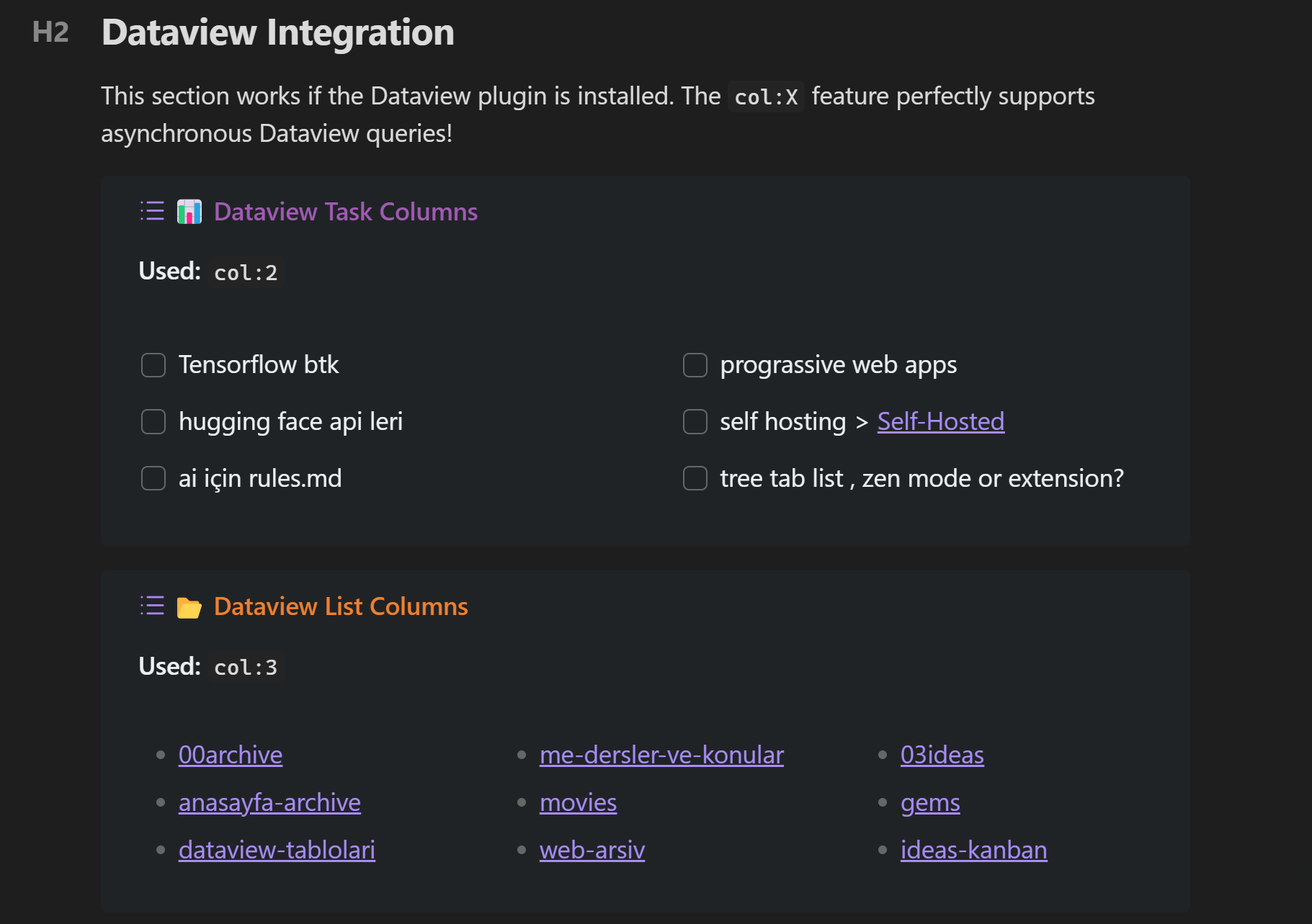
> [!example] (col:2, bg:#2c3e50, text:#ecf0f1, title:#9b59b6) 📊 Dataview Task Columns
> ```dataview
> TASK
> FROM ""
> WHERE !completed
> LIMIT 6
> ```
The Two Layout Engines: Inline vs Visual
Special Callouts comes with two distinct layout engines. Depending on your needs, you can use the simple inline system for quick alignments, or the advanced visual builder for complex, asymmetric dashboards.
1. The Inline Grid System (Basic & Quick)
Best for: Simple side-by-side grids, 50/50 splits, or quick alignments.
How it works: You write the layout directly in your markdown using the (position:columns) syntax inside a [!multi-callout] wrapper. No settings required.
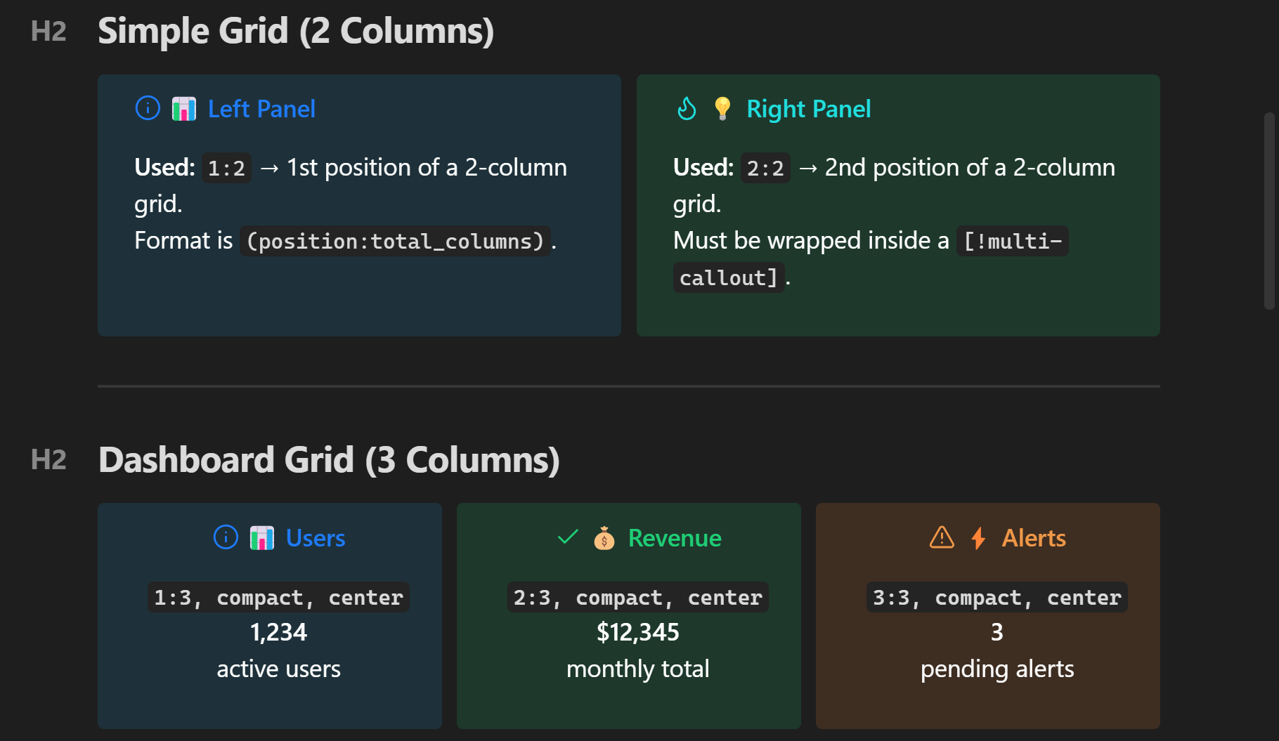
> [!multi-callout]
> > [!info] (1:2, bg:#3498db, text:white) 📊 Left Panel
> > Format is `(position:total_columns)`.
>
> > [!tip] (2:2, bg:#2ecc71, text:white) 💡 Right Panel
> > Must be wrapped inside a `[!multi-callout]`.
2. The Visual Layout Builder (Advanced & Interactive)
Best for: Complex dashboards, asymmetric designs, nested columns, and merged grids. How it works: Instead of writing complex layout math in markdown, you design your grid visually in the Plugin Settings. It works just like Excel or Elementor: drag to select cells, click "Merge", and visually build your layout!
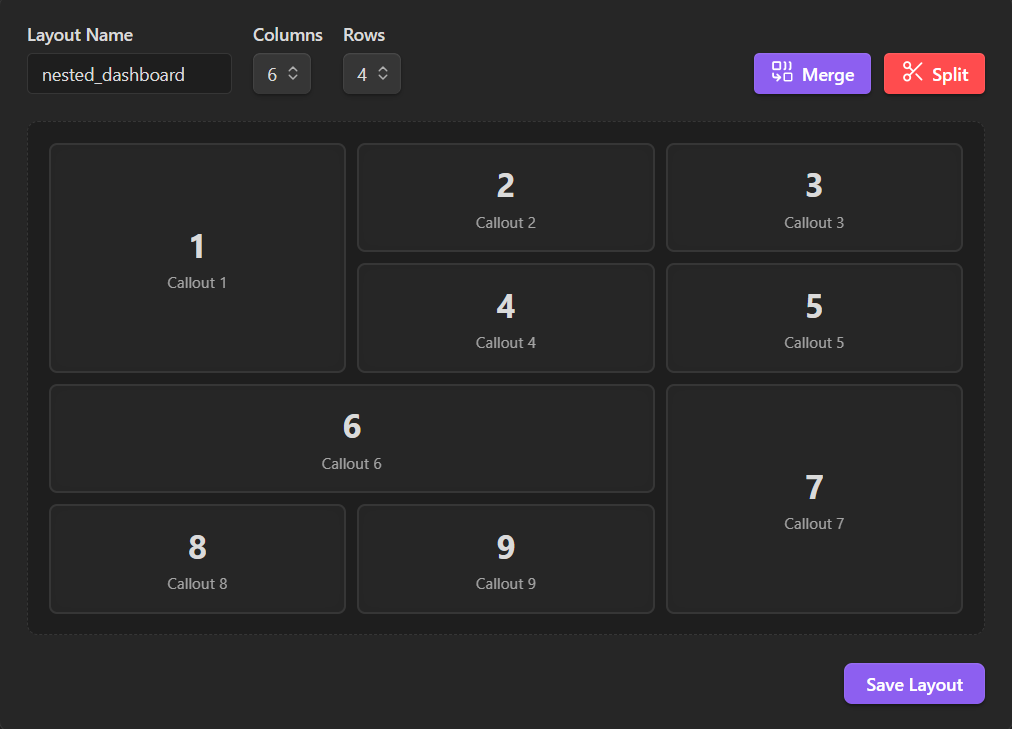 (Go to Settings -> Special Callouts -> Visual Layout Builder to try the drag-and-merge interface)
Once you save your layout with a name (e.g., my_dashboard), simply call it in your markdown. The system automatically places your callouts into the merged areas you designed.
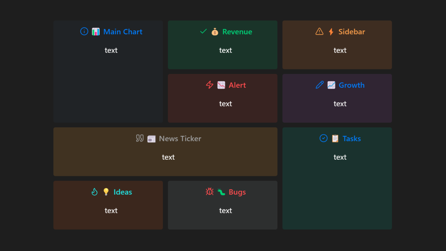
> [!multi-callout] (nested_dashboard)
>
> > [!info] (bg:#2c3e50, text:white, center, compact) 📊 Main Chart
> > text
>
> > [!success] (bg:#27ae60, text:white, center, compact) 💰 Revenue
> > text
>
> > [!warning] (bg:#e67e22, text:white, center, compact) ⚡ Sidebar
> > text
>
> > [!danger] (bg:#c0392b, text:white, center, compact) 📉 Alert
> > text
>
> > [!note] (bg:#8e44ad, text:white, center, compact) 📈 Growth
> > text
>
> > [!quote] (bg:#f39c12, text:white, center, compact) 📰 News Ticker
> > text
>
> > [!todo] (bg:#16a085, text:white, center, compact) 📋 Tasks
> > text
>
> > [!tip] (bg:#d35400, text:white, center, compact) 💡 Ideas
> > text
>
> > [!bug] (bg:#7f8c8d, text:white, center, compact) 🐛 Bugs
> > text
Mixed Grid
Combine columns inside grids!
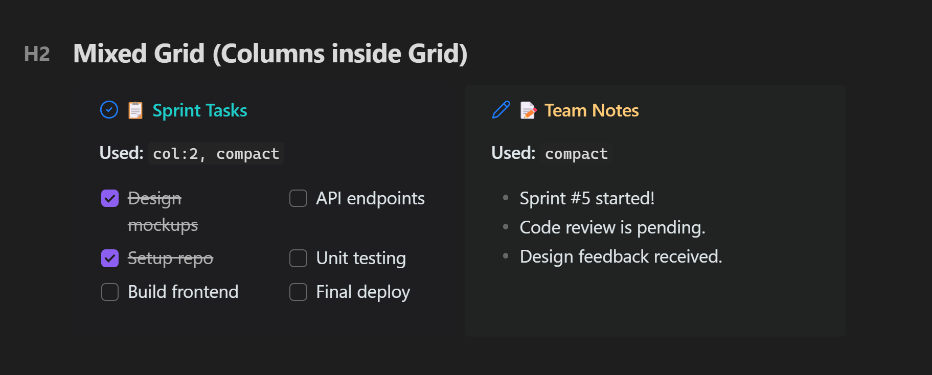
> [!multi-callout]
> > [!todo] (1:2, col:2, bg:#1a1a2e, text:#dfe6e9, title:#00cec9, compact) 📋 Sprint Tasks
> > - [x] Design mockups
> > - [x] Setup repo
> > - [ ] Build frontend
> > - [ ] API endpoints
>
> > [!note] (2:2, bg:#2d3436, text:#dfe6e9, title:#fdcb6e, compact) 📝 Team Notes
> > - Sprint #5 started!
> > - Code review is pending.
The Ultimate Showcase (Full Power)
Combine almost every parameter into a single, highly customized callout.
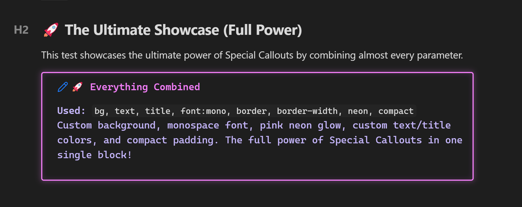
> [!note] (bg:#0f0e17, text:#c4b5fd, title:#e879f9, font:mono, border:#e879f9, border-width:2, neon:#e879f9, compact) 🚀 Everything Combined
> Custom background, monospace font, pink neon glow, custom text/title colors, and compact padding. The full power of Special Callouts in one single block!
Settings Panel
The plugin includes a rich visual settings panel accessible from Settings → Special Callouts.
What you can do:
| Section | Features |
|---|---|
| Quick Actions | "How to Use" modal, "Metadata Reference" modal |
| Custom Callouts | Create, edit, delete custom style presets with live preview |
| Quick Start Presets | Ocean Deep, Neon Glow, Forest, Sunset — one-click templates |
| Random Generator | Generate a unique random style instantly |
| Style Editor | Name, icon picker, 5 color pickers, neon toggle, font dropdown, border controls, layout toggles |
| Import/Export | Share styles as JSON — copy to clipboard or paste to import |
| Standard Callouts | Modify default colors of built-in types (note, info, warning...) |
| Standard Colors | Edit hex values of named colors (red, blue, green...) |
| Custom Colors | Add your own named colors for use in any callout |
Command Palette
Press Ctrl/Cmd + P and search for:
| Command | Description |
|---|---|
Insert Custom Callout | Browse and insert any saved custom style |
Insert "[style-name]" | Directly insert a specific custom style |
Show Metadata Reference | Open the full parameter reference |
Assign hotkeys to your favorites in Settings → Hotkeys → Special Callouts.
Installation
From Community Plugins (Recommended)
- Open Obsidian Settings > Community Plugins
- Turn off Restricted Mode
- Click Browse and search for
Special Callouts - Click Install then Enable
Manual Installation
- Download
main.js,styles.css, andmanifest.jsonfrom the latest release - Create folder:
VaultFolder/.obsidian/plugins/obsidian-special-callouts/ - Copy the downloaded files to the folder
- Enable the plugin in Obsidian settings
Building from Source
git clone https://github.com/ahseyg/obsidian-special-callouts.git
cd obsidian-special-callouts
npm install
npm run build
Copy main.js, styles.css, and manifest.json to your vault's plugin folder.
Contributing
This plugin is open source and we welcome contributions!
- Bug Reports: Open an issue — please include your Obsidian version, the callout markdown, and a screenshot
- Feature Requests: Same link — we'd love to hear your ideas!
- Pull Requests: Fork, branch, code, PR — all contributions are appreciated
Project Structure
├── main.ts              # Plugin entry point
├── src/
│   ├── types.ts         # TypeScript interfaces
│   ├── constants.ts     # Default settings, colors, fonts
│   ├── parser.ts        # Metadata parser
│   ├── processor.ts     # Core callout processor
│   ├── utils.ts         # Utility functions
│   ├── modals/          # UI modals (How To, Metadata, Icon Picker, Suggester)
│   └── settings/        # Settings tab UI
├── styles.css           # Core CSS styles
├── manifest.json        # Plugin manifest
└── esbuild.config.mjs   # Build configuration
License
MIT — See LICENSE for details.
Developed by ahseyg
For plugin developers
Search results and similarity scores are powered by semantic analysis of your plugin's README. If your plugin isn't appearing for searches you'd expect, try updating your README to clearly describe your plugin's purpose, features, and use cases.