Collapsing Group Table
approvedby Gilbert Hyatt
A Bases table view whose groups collapse like a tree, with nested groups, inline editing, and tag/link autocomplete. - This plugin has not been manually reviewed by Obsidian staff.
parent:
- "[[dev]]"
Collapsing Group Table
Bases Table & Card views that support collapsable grouping.
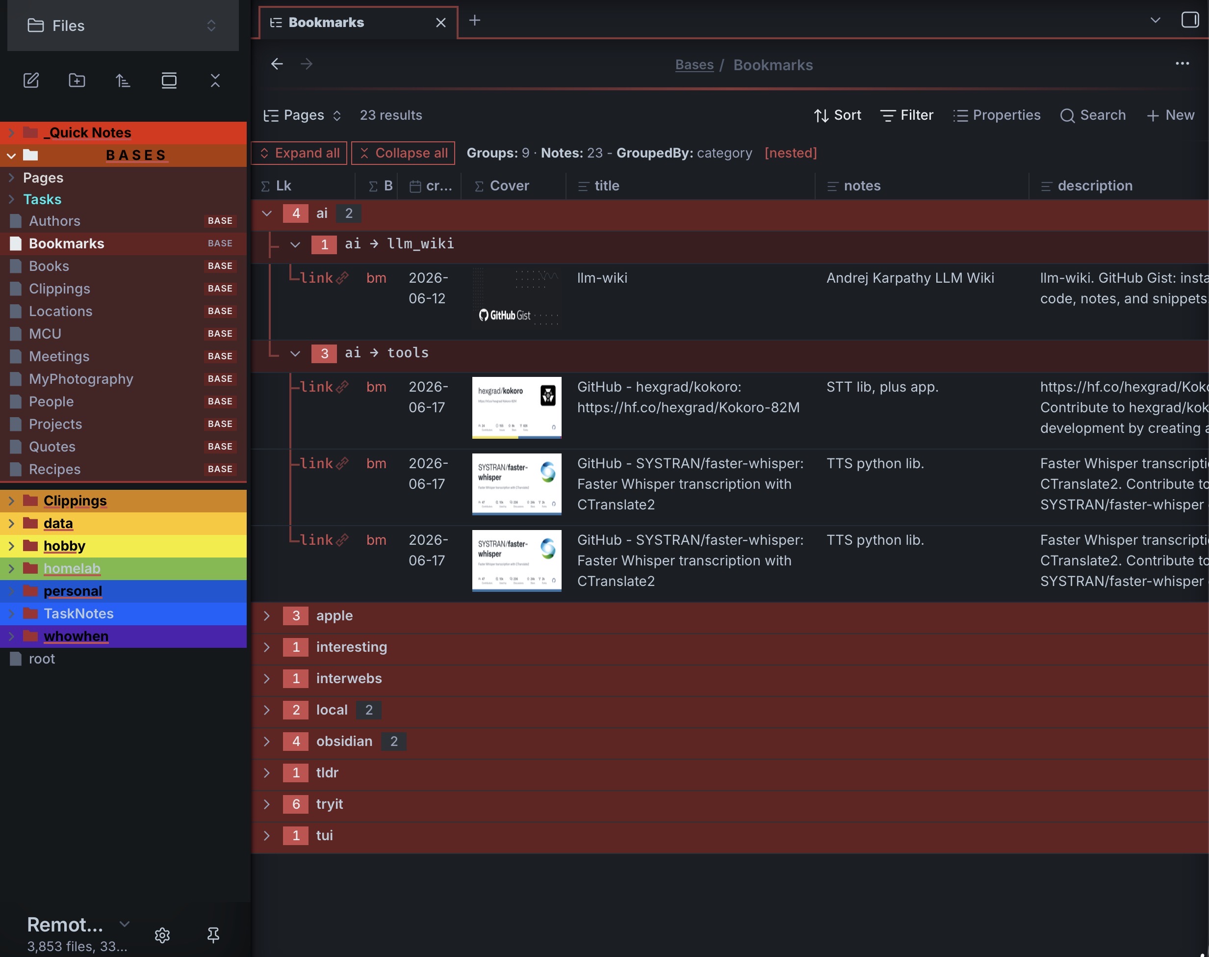
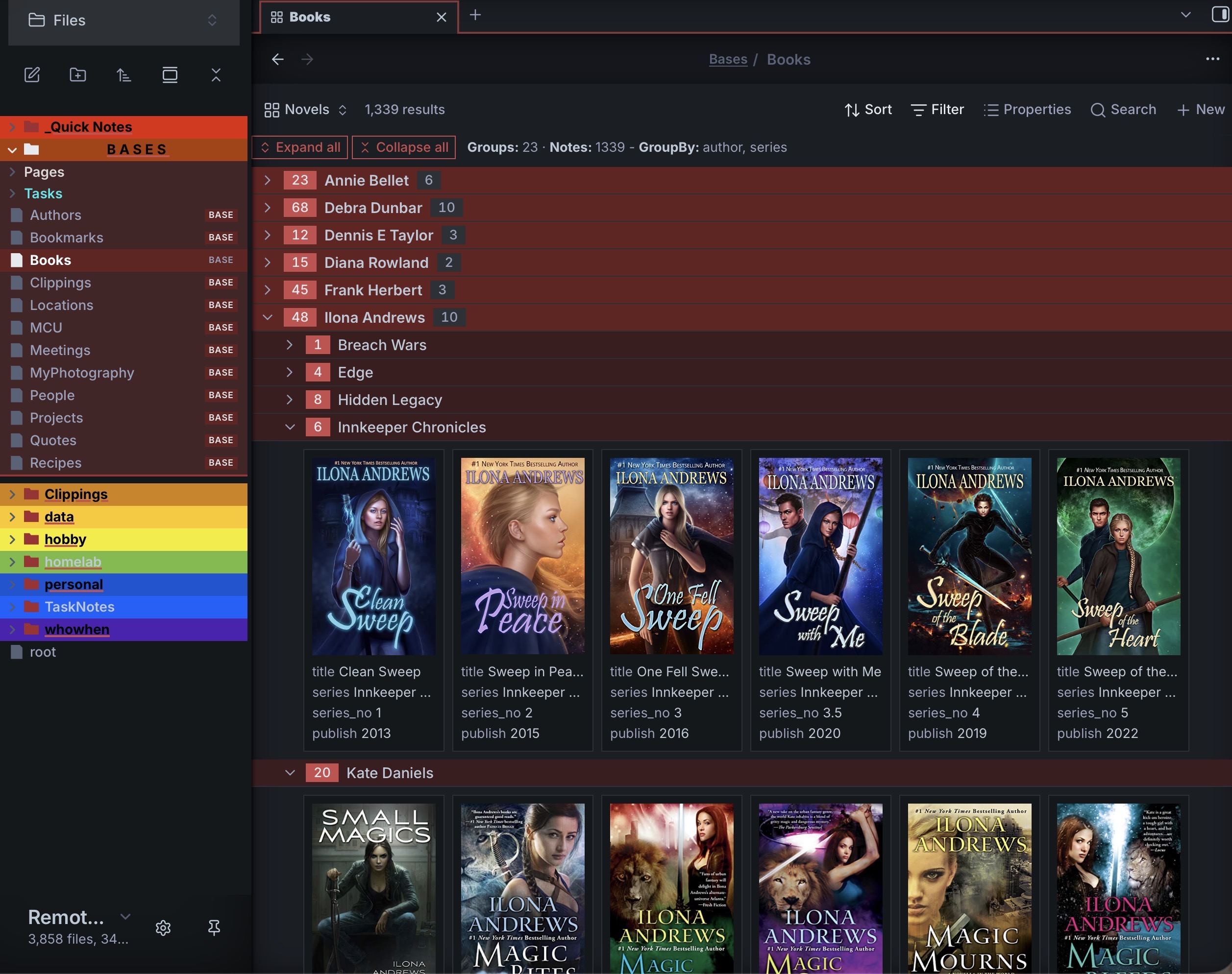
Two Bases Table and Card view for Obsidian that turns grouped results into a collapsible tree — fold and unfold groups like branches, optional support for nested hierarchical groups from a single /-delimited property, and edit your notes inline.
It adds new Bases and Card types that can be use in places of the Obsidian Bases Table and Card views with one that supports collapsable row groups based off GroupBy column set in the Bases configuration, or additional columns set in Bases config dialog. NEW: Card view now support property badges. You can now, for example, mark books as “read”, “owned”, or “loaned-out”. By setting a badge property and it having a non-false value.
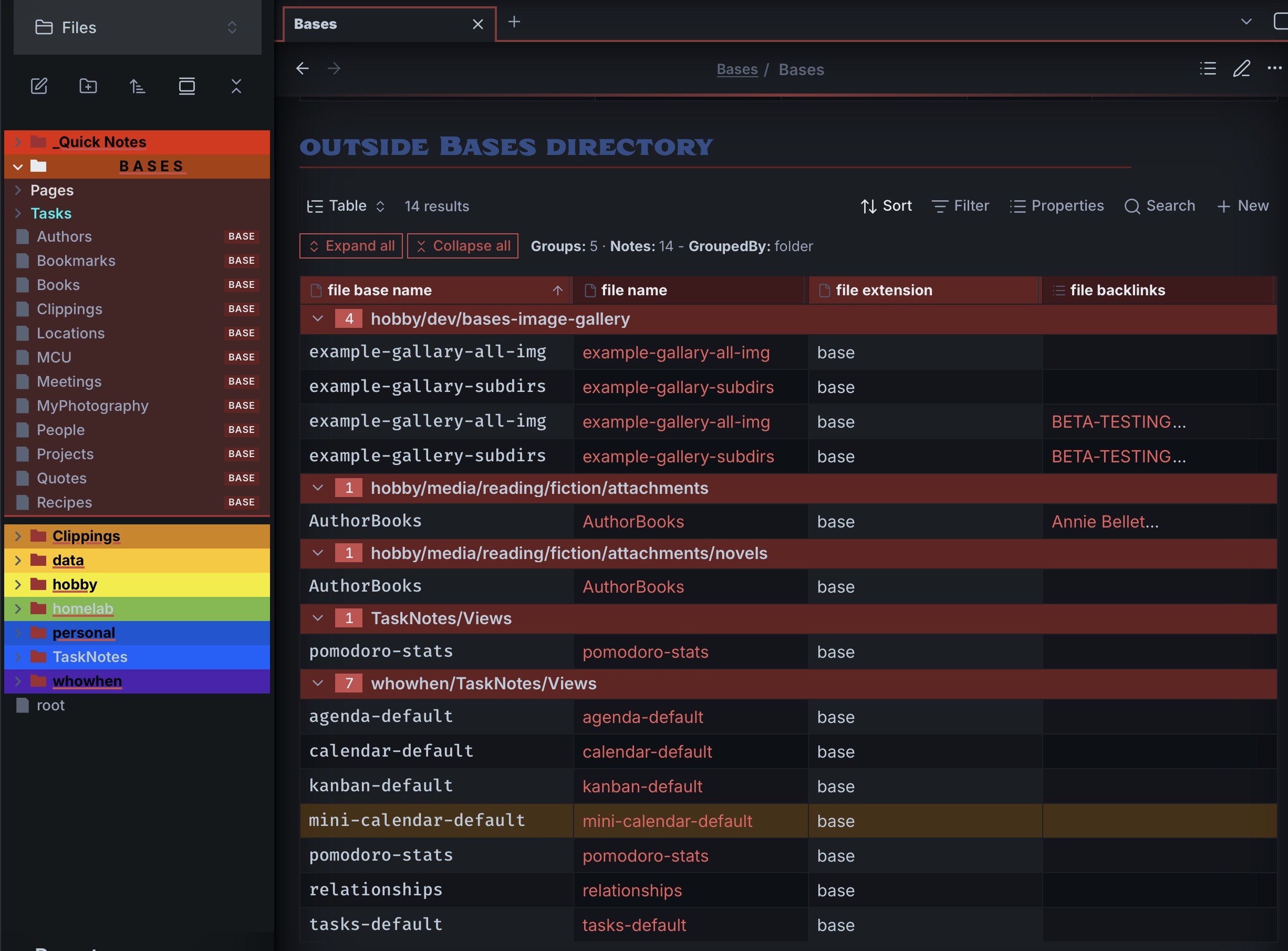
They also supports optional nested categories, for example: ”research/medical” or multiple columns and a number of new useful behaviors (example: accordion) . It tries to be a drop-in replacement for both the Obsidian Bases Table and Card views… tries to be (since Obsidian did not provide an extendible BaseTable object, several things had to be code from scratch, so somethings may vary). If you turn on nested groupBy keys, then it support up to multiple levels of nesting (example “art/painting/water_color” )
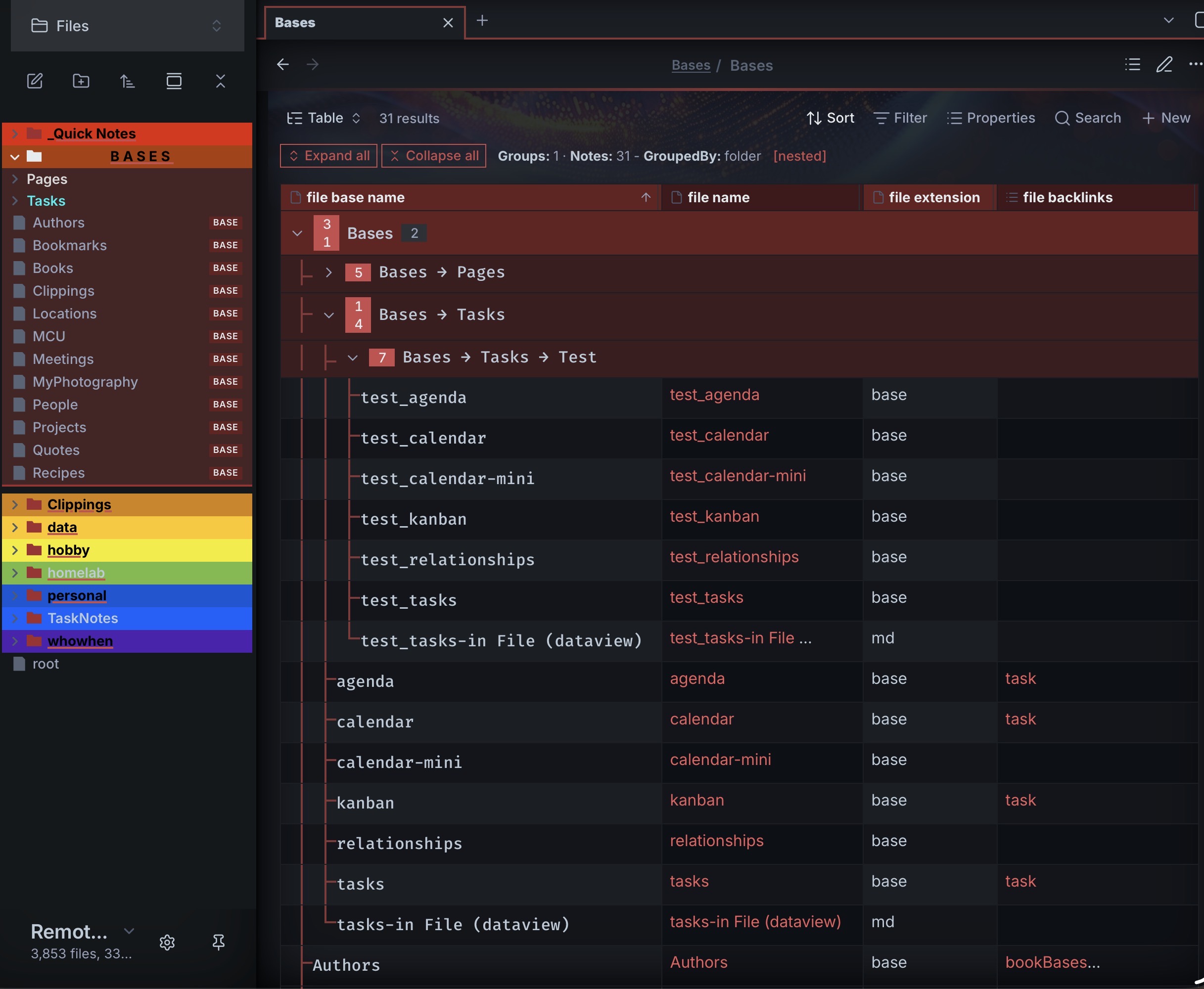
- MOC example above.
Requirements
- Obsidian
(ver >= 1.10.2)— the Bases core plugin must be available.
Installation
Community plugin
Search for Collapsing Group Table in Settings → Community plugins → Browse.
BRAT (beta)
- In Obsidian, install and enable BRAT (Settings → Community plugins → Browse).
- Settings → BRAT → Add beta plugin.
- Enter the repository
ghyatt/bases-collapsing-group-tableand click Add Plugin. - Enable Collapsing Group Table under Settings → Community plugins.
Usage
- Create or open a Base.
- Add a view and choose Collapsing group table or Collapsing group cards.
- Set a Group by property in the Base's view options — this becomes the foldable branch.
- Click a group header (or its chevron) to fold/unfold it.
If no Group by is set, the view renders as a plain table / card grid. Which rows appear, the column order, and the sort all come from the Base's own settings.
Collapsing & groups
- Click a group header — collapse or expand that group; closing a group also closes its sub-groups.
- Expand all / Collapse all — buttons in the control bar (which also shows Groups, Notes, the GroupBy columns, and a
[nested]tag). - Accordion mode — expanding one top group collapses the others (only one open at a time).
- Start with groups collapsed — open with everything folded.
- Group headers show an entry-count badge, and a sub-group count badge when a group has more than one sub-group.
Nested groups
There are two ways to nest, and they're mutually exclusive.
Split groupBy value on "/" to nest — turn on the toggle and any group value containing / is split into a nested tree, to arbitrary depth. For example, grouping by a category whose values are ai/llm_wiki, ai/tools, obsidian/plugin produces:
▾ ai
   ▾ ai → llm_wiki
   ▾ ai → tools
▾ obsidian
   ▾ obsidian → plugin
Sub-group by columns — instead of the / split, pick Sub-group by (2nd level) / (3rd level) properties to nest by those columns (values used whole, never split).
When opening a group controls what the sub-groups do on open (and on initial load): open the first sub-group, all of them, or none.
Situational options — strip a prefix (folder MOCs)
When nesting is on, Strip prefix from values removes a leading prefix from each group value before the / split, so a folder-based Map of Content shows clean relative paths. Enter either a literal path (e.g. hobby/media), or the formula this.file.folder, which resolves to the base's own containing folder — so an embedded base strips its own folder with no path to type, and keeps working if you move it. Files that sit directly in the stripped folder render at the top, ungrouped; sub-folders become the top-level groups.
Inline editing (table view)
In the table view, click a cell backed by a note property to edit it; changes are written to the note's frontmatter.
- Checkbox — boolean properties render an editable checkbox.
- Text — opens a multi-line editor sized to the row height.
- Number / Date — single-line editors (date uses a date picker).
- Tags / link lists — items render as native tag pills / clickable links, each with a × to remove; click the cell to add more, with autocomplete of existing vault tags or pages.
- File name renders as a clickable link to the note.
Layout
- Row height — Short / Medium / Tall / Extra tall (1 / 3 / 6 / 12 lines) or Dynamic; image cells scale to match.
- Resizable columns — drag a column header's right edge; double-click it to auto-fit. Widths are shared with the built-in Table view (
columnSize). - Headers show a type icon, the column name, and the current sort direction arrow.
- Date format — optionally format date cells with moment tokens (e.g.
YYYY-MM-DD).
Your fold state and column widths are saved into the .base file, so they survive reloads.
Cards view
The Collapsing group cards view renders entries as cards (cover image + title + fields) with the same collapsible grouping, nesting, accordion, and strip-prefix behaviour. It reads the built-in Cards view's settings (image, cardSize, imageAspectRatio, imageFit), so an existing type: cards view can be switched over — or set them via the view options:
- Card image property — the property used as the cover.
- Card width — card size in px.
- Image fit —
cover(crop to fill) orcontain(whole image), paired with Image aspect ratio (height ÷ width; 0 = natural) for uniform covers. - Filename — show below the cover, hide, or overlay on the cover (revealed on hover).
The cover and filename are clickable to open the note.
Image viewer
Cards whose file is an image (png, jpg, jpeg, gif, webp, svg, …) open a full-screen viewer when clicked; note cards open the note as usual. In the viewer:
- Prev / next — the ← / → buttons, arrow keys, or a horizontal swipe; it wraps through every image card in the view.
- Close — double-click, Esc, swipe down, click outside the image, or the ✕ button.
- Info box (top-right, fades in on hover) — filename, a position counter, the pixel dimensions, and the file size.
Card badges
Flag up to 4 columns as badges. When a card's value for that column is truthy (checked box, non-empty text, non-zero number, non-empty list), a coloured pill appears at the card's top-right showing a slot symbol and the column name — e.g. a read checkbox shows ★ read. Each of the four slots has a fixed position, symbol, and colour (① ★ ② ✓ ③ ◆ ④ ●), so a column always sits in the same spot across every card; a slot with no value leaves its place blank rather than shifting the others.
Configuration
Options are set from the Base view configuration menu, grouped into sections. A vault-wide default lives in the plugin's settings tab.
Grouping & nesting (both views)
| Option | Default | Description |
|---|---|---|
| Accordion mode | off | Expanding a top group collapses the others. |
| Start with groups collapsed | off | Open with all groups folded. |
| Show entry count on group headers | on | Show the entry-count badge. |
| Split groupBy value on "/" to nest | off | Split /-delimited group values into a nested tree. |
| Sub-group by (2nd / 3rd level) | — | Nest by additional columns (mutually exclusive with the "/" split). |
| When opening a group | First sub-group | On open, expand the first / all / no sub-groups. |
Situational options (both views; shown only when nesting is on)
| Option | Default | Description |
|---|---|---|
| Strip prefix from values | — | Remove a leading prefix before the "/" split. A literal path, or a formula like this.file.folder to strip the base's own folder. |
Table
| Option | Default | Description |
|---|---|---|
| Row height | Short | Short / Medium / Tall / Extra tall / Dynamic. |
| Date format | (plugin default) | moment.js tokens applied to date cells; blank inherits the plugin setting. |
Cards
| Option | Default | Description |
|---|---|---|
| Card image property | — | Property used as the cover. |
| Card width | 240 px | Card width. |
| Filename | Show | Show below image / Hide / Overlay on hover. |
| Image fit | Cover | Cover (crop to fill) or Contain (whole image). |
| Image aspect ratio | 0 (natural) | Height ÷ width for uniform covers. |
| Badge 1–4 | — | Columns shown as coloured top-right badges when truthy (fixed slot, symbol, colour). |
| Date format | (plugin default) | moment.js tokens applied to date fields; blank inherits the plugin setting. |
Plugin settings (Settings → Community plugins → Collapsing Group Table)
| Setting | Default | Description |
|---|---|---|
| Default date format | — | Vault-wide moment.js date format; a per-view Date format overrides it. |
| Show what's new on update | on | Open the changelog popup after an update. |
License
MIT — provided as is. File bugs or feature requests on GitHub.
Bugs
- Please reports any issues at the GitHub issues for Obsidian Collapsable Table Base
For plugin developers
Search results and similarity scores are powered by semantic analysis of your plugin's README. If your plugin isn't appearing for searches you'd expect, try updating your README to clearly describe your plugin's purpose, features, and use cases.