Homepage Blocks
pendingby Alfio Caprino
A composable, drag-and-drop homepage with 15 native block types — no Dataview required.
Homepage Blocks
A composable, drag-and-drop homepage for Obsidian.
Features
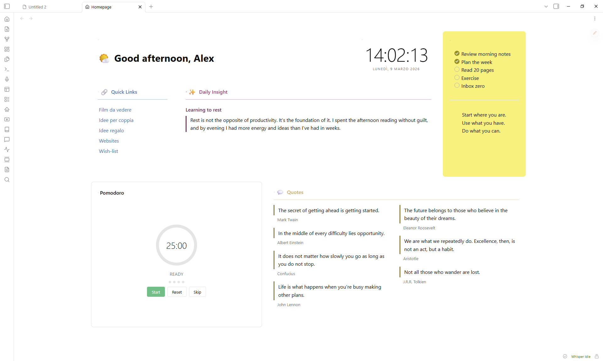
- 15 block types — greeting, clock, quotes, quick links, button grid, image gallery, video embed, embedded note, static text, HTML, bookmarks, recent files, pomodoro timer, spacer, random note
- Drag & drop layout with 2D resize (column span + row height)
- Accent colors with adjustable intensity (5–100%) — tints the entire card including interactive controls
- Per-block styling — title, emoji, divider, padding, elevation, border, opacity, backdrop blur, gradients
- Responsive — blocks adapt to narrow panes via CSS container queries
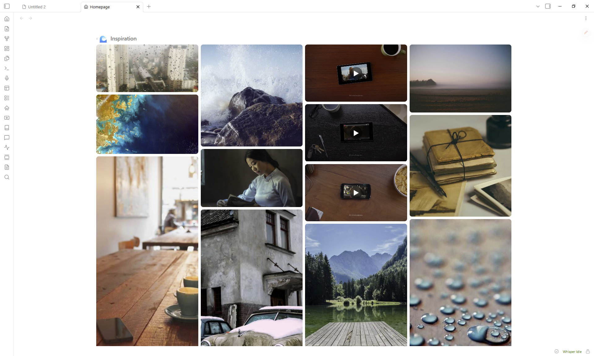
- Full-screen lightbox for gallery images with keyboard and swipe navigation
- Collapsible blocks — click any header to collapse/expand
- 50 language presets for greeting salutations
- Zero runtime dependencies beyond GridStack
Installation
From Community Plugins
- Open Settings > Community plugins > Browse
- Search for Homepage Blocks
- Click Install, then Enable
Manual
- Download
main.js,manifest.json, andstyles.cssfrom the latest release - Create
<vault>/.obsidian/plugins/homepage-blocks/ - Copy the three files into that folder
- Enable the plugin in Settings > Community plugins
How to use
- Click the house icon in the ribbon (or run
Open Homepagefrom the command palette) - Click the pencil FAB to enter edit mode
- Use Add Block to insert blocks, gear icon to configure, grip handle to reorder, corner grip to resize
- Click Done to exit edit mode
Block types
| Block | Description |
|---|---|
| Greeting | Time-aware salutation with 50 language presets, custom emoji per time slot or random pool |
| Clock | Live clock with optional seconds and date |
| Quotes | Multi-column quotes from tagged notes or manual text |
| Quick Links | Auto-list from a folder + manual links |
| Button Grid | Emoji-labeled buttons linking to notes |
| Image Gallery | Grid or masonry layout from a vault folder with lightbox |
| Video Embed | YouTube, Vimeo, Dailymotion (supports playlists with shuffle) |
| Embedded Note | Inline-rendered vault note |
| Static Text | Freeform markdown with quick-edit button |
| HTML | Custom HTML (sanitized) |
| Bookmarks | Web links and vault bookmarks grid |
| Recent Files | Most recently modified notes |
| Pomodoro | Configurable work/break timer |
| Spacer | Empty space for layout gaps |
| Random Note | Surface a random note from a tag filter with excerpt preview |
Card styling
Every block supports these shared settings (gear icon):
- Title — custom label, emoji (picker), size (h1–h6), show/hide, divider
- Accent color — preset swatches or custom picker, intensity slider (5–100%)
- Card — hide border, hide background, padding, elevation (shadow), border radius/width/style
- Advanced — background opacity, backdrop blur, two-color gradient with angle
Accent colors automatically tint the header, background, border, divider, and all interactive controls (checkboxes, toggles, radio buttons).
Settings
Open Settings > Homepage Blocks:
| Setting | Description |
|---|---|
| Open on startup | Automatically open the homepage when Obsidian launches |
| Startup open mode | How the homepage opens on startup (replace active tab, new tab, or sidebar) |
| Open when empty | Open the homepage when no other tabs are open |
| Manual open mode | How the homepage opens from ribbon/command (replace, new tab, or sidebar) |
| Pin homepage tab | Prevent the homepage tab from being closed |
| Default columns | Grid column count (2, 3, 4, or 5) |
| Hide scrollbar | Hide the homepage scroll bar |
| Reset to default layout | Restores demo blocks (cannot be undone) |
| Export layout | Export layout as JSON |
| Import layout | Import layout from JSON |
| Layout presets | Apply a preset layout (Minimal, Dashboard, Focus) |
Commands
| Command | Action |
|---|---|
Open Homepage | Open or focus the homepage tab |
Toggle edit mode | Switch between edit and view mode |
Add block | Open the add-block modal |
CSS customization
Override layout variables in a CSS snippet:
:root {
  --hp-gap: 16px;
  --hp-padding: 24px;
  --hp-card-padding: 16px;
  --hp-content-max-width: 1400px;
  --hp-row-unit: 200px;
}
Support
Bug reports and feature requests: GitHub Issues
License
For plugin developers
Search results and similarity scores are powered by semantic analysis of your plugin's README. If your plugin isn't appearing for searches you'd expect, try updating your README to clearly describe your plugin's purpose, features, and use cases.