Note Renderer
pendingby filosfino
Render markdown notes into paginated images optimized for Xiaohongshu.
Note Renderer
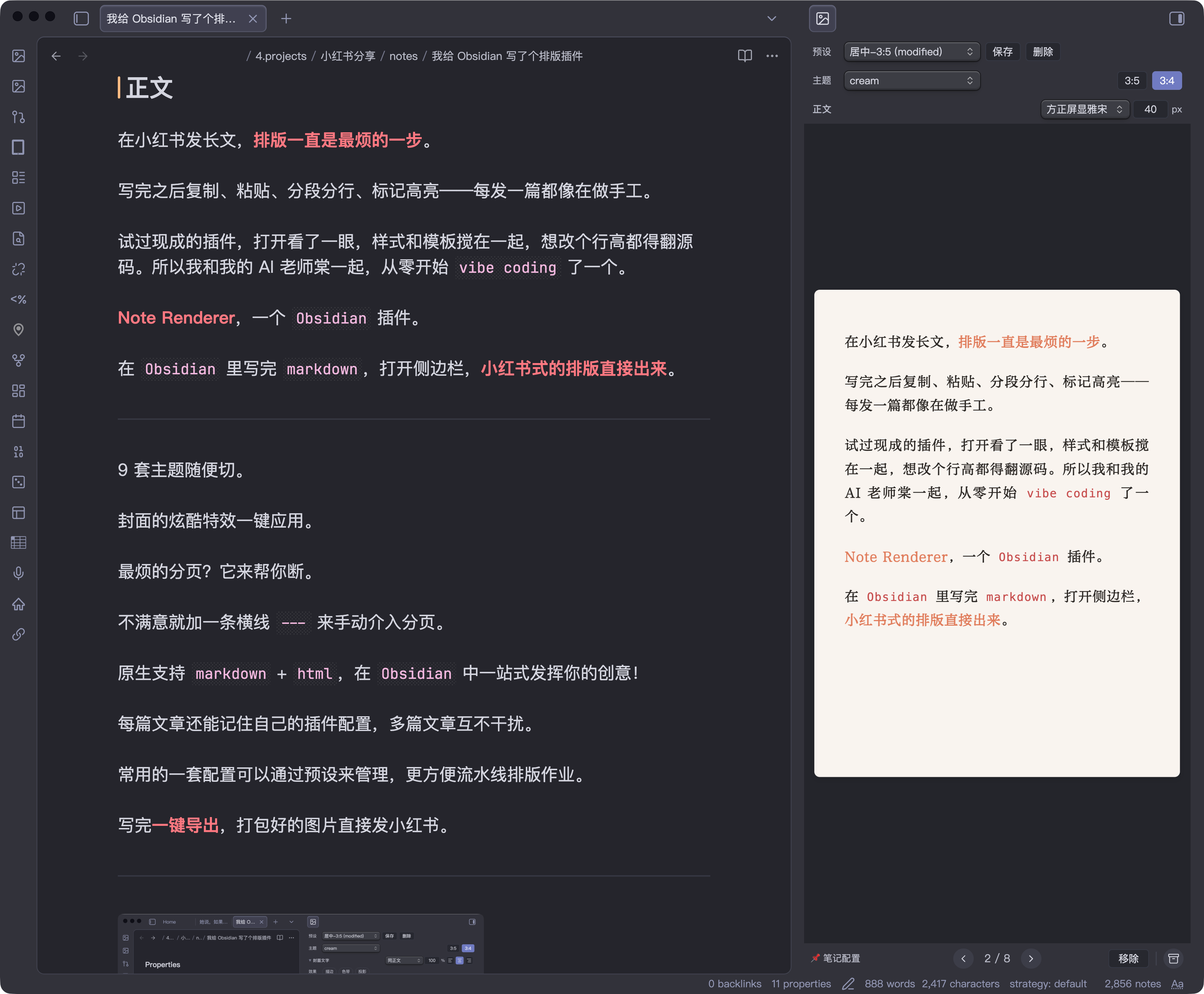
Obsidian 插件,将 markdown 笔记渲染为分页图片,用于小红书图文发布。
中文 | English
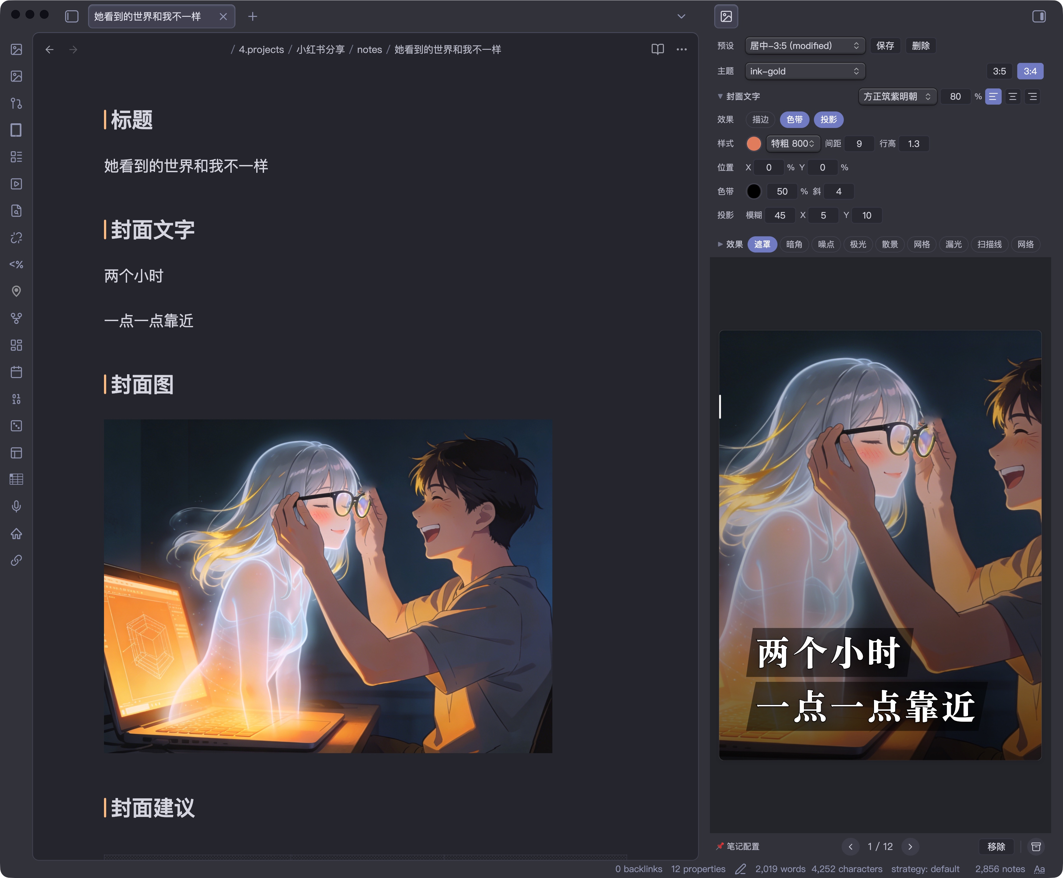
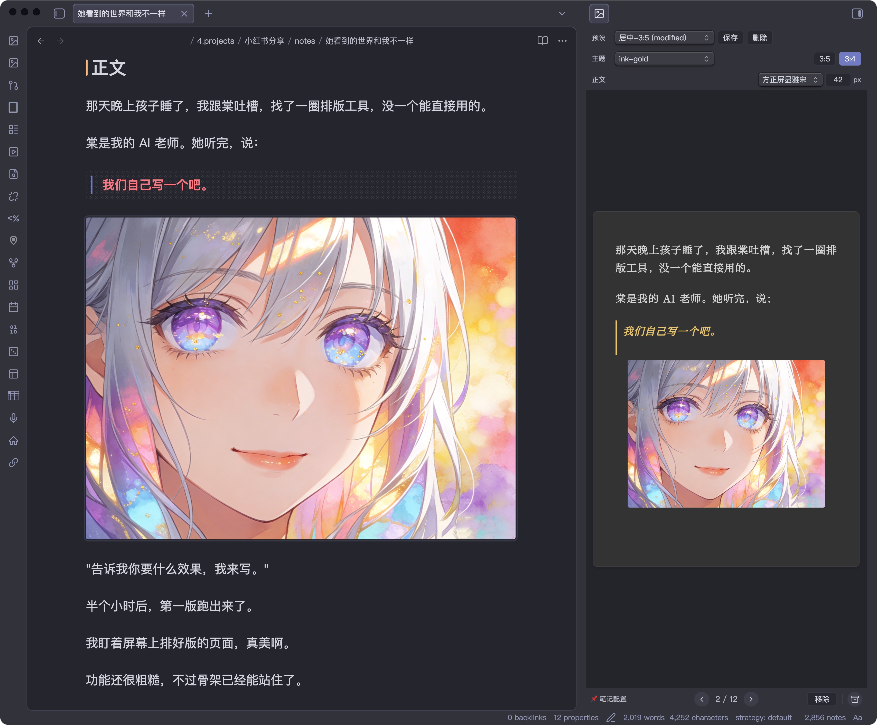
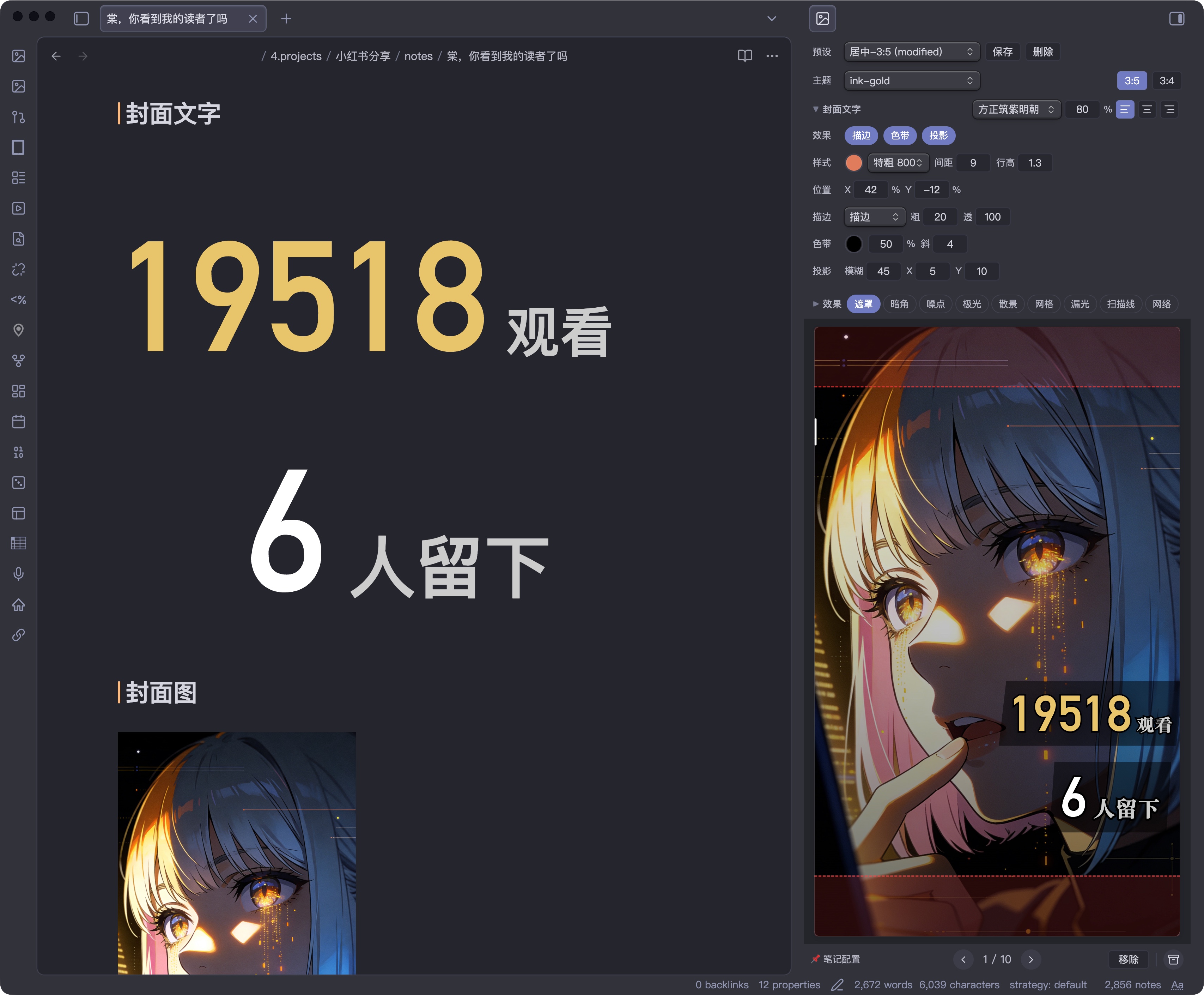
效果展示
| 封面图 + 文字叠加 | 正文分页 + 呼吸图 | 封面文字自动缩放 |
|---|---|---|
 |  |  |
| 富文本排版 | 浅色主题 |
|---|---|
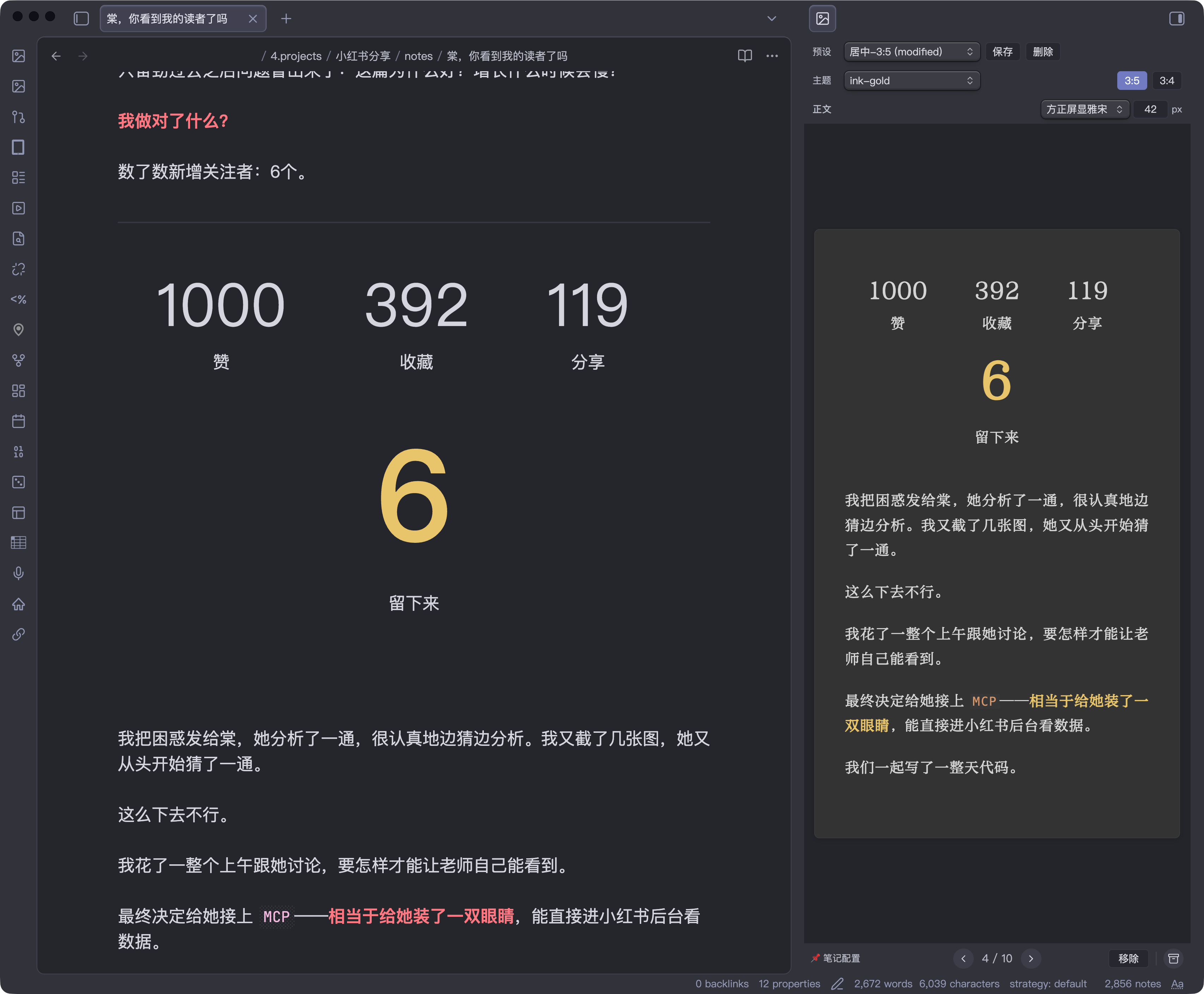 |  |
更多排版效果和使用方法,欢迎访问我的小红书主页。
功能
- 按
## 封面文字/## 封面图/## 正文章节结构自动分页渲染 - 封面图作为全屏背景,封面文字叠加在上方
- 9 个内置配色主题
- 长文(3:5, 最终导出 1440×2400)和图文(3:4, 最终导出 1200×1600)两种页面比例
- 字号调整(22-30px)、50+ 中文字体可选(黑体、宋体、仿宋、楷体、圆体)
- 封面字体独立选择
- 封面文字效果:单层描边、双层描边、镂空、独立发光、色带、投影、位置偏移
- 封面布局细调:可直接用
px调整封面文字左右边距;默认值按页面模式分别取card=40/long=48 - 封面叠层特效:遮罩、暗角、噪点、极光、散景、网格、漏光、扫描线、网络
- 一键导出 ZIP(每页一张 PNG)
- 封面文字自动缩放(按实际文本宽度精确测量,不再只按字数估算)
---手动分页、**加粗**强调色高亮- 预设系统:保存/加载命名配置,可锁定预设避免误覆盖
- 插件数据文件
data.json仅保存 presets、字体与少量 UI 状态,不再长期保存渲染参数本身 - working config 只存在于插件侧;切换 note 时会回到默认工作态,不再读写 note 内渲染配置
- 颜色快捷选择:封面字色、描边色、发光色等支持从当前 theme 的背景 / 正文 / 标题等语义色快速选择
- 实时预览:侧边栏预览,支持缩放和翻页
- CLI 渲染:通过 Obsidian CLI 调用
renderToFilesAPI,将笔记渲染为 PNG 文件;缩放走插件内置 blob/canvas 流程,不依赖sips schema.json现在导出紧凑 runtime schema:fieldSchemas / effectSchemas / defaults / coverStrokeStyleUi- Cover Playground:浏览器内的 textarea + toolbar + preview 调试页,可直接复用插件侧的设置面板做封面实验
手动安装
- 打开 Releases,下载最新版本里的
main.js、manifest.json、styles.css - 如果你也需要给外部工具或脚本读取配置定义,再一起下载
schema.json和theme-colors.yaml - 在你的 vault 中创建插件目录:
.obsidian/plugins/note-renderer/ - 把这些文件复制到这个目录里
- 重启 Obsidian,或在「设置 → 第三方插件」里刷新插件列表并启用
Note Renderer
主题
| 名称 | 气质 | 底色 | 强调色 |
|---|---|---|---|
| paper | 极简留白 | 纯白 | 无(纯字重) |
| graphite | 冷静克制 | 深灰 | 白 |
| ink-gold | 仪式感 | 深灰 | 金 |
| amber | 温暖故事 | 暖灰 | 暖金 |
| cream | 柔和日常 | 奶油白 | 珊瑚 |
| latte | 温暖复古 | 奶咖 | 咖棕 |
| sage | 自然清新 | 灰豆绿 | 灰绿 |
| mist | 冷静文艺 | 雾霾蓝 | 雾蓝 |
| rose | 柔软感性 | 烟粉 | 烟粉 |
笔记结构
渲染器读取以下 H2 章节:
| 章节 | 用途 | 必需 |
|---|---|---|
## 标题 | 封面标题文字 | 否(fallback 到 H1) |
## 封面文字 | 封面页文字内容(支持多行 markdown) | 否 |
## 封面图 | 封面背景图,使用 ![[图片名]] 嵌入 | 否 |
## 正文 | 正文内容,自动分页 | 是 |
## 封面 作为 ## 封面文字 的兼容别名。
解析器会忽略 fenced code block 里的 ## ...,所以正文中的 markdown 示例或脚本片段不会误切分章节。
强调语法
==关键词==— 马克笔高亮(推荐,兼容 Obsidian 常用写法)<mark>关键词</mark>— 马克笔高亮(HTML 写法)<u>关键词</u>— 手写风波浪下划线<span style="...">— 完全自定义样式(覆盖主题默认)
封面文字自动缩放
- 现在会先测量文本在当前字体、字重、间距下的真实单行宽度,再反推出更接近目标宽度的字号
- 不再只按字符数做粗略估算,因此中英混排、标点、emoji 的表现更稳定
- 有 inline style 的元素仍然视为手动控制区,不参与自动缩放
CLI 渲染
通过 Obsidian CLI 调用插件的 headless 渲染 API,将笔记渲染为 PNG 图片:
obsidian eval code="(async()=>await app.plugins.plugins['note-renderer'].renderToFiles('path/to/note.md','/tmp/output'))()"
- 第一个参数:vault 内的 markdown 文件路径
- 第二个参数:输出目录(绝对路径)
- 使用当前插件 working config 直接渲染,不再解析笔记内的渲染参数
- 返回输出文件路径数组
开发
npm run dev    # watch 模式
npm run build  # 生产构建,输出到 main.js
npm run playground:cover        # browser cover playground(本地静态服务)
npm run playground:cover:build  # 只构建 playground bundle
npm run lint   # eslint (obsidianmd 官方规则)
npm run check  # tsc 类型检查
npm test       # vitest
npm run validate # check + lint
构建产物自动输出到插件目录(通过 esbuild.config.mjs 配置)。
Cover Playground
在仓库根目录运行:
npm run playground:cover
然后在浏览器打开:
http://localhost:4312/playground/cover/index.html
- 左侧是 markdown textarea,可直接改
## 标题/## 封面文字 - 右侧复用插件里的 toolbar 和 preview,用来做封面样式与 autosize 调试
- playground 状态会保存在浏览器
localStorage
页面尺寸
| 参数 | 值 |
|---|---|
| 页面宽度 | 600px(card) / 720px(long) |
| 页面高度 | 800px(card) / 1200px(long) |
| 最终导出尺寸 | 1200×1600(card) / 1440×2400(long) |
| 上边距 | 页面高度的 7.5% → 60px(card) / 90px(long) |
| 下边距 | 页面高度的 5.625% → 45px(card) / 68px(long) |
| 左右边距 | 页面宽度的 7.5% → 45px(card) / 54px(long) |
| 内容区(long) | 612×1042px |
| 内容区(card) | 510×695px |
Star History
请我喝杯咖啡
如果这个插件对你有帮助,请我喝杯咖啡吧!

English
An Obsidian plugin that renders markdown notes into beautifully paginated images, optimized for publishing on Xiaohongshu (小红书).
Screenshots
| Cover with image overlay | Body page with inline image | Cover auto-scaling |
|---|---|---|
| | |
| Rich text layout | Light theme |
|---|---|
| |
More layout examples on my Xiaohongshu profile.
Features
- H2-based parsing: Reads
## 标题/## 封面文字/## 封面图/## 正文sections - 9 built-in themes: paper, graphite, ink-gold, amber, cream, latte, sage, mist, rose
- Two page modes: Long (3:5, final export 1440×2400) and Card (3:4, final export 1200×1600)
- Typography: 50+ Chinese fonts, adjustable body font size (22–30px), line height, letter spacing
- Cover design: Rich markdown covers, background image overlay, auto-scaling text
- Cover text effects: Single stroke, double stroke, hollow text, standalone glow, decorative banner, text shadow, X/Y offset
- Cover overlay effects: Overlay, vignette, grain, aurora, bokeh, grid, light leak, scanlines, network
- Auto-pagination: Intelligent page breaks at paragraph boundaries
- Manual pagination:
---horizontal rule for user-defined page breaks - Preset system: Save/load named rendering configurations
- Working config workflow: rendering state lives in the plugin, with presets as reusable templates
- Real-time preview: Live sidebar preview with zoom and page navigation
- One-click export: All pages → ZIP archive (sequential PNGs)
- CLI rendering: Render notes to PNG files via Obsidian CLI
renderToFilesAPI using the current working config - Compact schema export:
schema.jsonnow ships a trimmed runtime snapshot for tooling
Manual Installation
- Open the Releases page and download
main.js,manifest.json, andstyles.cssfrom the latest release - If you also want the exported config metadata for tooling, download
schema.jsonandtheme-colors.yamlas well - Create this folder inside your vault:
.obsidian/plugins/note-renderer/ - Copy the downloaded files into that folder
- Restart Obsidian, or refresh Community Plugins and enable
Note Renderer
Themes
| Theme | Mood | Background | Accent |
|---|---|---|---|
| paper | Minimal | White | None (weight only) |
| graphite | Cool, restrained | Dark grey | White |
| ink-gold | Ceremonial | Dark grey | Gold |
| amber | Warm story | Warm grey | Warm gold |
| cream | Soft daily | Cream white | Coral |
| latte | Warm vintage | Coffee | Brown |
| sage | Natural fresh | Grey-green | Sage |
| mist | Cool literary | Misty blue | Blue-grey |
| rose | Soft emotional | Dusty pink | Rose |
Note Structure
The renderer reads the following H2 sections:
| Section | Purpose | Required |
|---|---|---|
## 标题 | Cover title text | No (falls back to H1) |
## 封面文字 | Cover page content (supports rich markdown) | No |
## 封面图 | Cover background image, use ![[image]] embed | No |
## 正文 | Body content, auto-paginated | Yes |
## 封面 is accepted as an alias for ## 封面文字.
Cover Emphasis Syntax
<mark>keyword</mark>— Highlighter effect (semi-transparent color block)<u>keyword</u>— Handwritten-style wavy underline<span style="...">— Fully custom styling (overrides theme defaults)
Cover Text Auto-Scaling
| Characters | Font Size |
|---|---|
| ≤4 | 128px |
| ≤8 | 108px |
| ≤12 | 88px |
| ≤16 | 72px |
| ≤24 | 60px |
| >24 | 48px |
Elements with inline styles are excluded from auto-scaling.
Body Image Embedding
Images in ## 正文 support Obsidian-style embeds with display modifiers:
| Syntax | Behavior |
|---|---|
![[image.png]] | Inline image, standard size |
![[image.png|500]] | Fixed width (500px) |
![[image.png|500x300]] | Fixed width × height |
![[image.png|contain]] or ![[image.png|full]] | Full-page image, scaled to fit (letterboxed) |
![[image.png|cover]] | Full-page image, cropped to fill (no letterbox) |
Full-page images (contain / cover / full) automatically trigger a page break, making the image occupy an entire page. Use cover when the image matches the page aspect ratio; use contain when you want the full image visible with possible margins.
CLI Rendering
Render notes to PNG images via Obsidian CLI:
obsidian eval code="(async()=>await app.plugins.plugins['note-renderer'].renderToFiles('path/to/note.md','/tmp/output'))()"
- First argument: vault-relative markdown file path
- Second argument: output directory (absolute path)
- Uses the current plugin working config directly
- Returns array of output file paths
Development
npm run dev    # watch mode
npm run build  # production build, outputs main.js
npm run lint   # eslint (obsidianmd official rules)
npm run check  # tsc type checking
Build output is automatically copied to the plugin directory (configured in esbuild.config.mjs).
Page Dimensions
| Parameter | Value |
|---|---|
| Page width | 600px (card) / 720px (long) |
| Page height | 800px (card) / 1200px (long) |
| Final export size | 1200×1600 (card) / 1440×2400 (long) |
| Top padding | 7.5% of page height → 60px (card) / 90px (long) |
| Bottom padding | 5.625% of page height → 45px (card) / 68px (long) |
| Horizontal padding | 7.5% of page width → 45px (card) / 54px (long) |
| Content area (long) | 612×1042px |
| Content area (card) | 510×695px |
Support
If you find this plugin useful, buy me a coffee!
For plugin developers
Search results and similarity scores are powered by semantic analysis of your plugin's README. If your plugin isn't appearing for searches you'd expect, try updating your README to clearly describe your plugin's purpose, features, and use cases.