Theme Engine
pendingby Yazan Ammar
Take full control of your workspace with dynamic theme profiles, live overrides, and a powerful customization engine built for complete visual freedom.
Obsidian Theme Engine


A full theme-engine for Obsidian. Colors, backgrounds, snippets, profiles — all in one place.
Theme Engine exposes a broad set of core Obsidian CSS color variables (plus your own custom ones) through a polished UI. Manage profiles, snippets, and even video backgrounds—no CSS knowledge required, but perfect for power users.
Table of Contents
- Overview
- Why Theme Engine?
- Features
- Project Structure
- Supported Languages
- Included Profiles
- Screenshots / Demos
- Color Variable Reference
- Installation (End User)
- Building from Source (Developer)
- Usage Guide & Examples
- Hotkeys (Commands)
- Performance & Tips
- Changelog (Summary)
- Roadmap
- Contributing
- Troubleshooting / FAQ
- License
- Contact / Links
Overview
Theme Engine is an Obsidian plugin that allows you to edit and manage a large set of Obsidian’s core CSS color variables using an interactive UI. Create theme profiles (bundles of colors, snippets, notice rules, and settings), switch between them instantly, export/share them as JSON, or even import CSS from your installed themes to create new, editable profiles.
Designed for both:
- Beginners — Simple color pickers, preset profiles, and a "Set Background" feature to get a polished look fast.
- Power users / Developers — Full variable list, per-profile & global snippets, drag-and-drop reordering, regex notice rules, and exportable JSON.
Why Theme Engine?
- Dynamic Theme Engine: Theme Engine acts as a smart layer on top of your existing theme. It dynamically captures your active theme's colors, allowing you to override only what you need.
- Centralize Control: Unify theme tweaks into Profiles (collections of variables + snippets + backgrounds).
- No More CSS Sprawl: Keep small CSS hacks tied to specific profiles instead of managing dozens of separate
.cssfiles. - Shareable Themes: Create shareable theme packages (profiles export to a single
.jsonfile). - Automate Your Workspace:
- Force Dark/Light mode automatically per profile.
- Apply custom video or image backgrounds per profile.
- Intelligent & Dynamic:
- Style notice boxes by content (keyword / regex / keyword highlighting).
- Get warned if an external theme might be interfering with your profile.
- Performance Tuned: Use the Live Preview FPS slider to balance visual feedback with CPU usage on your machine.
Features
1. Core Profile Management
- Live Color Editor: An intuitive UI with color pickers and text inputs for over 100 core Obsidian color variables. It now provides instant visual feedback: variables matching your theme's default are dimmed (
Pristine), while your customizations light up (Modified). - Full Profile Management: Create, delete, rename, and switch between multiple color profiles.
- Import / Export:
- Export to JSON: Save your complete profile (colors, snippets, rules, background path) to a single
.jsonfile. - Import from JSON: Import a profile JSON. The UI lets you choose a new name, preventing accidental overwrites.
- Export to JSON: Save your complete profile (colors, snippets, rules, background path) to a single
- Beautiful Default Themes: Comes with 3 stunning, ready-to-use profiles to get you started.
2. Advanced Customization
- Per-Profile Backgrounds (Image & Video!):
- Set a custom image or video background for each profile.
- Built-in Background Browser to manage all your media: select, rename, and safely delete.
- Easily add new media via file upload, drag & drop, or pasting a URL.
- Automatically applies necessary transparency to UI elements for you.
- Dedicated settings for video (opacity, mute) and images (JPG conversion/quality).
- Import from Installed Themes:
- Instantly create a new, editable CSS-based profile by importing the code from your already-installed community themes or snippets.
- Advanced Notice Coloring:
- Control the background and text color of pop-up notices based on their content (keywords or Regex).
- New: "Highlight Only" mode to apply color only to specific keywords within a notice.
- Rules are saved per-profile and are included in exports.
- CSS Snippets (Profile & Global):
- Per-Profile Snippets: Attach CSS snippets that are only active when their profile is active. Included in exports.
- Global Snippets: Create snippets that stay active across all of your profiles, perfect for a custom font or a small, universal UI tweak.
- Drag & Drop: Easily reorder your snippets with drag & drop to manage CSS priority (cascade).
- Lock Reordering: A lock button to prevent accidental reordering of snippets.
3. Workflow & UI
- Complete i18n Overhaul (Translation System):
- Custom Languages Support: No longer limited to the 4 built-in languages. Add any language (e.g., Chinese, Spanish) directly from the settings.
- Tree-View Translation Editor: A powerful modal to edit translations in a nested tree, with deep search and highlighting.
- Management Tools: Import, Export, Copy, and Paste translations as JSON.
- Smart Fallback Engine: Gracefully falls back to English for any missing keys.
- Quick Theme Toggle: Instantly cycle the active profile's theme setting between "Force Light," "Force Dark," and "Auto" with a new icon in the profile manager.
- Ribbon Icon: Access the Theme Engine settings with a single click from the Obsidian ribbon.
- Selective Data Reset: The "Reset Plugin" feature is now granular. You can choose to delete only specific categories of data (Profiles, Snippets, Backgrounds, Settings, or Languages).
- Theme Interference Warning: A small icon appears if you have a community theme enabled, warning you that it might override your Theme Engine settings.
- Add Custom CSS Variables:
- Add any CSS variable (e.g., from another plugin) to the UI.
- Define its type (color, size, text, number) for the correct UI controls.
- Custom variables are saved and exported with your profile.
- Reliable Profile Snapshots: Use the Pin button to save a complete snapshot of your profile (colors, CSS, snippets, rules). Experiment freely and restore with one click.
- Multi-Step Color Undo: The "Undo" icon (
reset) remembers the last 5 changes you made to each specific color. - Plugin Integrations: Full color control for the Iconize plugin, with an automated cleanup system.
Project Structure
The codebase is organized by concern: plugin core, UI, modal system, i18n, and SCSS layers.
src/
|- main.ts                  # Plugin entrypoint and lifecycle orchestration
|- constants.ts             # Built-in defaults, maps, and static config
|- types.ts                 # Shared TypeScript domain types
|- utils.ts                 # Cross-cutting utility helpers
|
|- commands/
|  |- index.ts              # Command registration and command handlers
|
|- i18n/
|  |- strings.ts            # Translation engine + fallback behavior
|  |- types.ts              # i18n-specific typings
|  |- locales/              # Built-in locales + custom locale files
|     |- en.ts
|     |- ar.ts
|     |- fr.ts
|     |- fa.ts
|
|- styles/
|  |- main.scss             # Root SCSS entry (compiled to styles.css)
|  |- base/                 # Core tokens, animation, layout direction, editor styles
|  |- components/           # Shared component-level styles
|  |- modals/               # Styles scoped to modal experiences
|  |- settings/             # Settings tab layout, controls, search, accessibility
|
|- ui/
   |- settingsTab.ts        # Main settings screen composition
   |- components/           # Reusable settings UI sections/widgets
   |- modals/               # Modal architecture split by feature domain
      |- index.ts           # Central modal exports
      |- base.ts            # Shared modal base class/infrastructure
      |- info.ts            # Informational modal(s)
      |- common/            # Generic dialogs (confirmation, file conflict)
      |- editors/           # Content editors (CSS, notice rules, custom vars)
      |- profiles/          # Profile creation/import/browser modals
      |- settings/          # Settings-related modals (language, translator, etc.)
Supported Languages
Theme Engine has a powerful, extensible translation system. It includes full support for 4 built-in languages and allows you to add your own Custom Languages via the settings menu.
Built-in Languages:
- English (Default)
- العربية (Arabic) - Full RTL Support
- Français (French)
- فارسی (Persian) - Full RTL Support
Included Profiles
The plugin comes with these hand-crafted profiles by default:
- Default: A dynamic profile that acts as a transparent layer, automatically capturing and adopting the colors of your currently active Obsidian theme.
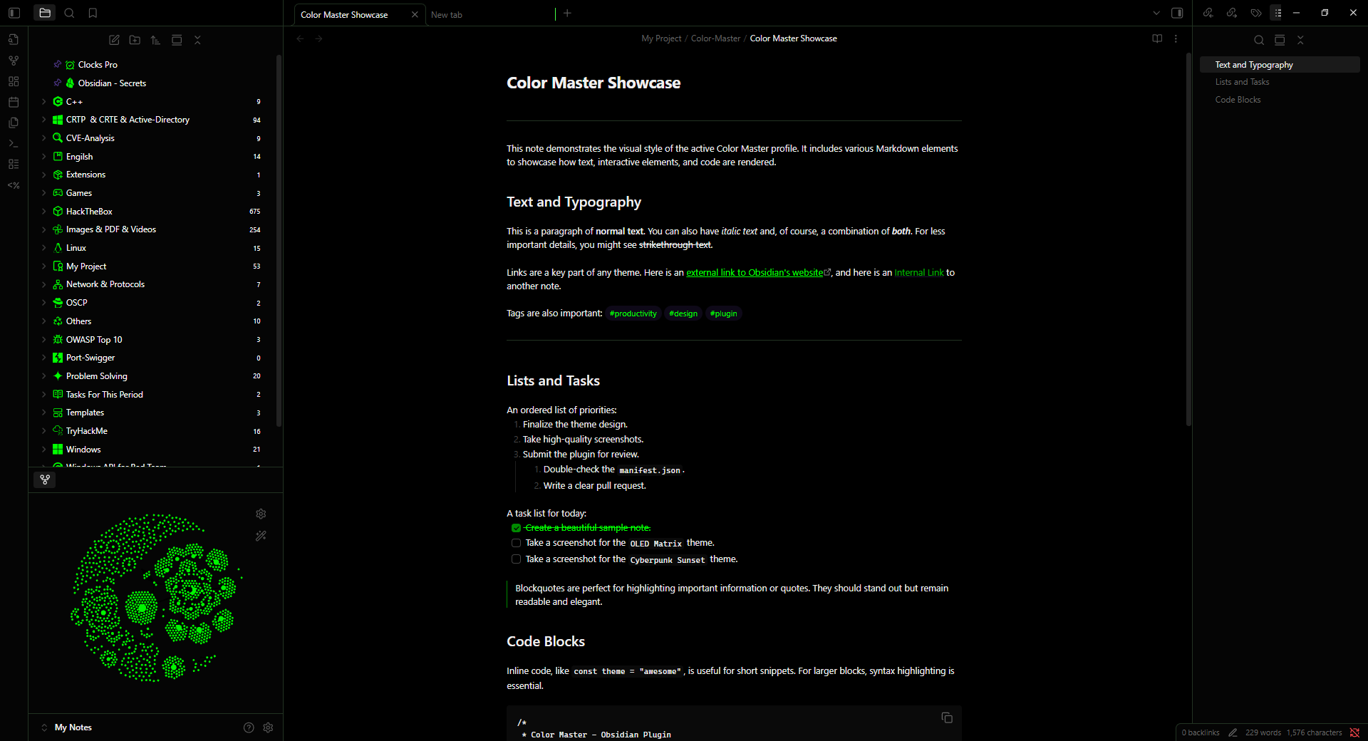
- OLED Matrix: A true-black, high-contrast theme with vibrant green accents.
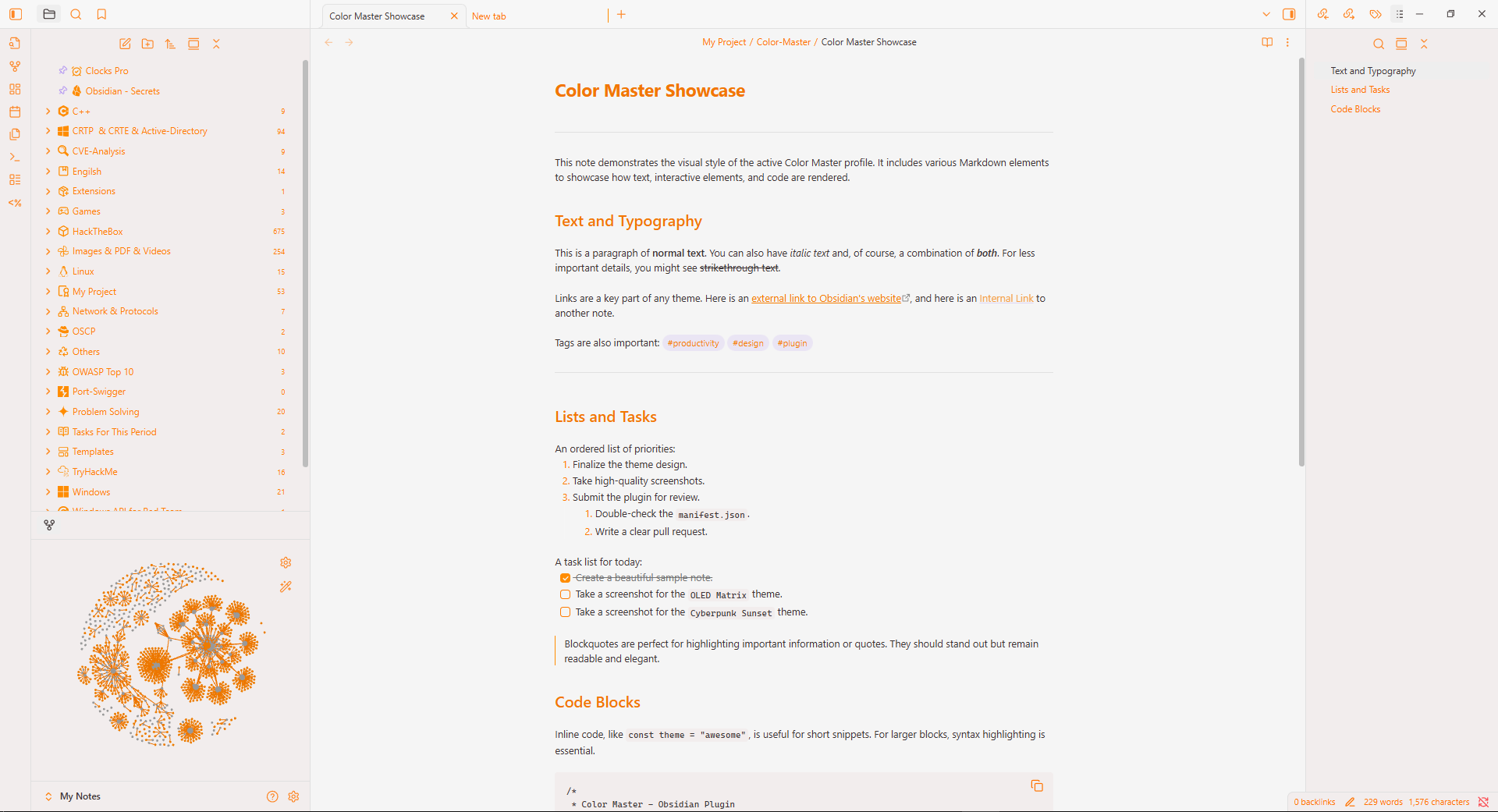
- Citrus Zest: A brilliant light theme with a clean design and stunning orange highlights.
Screenshots / Demos
Default Themes
| OLED Matrix (Dark) | Citrus Zest (Light) |
|---|---|
 |  |
Color Variable Reference
Theme Engine exposes 104 core CSS variables from Obsidian’s theme system.
These variables are grouped internally by category and can be edited visually through the plugin UI.
Each entry below shows:
- Variable — the CSS variable name
- UI Label — how it appears inside Theme Engine
- Description — what the variable controls
[!TIP]
Theme Engine also supports custom CSS variables.
You can add variables from other plugins or themes directly from the Custom Variables section in the settings.
Click to expand the full list of supported CSS variables
| Variable | UI Label | Description |
|---|---|---|
--iconize-icon-color | Iconize icon color | Sets the color for all icons added by the Iconize plugin and overrides its internal color settings. |
--background-primary | Background primary | Main background color for the entire app, especially editor and note panes. |
--background-primary-alt | Background primary alt | Alternate background often used for active editor lines. |
--background-secondary | Background secondary | Secondary background used for sidebars and panels. |
--background-secondary-alt | Background secondary alt | Alternate sidebar background used for active files. |
--background-modifier-border | Border | Border color used across UI elements such as buttons and inputs. |
--background-modifier-border-hover | Border (hover) | Border color when hovering UI elements. |
--background-modifier-border-focus | Border (focus) | Border color when an element is focused. |
--background-modifier-flair | Flair background | Background used for special UI states like syncing indicators. |
--background-modifier-hover | Hover background | Background color when hovering list items or controls. |
--background-modifier-active | Active background | Background color when elements are selected or clicked. |
--text-normal | Normal text | Default text color used across notes and most UI elements. |
--text-muted | Muted text | Slightly faded text used for secondary information. |
--text-faint | Faint text | Very subtle text used for disabled or low-priority UI. |
--text-on-accent | Text on accent | Text color displayed on top of accent backgrounds. |
--text-accent | Accent text | Accent color used for links and highlighted UI elements. |
--text-accent-hover | Accent text (hover) | Accent text color when hovering links. |
--text-selection | Text selection | Background color of selected text. |
--checklist-done-color | Checklist done | Color used for completed checklist items. |
--tag-color | Tag text | Text color of tags. |
--tag-color-hover | Tag text (hover) | Tag color when hovering over tags. |
--tag-bg | Tag background | Background color for tags. |
--nav-item-color | Nav item text | Default text color for items in navigation lists. |
--nav-item-color-hover | Nav item text (hover) | Text color when hovering navigation items. |
--nav-item-color-active | Nav item text (active) | Text color of the active navigation item. |
--nav-item-background-hover | Nav item background (hover) | Background color when hovering navigation items. |
--nav-item-background-active | Nav item background (active) | Background color for selected navigation items. |
--link-color | Link color | Default color for internal Markdown links. |
--link-color-hover | Link color (hover) | Color for internal links when hovering. |
--link-external-color | External link color | Default color for external links. |
--link-external-color-hover | External link color (hover) | External link color when hovering. |
--link-unresolved-color | Unresolved link color | Color for links pointing to notes that do not exist yet. |
--caret-color | Caret color | Color of the text cursor in editing mode. |
--code-comment | Code comment | Syntax color used for comments in code blocks. |
--code-function | Code function | Syntax color for function names in code blocks. |
--code-keyword | Code keyword | Syntax color for language keywords. |
--code-operator | Code operator | Syntax color for operators in code blocks. |
--code-property | Code property | Syntax color for object properties in code blocks. |
--code-string | Code string | Syntax color for string values in code blocks. |
--h1-color | H1 color | Color of H1 headings. |
--h2-color | H2 color | Color of H2 headings. |
--h3-color | H3 color | Color of H3 headings. |
--h4-color | H4 color | Color of H4 headings. |
--h5-color | H5 color | Color of H5 headings. |
--h6-color | H6 color | Color of H6 headings. |
--hr-color | Horizontal rule | Color of horizontal rule lines (---). |
--blockquote-border-color | Blockquote border | Color of the vertical border in blockquotes. |
--blockquote-color | Blockquote text | Text color inside blockquotes. |
--blockquote-bg | Blockquote background | Background color for blockquotes. |
--code-normal | Inline code text | Text color inside inline code. |
--code-background | Inline code background | Background color for inline code blocks. |
--text-highlight-bg | Highlighted text background | Background color of highlighted text. |
--table-background | Table background | Background color of Markdown tables. |
--table-border-color | Table border | Border color of Markdown tables. |
--table-header-background | Table header background | Background color of table headers. |
--table-row-alt-background | Table alt row background | Alternate row background color in tables. |
--callout-default | Callout default | Base color for note callouts. |
--callout-info | Callout info | Base color for info callouts. |
--callout-warning | Callout warning | Base color for warning callouts. |
--callout-error | Callout error / danger | Base color for error and danger callouts. |
--callout-success | Callout success | Base color for success callouts. |
--callout-tip | Callout tip | Base color for tip and hint callouts. |
--callout-question | Callout question | Base color for question, help, and FAQ callouts. |
--callout-important | Callout important | Base color for important callouts. |
--callout-bug | Callout bug | Base color for bug callouts. |
--callout-example | Callout example | Base color for example callouts. |
--callout-quote | Callout quote | Base color for quote and cite callouts. |
--callout-todo | Callout todo | Base color for todo callouts. |
--callout-summary | Callout summary | Base color for summary callouts. |
--callout-fail | Callout fail / failure | Base color for fail, failure, and missing callouts. |
--interactive-normal | Interactive normal | Background color for buttons and interactive controls. |
--interactive-hover | Interactive hover | Background color when hovering interactive elements. |
--interactive-accent | Interactive accent | Accent color for important actions and buttons. |
--interactive-accent-hover | Interactive accent hover | Accent color when hovering important buttons. |
--interactive-success | Success color | Color indicating successful operations. |
--interactive-error | Error color | Color indicating error states. |
--interactive-warning | Warning color | Color indicating warning states. |
--titlebar-background | Titlebar background | Background color of the window title bar. |
--titlebar-background-focused | Titlebar background (focused) | Title bar color when the window is active. |
--titlebar-text-color | Titlebar text | Text color of the title bar. |
--sidebar-background | Sidebar background | Background color of sidebars. |
--sidebar-border-color | Sidebar border | Border color next to sidebars. |
--header-background | Header background | Background color for pane headers. |
--header-border-color | Header border | Border color below pane headers. |
--vault-name-color | Vault name | Color of the vault name displayed in the sidebar. |
--tab-background-active | Active tab background | Background color of the active tab. |
--tab-text-color | Tab text | Text color of inactive tabs. |
--tab-text-color-active | Active tab text | Text color of the active tab. |
--workspace-background-translucent | Workspace translucent background | Translucent background used behind overlays. |
--cm-notice-text-default | Default notice text | Default text color for notices unless overridden by rules. |
--cm-notice-bg-default | Default notice background | Default background color for notices unless overridden by rules. |
--graph-line | Graph line | Color of connections between notes in graph view. |
--graph-node | Graph node | Color of nodes representing notes. |
--graph-text | Graph text | Color of text labels in graph view. |
--graph-node-unresolved | Graph unresolved node | Color of nodes for unresolved links. |
--graph-node-focused | Graph focused node | Color of the highlighted node. |
--graph-node-tag | Graph tag node | Color of nodes representing tags. |
--graph-node-attachment | Graph attachment node | Color of nodes representing attachments. |
--canvas-background | Canvas background | Background color of the canvas workspace. |
--canvas-card-label-color | Canvas card label | Text color of labels displayed on canvas cards. |
--canvas-dot-pattern | Canvas dot pattern | Color of the dotted grid pattern used in canvas. |
--scrollbar-thumb-bg | Scrollbar thumb | Color of the draggable scrollbar thumb. |
--scrollbar-active-thumb-bg | Scrollbar active thumb | Color of the scrollbar thumb when dragged. |
--scrollbar-bg | Scrollbar background | Background color of the scrollbar track. |
--divider-color | Divider | Color used for UI separator lines and dividers. |
Installation (End User)
- Download the latest release from the GitHub Releases page.
- Extract the plugin folder into your vault's plugins folder:
<YourVault>/.obsidian/plugins/. - In Obsidian, go to
Settings->Community plugins. - Enable the "Theme Engine" plugin.
- Open the plugin settings to start customizing!
Building from Source (Developer)
If you want to customize the plugin or contribute to its development, you can easily build it from the source code.
-
Clone the Repository:
git clone https://github.com/YazanAmmar/obsidian-theme-engine.git cd obsidian-theme-engine -
Install Dependencies:
Make sure you have Node.js installed. Then, run the following command.
npm install -
Build the Plugin: To compile the TypeScript code and package the plugin for Obsidian:
-
Standard Build: Use
npm run buildto compile the core files (main.js,styles.css,manifest.json) into the project root.npm run build -
Lint the Code: Run the ESLint script to check for code style issues.
npm run lint -
Development Build (Advanced): Use
npm run devto compile AND automatically copy the resulting files to a local Obsidian vault.npm run dev
-
[!NOTE]
The
npm run devcommand is currently configured with a personal path:
C:\Users\user\Documents\Obsidian\My Notes\\.obsidian\\plugins\\obsidian-theme-engineYou must edit the
devscript inside thepackage.jsonfile to point to your local vault's plugin folder before running this command.
-
Load into Obsidian: The compiled files (
main.js,styles.css,manifest.json) will be in the project's root. Copy these files into your vault's plugin folder:<YourVault>/.obsidian/plugins/obsidian-theme-engine/
Usage Guide & Examples
1. Profiles: Create, Import, Export
A Profile is a single "theme" that saves all your settings.
- Create: Go to
Profile Manager->New. Give it a name and choose if it should force "Dark", "Light" mode or "Auto". - Export: Select the profile you want to share, then click
Export File. This saves a single.jsonfile with all colors, snippets, and rules. - Import: Click
Import / Paste (.json). You can paste the JSON text or upload the file. You will be prompted to give it a new name.
2. Setting a Custom Background (Image/Video)
This is one of the most popular features .
- Go to
Advanced Settings->Set Custom Background. - Click the
+(Add) button. A modal will open. - Drag & drop an image or video, upload a file, or paste a URL.
- The plugin will save the media and activate it.
- Click the
📦(Browse) button to see all your saved media, rename them, or select a different one. - Click the
⚙️(Settings) button to control video opacity, mute, or image quality.
3. Using CSS Snippets (Profile & Global)
You can add small CSS tweaks without creating separate files.
- Profile Snippets: Created normally. They are tied to the active profile and are exported with it.
- Global Snippets: When creating/editing a snippet, check the "Save as Global Snippet" toggle. This snippet will remain active no matter which profile you switch to.
- Order: You can drag and drop snippets in the list to control their load order (snippets lower in the list can override ones above them).
4. Advanced Notice Coloring (Keywords & Regex)
Customize the color of pop-up notices based on their text content.
- Find the
Noticescategory in the color pickers. - Click the
⚙️(Settings) icon next to--cm-notice-bg-default(for background) or--cm-notice-text-default(for text). - In the modal, click
Add New Rule. - Keywords: Type keywords (e.g., "Success", "Saved") into the box and press
SpaceorEnter. - Regex: Or, type a regular expression (e.g.,
\bError\b) and check the "Regex" box. - New: Check the "Highlight Only" box (
highlightericon) to apply color only to the matching keywords, not the whole notice. - Choose a color for that rule.
- You can drag and drop rules to change their priority. The first rule that matches (from top to bottom) will be applied.
Hotkeys (Commands)
You can assign hotkeys to these commands in Settings -> Hotkeys:
- Enable & Disable: Toggle the entire plugin on or off.
- Cycle to next profile: Instantly switch to the next profile in your list.
- Cycle to previous profile: Switch to the previous profile.
- Open settings tab: Open the Theme Engine settings panel.
- Cycle active profile theme: Cycle the active profile's theme (Light/Dark/Auto).
Performance & Tips
- If you notice lag while dragging a color picker, reduce the Live Update FPS slider in the
Advanced Settingssection. A value of 0 disables live preview completely, applying color only when you release the mouse. - The Theme Interference Warning ⚠️ is important. If you have a community theme (e.g., "Minimal") enabled and a Theme Engine profile active, they might fight over colors. For best results, set your Obsidian theme to "Default" and let Theme Engine handle all the colors.
- For Optimal Performance: We recommend enabling the Convert images to JPG option in the Background Settings. This automatically compresses uploaded images, resulting in smaller file sizes and better loading performance without noticeable loss of visual quality.
- If you encounter stability or performance issues: First, export your current profiles and backgrounds. Then, use the Reset Plugin Settings option in Advanced Settings to restore the plugin to its factory state. This often solves underlying data conflicts.
Changelog (Summary)
For full details, see CHANGELOG.md.
- v2.0.0 - The Theme Engine Update. Re-wrote the core to dynamically capture your active theme's colors. UI now shows "Pristine" (dimmed) vs. "Modified" (bright) states. Added a complete Custom Language and translation editor system. Implemented granular data reset and SCSS/ESLint.
- v1.1.1 - Added Per-Profile Video Background support, enhanced settings display performance by restoring scroll position, and refactored the translation structure.
- v1.1.0 - Added Per-Profile Custom Backgrounds (Image & Video), background browser, and media management tools.
- v1.0.9 - Added Import from Installed Themes/Snippets, Quick Theme Toggle, Reset Plugin button, and Theme Interference Warning.
- v1.0.8 - Added Global CSS Snippets, a Ribbon Icon, flexible RTL options, and new hotkeys.
Roadmap
Here are the future plans for Theme Engine. Feel free to contribute or suggest features!
- Community Profile Marketplace: An easy way to browse, share, and import profiles from other users.
- More Plugin Integrations: Add dedicated color variables for other popular plugins (e.g., Kanban, Calendar).
- AI-Powered Theming: Integrate with Gemini or ChatGPT API to generate profiles and snippets, helping users build their dream theme.
- Export as Full Theme (.zip): Allow exporting a complete profile (colors, snippets, settings, and base64 background) as a ready-to-publish Obsidian theme file.
- Advanced Context Triggers: Automatically activate profiles based on context (time of day, current folder, or note tags).
- Advanced CSS Editor: Upgrade the snippet editor with syntax highlighting, autocomplete for Obsidian variables, and live error detection (Linting).
- Advanced Color Helpers:
- Live contrast ratio warnings (AA/AAA) directly in the color picker.
- A "Suggest Accessible Color" button based on contrast algorithms.
- Color Blindness Simulator: Add an accessibility tool that applies an SVG filter to the UI to simulate various types of color blindness.
- Expanded Core Variable Support: Add support for more official Obsidian color variables as they are introduced.
Contributing
Contributions are welcome!
- Fork the repo.
- Create a feature branch:
git checkout -b feat/your-feature. - Run
npm installandnpm run buildlocally to ensure no errors. - Open a pull request with a clear description.
- Update
CHANGELOG.mdand thisREADME.mdwhere relevant.
Please follow the existing code style, and ensure your contributions are innovative and consistent with the plugin's vision.
[!TIP]
Are you a developer of another plugin? If you'd like your plugin to be natively supported by Theme Engine (e.g., controlling a specific color variable of your UI), feel free to open a Pull Request. Supporting integration is a great way to gain more visibility for your work!
Troubleshooting / FAQ
Q: Why are my colors not changing after I activate a profile?
A: This is the most common issue. You likely have a Community Theme (like Minimal, Atom, etc.) enabled simultaneously. This external theme imposes its own color rules and interferes with the variables set by Theme Engine.
The Best Solution:
- Go to Obsidian's Settings -> Appearance -> Themes.
- Select the Default theme for Obsidian.
- The warning icon in Theme Engine settings will disappear, and your profile's colors will apply correctly.
Advanced Solution (To customize an external theme):
- Set Obsidian's theme to Default.
- Open Theme Engine settings and click Import / Paste (.css).
- Select the "Import from installed theme" option and choose the theme you want to modify (e.g., Minimal).
- This creates a new CSS Profile within Theme Engine containing the external theme's code, allowing you to customize its colors safely without conflicts.
Q: I added an image or video background, but the UI (like sidebars) is still dark. Why isn't it transparent?
A: Theme Engine uses Smart Transparency to handle this.
- When you activate a background, the plugin automatically sets key CSS variables (like
--background-primaryand--sidebar-background) totransparent. - This makes the UI layers see-through, allowing your image or video to be visible.
Q: What is the difference between a normal Snippet and a Global Snippet?
A: The core difference is scope:
- Profile Snippet (Normal): Is linked to a single profile. It only activates when that specific profile is active, and it is included when you export the profile.
Use Profile Snippets for things that only make sense with that profile, like a special
h1color.
- Global Snippet: Always remains active, regardless of which profile is currently selected. This is ideal for universal styles you always need, like a custom font or hiding a specific UI element.
Use Global Snippets for things you always want, like a custom font.
Q: What are Snapshots (Pin) and why should I use them?
A: Snapshots are a safety feature.
- The Pin button saves an instant snapshot of the profile's current state (colors, CSS, and notice rules).
- If you make changes you don't like, the Reset to Pinned button instantly reverts the profile to the saved snapshot, allowing for risk-free experimentation.
Q: Does the plugin support Right-to-Left (RTL) languages?
A: Yes, absolutely. The plugin fully supports Arabic (العَرَبيَّةُ) and Persian (فارسی). You can find the Enable Right-to-Left (RTL) Layout setting near the language dropdown to flip the interface completely for a seamless reading experience.
License
MIT — see LICENSE.
Contact / Links
- GitHub Repo: https://github.com/YazanAmmar/obsidian-theme-engine
- Issues & Features: GitHub Issues Page
- Telegram Channel: https://t.me/ThemeEngine
For plugin developers
Search results and similarity scores are powered by semantic analysis of your plugin's README. If your plugin isn't appearing for searches you'd expect, try updating your README to clearly describe your plugin's purpose, features, and use cases.