Style Manager
approvedby emarpiee
Provides advanced controls for managing themes, CSS snippets, and style settings. Transforms them into adjustable controls, enabling you to save, export or switch between configurations as presets. - This plugin has not been manually reviewed by Obsidian staff.
Obsidian Style Manager

This plugin wouldn't have been possible without the inspiration and foundational logic provided by Style Settings, an Obsidian plugin originally created by mgmeyers. I've adapted several key parts of their codebase to jumpstart the development of this plugin.
This plugin allows Obsidian snippet, theme, and plugin CSS files to define configurable options, offering users a central settings pane to tweak these variables. It supports toggling HTML body classes, numeric sliders, text inputs, color pickers, and more.
[!CAUTION] Do not enable Style Manager and Style Settings at the same time. Both plugins rely on the exact same
/* @settingsconfiguration system. If run simultaneously, they will compete to manage your CSS variables, which can lead to layout conflicts. To ensure a stable experience, please disable the Style Settings plugin before using Style Manager.
- Installation
- Style Settings Migration Guide
- Core Logic: Shared Mode vs. Isolate Mode
- Style Manager Interface Overview
- Global Toolbar & Status Badges
- Integrated CSS Code Editor
- CSS Snippet Metadata Block (
@metadata) - Settings Block (
@settings) - Storage Mapping
- Developer and Testing Utilities
- Command Palette Commands
- Transparency
- ☕️ Buy Me A Coffee
Installation
1. Via BRAT (Beta Reviewer's Auto-update Tool)
This is the recommended method to receive updates directly.
- Install the BRAT plugin from the Obsidian Community Plugins store.
- Enable BRAT in your Obsidian settings.
- Click "Add Beta plugin" within the BRAT settings panel.
- Paste the GitHub URL of this repository.
- Click "Add Plugin".
2. Manual Installation
Use this method if you prefer to install files directly without third-party tools.
- Go to the Releases page of this GitHub repository.
- Download the following three files:
main.jsmanifest.jsonstyles.css
- In your Obsidian vault, navigate to
.obsidian/plugins/(note that this folder is hidden by default on some operating systems). - Create a new folder named
obsidian-style-manager. - Move the downloaded files into that folder.
- Restart Obsidian or navigate to Settings > Community Plugins and toggle the plugin On.
3. Community Plugin Store
This is the easiest way to install the plugin.
- Open Obsidian Settings.
- Go to Community plugins and ensure Restricted mode is turned off.
- Click Browse and search for Style Manager.
- Click Install.
- Once installed, click Enable.
Style Settings Migration Guide
If you are switching from the Style Settings plugin, you can migrate your existing configurations into Style Manager:
- Click the More Actions menu (vertical ellipsis) in the global toolbar.
- Select Import preset… > Import from Style Settings.
This will import your current Style Settings configurations as preset.
Core Logic: Shared Mode vs. Isolate Mode
Managing your vault's look across multiple devices (such as a large monitor and a mobile phone) can introduce layout conflicts. Style Manager resolves this by offering two storage modes to control how your styles are synced.
Shared Mode (Default)
Best for: Maintaining a consistent global styles across all devices in shared vault.
When you modify styles in Shared Mode, the configurations are synced across your vault.
- The Memory (
data.json): First, it records your configurations indata.json. Think of this as the plugin's Master Ledger. It’s a private notebook where Style Manager keeps a detailed record of every preference you've set. - The Effect (
appearance.json): The plugin writes the values directly to Obsidian's default config file,appearance.json. Your sync service (Obsidian Sync, iCloud, Git, etc.) recognizes this change and distributes it to your other devices.
Isolate Mode
Best for: Customizing layouts for specific screens (e.g., larger fonts on mobile) or local style testing.
Isolate Mode is your "Creative Sandbox." Isolate Mode creates a private local environment that never writes to the shared appearance.json file, protecting other devices from unexpected style changes.
- The Visual Overlay: The plugin applies style changes as a live visual layer directly inside your current Obsidian client.
- Device Locker: The plugin creates a device locker for your device. Each device you use (your Mac, your Android phone, your iPad) is given a unique ID. The plugin creates a dedicated "locker" for that ID within
data.json. - Sync Behavior: Because the changes exist only within your local device's locker inside
data.json, other devices running in Isolate Mode will ignore them and run their own isolated configurations. When you're on your phone, the plugin looks intodata.json, finds the locker labeled "Phone," and loads your Isolate Locker from there. When you move to your desktop, it finds the locker labeled "Desktop" and loads a completely different set of styles.
Style Manager Interface Overview
Style Manager interface is structured into six functional tabs.
1. Styles Tab
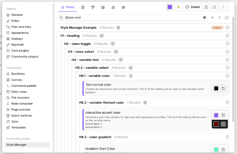
The primary workspace for Styles customization.
- Unified Style Control: Renders settings (parsed from theme and snippet CSS files) into interactive toggles, sliders, and color pickers.
- Modification Indicators: Customized settings are visually highlighted with a colored border on the left (modified border), allowing you to quickly identify modified values at a glance.
- Setting Count Badges: Displays the number of modified settings within a section. Root sections show the total count, while sub-sections show local counts and a downward arrow (↓) if nested settings are also modified. Clicking a badge opens a focused view of all modified styles in that section.
- Modified-Only Filter: A quick switch to hide unchanged settings and view only the settings you have specifically changed.
- Navigation: Search bar for instant filtering (supports
@id <id>,@type <known-type>,@title <text>, and@heading <text>prefixes), and a "Collapse/Expand All" toggle to manage large sets of style settings. - Parse Logs: An info button that opens a modal listing all warnings and errors found during the parsing of
@settingsblocks, allowing for quick debugging of CSS configurations. Errors are persistently tracked across theme and snippet changes. Clicking an error's line number or setting ID will instantly open the CSS editor and jump directly to the exact location of the issue.
2. Snippets Tab
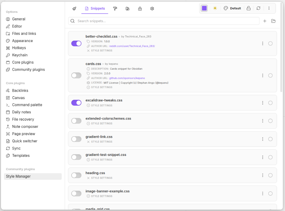
Manage Obsidian's native CSS snippets from a centralized list.
- Snippet Control: Search, select, and toggle native CSS snippets through a unified list.
- Style Settings Indicator: Visual indicator showing if a snippet supports configurable style settings.
- Advanced Filter Search: Filter snippets using specialized search attributes:
@name,@description,@license– Match against snippet metadata.@settings <true/false>– Filter for snippets that do or do not support style settings.
- Vault Integration: Quick-access buttons to open your system's file explorer directly to your vault's snippets folder.
- Bulk Selection: Choose multiple snippets simultaneously for coordinated actions.
3. Themes (Theme Builder) Tab
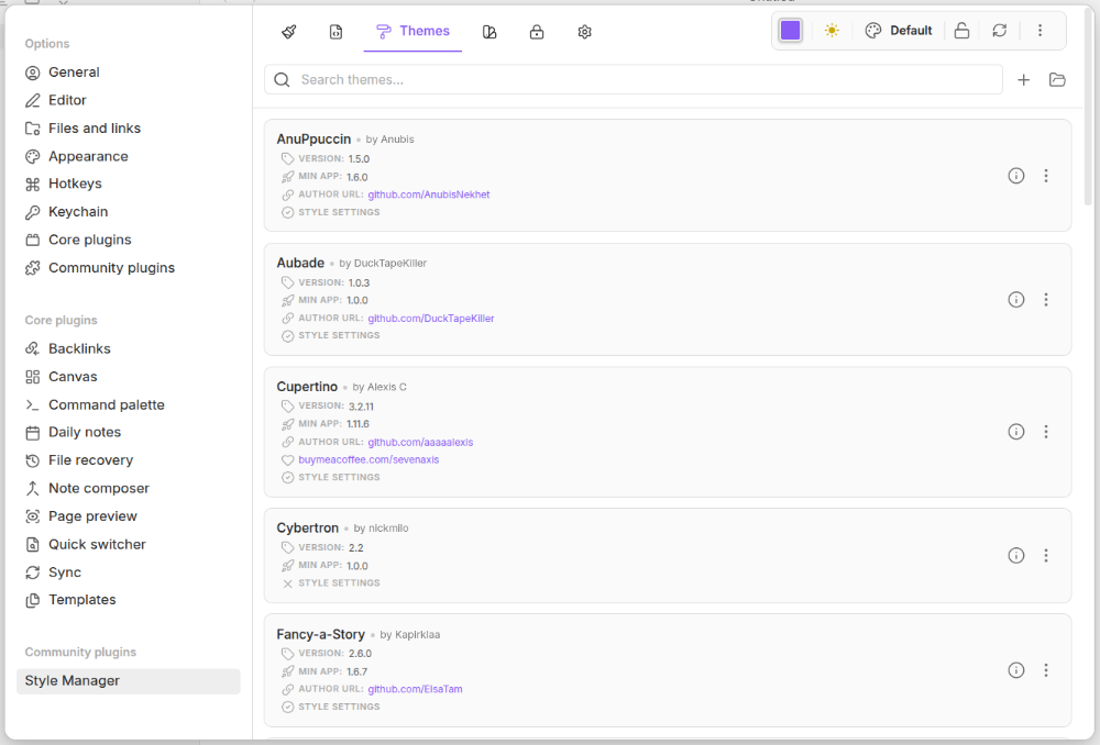
Tools for switching, and building custom themes.
- Theme Manifest Creation: Create new custom themes by defining their metadata (Name, Author, etc.) via a dedicated manifest modal.
- Style Settings Indicator: Visual indicator showing if a theme supports configurable style settings.
- Advanced Filter Search: Filter themes using specialized search attributes:
@author <name>– Find themes made by a specific creator. (e.g.@author emarpiee)@name <name>– Find themes matching a specific title. (e.g.@name Retroma)@settings <true/false>– Filter for themes that do or do not support style settings.
- Folder Shortcut: One-click button to open your local
.obsidian/themesdirectory.
4. Presets Tab
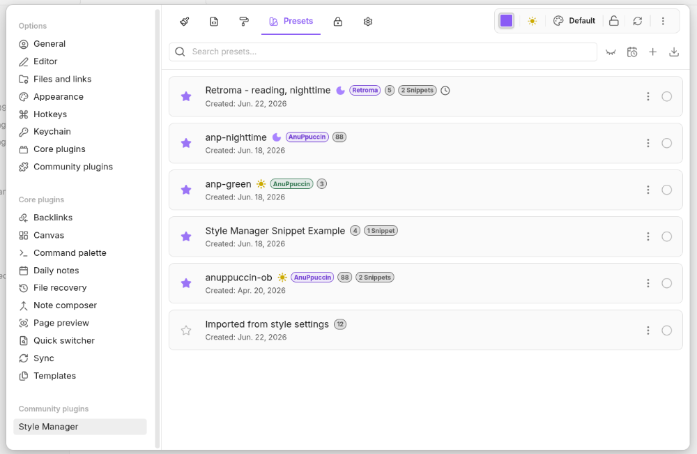
Capture, restore, and schedule snapshots of your entire workspace design.
- Visual State Snapshots: Save your active Theme, active CSS Snippets, style settings, and Accent Colors into a unified "Preset".
- Intelligent Search: Filter your preset library using tags:
@theme,@snippet, and@nameto match preset contents.@lightand@darkto filter by appearance mode.
- Export Bundles: Export presets as JSON or as a ZIP bundle that includes the actual CSS files (themes/snippets) required for the preset to work.
- Multi-Target Application: Apply presets to three different targets:
- Shared: Updates the shared configuration for all synced devices.
- Isolate: Applies changes only to the current device's local locker.
- Remote: Pushes a preset to a specific remote device's locker.
- Scheduling Automation: Access the Active Schedules modal to set presets to trigger automatically at specific times (e.g., switching to a dark, high-contrast style at 6:00 PM).
A. How to Save Your Own Preset
-
After customizing your vault's look in Style Manager, go to the Presets tab (or select Create preset… from the More Actions menu in the top toolbar).
-
Click Create preset.
-
Select which elements to include in your snapshot (such as Active theme, Appearance, Accent color, Snippets, or specific theme/snippet configurations). Tip: Use the Select modified button to automatically check only the settings you have explicitly changed.
-
Save the configuration using one of two options:
- Save preset: Click this button and enter a Name to store your current design state as a brand new preset.
- Save to existing preset: Click this button to select an existing preset from the list. A confirmation dialog will appear showing a summary of what will change — added, updated, and removed settings. Expand any category to see the exact values: updated settings show the old value → new value so you know exactly what is changing. Click Save to confirm.
-
Inactive Settings Warning: If the configurations you are saving include settings that are no longer active in your vault (e.g., from an inactive theme or snippet), a warning dialog will ask you:
- Click Discard to clean up the preset and remove these inactive settings.
- Click Keep to retain them (useful if you plan to re-enable that theme or snippet later).
[!TIP] Single-Purpose Presets: When creating a preset, try to give it a single clear purpose. For example, have one preset dedicated to an entire theme, and separate presets for specific active snippets or plugins, rather than mixing them all into one snapshot.
B. How to Import Presets
- Open Style Manager in Obsidian.
- Click the More Actions menu (three vertical dots) in the global toolbar.
- Select Import preset….
- Choose one of the available import methods:
- Import from style settings: Automatically migrate your configurations from the style settings plugin.
- Import from files: Click Choose files to select a
.jsonor.zipbundle from your device. - Import from vault: Browse and select
.jsonor.zipfiles already stored within your Obsidian vault. - Paste JSON data: Paste raw JSON text directly into the provided text box, then choose:
- Save preset: Imports the JSON and saves it as a preset without applying it.
- Save & apply: Imports the JSON and immediately applies the preset to your current settings.
- After resolving any conflicts, your new presets will appear under the Presets tab.
C. How to Apply a Preset
- Navigate to the Presets tab in Style Manager.
- Click on the preset you want to use from the list, or select multiple presets to apply them in bulk.
- Click the Apply button.
- Choose the target environment:
- Apply to shared locker: Updates the configuration for all synced devices.
- Apply to isolated locker: Loads the style only on your current device (requires Isolate Mode).
- Apply to remote locker: Pushes the preset to a specific connected device.
- Choose how to merge the styles (e.g., Overwrite to replace current settings, or Merge to combine). The preset will immediately load onto your workspace.
5. Isolate Tab
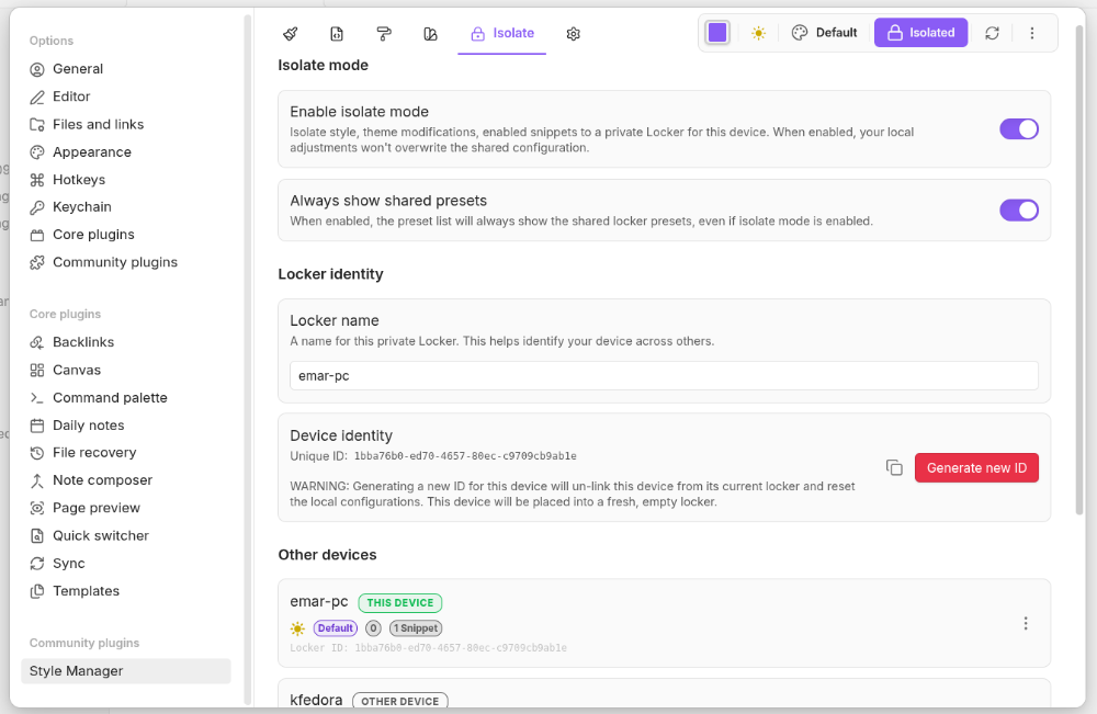
Manage device-specific profiles.
- Isolate Mode Toggle: Enable a private "Locker" for the current device. When active, local adjustments to styles, themes, and snippets are isolated and will not overwrite the shared configuration.
- Locker Identity Management:
- Custom Naming: Give your device a friendly name (e.g., "Office Mac").
- Identity Control: View, copy, or regenerate the unique Device ID.
- Remote Directory Management:
- Device List: View a list of all other devices sharing the vault.
- Locker Preview: Open a detailed preview of the isolated settings (Theme, Appearance, Snippets) active on any remote device.
- Remote Maintenance: Rename or delete lockers for other devices.
6. Preferences Tab
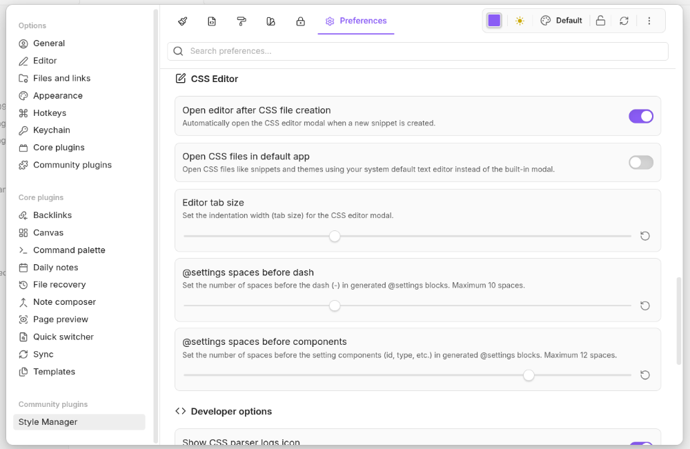
Plugin configuration, safety tools, and developer options. Includes a search filter to quickly find specific settings.
- UI Customization: Toggle sticky headings in the Styles tab, customize date formats for presets, toggle active count badges on tabs, choose the panel's open location (left sidebar, right sidebar, or main tab), and control status bar visibility.
- Confirmations:
- Skip Toggles: Quickly delete, export, or import presets and styles by bypassing confirmation dialogs.
- Apply Actions: Define how the plugin handles preset application (Ask, Overwrite, or Merge) for single, bulk, or scheduled actions.
- Backup & Recovery:
- Full Backup: Create a full ZIP backup containing plugin preferences, presets, snippets, and themes.
- Basic Backup: Generates a quick JSON file containing your style settings, presets, and plugin configurations.
- Safety Rollback: Instantly restore the plugin state from the automatically generated
data.json.baksnapshot.
- Export Customization: Change default export folders, file extension naming preferences (e.g.,
.json,.md,.txt), and timestamp layouts. - CSS Editor:
- Indentation Control: Adjust the indentation of @settings blocks.
- External Editor: Option to open CSS files in your system's default text editor instead of the plugin's integrated CSS editor.
- Editor Tuning: Adjust the tab size for the CSS editor.
- Developer Options:
- Notification Toggles: Control alerts for shared changes, preset actions, isolated configurations, snippet management, and general UI feedback.
- Debug Logging: Toggle comprehensive console logging for troubleshooting.
- Shared Version: View the internal version timestamp used to synchronize state across devices.
Global Toolbar & Status Badges
Instant Access Header Controls

The persistent toolbar header provides system actions across all tabs:
- Accent Color Selector: Opens a color picker to update your theme's primary accent color.
- Appearance Toggle: Swap between light and dark modes.
- Theme Selector: Quick-switch menu to change the active Obsidian theme.
- Isolate Mode Badge: A interactive clickable-icon showing if you are in Shared mode or Isolate mode.
- Refresh Button: Forces the plugin to reload configurations from the `data.json.
More Actions Menu (Vertical Ellipsis)
- Preset Management: Quickly
Create preset…orImport preset…. Completing these actions automatically switches the view to the Presets tab. - Snippet Management:
Create snippet…generates a new CSS file. Based on your preferences, it opens in the internal editor or your system's default text editor, then switches the view to the Snippets tab. - State Reset:
Reset stylesopens the Reset Settings Modal, allowing you to select specific style sections to clear and return to their default theme values.
Status Badges Reference
The Style Manager displays a system of badges to provide quick visual cues and access to configuration details. These are categorized into two types: interactive badges, which trigger actions or open menus when clicked, and info badges, which serve as read-only indicators for status and metadata.
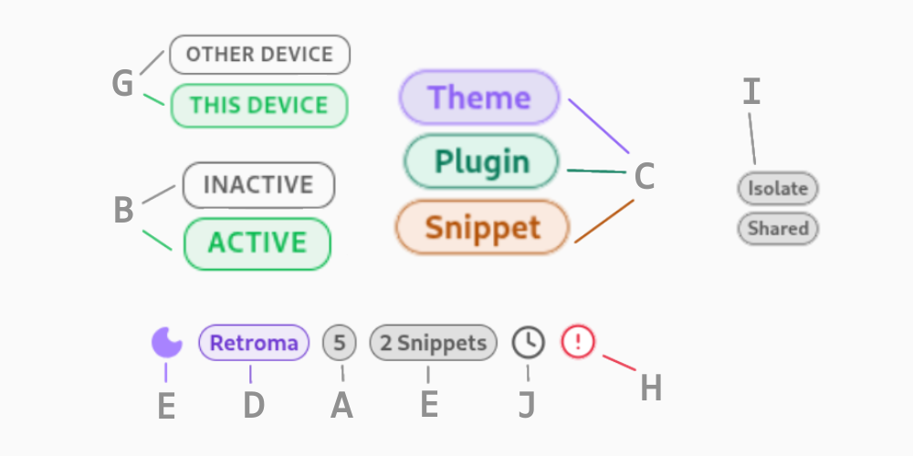
| Badge | Type | Description | |
|---|---|---|---|
| A | style settings count | interactive | Number of settings configured in a style, preset, or device locker. In Styles tab, click to show per section configurations. |
| B | style status | info | Shows if the specific style settings is currently active |
| C | style source | interactive | Indicates where the style originates (Plugin, Theme, or Snippet). Click to open the CSS editor as a modal, or open it in a tab from the modal. |
| D | active theme | interactive | Displays the name of the currently active Obsidian theme. Click to copy the preset or device locker current accent color. |
| E | active snippets | info | Current count of active CSS snippets |
| F | active appearance | info | Indicates if a device locker or preset is in Light or Dark mode |
| G | locker | info | Distinguishes the local device locker from other device lockers (in Isolate tab) |
| H | duplicate warning | info | Alerts you when a Style ID is duplicated across different sources. |
| I | mode | info | Shows which mode that component is currently active |
| J | schedule | interactive | Indicates if a preset is currently managed by a date & time-based schedule. Click to edit the preset's active schedule. |
Integrated CSS Code Editor
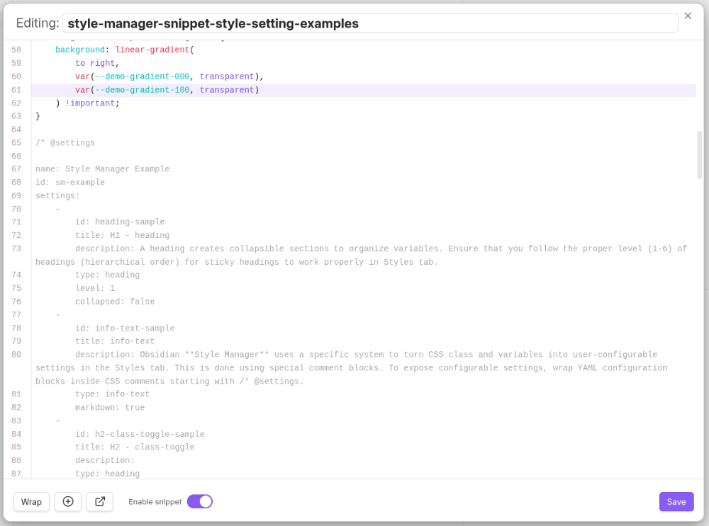
Style Manager features an integrated CodeMirror 6 editor that works in both a modal and a dedicated workspace tab. Use it to edit styles, snippets, and theme files without leaving Obsidian.
Key Features
- Reusable editor component: The same CodeMirror 6 editor powers both the modal and tab view.
- Direct editing: Modify CSS files without leaving Obsidian.
- Open in tab: From the modal, use the external-link icon to open the current CSS source in a dedicated workspace tab and close the modal.
- Jump-to-line navigation: When opened from a parse log error, the editor automatically scrolls and places the cursor on the specific line or setting block that caused the issue.
- Smart block injection: Quickly add blocks and setting components using the Add Block button.
- Developer-friendly tools: Includes line wrapping toggles, automatic bracket closing, and
Mod-s(Ctrl/Cmd+S) support for quick saving. - Flexible management: Rename snippets, toggle snippet activation, save changes, or copy read-only content directly from the footer.
- Indentation Control: Customize the indentation of
@settingsblocks to match your preferred coding style.
The Evolution of Style Management
For a long time, managing style settings manually in CSS files could cause errors:
- Manual Boilerplate: Authors had to manually type out the
/* @settingsblocks, leading to repetitive work and frequent typos. - Fragile Indentation: Since the configuration uses YAML, a single misplaced space or a wrong indentation level could break the entire settings block. Style Manager now supports customizable indentation and enforces constraints to prevent these errors.
- Structural Risks: Adding a new setting field often meant carefully inserting a dash (
-) and several lines of properties exactly in the right place, risking the accidental deletion of existing settings.
Style Manager eliminates these pain points by automating the structure and placement of these blocks, allowing authors to focus on the design rather than the syntax.
Smart Insertion Logic Reference
+---------------------------------------------------------+
|                  Top of CSS File                        |
|   /* @metadata                                          |
|      (Metadata block is always injected here) */        |
+---------------------------------------------------------+
|                                                         |
|                  Your Custom CSS                        |
|                                                         |
+---------------------------------------------------------+
|                  Bottom of CSS File                     |
|   /* @settings                                          |
|      (Settings container block is injected here) */     |
+---------------------------------------------------------+
| Block | Cursor Location | Resulting Position |
|---|---|---|
@metadata | Anywhere | Top of file |
@settings | Anywhere | Bottom of file |
| Setting Component | Left of/on the dash (-) | Above the current field |
| Setting Component | Inside setting properties | Below the current field |
| Setting Component | Outside any block (but one exists) | Above the first field of the next block (or end of last block) |
| Setting Component | No @settings block exists | Exactly at the cursor |
CSS Snippet Metadata Block (@metadata)
The @metadata block allows developers to embed authorship, license, and versioning data directly inside CSS files as a standard comment block. The Style Manager parser reads this block and displays in the Snippets tab.
Adding a Metadata Block
Method A: Automatic Injection (Recommended)
- In the Snippets tab, click on any CSS snippet to open the built-in editor.
- In the CSS editor footer, click the plus (
+) icon (Add block button). - Select "Add @metadata block".
- Fill in the values of the pre-formatted template inserted at the top of your file.
Method B: Manual Writing
Type the following comment structure at the top of your .css file:
/* @metadata
description: This snippet adds a glowing effect to the active line in the editor.
author: emarpiee
version: 1.2.0
authorUrl: https://github.com/emarpiee
license: MIT
*/
Supported Metadata Fields
| Field | Description | Example |
|---|---|---|
description | A brief explanation of what the snippet does. | description: Customizes the sidebar width |
author | The name of the creator. | author: emarpiee |
version | The current version of the snippet. | version: 1.0.0 |
authorUrl | A link to the author's profile or website. | authorUrl: https://github.com/emarpiee |
license | The license under which the snippet is shared. | license: MIT |
To show these in your list views, enable "Display metadata (Author, Version, etc.) for CSS snippets…" in the Preferences Tab.
Settings Block (@settings)
Style Manager uses a specific system to turn CSS class and variables into user-configurable settings in the Styles tab. This is done using special comment blocks. To expose configurable settings, wrap YAML configuration blocks inside CSS comments starting with /* @settings.
Style Manager scans for these comments in all CSS loaded by Obsidian from the snippets, themes, and plugins directories under your vault's configuration directory (%yourVault%/.obsidian/).
What is a Setting Component?
A Setting Component is a single configurable item within an @settings block. It defines one specific component type (like a color, a number, or a toggle) that a user can change.
Each component starts with a dash (-) and contains key such as an id, title, type, and a default value.
Example of a Setting Component:
/* @settings
name: My Theme
id: my-theme
settings:
    -
        id: accent-color
        title: Accent Color
        description: Changes the main accent color of the theme
        type: variable-color
        default: '#7b2cbf'
*/
In this example, everything from the dash (-) to the end of the default value is one Setting Component.
Basic Structure Example
Add the following template block inside a snippet or theme .css file:
/* @settings

name: Custom Sidebar
id: custom-sidebar-id
settings:
    -
        id: custom-sidebar-title
        title: Sidebar Settings
        type: heading
        level: 3
    -
        id: sidebar-bg-color
        title: Background Color
        type: variable-color
        format: hex
        default: '#1a1a1a'
    -
        id: sidebar-width
        title: Sidebar Width (px)
        type: variable-number
        default: 250
        format: px

*/
Setting Types Overview
Remember that every setting component is separated by a dash (-) and must include a type. Here is a quick reference for all available setting component types:
| Type | Description |
|---|---|
heading | Organizes settings into collapsible nested sections. |
info-text | Displays arbitrary informational text or markdown to users. |
class-toggle | A switch to toggle classes on and off the body element. |
class-select | A dropdown menu of predefined options to add specific classes to the body. |
variable-text | A standard text-based CSS variable. |
variable-number | A numeric CSS variable (with optional unit formatting). |
variable-number-slider | A numeric CSS variable represented and adjusted via a visual slider. |
variable-select | A dropdown menu of predefined options for a text-based CSS variable. |
variable-color | A color CSS variable with a corresponding interactive color picker. |
variable-themed-color | Generates two color pickers for light and dark mode. |
color-gradient | Outputs a fixed number of colors along a gradient between two existing variables. |
Global Parameters
All settings definitions (regardless of type) must include the following core parameters:
id: A unique identifier for the setting.title: The label displayed in the user interface.type: The layout component style.description(optional): Informational text displayed next to the setting.
Bypassing Variable Generation
If you want to allow the plugin to show the setting but not override the theme's native default variable, you can bypass variable generation by setting the default value to '#'.
[!WARNING] Because settings are parsed as YAML, a bare
#character will be treated as a comment. You must wrap the#in quotes to bypass generation properly without throwing a warning.
- For standard variable types (
variable-text,variable-number,variable-number-slider, andvariable-select), setdefault: '#'. - For color types (
variable-colorandvariable-themed-color), use'#'(e.g.,default: '#'ordefault-light: '#').
    -
        id: my-setting
        title: My Setting
        type: variable-number
        default: '#'
    -
        id: my-color
        title: My Color
        type: variable-color
        format: hex
        default: '#'
Detailed Setting Examples
1. heading
Creates collapsible sections to organize variables. Ensure that you follow the proper level of headings (hierarchical order) for sticky headings to work properly in Styles tab.
- Required:
level(number from1to6). - Optional:
collapsed(boolean:true/false).
    -
        id: structure-heading
        title: Layout Structure
        type: heading
        level: 1
        collapsed: true
2. info-text
Displays markdown-styled text blocks inside your settings view.
- Required:
markdown: true.
    -
        id: format-notice
        title: Readme Instructions
        description: "Refer to the *online guide* for configuration rules."
        type: info-text
        markdown: true
3. class-toggle
Toggles a CSS class directly on the HTML <body> element. The id of the setting will be used as the class name.
- Optional:
default(boolean),addCommand(boolean - adds a hotkey command to the command palette).
    -
        id: hide-sidebar-titles
        title: Hide Sidebar Headers
        description: Hides structural labels in the left sidebar
        type: class-toggle
        default: false
        addCommand: true
4. class-select
Creates a dropdown menu that applies a selected CSS class to the HTML <body> element. The id of the setting will be used as the variable name.
- Required:
optionslist,allowEmpty(boolean). - Optional:
defaultvalue (required ifallowEmptyis false).
    -
        id: sidebar-font-theme
        title: Navigation Typography
        type: class-select
        allowEmpty: false
        default: serif-style
        options:
            - serif-style
            - sans-style
            - mono-style
Note: Options can also be structured as label / value pairs:
    options:
        -
            label: Classic Serif
            value: serif-style
        -
            label: Modern Sans
            value: sans-style
5. variable-text
Sets a text-based CSS variable. The id of the setting will be used as the variable name.
- Required:
default. - Optional:
quotes(boolean - wraps output in single quotes if set to true).
    -
        id: header-font-family
        title: Main Header Font
        type: variable-text
        default: -apple-system, BlinkMacSystemFont, "Segoe UI", Roboto, Oxygen-Sans, Ubuntu, Cantarell, "Helvetica Neue", sans-serif
        quotes: false
6. variable-number
Sets a numeric value. The id of the setting will be used as the variable name.
- Required:
default. - Optional:
format(appends a unit string, e.g.,px,em,rem).
    -
        id: active-border-width
        title: Border Width
        type: variable-number
        default: 2
        format: px
7. variable-number-slider
Creates a sliding adjustment input for numeric values. The id of the setting will be used as the variable name.
- Required:
default,min,max,step.min: The minimum possible value of the slidermax: The maximum possible value of the sliderstep: The size of each "tick" of the slider. For example, a step of 100 will only allow the slider to move in increments of 100.
- Optional:
format(appends a unit string).
    -
        id: content-margin-size
        title: Border Gap Width
        type: variable-number-slider
        default: 16
        min: 0
        max: 64
        step: 2
        format: px
8. variable-select
Creates a dropdown selection to assign values to a CSS variable. The id of the setting will be used as the variable name.
- Required:
default,optionslist.
    -
        id: code-font-size-tier
        title: Editor Font Style
        type: variable-select
        default: Fira Code
        options:
            - Fira Code
            - Source Code Pro
            - Courier New
9. variable-color
Creates an interactive color picker interface. The id of the setting will be used as the variable name.
- Required:
default(hex color values must be wrapped in quote,format(e.g.,hex,rgb,hsl,oklch). - Optional:
opacity(boolean - enables transparency),alt-format(outputs alternative values to helper variable targets).
    -
        id: global-accent-color
        title: System Accent
        type: variable-color
        opacity: true
        format: hex
        alt-format:
            -
                id: global-accent-color-rgb
                format: rgb
        default: '#007AFF'
10. variable-themed-color
Generates dual color pickers for light and dark appearance profiles. The id of the setting will be used as the variable name.
- Required:
format(e.g.,hex,rgb,hsl,oklch),default-light,default-dark(hex color values must be wrapped in quotes). - Optional:
opacity.
    -
        id: primary-text-color
        title: Primary Text
        type: variable-themed-color
        format: hex
        default-light: '#111111'
        default-dark: '#f5f5f5'
11. color-gradient
Calculates intermediate color steps along a gradient between two defined CSS color variables.
- Required:
from,to,step,format. - Optional:
pad(pads number variables with leading zeros).
Parameters:
from: The starting color, or color that will be at step 0to: The ending color, or color that will be at step 100step: The increment at which to output a CSS variable. For example, settingstepto10will output--var-0,--var-10,--var-20, etc…format: Can be one of:hsl,rgb,hex, oroklch;pad: When set, the number section of the variable will be padded with0's until it contains this number of digits. For example, settingpadto3andstepto10will output--var-000,--var-010,--var-020
    -
        id: color-base
        type: color-gradient
        from: color-base-00
        to: color-base-100
        step: 5
        pad: 2
        format: hex
Outputs:
--color-base-00,--color-base-05,--color-base-10, etc.
Color Variable Formatting Options
The following color format options are available:
hex
--accent: #007AFF;
/* With opacity: true */
--accent: #007AFFFF;
rgb
--accent: rgb(0, 122, 255);
/* With opacity: true */
--accent: rgba(0, 122, 255, 1);
rgb-values
--accent: 0, 122, 255;
/* With opacity: true */
--accent: 0, 122, 255, 1;
rgb-split
--accent-r: 0;
--accent-g: 122;
--accent-b: 255;
/* With opacity: true */
--accent-a: 1;
hsl
--accent: hsl(211, 100%, 50%);
/* With opacity: true */
--accent: hsla(211, 100%, 50%, 1);
hsl-values
--accent: 211, 100%, 50%;
/* With opacity: true */
--accent: 211, 100%, 50%, 1;
hsl-split
--accent-h: 211;
--accent-s: 100%;
--accent-l: 50%;
/* With opacity: true */
--accent-a: 1;
hsl-split-decimal
--accent-h: 211;
--accent-s: 1;
--accent-l: 0.5;
/* With opacity: true */
--accent-a: 1;
oklch
--accent: oklch(70% 0.1 150);
/* With opacity: true */
--accent: oklch(70% 0.1 150 / 0.5);
Localization Support
You can provide translated titles and descriptions for every language Obsidian natively supports. Simply append the appropriate language postfix to your YAML keys:
    -
        id: side-panel-toggle
        title: Toggle Layout
        title.de: Layout Umschalten
        title.ko: 레이아웃 전환
        description: Toggles sidebar panel
        description.de: Schaltet das Seitenpanel um
        description.ko: 사이드바 패널을 토글합니다.
        type: class-toggle
Supported Language Postfix Codes:
en(English)zh(Simplified Chinese)zh-TW(Traditional Chinese)ru(Russian)ko(Korean)it(Italian)id(Bahasa Indonesia)ro(Romanian)pt-BR(Brazilian Portuguese)cz(Czech)de(German)es(Spanish)fr(French)no(Norwegian)pl(Polish)pt(Portuguese)ja(Japanese)da(Danish)uk(Ukrainian)sq(Albanian)tr(Turkish - partial)hi(Hindi - partial)nl(Dutch - partial)ar(Arabic - partial)
Storage Mapping
This section provides a comprehensive mapping of the storage structure used by the plugin.
1. Core Sync Keys
These keys are the "Master Ledger" for settings that are mirrored in Obsidian's native appearance.json to ensure they sync across devices via Obsidian Sync or other sync services.
data.json key | Description | appearance.json mapping |
|---|---|---|
__style_manager_theme | The active theme name | cssTheme |
__style_manager_appearance | Appearance mode (light, dark, or system) | theme |
__style_manager_accent_color | Custom accent color (hex code) | accentColor |
__style_manager_snippets | List of currently enabled CSS snippet IDs | enabledCssSnippets |
2. Plugin Configuration Keys
These keys store the internal preferences that control the Style Manager's UI, behavior, and utility settings. They are not mirrored in Obsidian's native config.
data.json key | Description |
|---|---|
__style_manager_show_status_bar | Toggles visibility of the Style Manager icon in status bar |
__style_manager_show_tab_badge | Toggles visibility of active count badges on the Styles & Snippets tabs |
__style_manager_panel_open_location | Workspace placement for the panel (left-sidebar/right-sidebar/main-tab) |
__style_manager_show_snippet_metadata | Toggles display of metadata for CSS snippets |
__style_manager_show_shared_notifications | Toggles notifications when shared settings change |
__style_manager_show_preset_notifications | Toggles notifications when a preset is applied |
__style_manager_show_isolate_notifications | Toggles notifications for Isolate Mode changes |
__style_manager_show_snippet_notifications | Toggles snippet-related notifications |
__style_manager_show_utility_notifications | Toggles general plugin utility notifications |
__style_manager_open_modal_on_create | Opens a manifest modal when creating a new snippet |
__style_manager_separate_bulk_presets | Controls behavior for bulk preset operations |
__style_manager_editor_tab_size | Tab indentation size for the CSS editor |
__style_manager_enable_console_logging | Enables verbose debugging logs in the console |
__style_manager_backup_path | Custom directory for plugin backups |
__style_manager_backup_date_format | Date format used for backup filenames |
__style_manager_tool_freeze_delay | Delay before the UI freezes during (freeze tool) |
__style_manager_tool_box_outline_color | Custom color for the box outline tool |
__style_manager_sticky_heading | Enables sticky headers in styles tab |
__style_manager_export_path | Custom directory for exported preset |
__style_manager_export_extension | File extension used for exported preset |
__style_manager_export_date_format | Date format used in exported preset filenames |
__style_manager_created_date_format | Timestamp format for "Created" dates in presets tab |
__style_manager_skip_delete_confirm | Bypasses confirmation when deleting a preset |
__style_manager_skip_export_confirm | Bypasses confirmation when exporting a preset |
__style_manager_skip_import_confirm | Bypasses confirmation when importing a preset |
__style_manager_always_shared_presets | Forces presets tab to always show shared preset list |
__style_manager_open_in_default_app | Opens CSS files in the OS default text editor |
__style_manager_preset_apply_action | Default action (ask/merge/overwrite) for single preset application |
__style_manager_bulk_preset_apply_action | Default action for bulk preset application |
__style_manager_schedule_apply_action | Default action for scheduled preset application |
__style_manager_settings_block_dash_spaces | CSS formatting: spaces around dashes in @settings block |
__style_manager_settings_block_component_spaces | CSS formatting: spaces before setting components in @settings block |
__style_manager_show_parse_logs_icon | Toggles visibility of the CSS parse log icon in styles tab |
3. Structural Management Keys
These keys store complex data structures and metadata used for the plugin's advanced features (Isolate Mode, Scheduling, and Presets).
data.json key | Description |
|---|---|
_manager_presets | Array of Preset objects containing saved style configurations |
_manager_schedules | Array of PresetSchedule objects for automated style switching |
__devices | Map of Device IDs isolateSettings (the "Locker" system) |
__shared_version | Version counter used to detect and resolve shared data conflicts |
4. Dynamic Settings (@@) Keys
Keys containing @@ are used to store user-defined CSS style settings. These are dynamically generated to link a specific setting to its parent section.
Format
[Section ID]@@[Setting ID] (and optionally @@light or @@dark for themed colors)
Examples & Logic
- Standard Settings:
theme-settings@@font-sizerefers to thefont-sizesetting within thetheme-settingssection. - Themed Colors:
theme-settings@@accent-color@@lightandtheme-settings@@accent-color@@darkallow separate values for Light and Dark modes.
Purpose
- Namespace Isolation: Prevents collisions between settings with the same name in different sections.
- Efficient Injection: Allows the
StyleGeneratorto quickly identify and apply CSS variables to the document. - Themed Overrides: Provides native support for appearance-mode specific styling.
Developer and Testing Utilities
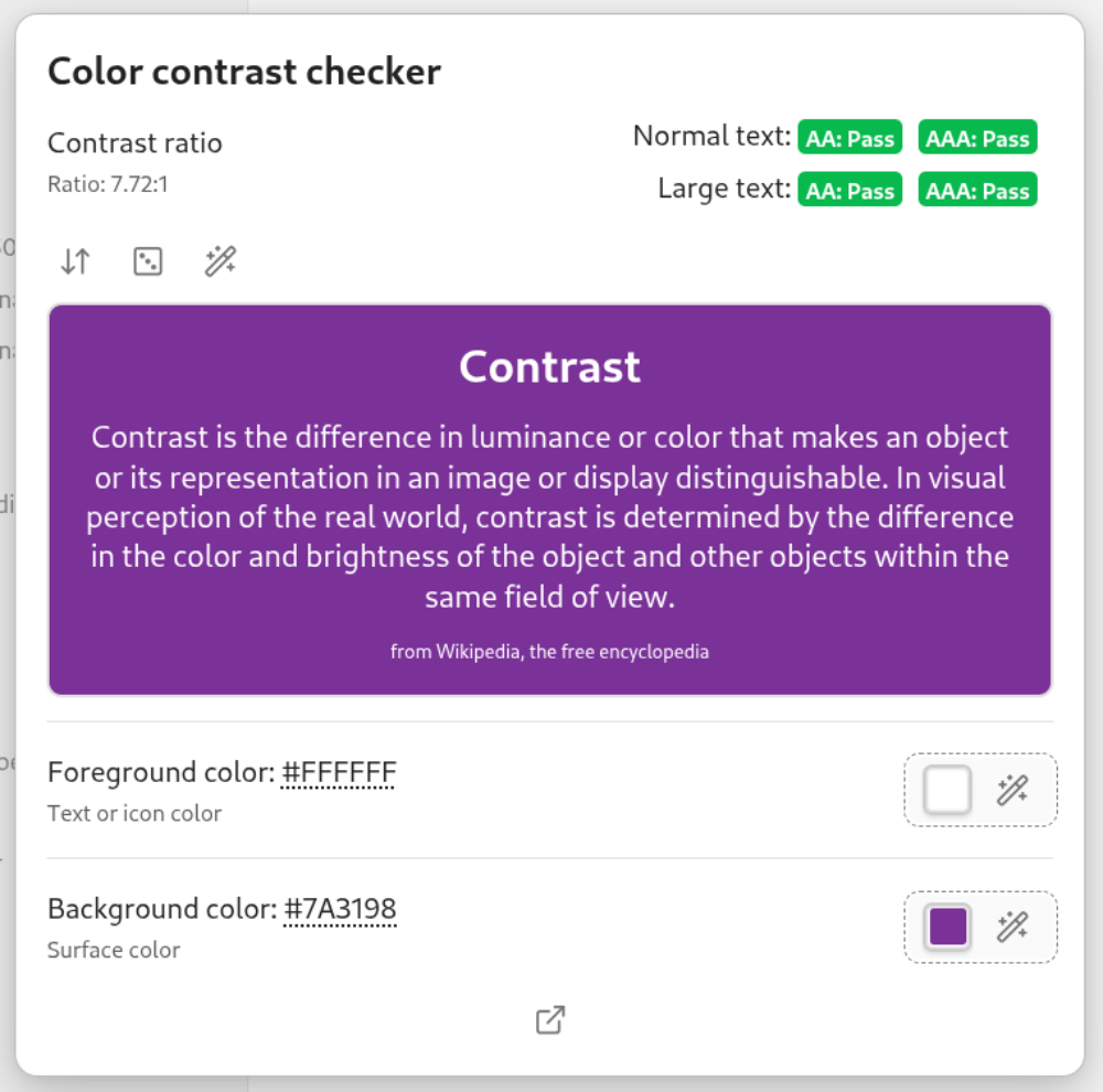
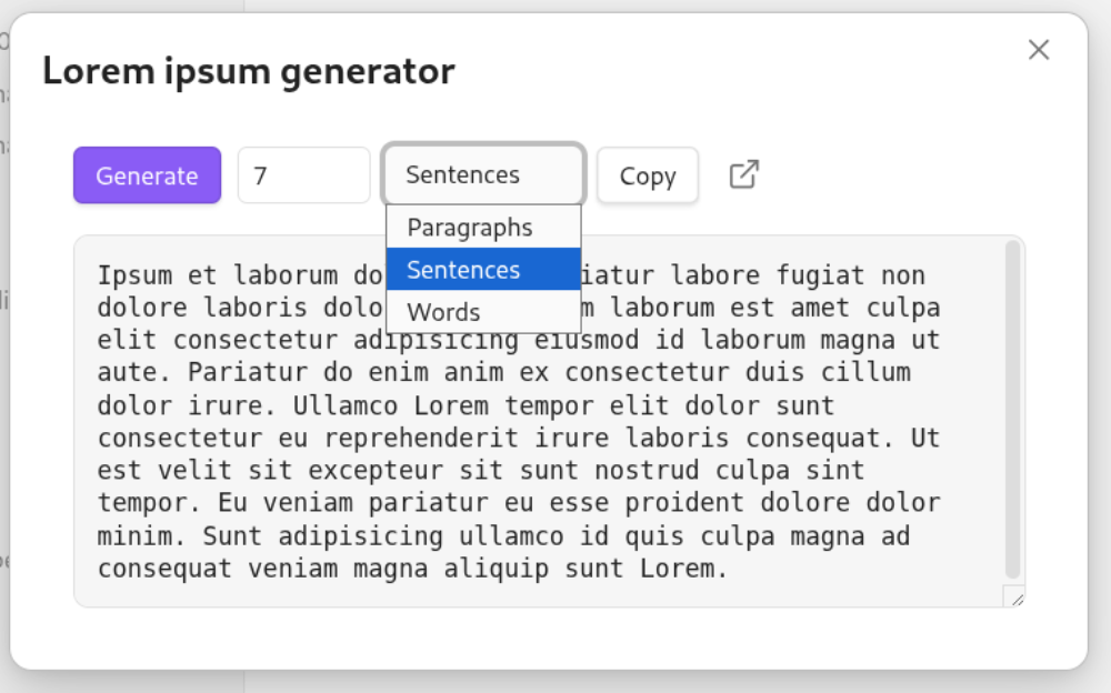
The Style Manager includes a suite of built-in tools designed to streamline the process of theme development and UI debugging within Obsidian. These tools provide developers with quick access to common debugging tasks, accessibility checks, and UI testing utilities, all of which are accessible via the Obsidian command palette.
Note: Tools marked with a
(+)are adapted from the obsidian-theme-design-utilities project.
| Tool | Type | Description |
|---|---|---|
| Color Contrast Checker | Accessibility | Opens a contrast checker modal to ensure color accessibility WCAG standards. Can be expanded to a full tab. |
Lorem Ipsum | Content Generation | Opens a lorem ipsum generator modal for layout and content testing. Can be expanded to a full tab. |
| Copy Accent Color | Utility | Quickly copies the vault's current accent color to the clipboard. |
| CSS Compatibility (+) | Information | Displays the current Chrome, Node, and Electron versions for CSS feature support verification. |
| Box Outline (+) | UI Debugger | Toggles a global outline on all elements to help visualize the box model. |
| Freeze Obsidian (+) | Debugger | Triggers a debugger statement after a specified delay to freeze the application state. |
| Garbled Text (+) | UI Testing | Toggles a garbled text on non-hovered text. |
| Mobile Emulation (+) | UI Testing | Toggles Obsidian's built-in mobile emulation mode to test responsive designs. |
| Test Notice (+) | Testing | Displays a persistent test notice to verify notification behavior and styling. |
| Toggle DevTools (+) | Debugger | Quickly opens or closes the Electron developer tools. |
Command Palette Commands
Style Manager registers several commands in the Obsidian command palette for quick access to various features and utilities.
| Command | Description |
|---|---|
| Apply preset to other device (isolate) | Pushes a preset specifically to a remote device's isolated locker. |
| Apply preset to shared locker | Applies a preset globally across all synchronized devices. |
| Apply preset to this device (isolate) | Applies a preset to only your current device's isolated locker. |
| Change CSS box outline color | Customizes the color of the CSS box outlines tool. |
| Change freeze Obsidian delay | Adjusts the countdown delay before freezing Obsidian. |
| Color contrast checker | Opens the accessibility contrast checker tool. |
| Copy current accent color | Quickly copies the current accent color hex to the clipboard. |
| Freeze Obsidian | Pauses the application state after a set delay for DOM inspection. |
| Import preset | Opens a modal to import presets from files, vaults, or raw JSON data. |
| Lorem ipsum generator | Generates dummy text for layout testing. |
| Obsidian tech stack versions | Displays versions of underlying technologies (Chrome, Node, Electron). |
| Reset current styles | Clears modified settings and returns them to their default values. |
| Save current styles as preset | Saves your currently active layout and styles into a new preset. |
| Set schedule for a preset | Sets up an automated schedule for a chosen preset. |
| Show panel | Opens the main Style Manager view in a workspace leaf. |
| Show readme | Opens the plugin documentation modal. |
| Show test notice | Displays a sample notification for testing purposes. |
| Toggle [Setting Name] | Any class-toggle setting with addCommand: true will create a dynamic command to toggle that specific style setting on/off. |
| Toggle CSS box outlines for debugging | Draws outlines around HTML elements for visualizing the box model. |
| Toggle devtools | Opens or closes the Obsidian developer tools panel. |
| Toggle garbled text | Randomizes text characters for layout testing. |
| Toggle isolate mode | Toggles whether your current device uses isolated or shared settings. |
| Toggle mobile emulation | Switches Obsidian into a simulated mobile view. |
| Toggle snippet | Opens a searchable list of all CSS snippets; selecting one instantly enables or disables it. |
| View active schedules | Opens a modal to manage and view active preset schedules. |
Transparency
I want to be open about my workflow for this project. I personally directed and designed every aspect of the UI and UX. To give myself more time to focus on that creative side, I used Gemma to help speed up the technical groundwork, specifically implementing complex logic, catching syntax errors, and generating my commit messages.
☕️ Buy Me A Coffee
Donations are greatly appreciated and will be used to fund my sanity, and my cats 😼 expensive taste.

For plugin developers
Search results and similarity scores are powered by semantic analysis of your plugin's README. If your plugin isn't appearing for searches you'd expect, try updating your README to clearly describe your plugin's purpose, features, and use cases.