Table Cards
approvedby Maxim Kravtsov
Study Markdown tables as adaptive, all-visible cards with a visual layout editor. - This plugin has not been manually reviewed by Obsidian staff.
Table Cards
Turn Markdown tables into focused, all-visible study cards inside Obsidian. Table Cards is local-first, leaves source notes untouched, and uses the same monochrome workflow on desktop and phone.
What it does
- Builds one deck from any mix of notes, folders, and individual tables.
- Opens straight into the cards once a deck is configured; the picker appears only when several decks exist and none has been studied yet.
- Shows every enabled card block immediately—there is no front/back reveal state.
- Searches every cell in the active scope and opens the exact matching source row as a card.
- Provides a visual, draft-based layout editor with desktop and phone previews.
- Works without telemetry, runtime translation, or an application network client.
Install
Copy these three release artifacts into .obsidian/plugins/table-cards/ in your vault:
main.js
manifest.json
styles.css
Then enable Table Cards in Settings → Community plugins. Obsidian 1.6.7 or newer is required. User settings live separately in data.json; the deploy script copies only the three runtime artifacts above.
First run
A fresh install opens a three-step setup wizard once. It starts from the note you have open when that note holds a table, and the file picker lists notes containing tables first:
- Data — add one or more Markdown notes or folders, then choose all tables or an explicit subset.
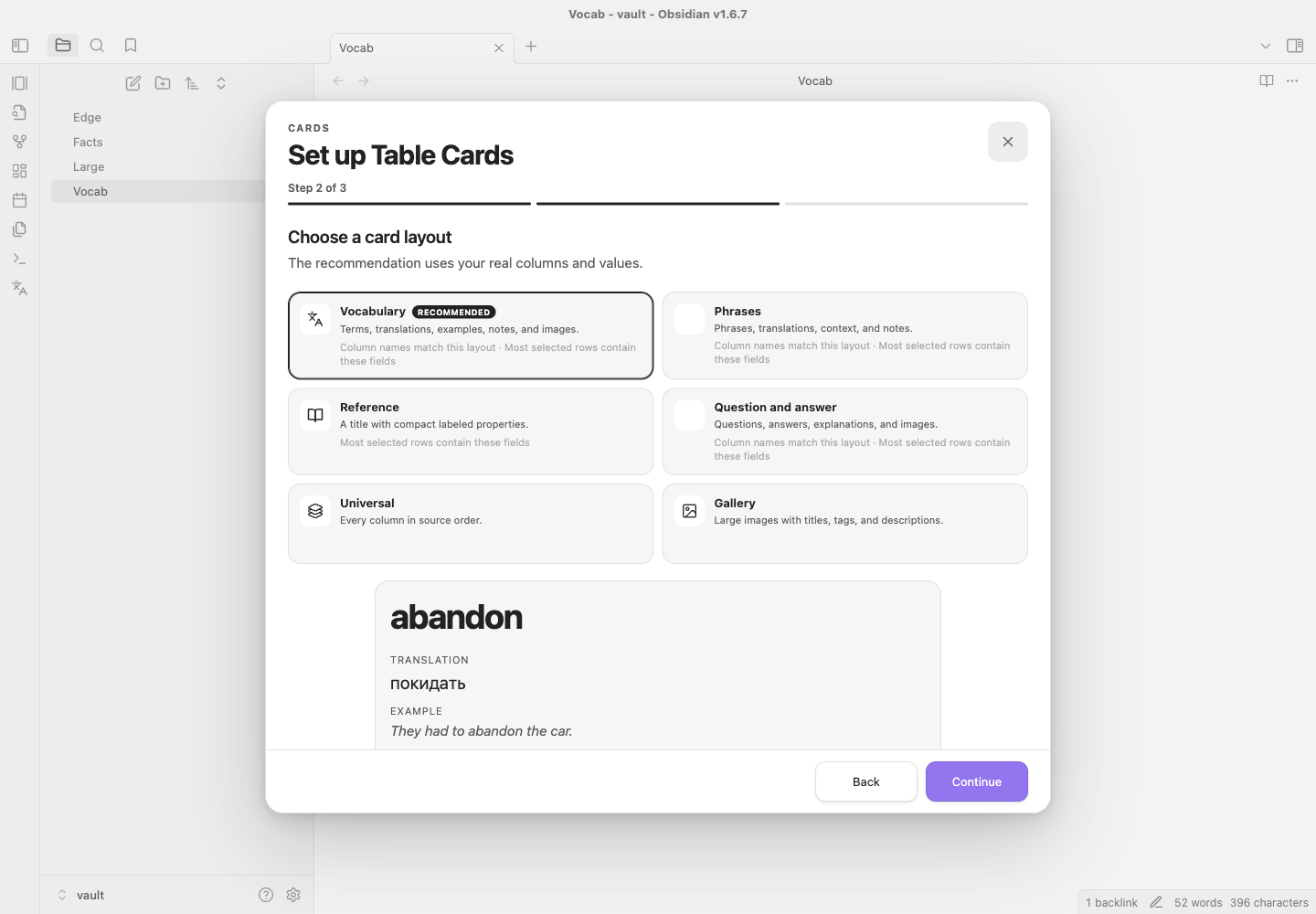
- Preset — compare six layouts against a real representative row. The scorer recommends one from Vocabulary, Phrases, Question and answer, Gallery, Reference, and Universal.
- Finish — name the deck, choose a ribbon icon, and decide whether to show the deck in Obsidian's left ribbon.
The wizard is deliberately compact; every preset produces ordinary editable blocks rather than a separate rendering mode. To run it again, use Create deck with setup in the command palette or the same action in Settings → Table Cards. Existing decks are not replaced.
Start a study session
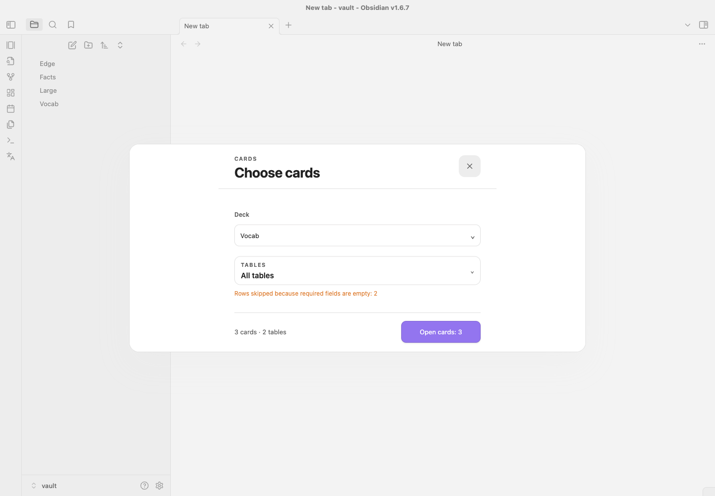
Run Open cards. A configured deck opens immediately with its remembered table scope. The picker appears only when it has a real question to ask — several decks and none studied yet — and there you pick a deck, review its scope, and confirm Open N cards; clearing every table disables the start action.
A deck-specific ribbon button opens the same launcher with that deck locked, straight into the cards. When several decks are enabled, the deck name in the session header is a button that returns to the picker.
During study:
- use Previous/Next,
←/→, or a horizontal swipe; - press
Sto toggle shuffle; - select the scope chip to change tables without rescanning the vault;
- open the card browser to search all active table cells — it opens on its search field, and
Enteropens the top match; - choose a result to open that exact card with its file, table label, and row context;
- tap an enabled image to zoom it.
The source line under each card stays secondary and uses the human table heading plus file name. Problems are named rather than counted: a renamed or deleted note reads as a missing source, and decks follow notes that the vault renames or moves.
Visual editor
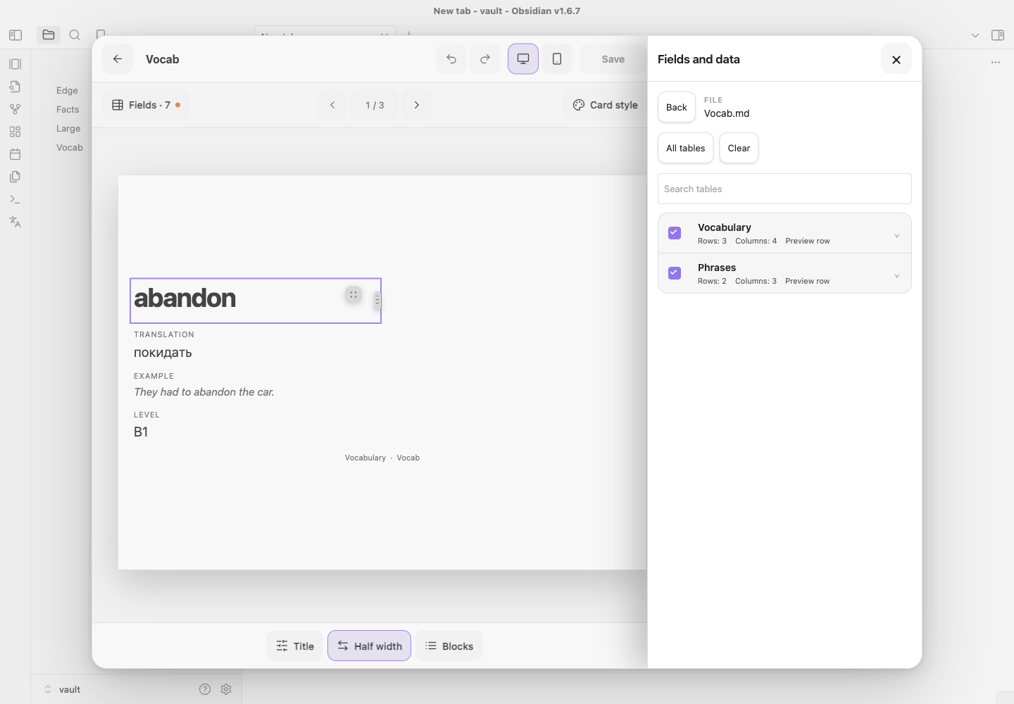
Open Settings → Table Cards → Edit layout.
- Layout for — a deck that holds more than one table gets a layout switch above the canvas. All tables edits the shared deck layout; picking a single table gives it its own blocks, built from that table's own columns. The switch appears only when a deck actually holds several tables, and on All tables it says how many of them already carry a layout of their own and offers to give the rest one in a single action. The fields sheet names the tables each column comes from.
- Sources — add notes or folders, see each source's compact selection summary, and enter a focused multi-table route with search, all/none actions, row previews, and Open this table.
- Fields — inspect inferred types, fill rates, examples, and warnings; type overrides remain deck-specific.
- Canvas — select rendered blocks directly. Drag on desktop or use accessible move actions on touch and keyboard.
- Block — configure columns, kind, label, width, phone density, height, overflow, empty values, image behavior, colors, border, and alignment.
- Card style — use Obsidian, monochrome, or custom colors and tune spacing, type scale, radius, border, shadow, and maximum width.
Source selection, automatic layout, and visual changes remain one local draft until Save. Undo/redo and Cmd/Ctrl+Z work inside the editor; Cmd/Ctrl+S saves. Closing a dirty editor offers Save, Discard, or Continue editing.
Data, empty cells, and images
Editing a table keeps working on the deck built from it: adding, renaming, or removing a column re-identifies the table inside its note instead of dropping it, and the saved table scope follows. A table that genuinely disappears is reported as missing rather than silently replaced.
Columns are detected as text, number, date, boolean, tags, link, Markdown, image, or mixed. Each block can hide an empty value, show a dash or custom text, preserve space, fall back to another column, or skip the complete row when required.
Obsidian embeds such as ![[image.png|300x200]] and Markdown images are supported. Image blocks provide contain/cover, aspect ratio, crop focus, captions, missing-file state, and optional tap-to-zoom. Local files resolve through the vault. A remote URL already present in source Markdown is passed to the standard image element; Table Cards itself adds no image service or network client.
Phone, keyboard, and RTL
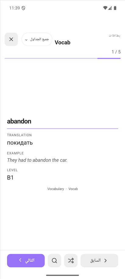
Phone uses one card column, full-height selection/browser sheets that can be pulled down by their grab handle, search beside shuffle in the thumb row, safe-area-aware footers, and controls at least 44×44 CSS px. Long content stays inside the card or its configured scrolling block and never creates document-level horizontal overflow. Reduced-motion preferences remove interface transitions.
Layout decisions follow height as well as width. A short viewport — a phone held sideways, or a squat desktop window — keeps compact chrome and a side panel instead of a bottom sheet, so the card stays visible while a panel is open. Card rows are sized by their own content and the card scrolls when it outgrows the window, instead of squeezing rows until text lands on the next block.
The UI supports English, Russian, Ukrainian, Spanish, German, French, Brazilian Portuguese, Italian, Polish, Turkish, Simplified Chinese, Traditional Chinese, Japanese, Korean, Arabic, and Hindi. Automatic mode follows Obsidian's locale; manual selection uses native language names. Arabic mirrors only Table Cards chrome. User-authored table content keeps dir="auto" and its natural direction.
Migration and privacy
Schema-v1 and schema-v2 settings migrate idempotently to schema v3. Deck IDs, file/folder sources, selected table, block order and visibility, appearance overrides, progress, shuffle seed, locale, and the last active deck are preserved. Migrated users are not interrupted by first-run setup.
Table Cards never rewrites Markdown tables or inserts hidden row IDs. Cards and source identities are derived in memory from the vault content. There is no telemetry, cloud sync, runtime translation, or remote content processing.
Intentional limits
- No external deep links to a Markdown row, because rows have no stable native ID.
- No spaced repetition, scoring, or statistics.
- No editing of Markdown cells from a card.
- The browser mounts at most 100 matches while still reporting the full result count.
Architecture and development
The plugin is TypeScript with small boundaries for table scanning/cataloguing, scope/search state, setup presets, typed i18n catalogs, launcher/study coordination, and editor routes. English is the canonical translation contract; all 16 catalogs are checked for exact key parity. Runtime code uses public Obsidian APIs and contains no Node or Electron import.
npm install
npm test
npm run test:tools
npm run lint
npx tsc --noEmit
npm run typecheck:tools
npm run build
npx playwright install chromium
npm run test:ui
npm run test:obsidian
npm run check:links
npx playwright install chromium is a one-time browser setup for a clean checkout.
npm run test:ui drives the static fixtures in preview/launcher.html, preview/setup.html, preview/v2.html, and preview/editor.html. They are a design mock: they exercise the stylesheet and the interaction patterns, not the plugin bundle. That gate covers desktop, tablet, zoom-equivalent, phone, Arabic RTL, reduced motion, focus restoration, target geometry, overflow, and console output.
npm run test:obsidian covers the plugin itself. It builds a throwaway vault under .obsidian-harness/, installs the freshly built artifacts into it, launches the installed Obsidian desktop app with a remote debugging port, and drives the real plugin over CDP: command and ribbon registration, editor shell geometry, panel chrome against Obsidian's own stylesheet, block placement and width dragging, wizard copy, and study navigation. The suite skips itself when no Obsidian binary is present, and OBSIDIAN_APP points it at any build.
TABLE_CARDS_AUDIT=1 npm run test:obsidian -- defects.spec.ts is the layout audit. It walks every surface — session, card search, table picker, launcher, editor with all four panels, and the setup wizard — across the eight supported viewports, and again in Arabic on the three shapes that matter most, and fails on a control that leaves the screen, text clipped without an ellipsis, a layout that scrolls sideways, boxes that overlap, content that escapes its parent, an unnamed control, or a control too small to hit. TABLE_CARDS_AUDIT=1 npm run test:obsidian -- audit.spec.ts writes the same surfaces to artifacts/audit/ in both themes for a human to look at.
See the changelog and UX/accessibility audit. Version 0.1.0 is the first complete release and already uses the schema-v3 product model; schema version and package version are intentionally independent.
For plugin developers
Search results and similarity scores are powered by semantic analysis of your plugin's README. If your plugin isn't appearing for searches you'd expect, try updating your README to clearly describe your plugin's purpose, features, and use cases.