Zeraphim
unlistedby Zeraphim
Zeraphim



Turquoise and teal. Light and dark. Same palette, everywhere I work.
Most themes give you somebody else's colours. This one is the palette from my own site — the "Faceted Clarity" design system behind jcdiamante.com — and it already runs my Zed and VS Code editors. Now it runs my notes too.
Deep navy canvas, turquoise accents, and a light variant that is not the dark
one with the lightness flipped. Every colour role was re-derived for a
paper-white ground, because a turquoise that sings on #060a13 is illegible on
#ffffff.
What it does differently
The palette is the reason to install it. These are the reasons to keep it.
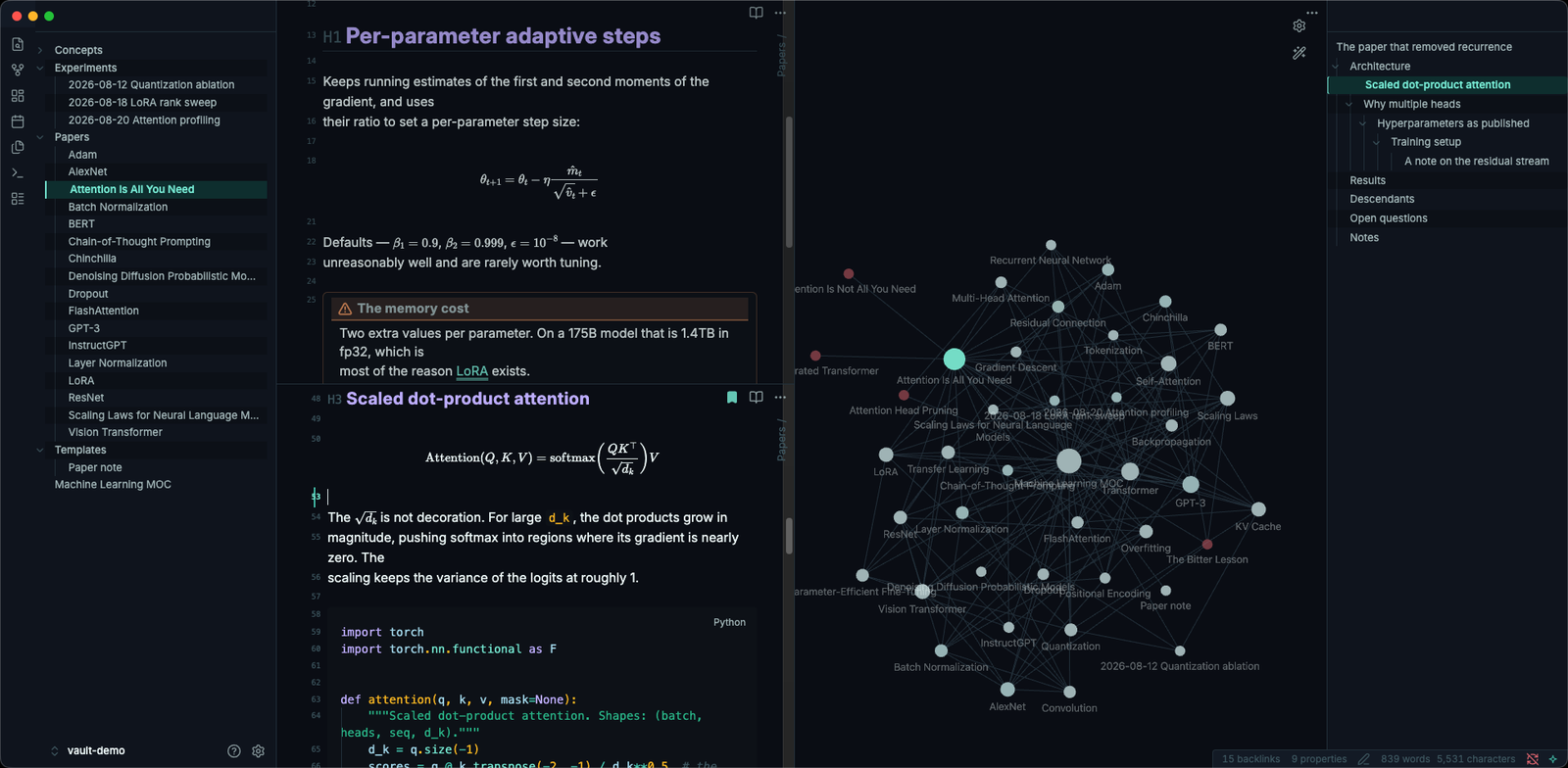
The tab bar disappears when there is one tab. A tab bar with a single tab is a label for the thing already filling your screen. The inline title does that job better, and you get the row of vertical space back.
The view header is rotated onto the right edge. The per-tab header duplicates the tab bar, the inline title, and the window title — three ways of telling you the same filename, and a full row of chrome on every pane. Here the breadcrumb stands up along the right edge, where it costs nothing vertically and still tells you which folder you are in.
Markup fades until you edit it. Heading hashes, list markers, emphasis
asterisks and link brackets sit at --text-faint — until your cursor lands on
the line, at which point they turn turquoise. In Source Mode, raw URLs collapse
to a small url marker so a link does not swallow its own line.
Headings alternate between two hues. Odd levels take lavender, even levels turquoise. Two colours cycling gives you six distinguishable heading levels without six font sizes, so a deeply nested note stays scannable instead of turning into a poster.
Search matches are ringed, not filled. A filled highlight puts a bright block behind the exact word you are trying to read.
Sidebar headers shrink to a sliver until you point at them. With a 180 ms delay, so they do not flash open as the pointer crosses the window.
Inactive panes dim, the focused one gets an accent rule. In a split, you can see where the cursor is without looking for it. Skipped entirely when there is only one pane.
Every one of these is a toggle. If you want plain Obsidian chrome with these colours, turn them all off — see Style Settings.
Palette
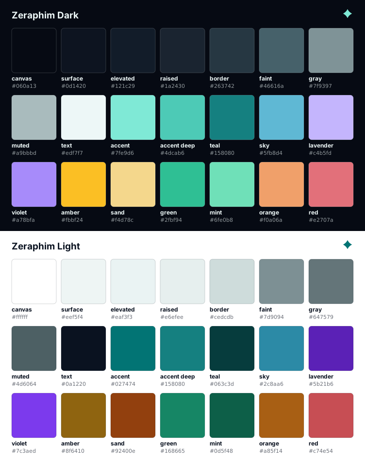
| Role | Dark | Light |
|---|---|---|
| Canvas | #060a13 | #ffffff |
| Surface | #0d1420 | #eef5f4 |
| Body text | #edf7f7 | #0a1220 |
| Accent | #7fe9d6 | #027474 |
| Hover / emphasis | #5fb8d4 | #0f6d8a |
| Tags, inline code | #fbbf24 | #8f6410 |
| Alternate headings | #c4b5fd | #5b21b6 |
Install
From the Obsidian theme store
- Settings → Appearance → Themes: Manage
- Search for Zeraphim
- Install and use
Manually
cd /path/to/YourVault/.obsidian/themes
git clone https://github.com/Zeraphim/obsidian-theme.git Zeraphim
For development
git clone https://github.com/Zeraphim/obsidian-theme.git
cd obsidian-theme
./tools/install.sh /path/to/YourVault --with-test
Symlinks the repo into the vault so ./build.sh is the whole edit loop, and
drops in a note that exercises every feature. See
PUBLISHING.md for the rest.
Then in Obsidian: Settings → Appearance → Themes → Zeraphim. If it does not appear, run Reload app without saving from the command palette.
The folder name must contain theme.css and manifest.json at its top level.
Anything else in the folder is ignored by Obsidian.
Style Settings
Every behaviour above is a switch, but you need the Style Settings plugin to reach them. Install it, then open Settings → Style Settings → Zeraphim.
Grouped into: Colour (canvas depth, highlight hue, uncoloured emphasis), Typography (four font stacks, heading scale and spacing, heading treatments), Layout (note width, tab width, square corners), Focus (active-line mode, pane dimming, URL folding), Show hidden interface (bring back anything the theme removes), Sidebars, Status bar, Images, and Motion and plugins.
Two are also bound to the command palette, so you can put them on a hotkey: Full-width notes and Scale images down.
Canvas depth
Three grounds for dark mode, because "dark" is not one thing:
| Canvas | For | |
|---|---|---|
| Standard | #060a13 | The intended look — deep navy |
| Deep | #000000 | OLED displays, maximum contrast |
| Soft | #0d1420 | Bright rooms, long sessions |
Fonts
None are bundled — that keeps theme.css around 60 KB instead of 600 KB, and
means the theme ships no font licences. The defaults ask for Inter and
JetBrains Mono and fall back to system faces, so it looks right out of the box
and better if you have those installed. All four stacks (body, interface,
headings, code) are editable in Style Settings.
Building from source
theme.css is generated. Edit files under source/ instead — they are
numbered so that concatenating them in path order produces a valid cascade.
./build.sh              # readable build, this is what is committed
./build.sh --minify     # minified, what CI ships in releases
python3 validate.py     # check the sources before you commit
validate.py catches the two failure modes CSS will not tell you about: a
custom property that is read but never defined, and a Style Settings control
whose id matches no selector — a switch that silently does nothing.
To regenerate the banner, palette sheet and store screenshot:
python3 tools/make_assets.py # needs Pillow for the PNG
assets/screenshot.png is a real capture, not generated — running the script
will not overwrite it. To re-crop a new capture to the 512×288 the store wants,
see tools/SCREENSHOTS.md.
Compatibility
Obsidian 1.5 or later, desktop and mobile. The theme leans on :has() and CSS
nesting, both of which need the Chromium in Obsidian 1.5+.
On mobile, the hover-driven parts are switched off — they mean nothing on a touchscreen — and the theme is the palette plus the typography.
Credits
The palette is mine. The interaction design owes a real debt to Shimmering Focus by Chris Grieser, which is where I first saw a tab bar that knew when to leave. The ideas are his; the code and colours here are not.
License
MIT — see LICENSE.
For plugin developers
Search results and similarity scores are powered by semantic analysis of your plugin's README. If your plugin isn't appearing for searches you'd expect, try updating your README to clearly describe your plugin's purpose, features, and use cases.