Zoomable Reader
approvedby Yi Yang
Read any note on a pan-and-zoom board. Pinch to zoom on mobile, Ctrl and wheel on desktop, drag to pan. Handy for wide diagrams, tables and screenshots. - This plugin has not been manually reviewed by Obsidian staff.
Zoomable Reader
两种读法:版面(跟随主题行宽)与白板(一整张 1280px 宽的版面)。 手机上双指捏合,桌面按 Ctrl 滚轮,拖动即平移,往下滑就是往下读。
Read any note on a pan-and-zoom board. The whiteboard mode renders the whole note as one 1280 px page (a desktop web content width) on a surface you can pinch, drag and scroll — no cards, no columns, just a wide sheet of paper you read downwards.

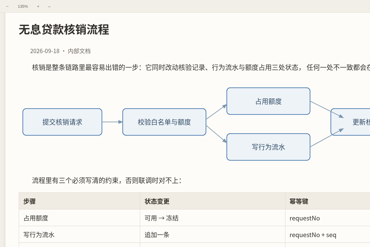
中文速览
-
阅读视图(Obsidian 自带的页面)也能改宽度、也能缩放:默认把版心放宽到 900px, 字号缩放默认 100%(60%~200% 可调)。手机上在阅读视图里双指捏合、桌面按 Ctrl+滚轮 就能自己调;命令面板还有「阅读视图放大 / 缩小 / 复位到 100%」。只看两条注入样式, 你的主题文件一个字节都不动;缩放是重排(字变大、版心宽度不变),不是把整页拉变形。
-
白板模式:把整篇笔记渲染成一张 1280px 宽的版面(网页版心宽),放在可平移、缩放、 往下滑的板子上 —— 没有卡片、没有分栏,往下滑就是往下读。宽度可调(设置 → 白板模式 → 白板版面宽度;想按纸的感觉就选 560 = A5、794 = A4)。每次进白板都重新编译一遍, 笔记改了白板跟着变(只读,不落盘)。
-
双指捏合在哪:设置页第一组就是 手势与缩放 → 双指捏合缩放(还有一张「手势速查」表)。 手机上要能缩放,必须用本插件的视图打开笔记(侧边栏放大镜图标、命令面板、或文件列表长按 →「编译成白板」)—— Obsidian 自带的阅读视图无法缩放,这是应用层限制,任何主题都改不了。
-
设置页中英对照:每一项都是「中文 / English」,并且能进 Obsidian 1.13+ 的设置搜索 (打「双指」或 pinch 都能直接跳到那一项)。
-
放大按钮默认在左上角:右上角是 Obsidian 自己的「编辑源文件 / 更多选项」入口,按钮贴在那儿 会把它盖住。想放回右上角:设置 → 图片与图表查看器 → 放大按钮的位置。
-
手机上也看得见这个放大按钮:触屏没有悬停,所以它常驻显示、不再靠鼠标指到才亮(视觉 34px, 触区约 46px —— 手指按不准也点得到)。点这个 icon 就放大,不必去点图片本身(图片边缘容易点空)。
-
放大查看就是高清:查看器按「1 个源像素 = 1 个设备像素」摆放 —— 读数显示 100% 时,你看到的就是 原图分辨率(DPR 3 的手机上,一张 1600px 的截图摆成约 533 CSS px,而不是 1600 CSS px)。 打开时也不会为了「适配」把小图拉大:放大是插值,插值就是糊。
Why this exists
Obsidian's reading view cannot be pinch-zoomed on mobile, and no theme can change that: the app
runs in a WebView whose zoom is a native, app-level switch (Capacitor's zoomEnabled, off by
default), plus a user-scalable=no viewport declaration. CSS cannot reach either one.
A plugin can. Zoomable Reader opens the note in its own view, renders the Markdown into a transformable layer, and handles the gestures itself — so pinch-to-zoom finally works on a phone, and wide tables, diagrams or screenshots can be read at 1280 px instead of being squeezed into a 700 px column.
Usage
- Open a note, then run Zoomable Reader: 打开当前笔记 / open the active note from the command palette, or click the zoom-in icon in the ribbon. On mobile you can also long-press a file in the file list and choose 编译成白板 / open as a whiteboard.
- Gestures:
| 手势 / Gesture | 手机 / Mobile | 桌面 / Desktop |
|---|---|---|
| 平移 Pan | 单指拖动 one-finger drag | 拖动 drag, wheel, trackpad |
| 缩放 Zoom | 双指捏合 two-finger pinch | Ctrl / ⌘ + wheel |
| 放大到 200% | 双击 double tap | 双击 double click |
| 放大 / 缩小 / 复位 | 工具条按钮 toolbar | 工具条, + - 0 |
| 适配宽度 Fit width | 工具条「适配宽度」 | 同左 |
- The toolbar has zoom out, the current zoom level (click it to reset), zoom in, fit width, reset, and the mode switch (page ⇄ whiteboard). In whiteboard mode there is also a 重新编译 / recompile button.
Notes:
- 版面模式 follows your theme's line width (
--file-line-width, usually 700–760 px) and never exceeds the viewport — it looks exactly like your reading view, only zoomable. - 白板模式 uses its own width (default 1280 px) and does not shrink to fit: on a phone you pan and pinch, or hit 适配宽度 to see the whole page width at once and then just scroll down.
- Zoom and position are remembered per note and per mode, and are dropped when the page width
changes (a saved camera is only meaningful for the geometry it was taken in). Everything is stored
in this plugin's own
data.jsoninside your vault. - The view is a board, so dragging pans instead of selecting text. Use the normal reading view when you need to select or edit text.
- The zoom button is always visible, on touch too. In 1.3.9 and earlier it was hidden entirely on
touch devices (
@media (hover: none) { display: none }) in favour of "just tap the image" — which meant tapping near an image edge often missed. It is now 34 px visually with a ~46 px tap area, and tapping it opens the viewer for that image or diagram (tapping the image still works). - The viewer shows images at their real resolution. The probe is laid out at
naturalWidth / devicePixelRatio, so 100 % is 1 source pixel = 1 device pixel — on a 3× phone a 1600 px screenshot sits at ~533 CSS px instead of being stretched over 4800 physical pixels. Opening a small image never upscales it (fit is capped at 100 %), and the canvas no longer carrieswill-change: transform, which used to pin the rasterization scale and turn zooming into bitmap stretching.
Whiteboard mode: one 1280 px page
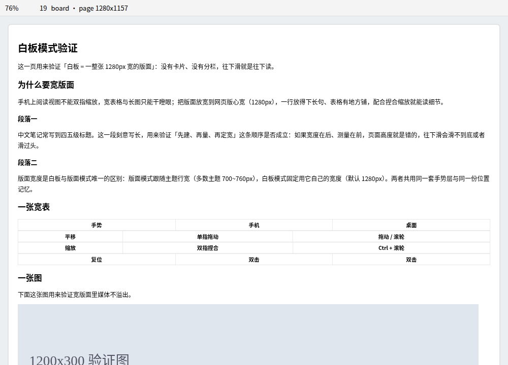
- One page, not a pile of cards. The whole note is rendered into a single page element; there is no card, no column, no connector, and no per-section box. Its width is the setting (1280 px by default), so a wide table, a Mermaid diagram or a 4K screenshot has room, and long Chinese lines stop wrapping early.
- Reading is vertical. Scrolling down is reading down; on a phone you can either pan around at 100% (readable text) or press 适配宽度 / fit width to bring the whole page width into the viewport and scroll only downwards.
- A view, recompiled every time. Entering whiteboard mode compiles the note again from scratch — reading the live editor text when the note is open in a pane, so unsaved edits show up — and it recompiles again when the note changes (a save, or typing in another pane, throttled to 400 ms). Nothing is written back; the toolbar's 重新编译 / recompile button forces a refresh.
- Paper presets if you want them. The width slider names the classic measures: 1280 px (网页宽 Web, the default), 560 px (A5, 148 mm) and 794 px (A4); the readout shows millimetres so the choice is obvious.
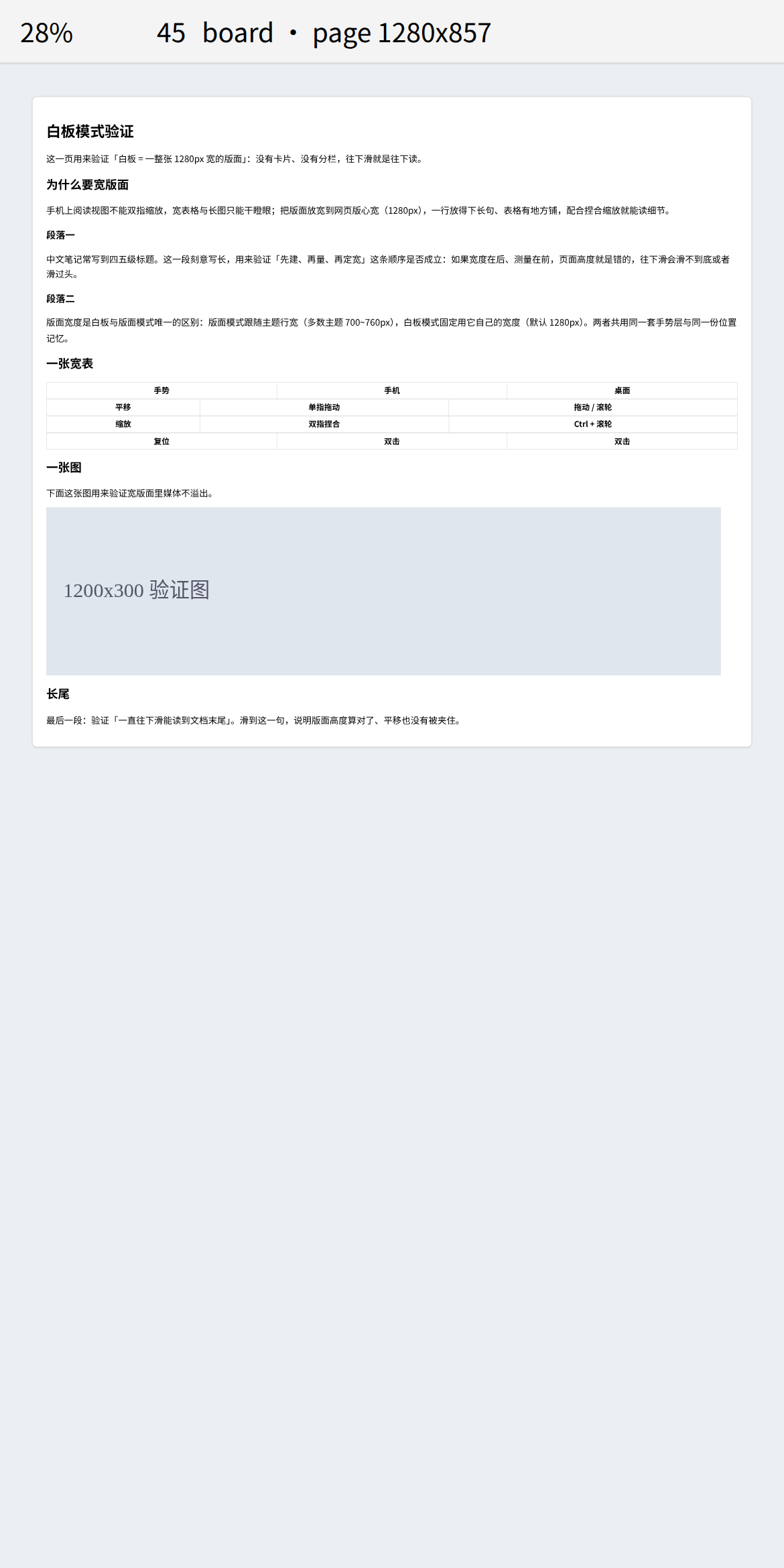
Whiteboard settings: 打开笔记时的默认模式 / default mode, 白板版面宽度 / whiteboard page width (480–1920 px, default 1280 px).
Reading view: line width and zoom
The reading view is Obsidian's own page, so the plugin does not take it over — it changes two CSS properties of it and leaves your theme files untouched:
- Line width (default 900 px, options 760–1200 px or 跟随主题 / follow the theme). The
plugin sets
--file-line-width/--line-widthon.markdown-reading-viewand adds amax-widthfallback on the sizer, so it works with themes that hard-code the width. Choose follow the theme and nothing at all is injected. - Zoom (60 %–200 %, default 100 %). Applied as CSS
zoom, which reflows: the text grows while the measure stays exactly the line width you chose (the sizer width is divided by the zoom factor). It is not a transform, so nothing stretches or overflows sideways. - Gestures: pinch inside the reading view on mobile, or Ctrl / ⌘ + wheel on desktop. Only two-finger pinches and Ctrl+wheel are intercepted — one-finger scrolling, taps and the plain wheel stay with Obsidian. Pinches outside the reading view are ignored, and switching the gesture setting off removes the listener entirely.
- Images and diagrams fill the line width (default) and are scaled keeping their aspect ratio —
no cropping, no stretching, and an explicit
![[image.png|300]]is normalised too. Diagrams matter as much as photos here: themes setflowchart.useMaxWidth: false(so boxes follow the text), which makes Mermaid render at its natural width; the plugin pulls it back to the line width, so on a phone a flow chart is one screen wide and double-tap opens it for detail. Switch the policy to fit within the line width or natural size if you prefer the old behaviour. - Mobile: double tapping no longer opens the editor — anywhere in the reading view. Obsidian's reading view uses a double tap to enter editing, which is the easiest gesture to trigger by accident while reading, so the plugin intercepts it across the whole reading view (text as well as images). Use the menu button when you really want to edit. Double tapping an image or diagram opens the zoomable viewer instead. Desktop is deliberately untouched.
- A self-check switch (手机:双击自检) makes every intercepted double tap show a notice saying what was caught and whether the viewer opened — the fastest way to tell whether a problem lives in the plugin or in the host.
- Commands: 阅读视图放大 / 阅读视图缩小 / 阅读视图复位到 100% — bind them to hotkeys if you prefer buttons. Each shows the new level in a notice.
Why this works where the WebView does not: the app-level pinch zoom is a native switch we cannot reach, but the page's own CSS is ours — and CSS
zoomreflows content instead of scaling a bitmap, which is what you want for text.
Privacy and disclosures
- No network access. This plugin makes no HTTP requests and loads no remote assets.
- No telemetry. Nothing is collected, and nothing leaves your device.
- No access outside your vault. The plugin only reads notes through Obsidian's own vault API.
- The only data it writes is
data.jsonin this plugin's folder (your zoom levels and positions). - No ads, no accounts, no payment.
Settings
Every setting is labelled in Chinese and English, grouped by what it does, and indexed for Obsidian 1.13+ settings search — typing 双指 or pinch jumps straight to the two-finger switch.
| 设置 / Setting | 默认 / Default | 作用 / What it does |
|---|---|---|
| 双指捏合缩放 / Two-finger pinch zoom | on | The mobile zoom gesture. Off: two fingers only pan with their midpoint |
| 捏合灵敏度 / Pinch sensitivity | 1x | 1x doubles the zoom when the finger distance doubles |
| 双击放大倍数 / Double-tap zoom | 2x | How far a double-click or double-tap zooms in |
| 最大放大倍数 / Maximum zoom | 64x | Upper limit for pinch and wheel zoom |
| 阅读视图版心宽度 / Reading view line width | 900 px | Obsidian's own reading view; 跟随主题 injects nothing |
| 阅读视图缩放 / Reading view zoom | 100% | Reflows (text grows, line width unchanged); pinch or Ctrl+wheel |
| 阅读视图手势缩放 / Reading view zoom gestures | on | Pinch inside the reading view / Ctrl+wheel; the plain wheel and one-finger scroll are untouched |
| 阅读视图图片/图表宽度 / Image & diagram width | 撑满版心 fill | Scale images and diagrams (Mermaid/Excalidraw/charts) to the line width; or fit-within / natural |
| 手机:双击不进编辑 / Mobile: double tap does not open the editor | on | Anywhere in the reading view (text and images). Use the menu button to edit |
| 手机:双击图片 = 放大查看 / Mobile: double-tap an image to zoom | on | Opens the zoomable viewer from an image or diagram |
| 手机:双击自检 / Mobile: double-tap self-check | off | Shows a notice for every intercepted double tap (diagnostics) |
| 打开笔记时的默认模式 / Default mode | 版面 page | 版面 page (theme line width) or 白板 whiteboard (1280 px page) |
| 显示工具条 / Show toolbar | on | Zoom buttons, zoom level, fit width, mode switch |
| 版心四周留白 / Page padding | 16 px | Gap between the page and the edge of the view |
| 白板版面宽度 / Whiteboard page width | 1280 px(网页宽 Web) | 1280 = desktop web width; 560 = A5, 794 = A4 for a paper feel |
| 放大按钮的位置 / Zoom button corner | 左上 | 左上 or 右上 — the top-right belongs to Obsidian's own controls |
| 放大按钮常驻显示 / Always show the zoom button | on | Off: the button only appears on hover |
| 点击图片打开可缩放查看器 / Click images to open a viewer | on | Full-screen image viewer |
| 点击图表打开可缩放查看器 / Click diagrams to open a viewer | on | Same viewer for Mermaid, Excalidraw, charts |
| 点图片本身也打开查看器 / Open the viewer by clicking images too | off | On: a plain click on an image opens the viewer |
| 查看器打开时适配窗口 / Fit to window when the viewer opens | on | Off: images open at 100% |
| 图表框随文字走 / Wider diagram boxes | on | Raise Mermaid's 200 px label cap so Chinese labels stop folding |
| 标签最大宽度 / Max label width | 460 px | How wide a label may get before it wraps |
| 记住每篇笔记的缩放与位置 / Remember zoom and position | on | Per note and per mode, stored locally |
| 清除已保存的缩放与位置 / Clear saved zoom and positions | — | Forgets every note's saved zoom |
Image viewer
Every image and diagram carries a small button — by default in its top-left corner, because the top-right corner is where Obsidian puts its own 编辑源文件 / edit source and more-options controls, and the button used to cover them. Move it back in the settings if you prefer.
- Zoom: mouse wheel with Ctrl or Cmd, the toolbar buttons,
+-0, or a two-finger pinch on mobile. - Pan: drag. Double-click (or double-tap) toggles between 100% and fit.
- Close:
Esc, thexbutton, or a click on the empty background. - The toolbar shows the real size and the size currently on screen, so you can tell when you are at 100% of a 4K screenshot.
- Nothing is decorated: images are shown as they are, and diagrams keep their transparent background with solid lines and text — the same look as in the note, only bigger.
- A diagram in the viewer looks like the diagram in the note, not merely similar: the moved
node keeps its
.mermaidancestry, so the theme's text styles still apply, and its size is pinned to the size it had in the note — no silent rescale, so labels do not reflow.

Diagram layout: boxes follow the text
Mermaid caps a label at flowchart.wrappingWidth = 200, so a long Chinese label folds into four
or five narrow lines. PlantUML does the opposite — a box grows to fit its text and only wraps where
the author breaks a line — and that is the look this plugin brings to Mermaid:
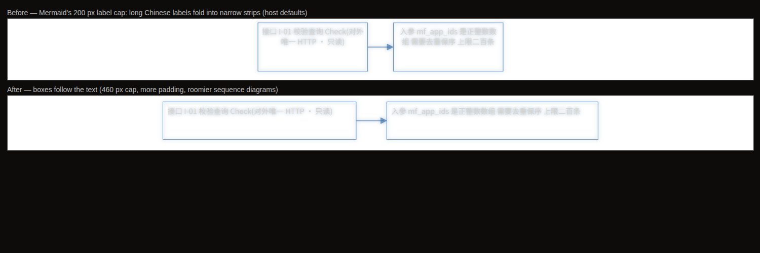
- Max label width (default 460 px) replaces Mermaid's 200 px cap. A 46-character label goes from four lines in a 215 px box to two lines in a 478 px box.
- More padding and spacing — the box interior (15 px → 18 px), node and rank spacing, and roomier sequence diagrams (participant margin 50 px → 60 px).
- It is a rendering parameter, not styling: CSS cannot reach the layout engine, which is why this lives in the plugin rather than in the theme.
- Your host's own settings are left alone.
mermaid.initialize()replaces nested config objects instead of merging them, so passing a partial config would drop Obsidian'sthemeVariables.fontFamily: var(--font-mermaid)and send Chinese text back to Mermaid's defaulttrebuchet ms. The plugin reads the live config first, merges on top of it, and hands the whole thing back. - Mermaid loads lazily, so the plugin retries until it appears and re-checks on
layout-change. Diagrams already open pick the new layout up the next time they render. - Turn it off in the settings if you prefer Mermaid's own sizing.
Installation
From the community directory (after this plugin is published): Settings → Community plugins → Browse → search for "Zoomable Reader".
Manually
- Download
main.js,manifest.jsonandstyles.cssfrom the latest release. - Put them in
<your vault>/.obsidian/plugins/zoomable-reader/. - Enable Zoomable Reader in Settings → Community plugins.
Development
npm install
npm run dev             # esbuild watch → main.js
npm run typecheck       # tsc --noEmit
npm test                # vitest: zoom math, settings contract
npm run verify:gestures # real Chromium: wheel, Ctrl+wheel, drag, pinch, double-tap, button corner
npm run verify:board    # real Chromium: whiteboard width, gesture invariants, no-card regression
npm run verify:reading  # real Chromium: reading view line width, reflow zoom, pinch/Ctrl+wheel
npm run build           # production bundle
npm run check           # everything above, in order
Nothing about the gestures is taken on faith: verify:gestures drives a real Chromium with
mouse.wheel, pointer drags and CDP-synthesised touch events, and asserts the anchor invariant —
the content under your finger must not move while zooming. verify:board asserts the whiteboard
from the DOM: the page really is 1280 px wide by default (read from the shipped settings data,
not a number copied into the test), the page mode really follows the theme line width, one page
element and zero card artifacts exist in the source, the bundle and the live DOM, wheels scroll to
the very end of the document, and fit-width brings the whole page inside the viewport.
Repository layout:
main.ts               plugin entry: view registration, commands, file menu, settings storage
src/view.ts           the ItemView: page mode and whiteboard mode (one page each)
src/zoom-pan.ts       zoom math (pure functions) + ZoomPanLayer (pointer gestures)
src/settings-spec.ts  settings as data: bilingual labels, controls, search aliases
src/settings.ts       the settings tab: declarative (1.13+) and imperative fallbacks
src/lightbox.ts       the image and diagram viewer
styles.css            view styles, using Obsidian CSS variables only
tests/                vitest suites + the browser harnesses
tools/                the Playwright verifiers
Compatibility
- Obsidian 1.5.7 or newer (uses
MarkdownRenderer.renderandView.scopefor the keyboard shortcuts). On 1.13+ the settings page is declared throughgetSettingDefinitions, so every setting shows up in the settings search; older versions get the same content rendered imperatively from the same data. - Desktop and mobile. No Node.js or Electron APIs are used, hence
isDesktopOnly: false. - Works with any theme: the page is rendered with your theme's styles, and the board itself uses Obsidian's public CSS variables.
License
MIT — see LICENSE.
If this plugin saves you some squinting, you can support its development.
For plugin developers
Search results and similarity scores are powered by semantic analysis of your plugin's README. If your plugin isn't appearing for searches you'd expect, try updating your README to clearly describe your plugin's purpose, features, and use cases.