Atlas Presenter
approvedby Preetesh Magadum
Present an Obsidian Canvas as a map you fly across: edges set the running order, groups become sections, and you can jump to any card — or any note in the vault — mid-talk and land back exactly where you were. - This plugin has not been manually reviewed by Obsidian staff.
Atlas Presenter



Turn an Obsidian Canvas into a presentation. Not a stack of slides — a camera flying across a map of your notes.
Advanced Slides gives you one markdown file split by ---. Atlas Presenter gives
you the canvas you already drew: cards keep their positions, edges become the
running order, groups become sections, and you can leave the path at any moment
and come back.
What it needs
Obsidian 1.7.2 or newer, and nothing else. Canvas is part of Obsidian, and everything Atlas does is its own code — no other plugin to install, no service to sign up to, no network call it makes by itself.
Three things are optional, and each says so when it is missing:
| For | Without it | |
|---|---|---|
| Excalidraw | cards that embed a .excalidraw drawing | that card says it needs the plugin; the deck runs on |
| A model you provide | Ask your notes | the feature stays shut |
| Run scripts in HTML cards | a card carrying a <script> | the card says the setting is off |
It loads on mobile, but exporting and opening a file in a browser need the desktop app, and recording needs a microphone.
Install
From the community store
Once Atlas is listed: Settings → Community plugins → Browse, search Atlas Presenter, Install, Enable. Nothing else to do.
With BRAT, before then
Install the BRAT community plugin, choose Add a beta plugin for testing,
and paste Preeteshgm/atlas-presenter. BRAT keeps it up to date as releases are
tagged.
By hand
Download main.js, manifest.json and styles.css from the
latest release
into <your vault>/.obsidian/plugins/atlas-presenter/, then enable Atlas
Presenter under Settings → Community plugins.
After any of these, reload Obsidian with Ctrl/Cmd+R — a plugin already in
memory does not pick up new files on its own.
The demo decks
The six canvases this README refers to are in demo/Atlas/. Copy that folder
into your vault to follow along; 6 · A full talk is the one to present.
Presenting
Ctrl+Shift+P, the ribbon icon, or right-click a canvas in the file explorer.
With a card selected, the deck opens on that card; with nothing selected it
starts at the beginning.
| Key | |
|---|---|
→ Space PageDown | Reveal, then the album, then scroll, then the next card |
← PageUp | Back, the same way |
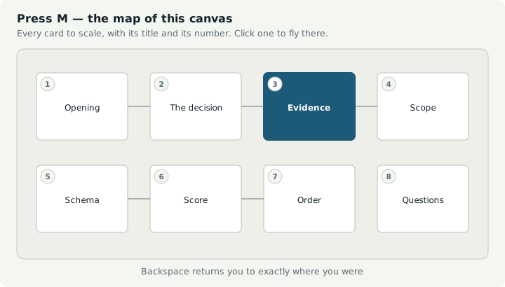
M | The schematic map — titles and order, for a deck too big to read at once |
G | Obsidian's graph view of the whole vault |
Backspace | Return from a jump, or one level out of a peeked note |
O | The overview — drag or scroll around the deck, Ctrl+wheel or +/− to zoom, 0 shows all, click a card to go there |
Home End | First and last card |
B | Blank the screen — attention on the room, not the slide |
N | Note against the card on screen — the cursor goes to the presenter panel's box |
R | Speak that note instead. Press again to stop; it lands on the same card |
A | Ask your notes a question, over the deck |
Shift+R | Record the whole meeting. The write-up indexes it by card |
W | Read the session and write it up — opens over the deck, so it works fullscreen |
P | Open the presenter panel — notes, the clock, what is next, and a box to write a remark in |
Enter | Dive into the sub-deck on this card |
E | Export the deck to one standalone HTML file |
F | Fullscreen |
Esc | Close the map or the note, then leave the deck |
Clicking the right two-thirds advances, the left third goes back. Clicking a control inside a card never advances the slide.
Where the deck opens
In a tab of its own. Like any Obsidian tab, you can drag it out to a
window and put that window on whichever screen you like — then press F for
fullscreen. Leave it where it is and it is simply a tab you can switch away from.
A tab is an ordinary leaf, which is the point: everything Obsidian opens lands
beside it rather than somewhere you cannot see. The presenter panel opens itself
in the sidebar, G steps the deck aside for the real graph view and offers a way
back, and N puts the cursor straight in the panel's note box.
Closing the tab ends the talk, and so does Stop presenting.
Starting and stopping with a key
Atlas binds no hotkeys of its own — defaults collide between plugins and differ across platforms. Assign your own under Settings → Hotkeys, searching for Atlas. A pair worth binding:
| Command | |
|---|---|
| Present | Starts the talk |
| Stop presenting | Ends it from the main window |
Esc ends the talk too, but it works on the deck's own window — which may be
behind something, or on a screen you cannot see. Stop presenting works from
wherever you are.
Ctrl+P is safe inside a deck window: it does nothing. A deck window is a plain
Chromium window as far as that key is concerned, and left alone it would raise a
print dialog on the projector in the middle of a talk.
How a canvas becomes a deck
| Canvas | Presentation |
|---|---|
| Card | A slide |
| Card position and size | Where the camera goes and how far it zooms |
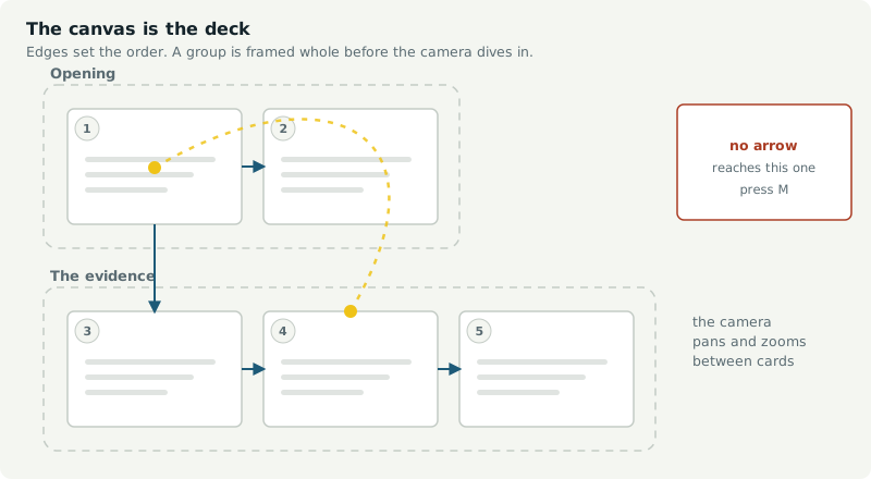
| Edge | The path from one card to the next |
| Edge label starting with a number | Forces the running order |
| Group | A section — framed whole before diving in, named on the map |
| Card with no edges | Still on the map, reachable by jumping |
| Card colour | Mirrored on the map |
Traversal is depth-first: a branch is told to its end before the next begins. The
start is the card with outgoing edges and none incoming, or any card containing
#start. A canvas with no edges presents in reading order.
How a card is named
The same name appears on the map, in the next-card line, in the presenter window and in the minutes.
| Card | Named by |
|---|---|
| A text card | Its first line of real content — tag lines and %%notes%% skipped |
| A note or file | The filename without its extension |
| …with a heading | Controls Plan #Why the code |
| An HTML card | Its first heading, else "HTML slide" |
| A web link | The hostname |
A card that opens with ## A short heading names itself well. One that opens
with a long paragraph takes the whole first line, which reads badly on the map.
Pictures are the awkward case. A media card is named by its filename, which
is fine when you chose it and poor when a camera did — so Pasted image 20251029102222 becomes Image · 29 Oct 2025, and IMG_2043.jpg becomes
Image.
Better still, put the picture in a card rather than making the card a picture:
## The surfaces, to scale

![[surfaces.svg]]
Now you choose the name, and you get a caption for free.
Writing cards
Everything below is written on the canvas. Nothing needs a setting turned on, and no CSS ever goes in a card — so a card is still a readable, shareable note.
Markdown
Rendered through Obsidian itself, so wikilinks, embeds, Mermaid and Dataview all work.
+++ on its own line | A reveal — → shows the next block before moving on |
%%…%% | Speaker notes. Never drawn on the slide; optionally shown under it |
[[A note]] | Click while presenting to read the whole note over the deck |
![[picture.png]] | Images, video and audio embeds |
![[drawing.excalidraw]] | Excalidraw drawings, rendered by that plugin |
| A very long card | Scrolls a screenful per press, then moves on |
Pictures
Obsidian's own sizing works on a card: ![[plan.png|420]] is 420 wide with the
shape kept, ![[plan.png|420x260]] is forced into that box, and the number is
pixels on the card, not on the screen. Several pictures written on one line
become a row rather than a stack.
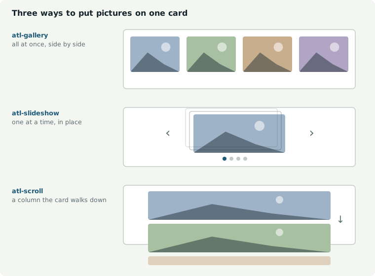
Three layouts, all taking the same markup:
<div class="atl-gallery">   <!-- all at once, side by side in a grid -->
<div class="atl-slideshow"> <!-- one at a time, in place, with dots -->
<div class="atl-scroll">    <!-- a column the card scrolls through -->
  <img src="Assets/a.png">
  <img src="Assets/b.png">
</div>
A slide show has dots, arrows, swipe (any direction) and five transitions. →
steps through it before leaving the card.
Sound, video and the web
A sound file on a card gets a face rather than a 40px player adrift in the middle of a slide: its name, how long it runs, and bars that move only while it is playing. Putting it inside a card is usually better — you choose the heading, and you have room to say why anyone is listening.
Video plays the same way. .mp4 (H.264) and .webm work; .mov and .mkv
usually do not, because Chromium cannot decode those containers — you get a
black rectangle with working controls, and the fix is to re-wrap the file. A
voice memo saved as .webm has no picture, and shows as a bar once its metadata
says so.
A link to the web opens over the deck, not in your browser. Obsidian would
hand it to the system browser, which leaves the talk behind a window you then
have to find your way back from, in front of a room. Esc closes it, and the
bar carries the address and a way out to a real browser — always there, because
a site that refuses to be framed says so in a header we cannot see the effect of
from inside.
Styling hooks, with no CSS in the card
| Hook | Selector |
|---|---|
A line of bare tags — #title #dark | .atl-tag-title, .atl-tag-dark |
cssclasses: frontmatter on a note | that class |
| The enclosing group | [data-group="the-evidence"] |
The tag line is stripped before rendering, so it never reaches the slide.
HTML, when you want full control
```slide-html
<style> .hero { display: grid; place-items: center; } </style>
<div class="hero">Anything you like</div>
```
It renders into a shadow root, so a card's CSS cannot leak. <script> runs, so a
card can hold a toggle, a chart or an animation. A card that animates should stop
when off camera:
Two things are already in scope for you: root, the card's own shadow root,
and host, the card element. Look things up through root — document sees
a different tree and will find nothing.
The code is compiled and run, not inserted as a <script> element, because a
script element in a shadow root is not reliably executed. So document.currentScript
is not available, and root is how you find yourself.
const chart = root.querySelector('#chart');

// A card that animates should stop when it is off camera.
host.addEventListener('atlas:enter', start);
host.addEventListener('atlas:leave', stop);
Anything that throws is printed on the card, so a broken script says so rather than failing quietly.
A .html file dropped on the canvas behaves the same way. note.md#Heading
cards present just that section.
The #deck card
One card, tagged #deck, configures the deck — and, if you write anything under
its settings, opens the talk.
#deck

theme: Atlas/Theme.css
logo: Assets/client.png
header: {deck} · {section} · {n}/{total}

# Northwind Depot
Controls plan, rev A · **Sam Avery**
---
![[logo.png|170]]
key: value lines above the first blank line are settings. Everything below is
the banner: a real card, rendered like any other, presented first.
It is sized for you — as wide as the first section, never wider than the canvas,
never flatter than 4:1, and as tall as the cards below it. Dragging the card
changes nothing; resize the first group and the banner follows. It is given
the #banner role, which sets the title large, centres everything against the
height and aligns the right-hand column right; write a role of your own and
yours is used instead. The standing header and the page number are hidden on it,
and the deck's logo is shown at banner size.
A #deck card carrying settings and nothing else has no banner and no extra
stop, exactly as before.
# is the talk's title, ## a size down, ### smaller again; a plain line
becomes the subtitle. The band is 24% of the screen by default — adjust it in
Style Settings, or with --atl-band in a theme.
Wrap a note to yourself in %%…%% and it is ignored, the same as a speaker note
— otherwise it would end up on screen.
Every key becomes a token — {title}, plus built-in {deck} {section} {n}
{total} {date}.
These keys override the plugin settings for this canvas alone, so a client deck and an internal deck can differ entirely with nothing in settings:
theme: backdrop: logo: logo corner: logo height: accent: colour:
image: dim: align: fit: transition: header: header on: section:
variant: advance:
section: says how a section overview is framed — title (the default) frames
the section's name and its first cards, the same size on every section, and
contain shows the whole section however wide it is.
backdrop: takes any CSS background — a colour, or a gradient, which is what
sits behind the cards:
backdrop: linear-gradient(180deg, #FBFCFA, #E4EAEC)
Atlas/Themes/Backdrops.css lists two dozen of them to copy, and the same set
is in Atlas/Backdrops/ as SVG files for image: instead. A theme carries the
default; this line overrides it for one canvas, exactly as theme: does.
advance: 8s runs the deck by itself for an unattended screen — a lobby,
a stand. Any keypress stops it, because someone has arrived.
Theming
Every # line
A line holding nothing but tags is an instruction. It is removed before the card is drawn, so it never reaches the slide.
Markers — what a card is:
#deck | The deck's settings, and the banner that opens the talk |
#start | Begin here, whatever the arrows say |
#skip-short | Leave this card out of the talk called short |
#only-short | Show it in short and nowhere else |
Roles — how a card looks:
The card roles
Every Atlas theme implements the same names, so a deck written against one theme works against all of them. Put a bare tag line at the top of a card — it never reaches the slide.
| Tag | The card becomes |
|---|---|
| (none) | An ordinary card: heading and text |
#title | The opening card — large heading, a line beneath |
#section | A divider carrying only the section's name |
#quote | A pull quote |
#stat | One large number and a line about it |
#dark | The same card, inverted |
#agenda | A running order — numbered, set large, one line to a row |
#end | The closing card — thanks, a contact, a next step |
#full | A picture with no margin. Words take their line; the picture fills the rest and crops |
#focus-left | Keep the left of a cropped picture. #focus-right and #focus-centre are the others |
#fade-left | Dissolve the picture's left edge into the card. #fade-right, #fade-both |
#split | Two flowed columns — text spills from one into the next |
#banner | The deck card's own opening slide. Given to it automatically |
Two more split the card themselves, and say what becomes of the first block. Add either to a split layout, or write one on its own:
| Tag | What it does |
|---|---|
#band | The first block runs across the top of the columns, whatever is in it |
#noband | Every block is a column, including the first, even if it is only a heading |
Saying neither keeps the old rule: a first block of nothing but headings becomes a band, anything else is a column.
Layouts you place yourself
#split flows: text runs out of the bottom of the left column into the top of
the right, and you cannot say what goes where. These four let you say. They
split the card at a --- rule.
| Tag | The card becomes |
|---|---|
#two | Two columns, side by side, equal width |
#compare | The same, drawn as two panels being weighed against each other |
#left | A picture filling the left half, text centred on the right |
#right | The mirror — text left, picture filling the right |
#two
# This heading spans both
---
The left column.
---
The right column.
Two blocks make two columns. A first block of nothing but headings becomes a
band across the top instead of a column. The rule needs no blank line around it:
on these cards a line of three dashes is always a rule, never a markdown
underline for the line above it. For #left and #right the order on
the card is the order on the screen: write the picture first for #left, second
for #right. +++ reveals work inside a column.
Unlike the roles above, these are defined in the plugin's own stylesheet using each theme's tokens — so they work with any Atlas theme, and with none.
Placing a block yourself
:::pin lifts a block out of the flow and puts it against the card.
:::align leaves it in the flow and places it inside its column.
:::pin top-right row
![[a.png|90]] ![[b.png|90]]
:::

:::align bottom-left
The foot of this column.
:::
Nine places, for both: top-left top top-right left centre right bottom-left bottom bottom-right. Add row to lay the block across instead of down. A
block with no closing ::: runs to the end of its column — the --- rule
stops it — so the closer is only needed when something follows it in the same
column.
Advanced Slides' <grid> says the same thing and is accepted as written, so a
deck carried over keeps working:
<grid drag="40 60" drop="topright">…</grid>
<grid drag="30 20" drop="10 72">…</grid>
drop takes a name or an x y pair in percent; drag is width and height in
percent; flow="row" lays it across. Markers inside a code fence are left
alone, so a card can document them.
Tables and lists
Neither needs a tag. Obsidian's own table CSS is sized for a note at 14px inside
a card the camera then scales up, which on a projector is a postage stamp in the
wrong colours. Atlas restyles both for a slide: a ruled header row, banded rows,
tabular numerals, markdown's ---: and :---: alignment, accent-coloured
bullets and real checkboxes for a task list.
Ten themes, ready to use
| Paper | Editorial light — warm paper, near-black ink, deep blue accent |
| Slate | Dark room — for a projector with the lights down |
| Plain | Follows your Obsidian theme; only the roles are imposed |
| Mono | Black on white, oversized, one red accent. For a bad projector |
| Blueprint | A drafting grid behind the cards, mono headings, cyan |
| Harbour | Deep blue on warm white, with a colour for every section |
| Midnight | Near-black with a vignette and an accent glow |
| Gold | Near-black with a gold plate at the head of every card |
| Onyx | A drafting grid behind flat black cards, one cold accent |
| Bronze | Warm black, no card edges, big type, deep shadow |
| Glass | Translucent cards, frosted, for a deck with a picture behind it |
Settings → Theme and background → Theme stylesheet, which lists only
stylesheets that are actually Atlas themes — a vault that has exported a reveal.js
deck holds dozens that would do nothing here. Or theme: Atlas/Themes/Slate.css
on a canvas's #deck card, to change one deck without touching settings.
A theme carries its backdrop too, so picking one is the only choice most
decks need. backdrop: on a #deck card overrides it for that canvas, and
Atlas/Backdrops/ holds two dozen as image files if you would rather pick one in
settings.
A picture behind the cards
Two lines on the #deck card, and they beat both the theme's backdrop and any
backdrop: line:
#deck

theme: Atlas/Themes/Glass.css
image: Atlas/Backdrops/Harbour fall.svg
dim: 0.35
image: is a vault path — no brackets, no exclamation mark, spaces are fine.
dim: is 0 to 1 and lays black over the picture so the deck stays readable:
photographs usually want 0.45 to 0.6, the flat SVG backdrops 0.2 to 0.4.
A backdrop wants one tone across the middle where the cards sit, detail only at the edges, and no focal point of its own. Glass is the theme built for this case: translucent cards over a frosted blur, so the picture carries colour through the deck instead of hiding behind it.
Making your own
Copy Atlas/Themes/_Template.css, which documents every token with what it
touches, and change the block at the top. A theme is only a list of values —
the card roles live in the plugin, so they work with any theme and with none:
.atl-overlay {
  --paper: #F4F5F0;      /* card background */
  --ink: #14232A;        /* text */
  --ink-soft: #4E5F66;   /* secondary text */
  --rule: #C6CDC6;       /* borders */
  --accent: #1D5A78;     /* the current card on the map, highlights */
  --radius: 14px;
  --body-size: 19px;
  --display-font: 'Archivo Narrow', sans-serif;
  --body-font: 'IBM Plex Sans', sans-serif;
  --mono-font: 'IBM Plex Mono', monospace;
  --atl-inactive: 0.18;  /* how visible off-camera cards are */
}
What to use when
| You want | Use |
|---|---|
| A different colour, backdrop or logo | Settings — no CSS |
| Bigger text, rounder corners, a different accent | Style Settings plugin — sliders, live preview |
| A card to look like a title, a quote, a statistic | A tag line in the card |
| A whole deck to look different | A theme file, per canvas via theme: |
| One card to look like nothing else | A slide-html card with its own <style> |
Reach for the row you need and stop there. Most decks never get past the third.
Other hooks
.atl-node[data-color="1"]              /* canvas colours 1–6 */
.atl-node[data-group="the-evidence"]   /* a whole section at once */
.atl-node.is-active                    /* the card on camera */
.atl-group-label                       /* section names on the map */
A group is also a
.atl-node. Styling.atl-nodewith a background paints a panel over the cards inside every group. Use:not(.atl-node-group).
With a deck open, Ctrl+Shift+I shows you the exact classes on anything.
Settings
| Section | |
|---|---|
| Starting a presentation | The handbook, your shortcut, and a button to Obsidian's hotkey pane |
| Camera | Flight duration, section overviews, framing padding, contain/cover, maximum zoom |
| Theme and background | The theme first, since it decides everything including the backdrop. Then the backdrop if you want to override it, the image folder both pickers draw from, accent, off-camera card opacity |
| Logo | Any vault image, corner, height, opacity. Several, comma-separated, sit in a row |
| Pictures and media | Slide show transition, how pictures fit, video autoplay |
| On screen | Bottom bar and counter, header line and where it shows, section titles, card alignment, next-card title, progress rail, timer |
| Notes and minutes | Where minutes are filed, a local speech server if you have one, write-up on leaving, what goes in an action |
| Asking your notes | A local model server and which model, where to look, and whether questions may leave the machine |
| Browsing the vault | What G opens — Obsidian's own graph view, or the one inside the deck |
| HTML cards | Whether a card's |
| Reference | The full authoring reference, with copyable snippets |
The same material, with room to breathe, is at the handbook.
Settings are read when a deck starts — change them, then present.
The demo
npm run install:vault -- -WithDemo copies one folder into the vault:
Atlas/
  1 · Start here.canvas     the rules, in the smallest deck that shows them
  2 · Themed deck.canvas    every card role, so you can compare the themes
  3 · A real deck.canvas    a plan: HTML slides and an animated card
  4 · Everything.canvas     the feature test — one card per thing it does
  5 · Cheat sheet.canvas    every feature *with the syntax that produces it*
  6 · A full talk.canvas    a talk you could stand up and give, start to end
  Themes/                   Paper, Slate and Plain
  Assets/                   the slides, pictures and audio the decks point at
Start with 1, present 5 when you want to look something up, and read 4 to see what a finished deck feels like. They are built on an invented project, so everything in them is safe to copy.
One map, several talks
Tag a card to leave it out of a shorter version:
| Tag | Meaning |
|---|---|
#skip-exec | Left out of the exec talk, in every other one |
#only-exec | Appears in the exec talk and nowhere else |
Run Present this canvas as… and pick. The list is built from the tags the
cards already carry, so there is nothing to declare first; the #deck card can
name a default with variant:. Traversal walks through an omitted card to its
children, so leaving one out never severs the chain.
Export
Press E while presenting, or run Export to HTML — which no longer needs
a deck running. You get one .html at your vault root: the cards as they stand,
every image, video and audio file inlined as a data URI, your theme and your
logo, and a camera with the same keys. It opens in any browser — no Obsidian, no
network, no plugin.
The exported file behaves like the deck. → steps through reveals and picture
stacks in the same order, O opens the overview and M the schematic map, B blanks, F goes
fullscreen. Card scripts travel too, wrapped so root and host mean the same
there, and the card is told atlas:enter and atlas:leave as it comes on and
off camera — but only when Run scripts in HTML cards is on. A card not
trusted to run here should not start running because it was sent to somebody.
Four things stay behind, and cannot sensibly travel: peeking a note, the vault graph, remarks and minutes, and your speaker notes.
Preview it first
Preview the export opens that same document, running, in a tab beside the canvas, with a Refresh button that rebuilds it. Nothing is written to the vault. It exists to answer what will the person I send this to actually see — a question only the exported document can answer.
There is no auto-refresh, because a page opened from file:// cannot watch your
vault. Re-exporting overwrites the same path, so the loop is edit → export →
F5.
Where it lands
Each deck gets a folder of its own under Settings → Atlas → Export folder
(Atlas/Exports by default): the HTML file, with every picture inside it, and
any sound or video beside it under a relative link. Share the folder — or zip
it — and the deck is complete. A deck with no recordings in it is a folder
holding one file, which you can send on its own.
The write-up, beside the deck
Turn on Export the write-up beside the deck and the remarks you typed on each card travel with it: a second page in the same folder, one card after another in the order you presented, and a Notes button on the deck that opens the same thing over the cards. Read-only, text only, off by default — those remarks are written for you.
For PDF, print it
The exported file carries a print stylesheet: one card per landscape page, the card's number at the foot of each page, the camera and bottom bar hidden, every reveal shown and picture stacks un-stacked so nothing is lost on paper. Open it in a browser and print to PDF. That keeps the deck a deck on screen and gives you pages on paper, without a second export path to maintain.
The reference, beside the canvas
Atlas: How to write a card writes a reference note into your vault and opens
it in a pane. It is organised by what you want rather than by what things are
called — I want two columns against what to type — and covers the roles, the
switches, :::pin and :::align, pictures and their cropping, +++, the
#deck card's keys, and the two markdown traps worth knowing.
It opens whichever copy is already in the vault, so a copy you have moved or annotated is the one you get back. Settings → Atlas carries the same reference for when you would rather not have a note.
The presenter window
Press P. Obsidian opens a second window showing what you need and the
audience does not: the current card, its speaker note at a readable size, the
section you are in, what is coming next, the elapsed time and the clock, and
Back / Next buttons.
Drag it to your laptop screen and put the deck on the projector. Arrow keys work in either window and drive the same deck.
Speaker notes are collected whether or not the on-screen panel is enabled, so turning that off leaves the presenter window fully fed.
Notes, and minutes
The deck keeps one note. It sits beside the canvas, takes the canvas's own name, and holds a section for each card — so presenting the same deck again opens the same words, ready to be edited or added to, rather than filing them away in another dated file.
---
type: deck-notes
canvas: Talks/Northwind.canvas
---

# Northwind

## The controls plan
%%card: 3f9a21%%
Lead with the programme, not the model.

---
Presented: 14 Sep 2026 · 18 Sep 2026
A card is identified by its canvas node id, never by its title. Rename a card and its notes stay; delete the card and they move to Cards no longer on the canvas rather than vanishing, so re-adding it puts them back. Anything you edit by hand is left alone — only the card you just noted on is rewritten. A card carrying a note wears a dot in its corner while you present, with a ring when the note was spoken rather than typed.
Turn Keep one note per deck off in settings for the older behaviour: a new dated write-up every session.
Two different things share the word "note".
Prepared notes are %%…%% anywhere in a card. They are stripped before the
card is drawn, so they never reach the screen — they appear in the presenter
panel, which opens in the sidebar with every deck, and nowhere else.
On a card that is a note rather than text, write them in the note itself. On a
#deck card they are how you leave yourself a reminder about the deck.
## The decision

We are going with option B.

%%Slow down here. Someone always asks about the survey — it is in the appendix.%%
Notes you take during the talk are new. Press N and a box opens over the
deck, already focused. Type, press Enter, it closes. What you typed is attached
to the card that was on screen, with the time.
Press N on that card again and the box comes back with what you wrote in it,
cursor at the end — so a second thought adds a line rather than starting a blank
note you cannot see. One card holds one note, kept at the time you first made it
so the write-up stays in order. Clear the box and save to delete it. The Remark
button in the bar is outlined when the card you are on already has one.
Or speak it. Press R, say the thing, press R again. The clip is saved
and attached to the same card as if you had typed it, so it reaches the write-up
by the same route. A pip appears in the corner with a live level meter — a
recorder that captured nothing is discovered after the meeting, when the thing it
was recording cannot be repeated.
Shift+R records the whole meeting. One file, and the write-up indexes it
by card:
| At | Card |
|---|---|
| 0:00 | Opening · Northwind Depot |
| 2:14 | The evidence · What the survey found |
| 8:41 | The decision |
That table is why this is worth having. The deck knows which card was on screen at every moment, so one long recording chapters itself. No recorder can do that, because none of them know what you were talking about.
Everything is local. MediaRecorder is built into the app Obsidian runs on — no
plugin, no key, no network.
Nothing is lost
Notes used to live in memory until the deck closed cleanly, so a crash took the
meeting with it. Every note and every card visit is now written the instant it
happens, to Meetings/Sessions/, and a running recording is flushed to disk every
two minutes. A crash costs the gap, never the notes.
Next time Obsidian opens you are told: "a session from Tuesday 14:02 was never written up — 9 notes · 23 cards", with a button. There is a command for it too, Write up an unfinished session. The journal is deleted only once the minutes exist — deleting it first would take the meeting with it, which is the one thing it is there to prevent.
Meetings/
  Northwind Depot 2026-09-14.md     the minutes
  Recordings/                        audio, kept: the minutes link it
  Sessions/                          journals, cleared automatically
Leaving the deck writes it all up as one note in Meetings/ — ordered the way
minutes are read, not the way the talk ran. Whoever opens it a fortnight later
wants the actions, and should not have to scroll past twenty cards to find them.
---
type: minutes
deck: "Northwind Depot"
date: 2026-09-14
start: 11:02
end: 11:49
minutes: 47
cards: 4
actions: 3
---

# Northwind Depot — 14 September 2026

> [!info] At a glance
> **When** 11:02–11:49 · 47 min
> **Deck** [[Northwind Depot]] · *short*
> **Covered** 4 cards · **noted on** 3 · **actions** 3

## Attendees

-

## Decisions

-

## Actions

- [ ] Send the cost breakdown to finance (What it costs) #minutes
- [ ] Confirm shutdown dates with operations (What we need today) #minutes

## Notes

### The plan

**The two options**

11:13 — Ops pushed back on three shutdowns. Two may be possible if we split
the backbone work.

**What it costs**

11:23 — Finance want the shutdown cover broken out.
→ Send the cost breakdown to finance
The frontmatter is there so a vault can count and query them. Attendees and Decisions are left empty on purpose — every set of minutes has both, and only a person can fill them in.
An action is a checkbox once, under Actions. Where it appears again in the
notes it is written as → … rather than a second - [ ]: two boxes would have
the Tasks plugin count the same job twice, and ticking one would leave the other
undone. The line itself is otherwise untouched, so Tasks reads its own due-date
and priority syntax as written.
A card's own %%notes%% are left out by default. They are your prompts —
they will ask about the survey — and minutes get sent round. Turn on Include
the cards' own notes if you want them in.
Cards appear in the order you actually visited them, detours through the map
included. A card nobody wrote anything about is left out. Any line you type
beginning - [ ] is gathered into Actions at the end.
W, or the Write up button in the bar, opens the session for review: every
card that carries anything, in the order you visited it, each one editable in
place. Fix a typo, add the thing you meant to say, watch the action count
change — then Create the note, and it opens behind the deck.
Editing there writes into the same store the cards use, so pressing N on a card
afterwards shows what you changed. Keep presenting closes the review and
changes nothing.
Leaving the deck writes the note directly, without the review.
The folder is Settings → Notes and minutes → Where minutes are filed
(Meetings by default), along with whether leaving writes at all, what gets
appended to each action, and whether actions name the card they came from.
Asking your notes
Minutes accumulate. Six months of them is where the answer to "what did we decide about the field app?" actually lives, and by then you have forgotten which meeting it was.
The magnifier in the ribbon — or the command Ask your notes — puts a question to them. It is off until you point it at a model, and everything about it is built so it cannot quietly become something else.
It runs on your machine. Where questions may go defaults to On this machine only, which never contacts anything but a local server whatever else is configured. Two other settings allow OpenAI as a first or second choice; both require a key you enter yourself, and every answer says which model produced it, including that the notes were sent. A key is kept in the plugin's data file — which lives in your vault, so it travels with any sync or backup. The settings panel says so where the field is.
It works the way you would, and shows you. Your question becomes search terms; the search returns candidates; the model reads their extracts and says which are worth opening — or that none are; it answers from those; then it reads its own answer back against them. Each step appears on screen as it happens, so you can see which note it decided to read.
● Looking for: intake survey findings
● 9 notes mention it
● Reading Northwind Depot 14 September, Intake survey 2026
● Every part of it is in the notes
Refusing is decided on evidence, not on word counts. Asked for the budget for a swimming pool, every scoring rule tried here surfaced a schedule line about a pool and courtyard, because the word was there. Shown the extract and asked whether it bears on the question, the model says none of them do — and you get "No note found on that topic" without an answer ever being written.
Nothing is invented on your behalf. Telling a 3B model "reply NOT FOUND if the notes do not contain the answer" made it reply NOT FOUND to a question the notes answered in one line — measured, twice. Letting it invent better search terms was worse: it turned PPC into pay-per-click. Recognising is a small model's strength and generating is not, so it is only ever asked to recognise.
Every answer carries its sources, as chips you can click to open the note. A claim about what a meeting decided gets repeated in another meeting; it has to be checkable in one click.
Running a model
Full instructions, including what an update does and does not touch, are in docs/local-model.md.
No model ships with Atlas, and none is downloaded for you. Models are gigabytes and are not a plugin's to distribute, so this is a thin client: you install a server, Atlas talks to it. Until you do, the feature is invisible — no ribbon icon, no button on the bar, and no network call of any kind.
Any server speaking the OpenAI chat API works — Ollama on 11434, or llama.cpp's
llama-server, which points straight at a .gguf with nothing to download:
llama-server -m path\to\model.gguf --host 127.0.0.1 --port 8080 -c 4096
Then Settings → Atlas → Asking your notes, paste the address, press Test. It says what is wrong rather than failing silently: server not answering, no models pulled, or connected with the list.
qwen2.5:3b is a good starting point at about 2 GB. Changing the model is one
field, so it is worth trying a larger one before concluding something cannot be
done.
Sub-decks
Drop a .canvas on a canvas and the card draws that canvas to scale — its
cards, groups and edges in miniature — so you can see how big the detour is
before taking it. Press Enter to present it.
The parent is hidden, not torn down: Esc comes back to the same card, with the
same history and the same remarks still gathering.
Audits
Four sweeps live in scripts/audit/, each written after a real bug got through
review:
python scripts/audit/leaks.py        # a listener that acts, then lets the event travel
python scripts/audit/sweep.py        # listeners, loops, dropped awaits, CSS coverage
python scripts/audit/demo_audit.py   # does every feature still have an example
ATLAS_VAULT="…" python scripts/audit/audit.py   # naming, settings wiring, install drift
None of them can tell you whether an interaction is right — only that the plumbing holds. Every wrong interaction so far was found by presenting.
Writing decks with an assistant
A canvas is plain JSON, so an assistant can write one — the geometry, the
sections, the running order and the cards — and you open the file it produces.
docs/authoring-with-an-assistant.md is the brief to
hand it: the node shapes, the spacing that reads well, the #deck keys and the
card roles. Put that and this README in front of it and the decks come back
presentable rather than close.
Developing
npm run dev watches and rebuilds; the installer drops a .hotreload marker, so
with the Hot Reload plugin your changes apply without restarting.
src/
  main.ts              commands, hotkey, ribbon, canvas selection
  settings.ts          the settings tab and the authoring reference
  types.ts             canvas format, scene model, settings
  canvas/parse.ts      .canvas JSON, rects, group containment
  canvas/path.ts       edges -> running order, the #deck card
  present/presentation.ts  the deck: keys, chrome, stops
  present/camera.ts    pan, zoom, the arc between distant cards
  present/render.ts    cards -> DOM, media, reveals, styling hooks
  present/slideshow.ts the album inside a card
  present/minimap.ts   M — this canvas, drawn to scale
  present/browse.ts    G — the built-in vault graph
  present/peek.ts      reading a note without leaving the deck
Release: npm version patch && git push --follow-tags.
For plugin developers
Search results and similarity scores are powered by semantic analysis of your plugin's README. If your plugin isn't appearing for searches you'd expect, try updating your README to clearly describe your plugin's purpose, features, and use cases.