Icon Bullet Helper
approvedby jaewone
Helps you styling checkboxes in preview mode.
Icon Bullet Helper
[!NOTE] The existing
checkbox-styling-helperplugin now provides a more complete icon bullet experience through Codex. The renamed repository is available on GitHub.
Icon Bullet Helper is an Obsidian plugin for writing visual icon bullets while keeping your notes in plain Markdown.
- {p} Looks good
- {!important} Needs attention
- {next-step} Follow up tomorrow
The plugin renders marker syntax as SVG icons in Live Preview and Reading view. The original Markdown text stays readable, portable, and editable.
Features
- Render
{marker}syntax as theme-independent SVG icon bullets. - Render
{!marker}syntax as callout icon bullets with a solid background tint. - Keep raw marker text visible in Source view and inside fenced code blocks.
- Open the picker with
Command + ;on macOS orCtrl + ;on Windows/Linux. - Open the picker by typing the configured trigger after a list marker, for example
- !. - Use arrow keys, mouse hover, click,
Space,Enter, andEscapeinside the picker. - Insert common markers with
Spaceand callout markers withEnter. - Toggle the current marker between common and callout forms with
Command + .on macOS orCtrl + .on Windows/Linux. - Customize marker labels, marker names, colors, callout backgrounds, SVG markup, and picker layout.
- Hide disabled entries from the picker while still rendering existing markers in notes.
- Adapt icon and callout colors for light and dark themes without separate dark-mode settings.
Syntax
Common icon bullet:
- {p} Looks good
Callout icon bullet:
- {!p} Looks good
Markers may contain letters, numbers, underscores, and hyphens. Marker names are normalized by the settings UI, so spaces become hyphens.
Icon marker rendering currently targets unordered Markdown list markers in Live Preview:
- {p} Dash list
* {i} Asterisk list
+ {q} Plus list
Reading view renders markers after Obsidian has parsed the list item. Source view and fenced code blocks always show the original text.
Picker
Open the picker in either of these ways:
- Run Icon Bullet Helper: Open icon bullet picker.
- Type the picker trigger after a Markdown list marker, for example
- !.
Default picker controls:
| Action | Shortcut |
|---|---|
| Move selection | Arrow keys |
| Insert common marker | Space |
| Insert callout marker | Enter |
| Close picker | Escape |
| Toggle current marker between common and callout | Command + . or Ctrl + . |
Additional shortcuts can be assigned from Obsidian's Hotkeys settings to the picker and toggle commands.
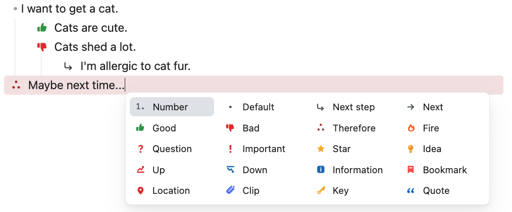
Built-in Items
The picker includes two kinds of entries.
Icon marker entries render as SVG icon bullets:
| Marker | Label |
|---|---|
{next-step} | Next step |
{next} | Next |
{therefore} | Therefore |
{clip} | Clip |
{p} | Good |
{c} | Bad |
{q} | Question |
{important} | Important |
{bookmark} | Bookmark |
{star} | Star |
{fire} | Fire |
{up} | Up |
{down} | Down |
{forwarded} | Forwarded |
{scheduling} | Scheduling |
{i} | Information |
{location} | Location |
{quote} | Quote |
{dollar} | Dollar |
{idea} | Idea |
{k} | Key |
{win} | Win |
Insert helper entries write ordinary Markdown syntax and are not SVG marker entries:
| Picker item | Inserted text |
|---|---|
| Number | 1. |
| Default | - |
| Unchecked | - [ ] |
| Incomplete | - [/] |
| Checked | - [x] |
Settings
Settings are split into three tabs.
General
- Change the picker size.
- Change the picker trigger text. The default trigger is
!. - Review picker shortcut behavior.
- Restore all plugin settings to the built-in defaults.
Icon Layout
- Set the enabled picker grid size as columns x rows.
- Drag icons to reorder them in the picker.
- Move icons to the disabled area to hide them from the picker.
- Move disabled icons back into the grid to enable them again.
At least one icon remains enabled. Disabled icon marker entries are hidden from the picker but still render in existing notes.
Icon Bullets
- Add a custom marker.
- Enable or disable picker entries.
- Edit marker names, labels, colors, callout background colors, and SVG markup.
- Remove custom markers.
Some SVGs contain hard-coded fill or stroke colors. The Color setting only affects SVG parts that use currentColor.
Custom SVG Safety
Custom SVG input is sanitized before it is stored or rendered. The sanitizer removes scripts, event handlers, external resources, unsafe URLs, and unsupported embedded content such as foreignObject.
For best results, use compact SVGs that:
- include a
viewBox; - use
currentColorfor colorable paths; - avoid external assets;
- avoid very thin outline-only shapes.
Privacy and Network Access
Icon Bullet Helper works locally inside Obsidian.
- It does not send notes, settings, SVGs, or usage data to any external service.
- It does not use telemetry.
- It stores plugin settings in Obsidian's normal plugin data file for the current vault.
Installation
From Community Plugins
After the plugin is accepted into the Obsidian Community Plugins directory:
- Open Settings in Obsidian.
- Go to Community plugins.
- Search for Icon Bullet Helper.
- Install and enable the plugin.
Manual Installation
Download the release assets from the latest GitHub release:
main.jsmanifest.jsonstyles.css
Copy them into:
<Vault>/.obsidian/plugins/checkbox-styling-helper/
Then reload Obsidian and enable Icon Bullet Helper from Settings -> Community plugins.
Development
Install dependencies:
npm install
Start the development watcher:
npm run dev
Run a production build:
npm run build
The production build type-checks the plugin, bundles main.ts into main.js, and copies the release files into build/.
Generated release files are not committed to the repository unless a release process explicitly requires them:
main.jsbuild/data.jsonnode_modules/
Community Plugin Release Notes
For Obsidian Community Plugins distribution, keep manifest.json, package.json, and versions.json synchronized. The GitHub release tag must match the version in manifest.json exactly, without a leading v.
Attach these files to each GitHub release:
main.jsmanifest.jsonstyles.css
See RELEASE.md for the release and submission checklist.
License
This project is released under the GPL-3.0 license.
For plugin developers
Search results and similarity scores are powered by semantic analysis of your plugin's README. If your plugin isn't appearing for searches you'd expect, try updating your README to clearly describe your plugin's purpose, features, and use cases.