Inline Fold
approvedby Mohamed Saleh
Extend Markdown capabilities by adding inline fold, encapsulate text anywhere in the note, create spoilers, even flashcards for active recall. - This plugin has not been manually reviewed by Obsidian staff.
Inline Fold
Wrap any text in a delimiter pair and it collapses into a small, styled badge right in the flow of your note — click or hover to reveal what's hidden. Built for flashcard-style self-testing, but works for spoilers, asides, footnote-style references, or anything else you'd rather keep out of sight until you ask for it.
About the media in this README: this repo doesn't have a real screen recording yet. The demo below is an animated SVG mockup — a stand-in that shows the actual interaction (click → reveal) so the README isn't just describing behavior in prose. Everywhere you see "(placeholder)" is meant to be swapped for a real recording. See Replacing the placeholders at the bottom for exactly how.
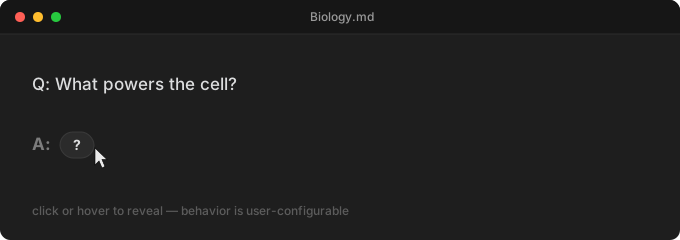
(placeholder mockup — not a real recording)
What it does
Write:
The powerhouse of the cell is the [=mitochondria=].
See:
The powerhouse of the cell is the ?
Click (or hover, depending on your settings) the badge, and it expands
in place to show mitochondria. Collapse it again the same way. Works
identically in Live Preview and Reading view, and expand/collapse
state is shared between them and persists across restarts — expand
something, close Obsidian, come back tomorrow, and it's still expanded.
Features
- Multiple fold classes — define as many delimiter pairs as you
want (
[=…=]for flashcards,{{…}}for asides, whatever you pick), each with its own trigger text, icon, and style. - Annotations, not just folds — a class can leave its content always visible instead of hidden, showing a definition or note in a floating popover on hover/click instead — like a wikilink's hover preview, but for any term you mark yourself.
- Popovers for hidden content too — a fold can stay collapsed and reveal its content in a floating card instead of expanding in place, with the card able to render full Markdown (headings, lists, images, embeds), not just inline text.
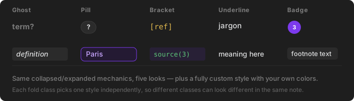
- Five built-in styles (Ghost, Pill, Bracket, Underline, Badge) plus a fully custom style with your own colors, borders, and padding.
- Real nesting — a fold can contain another fold, which stays independently collapsible once its parent is expanded.
- Rich content — bold, italic, inline code, links, and
[[wikilinks]]work inside revealed content in Live Preview. - Regex delimiters — opt a class into matching its start/end symbols as patterns instead of fixed literal text.
- Commands for wrapping/unwrapping text, toggling a fold at the cursor, expanding/collapsing everything in a note (globally or per class), jumping to the next/previous fold, and starting a quick "focus mode" pass over a note.
- Auto-pairing — typing a class's start symbol inserts its matching end symbol automatically.
- Auto-collapse timer — optionally have a clicked-open fold re-collapse on its own after a delay, for timed self-testing.
Installation
Requires Obsidian 1.13.0 or newer (the settings tab uses Obsidian's declarative settings framework introduced in that release).
Manual install (not yet on the Community Plugins list):
- Download
main.js,manifest.json, andstyles.cssfrom a release (or build them yourself — see Building from source). - Create a folder
<your vault>/.obsidian/plugins/inline-fold/and put those three files in it. - In Obsidian: Settings → Community plugins, reload the plugin list, and enable "Inline Fold".
Quick start
- Open a note and type
[=your hidden text=]. - Switch to (or stay in) Live Preview — it collapses into a small
?badge. - Click it. It expands to show
your hidden text. - Open Settings → Inline Fold to add your own fold classes, change the interaction mode, or pick a different style.
Nested folds
A fold can contain another fold. The inner one only exists once the outer one is expanded, and it collapses/expands independently after that.
The mitochondria is the powerhouse ([=of the cell=]).

Annotations & popovers
Every class isn't necessarily a fold. Set a class's Content
visibility to "Always visible" and it becomes an annotation instead:
the text renders normally, in place, all the time — and the part after
| becomes a definition shown in a popover on hover or click, rather
than a trigger override.
The [=mitochondria|the powerhouse of the cell=] is found in every cell.
Reads as plain text — "The mitochondria is found in every cell" — with "mitochondria" getting a subtle dotted underline. Hover it, and the definition appears in a floating card.

Hidden folds can use a popover too, instead of expanding in place — set Reveal style to "Floating card" on a hidden class and its content shows in the same kind of popover rather than pushing the surrounding text around. This is also the one place richer content makes sense: set Popover content to "Rich" and the card renders full Markdown (headings, lists, images, embeds) via Obsidian's own renderer, since a floating card — unlike an inline fold — was never constrained to fit on one line.
Settings
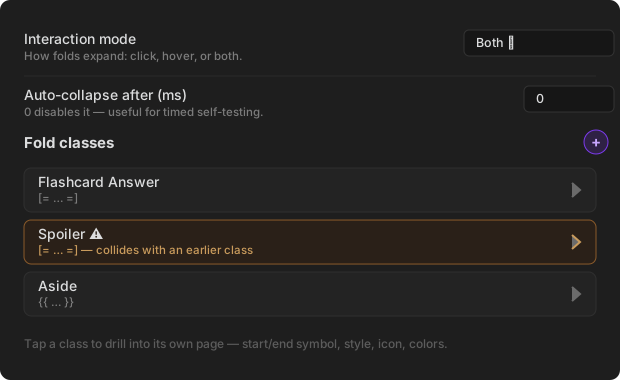
(placeholder mockup — not a real screenshot)
Settings live on Obsidian's native declarative settings framework (1.13+), which is also why the plugin requires Obsidian 1.13.0 or newer. General options sit directly on the tab; each fold class is a row in a reorderable list that opens its own drill-in page — add, delete, and drag-to-reorder classes right from the list, and a class with a delimiter conflict or invalid regex pattern is flagged with a warning badge before you even open it.
General
| Setting | What it does |
|---|---|
| Interaction mode | Click, hover, or both, for revealing a fold. |
| Cursor behavior over collapsed folds | Whether the caret jumps over a collapsed fold or reveals its raw markdown as it gets close. |
| Protect collapsed boundaries | Keeps the caret from exposing raw markdown right at a fold's edges unless it's already expanded. |
| Hotkey expansion target | Whether the toggle command affects every fold on the line, or just the closest one. |
| Hover collapse delay | Grace period before a hover-revealed fold hides again. |
| Auto-pair delimiters | Typing a start symbol auto-inserts the matching end symbol. |
| Auto-collapse after (ms) | A clicked-open fold re-collapses on its own after this delay. 0 disables it. |
Per fold class (its own page, opened from the "Fold classes" list)
| Setting | What it does |
|---|---|
| Start / end symbol | The delimiter pair, or a regex pattern if "Use regex delimiters" is on. |
| Use regex delimiters | Interpret the symbols above as regular expressions. Disables auto-pair and the wrap/unwrap command for that class, since there's no fixed literal text to insert. |
| Content visibility | Hidden (a fold) or Always visible (an annotation — content renders normally, and the part after ` |
| Reveal style (hidden classes only) | Expand in place, or stay hidden and show content in a floating popover instead. |
| Trigger text (hidden classes only) | What shows on the collapsed badge (e.g. ?). Can be overridden per-fold with `[=content |
| Icon (hidden classes only) | An optional Lucide icon shown before the trigger text. |
| Style (hidden classes only) | Ghost / Pill / Bracket / Underline / Badge / Custom. |
| Popover content (shown whenever a popover is used) | Simple (inline formatting only) or Rich (full Markdown — headings, lists, images, embeds). |
Commands
Open the command palette (Cmd/Ctrl+P) and search "fold":
- Toggle expansion/collapse of folded text — expand/collapse at the cursor.
- Toggle encapsulation: [class name] — wrap the selection or word under the cursor in that class's delimiters, or unwrap if the cursor is already inside one. For an "Always visible" class, this opens a small modal to fill in the term and its definition instead of wrapping immediately, since an annotation needs both.
- Expand all / Collapse all folds in note — every fold, or...
- Expand all / Collapse all: [class name] — just one class's folds.
- Jump to next / previous fold — cyclic navigation.
- Start focus mode — collapses everything and jumps to the first fold, for reviewing a note top to bottom.
Assign hotkeys to whichever of these you use often via Settings → Hotkeys.
Tips
- Custom trigger per fold:
[=answer|💡=]shows💡instead of the class's default trigger text for just that one fold. - Literal
|in content: escape it as\|—[=A \| B=]folds toA | Bwith no alias split. - A fold class per purpose: e.g.
[=…=]for flashcards,{{…}}for spoilers,<<…>>for asides — each can have its own icon and style so they're visually distinct at a glance.
Building from source
npm install
npm run build      # type-checks, then produces main.js
npm run dev          # esbuild watch mode
npm test              # runs the test suite
Copy the resulting main.js, plus manifest.json and styles.css,
into your vault as described in Installation.
For architecture notes, what changed from v1, and why certain things were deliberately scoped out, see docs/DEVELOPMENT.md.
Replacing the placeholders
Everything under docs/media/ right now is a hand-built SVG mockup, not
a real capture. To replace one:
- Record the real interaction — any screen recorder works (macOS Screenshot app / QuickTime, Windows Snipping Tool, or a GIF-focused tool like Kap or ScreenToGif if you want a small, loopable file for the README).
- Export as GIF or MP4 and drop it into
docs/media/, e.g.docs/media/hero-demo.gif. - Update the corresponding
<img src="...">in this README to point at the new file, and delete the matching.svgmockup and its "(placeholder mockup)" caption line.
License
MIT
For plugin developers
Search results and similarity scores are powered by semantic analysis of your plugin's README. If your plugin isn't appearing for searches you'd expect, try updating your README to clearly describe your plugin's purpose, features, and use cases.