by Meiorz
Render Google Material Icons inline using !icon[name] syntax.
Material Icons Inline
Render Google Material Icons in Obsidian using the !icon[name] markdown syntax.
Demo
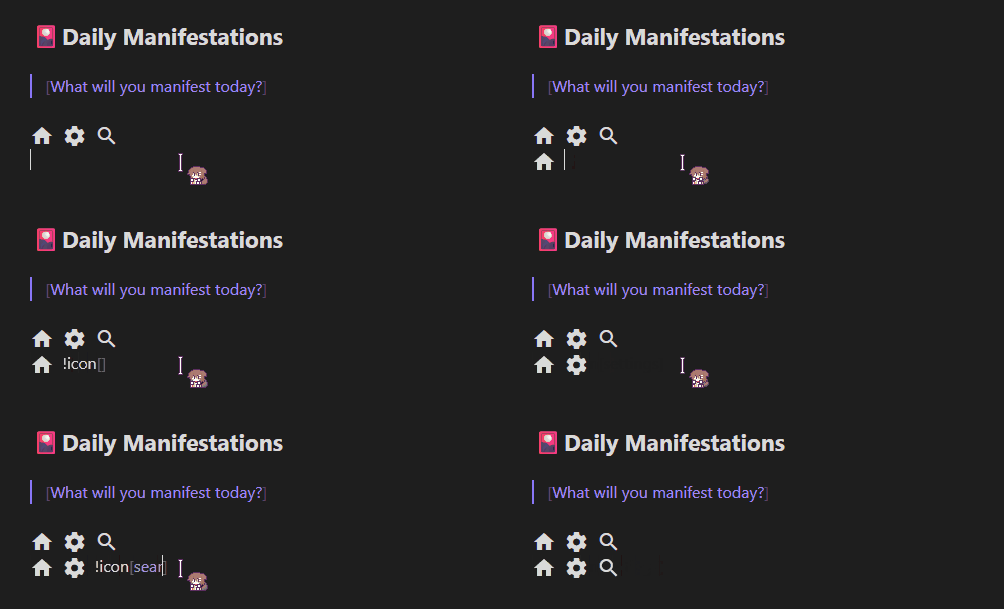
Note: The animated mouse cursor seen in the demo is by Haku.
Features
- Live Preview — icons render as you type; click to reveal raw syntax, click away to render again
- Reading view — icons render in reading view and exported notes
- 2,500+ icons — full Google Material Icons library
- Simple syntax —
!icon[home],!icon[settings],!icon[check_circle] - Configurable — set any CSS size or color via plugin settings
- Works offline — the icon font is bundled with the plugin; no network requests, no API key
Installation
Via Community Plugins (recommended)
- Open Obsidian → Settings → Community plugins → Browse
- Search for Material Icons Inline
- Click Install, then Enable
Manual
- Download
main.js,manifest.jsonandstyles.cssfrom the latest release - Copy the three files to
<vault>/.obsidian/plugins/material-icons-inline/ - Enable the plugin under Settings → Community plugins
Build from Source
git clone https://github.com/meiorz/material-icons-obsidian
cd material-icons-obsidian
npm install
npm run build
Copy main.js, manifest.json and styles.css to your vault's plugin folder.
Usage
Syntax
!icon[icon_name]
Icon names are lowercase with underscores, matching the names shown on the Google Material Icons site.
Examples
!icon[home] Home
!icon[settings] Settings
!icon[search] Search
!icon[check_circle] Task completed
!icon[error] Something went wrong
!icon[arrow_forward] Next  !icon[arrow_back] Previous
Finding Icon Names
- Visit Google Material Icons
- Search for the icon you want
- Copy the name shown below it — uses underscores, all lowercase
- Example: "Check Circle" →
!icon[check_circle]
Live Preview Behavior
In the editor, icons behave like Obsidian's image embeds:
| State | What you see |
|---|---|
| Cursor elsewhere | Rendered icon |
Cursor inside !icon[...] | Raw syntax |
This lets you edit the icon name without switching modes.
Settings
Access via Settings → Material Icons Inline.
| Setting | Default | Accepts |
|---|---|---|
| Icon Size | 24px | Any CSS length: 16px, 1.5em, 2rem |
| Icon Color | currentColor | Any CSS color: red, #ff0000, rgb(255,0,0) |
Invalid values fall back to the default silently.
How It Works
- Font loading — The Material Icons font is embedded in
styles.css(generated at build time fromstyles.src.css), which Obsidian loads and unloads with the plugin. No network requests are made. - Live Preview — A CodeMirror 6
ViewPluginscans visible text for!icon[name]patterns and replaces them withDecoration.replacewidgets. Decorations are removed when the cursor enters the token range, revealing the raw syntax. - Reading view — A markdown post-processor uses
TreeWalkerto find text nodes and replaces each match with an<i class="material-icons-inline">element viaDocumentFragment. - Styling — Icon size and color are passed to
styles.cssas the CSS variables--material-icons-inline-sizeand--material-icons-inline-color.
Customization
Change the Syntax
Edit the regex in parseAndCreateIconHTML() and buildDecorations() in main.ts:
// Current: !icon[home]
const iconRegex = /!icon\[([a-z0-9_]+)\]/g;

// Alternative: {{icon:home}}
const iconRegex = /{{icon:([a-z0-9_]+)}}/g;
Change Default Size or Color
Edit DEFAULT_SETTINGS in main.ts:
const DEFAULT_SETTINGS: MaterialIconsSettings = {
    iconSize: '20px',
    iconColor: 'currentColor'
}
Testing
npm test              # run all tests
npm run test:watch    # watch mode
npm run test:coverage # coverage report
Troubleshooting
Icons not showing in editor
- Confirm the plugin is enabled under Settings → Community plugins
- Make sure you are in Live Preview mode, not Source mode (Source mode does not render decorations)
- Reload the vault with
Ctrl+R
Icons not showing in reading view
- Make sure
styles.cssis in the plugin folder next tomain.js(it contains the icon font) - Reload the vault with
Ctrl+R
Wrong icon appears
- Double-check the name at Google Material Icons
- Names must be lowercase with underscores:
check_circlenotcheck circleorCheck_Circle
Settings change not reflected
- Settings apply on next render; toggle reading view or move the cursor out of the icon token to refresh
Common Icons
| Syntax | Description |
|---|---|
!icon[home] | Home |
!icon[settings] | Settings |
!icon[search] | Search |
!icon[edit] | Edit |
!icon[delete] | Delete |
!icon[check_circle] | Done / Completed |
!icon[error] | Error |
!icon[warning] | Warning |
!icon[info] | Information |
!icon[favorite] | Favorite |
!icon[bookmark] | Bookmark |
!icon[arrow_forward] | Next |
!icon[arrow_back] | Previous |
!icon[download] | Download |
!icon[upload] | Upload |
!icon[star] | Star |
Acknowledgements
-
Mouse Cursor: The 戌神ころね (Inugami Korone) animated mouse cursor seen in
demo.gifis created by Haku and is not affiliated with this plugin. You can download the cursor here. -
Icon font: Material Icons by Google, licensed under the Apache License 2.0. The font is bundled from the
material-iconsnpm package.
License
MIT
Author
Contributing
Pull requests and issues welcome.
For plugin developers
Search results and similarity scores are powered by semantic analysis of your plugin's README. If your plugin isn't appearing for searches you'd expect, try updating your README to clearly describe your plugin's purpose, features, and use cases.