Simple Gallery
approvedby Robert Fleming
Turn a simple, YAML-inspired list of image embeds into a responsive photo grid. - This plugin has not been manually reviewed by Obsidian staff.
Simple Gallery
Turn a simple list of image embeds into a responsive, portfolio-style photo gallery — no frontmatter, no per-image HTML, just a short list in a code block. Already dropped some images into a note? A single command turns them into a gallery on the spot.
Simple Gallery is deliberately small and local-first. Its editing controls only rewrite the gallery block you act on; it does not collect telemetry or make network requests.
Companion image plugins
- Image Kit — size, align, and caption individual images from one toolbar.
- Fullscreen Image — open photos fullscreen, zoom, pan, and browse gallery images.
Features
- Renders a
simple-gallerycode block as a responsive, grid-based photo layout. - A Convert selection to gallery command turns existing images already in a note — bulleted or not, selected or not — straight into a gallery block. An Insert empty gallery block command starts one from scratch.
- Reorder photos by clicking and dragging a thumbnail, swap photos between sections by dragging one onto another, edit captions or section names by clicking them, and feature any number of photos as bigger visual cells — the note's underlying code block updates to match, no manual editing required.
- Each photo carries a single quiet "⋯" button (always visible while editing on desktop and mobile) opening a native menu with every per-photo action: captions, larger sizing, reordering, section boundaries, and removing the photo from the gallery.
- On mobile, tap a photo once to open it. Use its “⋯” menu to edit its caption or choose Move earlier / Move later to reorder within its section without dragging.
- Accepts standard image embeds (
![[photo.jpg]], with or without an alias), bare filenames/relative paths, or a standard Markdown image link (), including a remote URL. - Optional per-image captions, any number of featured photos, optional
section:groupings, and an optional intro blurb — all opt-in; a plain list of images works with none of them. - Default Justified layout packs photos into equal-height rows at their exact proportions, never cropping — the classic photography-portfolio presentation. Optional Masonry (column-flow, sized by each photo's proportions) and Grid (uniform, cropped tiles) layouts. Every setting — layout, thumbnail size, gap, captions — can also be overridden for a single gallery, right in its code block.
- Broken or unresolved image references degrade gracefully to an inline placeholder.
- A documented set of CSS custom properties for deeper visual customization via snippets.
- Works without external services on desktop and mobile.

See it in action
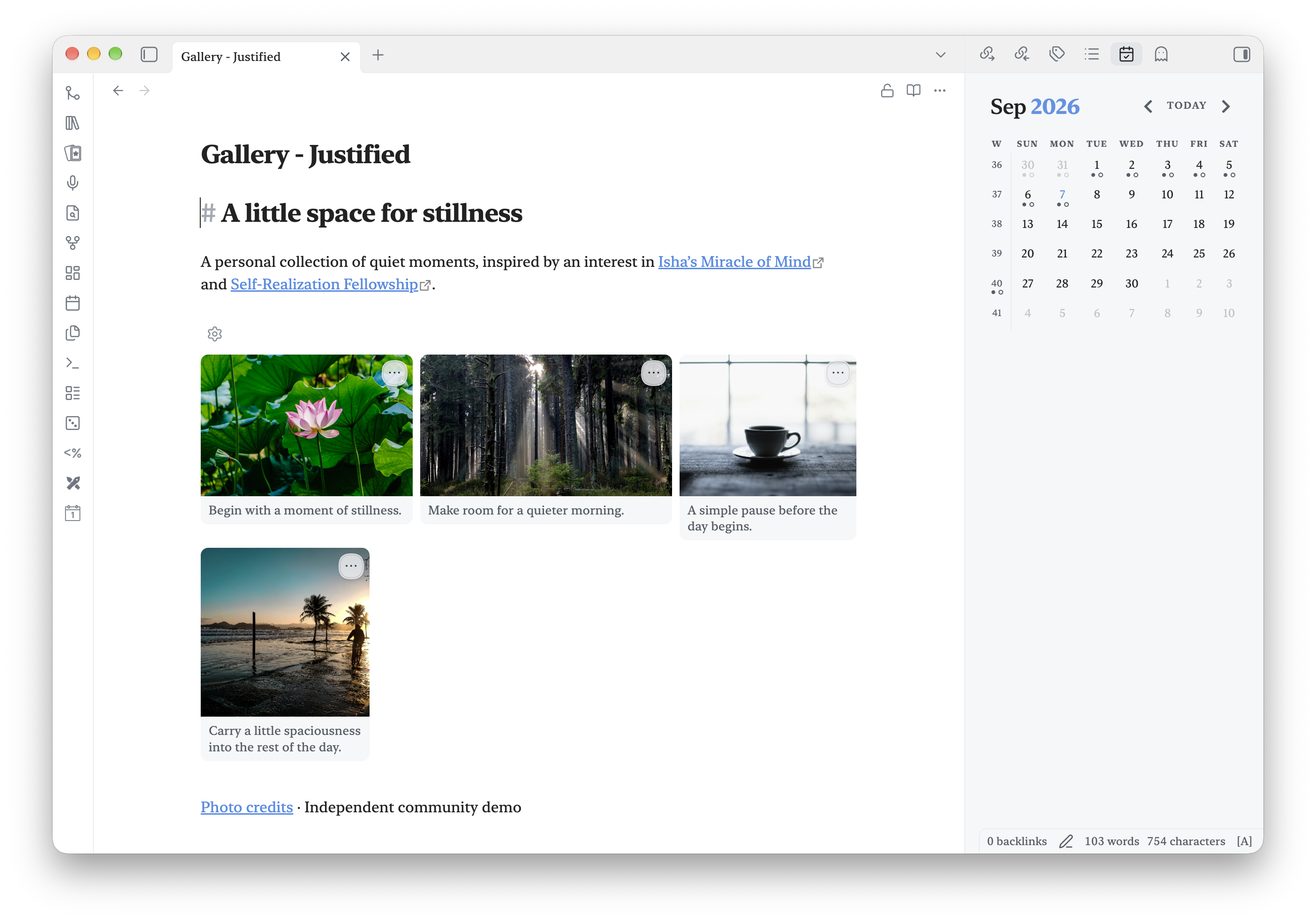
A gallery inside your note
Justified rows preserve photo proportions, with captions and editing controls in Live Preview.
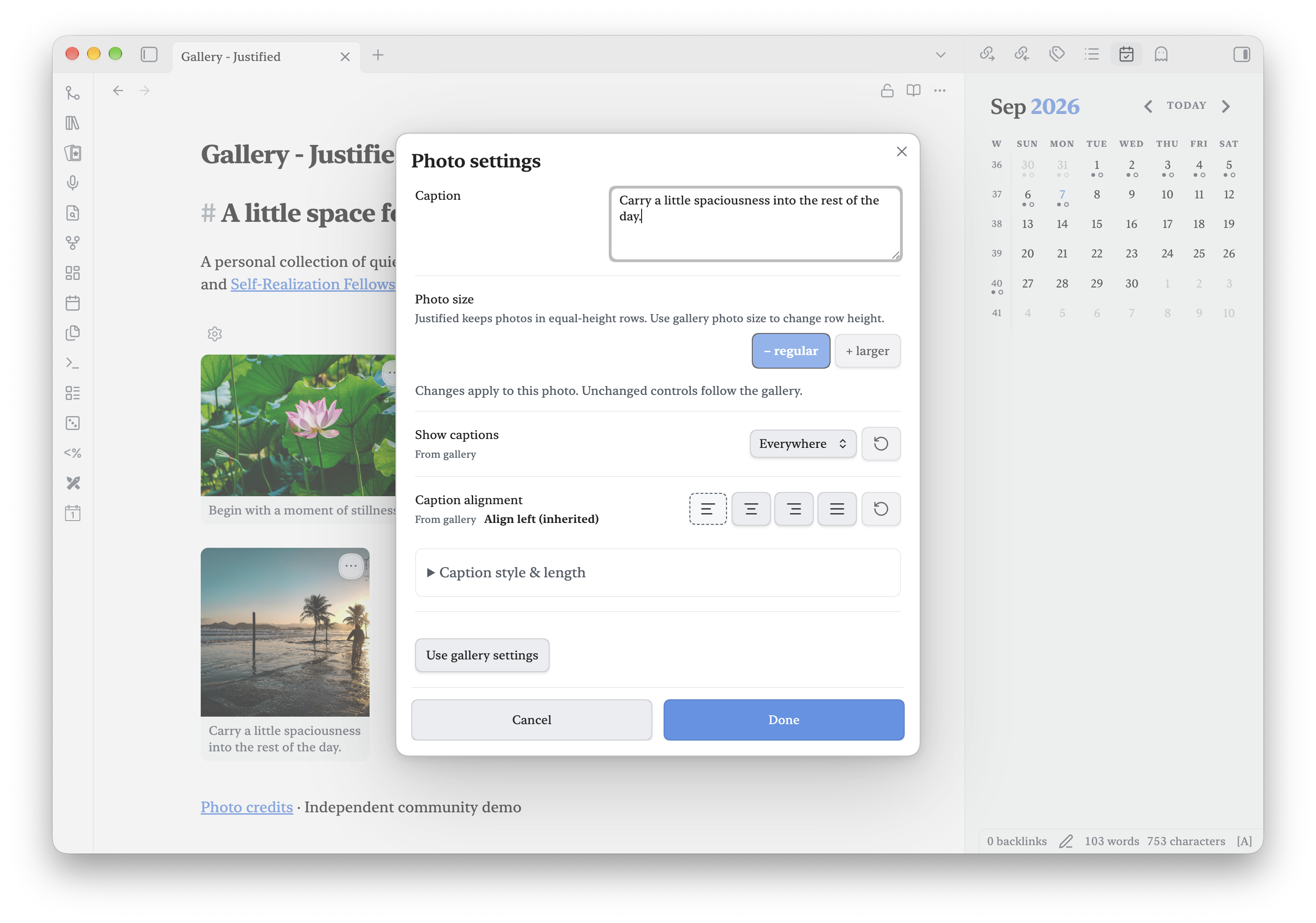
Edit a photo in one place
Edit the caption and see which appearance settings are inherited from the gallery.
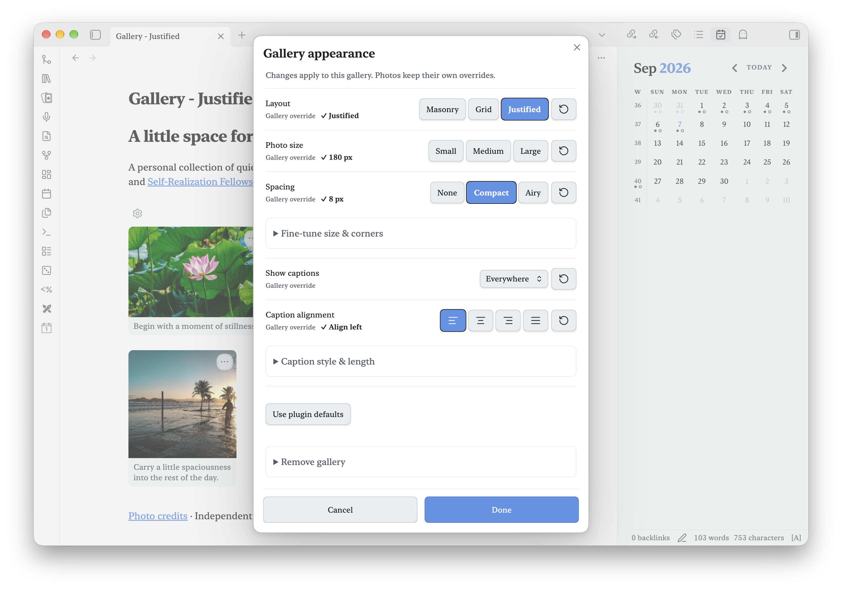
Make the gallery your own
Choose a layout and spacing, with visible selections and clear gallery overrides.
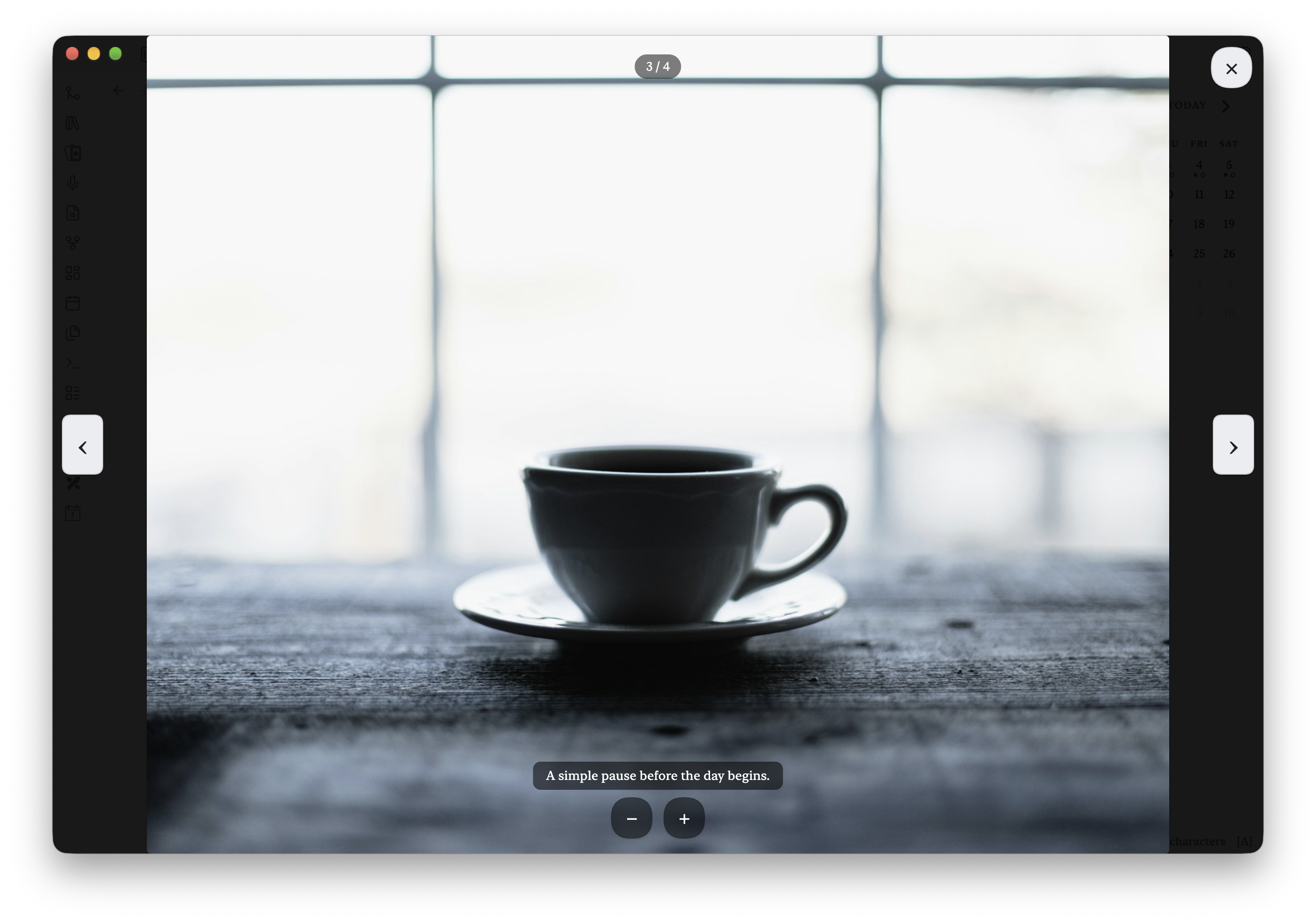
From gallery to fullscreen
With Fullscreen Image installed, browse gallery photos with captions, navigation, and zoom.
Usage
Add a fenced code block with the language tag simple-gallery. List one image per line,
each starting with - . Reference images the same way you would embed them anywhere else
in Obsidian — a wikilink embed (![[photo.jpg]], with an alias like Obsidian's own embed
syntax if you like), a bare filename/relative path, or a standard Markdown image link all
work:
```simple-gallery
- ![[brussels-1.jpg]]
- ![[brussels-2.jpg]]
  caption: Roasting at 425°F
- ![[brussels-3.jpg]]
```
Simple Gallery resolves each reference the same way Obsidian resolves any other embed, so images anywhere in the vault work without a full path. If a reference can't be resolved, that one item renders as a small broken-image placeholder instead of failing the whole block. Or skip typing it out entirely — see Commands below.
Captions
Add an optional caption on the line directly below an item, indented and prefixed with
caption:. Captions are entirely optional — leave them off any item you don't want one for.
Featuring larger photos
Mark any photo as a larger visual focus with an indented featured: true line — same shape
as caption:, and an item can have both:
```simple-gallery
- ![[brussels-1.jpg]]
  caption: Halved and tossed with oil, salt, and pepper
  featured: true
- ![[brussels-2.jpg]]
```
Each featured photo gets a bigger cell (roughly 2×2) and everything else in that section flows around it — masonry or grid alike. Star as many photos as the composition needs; each one is independent and the remaining cells reflow around all of them.
Editing directly in the gallery
All of this only appears in Live Preview. Reading Mode is pure presentation: no caption unless a photo actually has one, no buttons, nothing but the gallery itself.
Each photo carries one piece of chrome: a "⋯" button in its top-right corner (quietly visible on both desktop and mobile while editing) that opens a native menu with every per-photo action. A plain click or tap on the photo itself is never intercepted, so it stays available to an installed fullscreen or lightbox plugin in both modes. With the Fullscreen Image plugin installed, a photo opened from a gallery also gets prev/next navigation across the whole gallery — arrow buttons, a position counter, and the left/right arrow keys.
- Reorder or swap — Click and drag any thumbnail to a new position within its section. Drag it onto a photo in another section to swap those two photos between sections.
- Photo settings — Click a caption or choose Photo settings… from “⋯”. Edit the complete caption alongside visibility, alignment, font, length, and photo size. Clearing the text removes the caption. Line breaks are saved as spaces. Gallery captions show at most four lines; the full text stays in the note and remains available to the fullscreen viewer.
- Rename a section — Click its name, then press Enter or click away to save; Escape cancels.
- Add a section — Pick New section above or New section below from a photo's "⋯" menu to split its section into two right there, with a "New section" label ready to rename. Splitting at the very first or last photo of a section creates an empty section on that side rather than being disabled — a rare, harmless edge case.
- Remove a section — Click Remove section beside its heading. Only the grouping and section note are removed; its photos are kept in order and merged into the neighboring section.
- Photo size — The minus/plus controls in Photo settings select regular or larger cells in Masonry and Grid. In Justified, change the gallery’s photo size to adjust row height; individual enlargement is disabled because the layout keeps its rows uniform.
- Remove a photo — Remove photo in the "⋯" menu takes just that photo out of the gallery block. The image file itself stays in the vault untouched. It works on a broken-reference placeholder too, which is the easiest way to clear one out.
- Gallery settings — The gear opens the same appearance controls as plugin settings. Choose layout, photo size, spacing, caption visibility, and alignment. Expand Fine-tune size & corners for exact pixels, or Caption style & length for the finer controls. Source labels show inherited and overridden values. The reset arrow on a row restores inheritance; Use plugin defaults resets the whole gallery. Choosing even the same value explicitly creates an override, so later plugin changes cannot silently change it. Appearance changes preview behind the dialog. Done or closing saves; Cancel restores.
- Remove gallery — At the bottom of the same Gallery settings modal, Remove gallery… asks for confirmation, then removes only the fenced gallery block from the note. Referenced image files remain in the vault untouched.
The gallery toolbar is contextual: the settings button appears while the gallery is hovered, keyboard-focused, or selected, and disappears when focus moves elsewhere.
Every one of these rewrites just the affected part of the gallery's code block and leaves everything else — other galleries, the rest of the note — untouched.
Sections and notes
For a longer gallery, group images under labeled sections, each with its own optional blurb, plus an optional intro blurb for the whole gallery:
```simple-gallery
note: A weeknight side that turns into the best thing on the plate.

section: Prep
  note: Don't rush the cut — even pieces roast evenly.
- ![[brussels-1.jpg]]
  caption: Halved and tossed with oil, salt, and pepper
- ![[brussels-2.jpg]]

section: Roasting
  note: High heat and a single layer are non-negotiable.
- ![[brussels-3.jpg]]
  caption: Cut side down, ready for the oven
```
Sections and notes are entirely optional. A block with no section: lines at all renders
exactly like the plain list above — one flat gallery, no headings. A bare section: line
creates an unnamed section: its heading is transparent, but its photos still begin in a
separate section row.
Per-gallery overrides
Every setting in Settings → Simple Gallery is really just a default. Any single
gallery can override one or more of them by adding a line before its first section: or
image — the rest of the settings, and every other gallery in the vault, are unaffected:
```simple-gallery
layout: grid
min-size: 220
gap: 4
captions: false
caption-font: monospace
caption-lines: single
caption-align: left
- ![[brussels-1.jpg]]
- ![[brussels-2.jpg]]
```
layout: masonry/layout: grid/layout: justified— Overrides the Layout setting for this gallery only. (featured:sizing applies in Masonry and Grid; Justified rows always keep every photo at its natural proportions.)min-size: <pixels>— Overrides Minimum thumbnail size for this gallery only.gap: <pixels>— Overrides Gap between images for this gallery only.captions: true/captions: false/captions: gallery/captions: fullscreen— Overrides Show captions for this gallery only: everywhere, hidden, gallery view only, or fullscreen viewer only.caption-font: default/caption-font: monospace— Overrides Caption font for this gallery only.caption-lines: full/caption-lines: single— Overrides Caption length for this gallery only.caption-align: left/caption-align: center/caption-align: right/caption-align: justify— Overrides Caption alignment for this gallery only.caption-placement: below/caption-placement: overlay— Overrides Caption placement for this gallery only: in its own row beneath the photo, or laid over the photo's bottom edge (denser, and adding a caption never changes the gallery's layout).corners: <pixels>— Overrides Rounded corners for this gallery only.corners: 0keeps thumbnails square.
All of these are optional and independent — use just the ones you need. They only take effect
before the first section: or image line; anywhere after that, they're ignored like any
other stray text.
Per-photo caption overrides
The same three caption appearance fields — plus a per-photo captions: visibility
override taking the same everywhere/hidden/gallery/fullscreen values as the gallery-level
field — can be indented beneath one image to affect only that photo. The photo menu's
Caption settings… writes these for you:
```simple-gallery
- ![[brussels-1.jpg]]
  caption: A longer caption shown in full
  caption-font: monospace
  caption-lines: full
  caption-align: right
- ![[brussels-2.jpg]]
  caption: This photo inherits the gallery settings
```
Remove an indented field—or choose Use gallery setting in the photo modal—to resume inheriting that setting from the gallery.
Note: this syntax is YAML-inspired, not strict YAML. Real YAML treats a leading
!as a tag indicator and can't parse an unquoted![[...]]embed, which would force quoting every image link. Simple Gallery instead uses a small, tolerant line parser built specifically for this shape: a top-level-line is an image; indentedcaption:,featured:,caption-font:,caption-lines:, andcaption-align:lines belong to that image; a top-levelsection:line starts a group; and an indentednote:line beneath a section (or at the very top of the block) is a short blurb. Nothing else is interpreted.
Commands
- Convert selection to gallery — Scans the current selection (or, if nothing is
selected, the paragraph of text around the cursor) for image references — embed
wikilinks, bare filenames, or Markdown image links, whether or not they're in a bulleted
list — and replaces that text with a
simple-galleryblock containing them, one per line. Only appears in the command palette when there's actually something to convert. Non-image content mixed into the selection (other notes, audio embeds, prose) is left out of the resulting gallery automatically. - Insert empty gallery block — Inserts a starter
simple-galleryblock at the cursor with a single placeholder image reference pre-selected, so you can immediately type over it with a real filename.
Settings
These are the defaults for every gallery in the vault. Any single gallery can override any of them — see Per-gallery overrides above.
- Layout — Justified (default) packs photos into equal-height rows at their exact proportions, never cropping — the classic photography-portfolio presentation, at its best with captions hidden or placed over the photo. Masonry sizes each thumbnail from its own photo's proportions in a column flow. Grid uses uniform, cropped tiles. Switching this instantly updates any gallery already open.
- Rounded corners — Corner roundness of each thumbnail, in pixels. 0 (default) keeps photos square-cornered, the way a print or portfolio usually presents them; raise it for a softer, card-like look.
- Show captions — Where captions appear: Everywhere (default), Gallery only, Fullscreen only (a photographer's favorite: the grid stays clean and the caption appears when a photo is opened in a fullscreen viewer), or Hidden — all without removing captions from the source.
- Caption placement — Over the photo (default) lays the caption on the photo's bottom edge in a translucent strip — dense, and adding or editing a caption never shifts the gallery's layout. Below the photo gives each caption its own row instead.
- Caption font — Default uses the normal text font. Typewriter uses your configured monospace font instead.
- Caption length — Single line, or up to four lines (the existing
fullvalue). This limit prevents long captions from stretching a gallery. Complete text remains stored; the fullscreen viewer controls its own caption length. - Caption alignment — The same left, center, right, and justify buttons at all three levels. Explicit selections use a solid accent highlight and a checked value label. Inherited values use a dashed outline and an inherited label.
- Photo size & spacing — Quick presets at both plugin and gallery levels, with current pixel values shown. Expand Fine-tune size & corners to enter an exact value or use a slider.
Each setting identifies its source: Plugin default, From plugin defaults, Gallery override, From gallery, or Photo override. Use the reset arrow to inherit again. Resetting appearance never removes caption text or changes the photo’s size.
Finer visual control (hover effect, colors) is available through CSS custom properties rather than additional settings. See Customizing the appearance below.
Customizing the appearance
Themes and CSS snippets can override the plugin's public variables. For example:
body {
  --simple-gallery-hover-scale: 1.03; /* optional Reading view hover zoom */
  --simple-gallery-background: var(--background-primary);
  --simple-gallery-caption-color: var(--text-faint);
}
Because these are ordinary CSS custom properties, users have final control without editing the plugin files.
Installation
Community Plugins
Once accepted, install Simple Gallery from Settings → Community plugins → Browse.
Manual installation
Copy main.js, manifest.json, and styles.css from a release into:
<vault>/.obsidian/plugins/simple-gallery/
Then reload Obsidian and enable Simple Gallery under Community plugins.
Development
Requires Node.js 20 or newer.
npm install
npm run dev     # esbuild watch mode
npm run build   # type-check + production build
npm run lint
Release checklist
- Run
npm run buildandnpm run lint. - Test a gallery in both Reading view and Live Preview, in both layout modes, and in both light and dark themes. Test both commands, with and without a selection.
- Run
npm version patch,npm version minor, ornpm version major. The version script keepsmanifest.jsonandversions.jsonin sync. - Push the resulting numeric tag (for example
1.0.1). GitHub Actions builds the plugin and attachesmain.js,manifest.json, andstyles.cssto the GitHub Release.
On the maintainer workstation, use the USA OS plugin release command. It pushes the exact
main commit to private Forgejo and public GitHub, verifies both tips, and atomically updates
the primary vault's runtime copy while preserving its settings.
Contributing
Bug reports and pull requests are welcome. Please keep the plugin focused: it should
remain a simple, dependable gallery renderer that respects local-first Obsidian workflows.
Before opening a pull request, run npm run build and npm run lint. See
CONTRIBUTING.md for the full checklist.
Privacy
Simple Gallery does not collect telemetry, make network requests, or send vault data anywhere.
Support
If Simple Gallery improves your workflow, you can support its continued development on Buy Me a Coffee.
Acknowledgements
Simple Gallery was directed by Robert Fleming, who set the vision, made every product call — the gallery syntax, the masonry-by-default look, per-gallery overrides, drag-to- reorder, click-to-edit, what belongs in Reading Mode versus Live Preview — and tested it against a real recipe note along the way. The implementation, architecture, and documentation were written by Claude (Sonnet 5, Anthropic) in close collaboration with him. Robert wanted this credited plainly, and gladly: this plugin exists because of that collaboration, and he's grateful for it. The subsequent release-preparation work and expanded Live Preview editing experience were developed with OpenAI Codex, including section boundaries, multi-photo featuring, per-photo caption controls, mobile action controls, and gallery removal.
Robert Fleming directed and reviewed this work. Recent refinements, documentation, and screenshot preparation were developed in collaboration with OpenAI Codex, powered by GPT-6. Thank you to the AI collaborators who helped bring these ideas into a usable community plugin.
License
MIT
Screenshot demo
A ready-to-use screenshot kit includes demo notes and capture instructions.
Feedback
Bug reports are welcome in this repository’s issue tracker when available. Include your Obsidian and plugin versions, desktop or mobile, a short reproduction, and expected versus actual behavior. Use a small sample note without personal content. This is a spare-time project; fixes and replies have no guaranteed schedule. Contributions and forks are welcome; donations are optional.
For plugin developers
Search results and similarity scores are powered by semantic analysis of your plugin's README. If your plugin isn't appearing for searches you'd expect, try updating your README to clearly describe your plugin's purpose, features, and use cases.