Slipbox Desk
approvedby John Gargalionis
A paper-like Zettelkasten: addressed cards, a browsable sequence, and a desk to lay them out on. - This plugin has not been manually reviewed by Obsidian staff.
Slipbox Desk
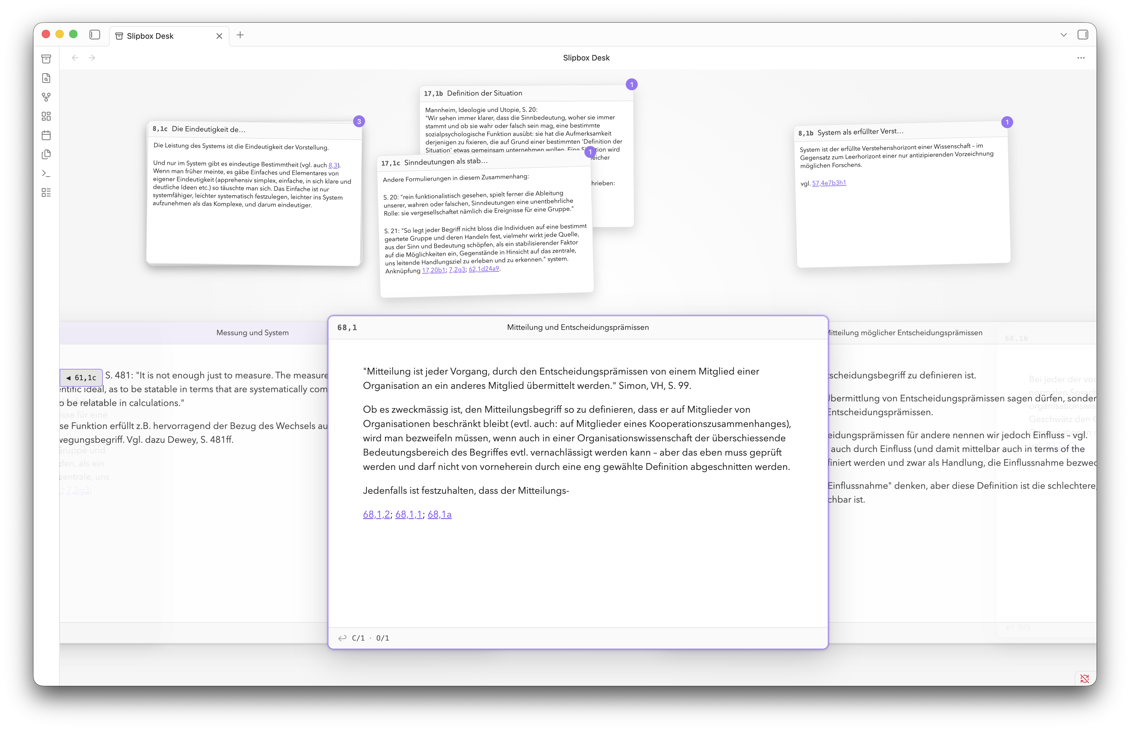
Slipbox Desk is a paper-like Zettelkasten for Obsidian: addressed cards, a browsable sequence, and a Desk to lay them out on.
Warning! Slipbox Desk is under active development. If you find a bug, please open a GitHub issue and include the steps to reproduce it, your Obsidian version, and your operating system. See the changelog for release history.
Notes become cards, organised into a single sequence by addresses that mark out lines of thought. Browse with a mouse, trackpad, or vim-like keys. Pull cards out of the Deck and stack them in piles on the Desk, where you can work out how notes connect and begin structuring your writing. The Deck map and Branch View help you find your way around and remember where ideas live.
A note becomes a card when it has the configured address property. The default is slipbox-id:
---
slipbox-id: "68/1a"
---
The address on each note determines its place in the linear sequence of cards that constitute the Deck.
Philosophy
My proposal is that the customary niceties of digital note-taking like search, folders, tags, following links, infinite scroll, etc. can ultimately detract from the serendipitous resurfacing of old, forgotten ideas, which is the whole point of Zettelkasten.
The strictest paper-like experience might be too extreme for some users. For this reason, some of the more surprising constraints can be toggled in the settings, including deleting text, pasting text, and following links. These constraints apply only while editing in the Slipbox Desk view; ordinary Markdown editing elsewhere in Obsidian is never restricted.
Deck and Desk
| Surface | Purpose | Persistence |
|---|---|---|
| Deck | Browse filed cards in address order | Derived from Markdown frontmatter |
| Desk | Work with unfiled cards and temporary piles | Current Obsidian session |
The Deck is the canonical sequence, while the Desk is a temporary working area beside it. Cards on the Desk keep their filed address and remain in the Deck. Slipbox Desk integrates with Obsidian Canvas, and piles can be moved easily to an existing or new canvas.
Installation
Slipbox Desk requires Obsidian 1.13.0 or later and is available on desktop only.
The preferred installation method is Settings → Community plugins → Browse. Slipbox Desk can also be installed manually from a GitHub Release:
- Download
manifest.json,main.js, andstyles.cssfrom the same release. - Put the files in
<Vault>/.obsidian/plugins/slipbox/. - Reload Obsidian.
- Enable Slipbox Desk under Settings → Community plugins.
Use the archive ribbon icon or run Slipbox Desk: Open from the command palette.
A source checkout does not include the generated main.js. Run npm run build before loading a checkout directly in Obsidian.
Quick start
- Enter Slipbox Desk with Slipbox Desk: Open.
- Right-click anywhere to create a new note.
- Double-click the note body to write your note.
- Double-click the empty address field to file the card.
- Navigate the Deck by scrolling.
- Drag Deck cards onto the Desk to make new piles.
Cards can also be added to the Deck by adding a slipbox-id property to the Markdown note. This can also be done using Slipbox Desk: Make active Markdown note a card.
Any trimmed, nonempty, single-line string without control characters is a valid address. Slipbox cards accept addresses such as 1/2b1, A/1, Project-17, and α/12.
Natural address ordering is the default, so A/2 comes before A/10. Lexicographic ordering is also available. Duplicate addresses are allowed by default, but they can be optionally reported. Slipbox Desk never rewrites an existing address automatically.
Custom card styling
Use CSS snippets to customize paper, typography and fixed or responsive card sizes. A complete ruled index-card example covers Deck, Viewed and Desk cards.
Deck layout
Choose Deck orientation (horizontal or vertical) and Stacking model
(Drawer or Fan) independently. Horizontal Drawer is the default, including when
upgrading. Drawer keeps cards in filing order and opens a 12 px reading gap
following the anchor. An ordinary card click brings the chosen card back to its
reading position, even when it is already selected: vertical Drawer clears vertical
workspace pan, while horizontal Drawer clears horizontal pan. The other axis keeps
its pan and alignment. Explicit zt / zb or zh / zl choices are respected;
without a choice, Drawer starts centred along its sequence, including with Desk piles.
Selection, the reading gap, and pan return animate together and respect reduced motion.
Wheel browsing and pointer panning remain continuous; controls, links, editing,
double-clicks, and clicks generated after a drag do not request another return.
Fan keeps the selected card above its neighbours and retains stationary selection.
By default, Deck cards have fixed dimensions: Small 720 × 480 px, Medium 840 × 560 px, and Large 960 × 640 px. Resizing the pane or positioning the Deck does not resize cards. Drag empty workspace to pan in either direction and reach offscreen content. Viewed cards and Desk piles retain their own sizing behavior.
The Deck starts behind Desk piles. Right-click a Deck card or empty workspace and choose Bring Deck to front or Send Deck to back to move it above or below all piles. This applies to the current pane for the session and survives orientation changes and refreshes. Branch View and its controls stay above both; these actions do not move cards or change the order of Desk piles.
Enable Show lower Fan headers at bottom to place the address, title, and header controls at the bottom of cards below the anchor in vertical Fan, replacing the ordinary backlink footer. The top header and normal footer return as soon as the card becomes the anchor or moves above it. This option is off by default and does not affect Drawer or horizontal layouts.
Card spread runs from 0.10 to 1.12 and measures separation as a fraction of card width horizontally or card height vertically. Card splay runs from 0 to 5 and adds stable rotation and sideways offsets to neighbours; the focused card stays straight. A spread near 0.46 and splay near 2.4 produces a loose stack. No card-count setting is needed: the rendered window follows pane geometry and panning.
Card fading controls how quickly Deck cards fade with distance from the focused card: 0 keeps every card opaque, 1 preserves the default strength, and 2 doubles the fade rate. Drawer fades by 8 percentage points per card down to 45% opacity at default strength; Fan fades by 13 points down to 42%. The focused card's target opacity is always 100%.
In vertical orientation, wheel gestures browse the Deck. With Wheel over card body: Body first, long anchor bodies scroll first, followed by a short boundary resistance before browsing continues. Once a gesture starts moving cards, it continues browsing until you pause, even as the focused card changes. Deck bypasses body scrolling. Editor and Branch View scrolling remain independent. Vertical header drags pan the workspace; sideways header drags pull cards onto the Desk. Horizontal header drags retain their existing behavior.
Use zh / zl to position the Deck near the left / right, and zt / zb for
the top / bottom. Each changes only its own axis, including resetting pan on that
axis. Commands compose: zt followed by zh places the Deck near the top-left.
zz centres both axes and clears workspace pan and the offset along the sequence.
Positions prefer 22% / 50% / 78% along the card sequence and 33% / 50% / 67%
across it, moving inward as needed to keep the fixed card inside the pane with a
small margin. When the card exceeds the pane, the requested edge stays visible;
pan to reach the rest.
Toggle Deck orientation switches the saved orientation for all open Slipbox
views. It preserves the selected card, body scroll positions, workspace pan,
alignment and offset along the sequence. It has no default shortcut; assign one
in Deck keybindings or Obsidian Hotkeys, or use the command palette.
Existing Desk piles keep their positions, including piles you have not dragged.
New automatic piles use the current orientation's initial layout. Resizing does
not rearrange stored pile positions; pan to reach piles outside a smaller pane.
Default arrows follow the orientation: Left/Right horizontally, Up/Down
vertically; k/j always mean previous/next. Existing bindings matching the old
defaults are treated as automatic on upgrade. Custom and disabled bindings are
preserved, and explicitly edited shortcuts no longer follow orientation until
reset.
Deck map
The Deck map is an ordinal rail across the top in horizontal orientation, or along the right edge in vertical orientation. The complete filed Deck runs from left to right, or top to bottom. Clear dividers and labels mark top-level address sections, and a prominent vertical cursor marks the active card.
Ordinary cards do not produce individual marks. Coloured cards appear as small, subdued colour ticks; bookmarks use taller accent-coloured ticks, while Desk membership remains a sparse secondary outline. The active cursor and bookmarks render over colour marks. Move the pointer along the rail to see the nearest card's signature and its configured title when one is present. Clicking any position jumps to the nearest filed card even when there is no visible landmark; when the rail is focused, the arrow, Home, and End keys navigate the same complete Deck.
Card colours
Run Slipbox Desk: New card with options or its Desk variant and choose a card colour.
The selected value is stored in the fixed slipbox-card-color property:
---
slipbox-id: "68/1a"
slipbox-card-color: yellow
---
The colour tints the card header and adds a subdued tick to the Deck map; edit or remove the property directly in Markdown to change it later.
Branching and structural navigation
In Communication with Zettelkastens, Luhmann described free internal branching as one of the main advantages of his method, while lamenting that later card insertions could obscure an earlier sequence.
For this reason, the same branch types and navigation inspired by the Niklas Luhmann Archive can be used to navigate the Slipbox. Again, this feature can be toggled in the settings.
- Supplementary branches or ergänzende Stränge are created by explicit links in the Zettelkasten. See this example from Luhmann.
- Inserted branches or eingeschobene Stränge are inferred from the card address.
The Recognise supplementary branch links setting treats a link alias beginning with the + symbol, such as [[Child card|+a]], as a supplementary branch. With Show supplementary branch labels on cards enabled, its remaining alias, a in this example, appears beside the child card's address.
The separate Derive inserted branches from addresses setting derives structural relationships from address extensions. With natural ordering, 2a can be a child of 2, while 20 is not.
With either relationship type enabled, Branch View placement chooses Automatic, Left, Below, or Hidden. Automatic places the diagram below a horizontal Deck or left of a vertical Deck. Left placement runs strands downward and expands departure columns to the left; pan the workspace to explore columns outside the pane. The diagram keeps its full-size nodes and scrolls along strands. The existing Branch View command can temporarily show or hide it; branch navigation commands remain available.
Essential keys
There are some actions that are very quick to do in the real world, but take time in the digital world. For this reason, a default set of vim-inspired keybindings tries to streamline the process of all such card actions. (Here, a strand is any linear sequence of cards, including the root strand, while a branch is a departure or relationship that leads from one strand to another.)
| Key | Action |
|---|---|
← (horizontal), ↑ (vertical) / k | Move to the previous Deck card |
→ (horizontal), ↓ (vertical) / j | Move to the next Deck card |
n / N | Move forward/backward on the current strand |
^ | Move to the current strand's beginning |
> / < | Enter an inserted branch or move to a higher strand |
+ | Enter a supplementary branch |
b | Toggle Branch View |
p | Put the focused card on the Desk, or return it |
i | Edit the focused Desk or viewed card |
v | View a Desk card, or return a viewed card |
{ / } | Cycle focus through the Deck and Desk piles |
% | Swap focus between the Deck and the last pile |
Space | Expand or collapse the focused pile |
m | Toggle the focused Deck card's bookmark |
O | Toggle the Deck map |
zh / zl / zt / zb | Position the Deck near the left, right, top, or bottom |
zz | Centre the Deck on both axes and reset pan |
y | Copy a link to the focused card |
o | Open the focused card as a Markdown note |
These shortcuts apply only while a Slipbox Desk view is active. You can change them under Settings → Slipbox Desk. Obsidian hotkeys take priority when bindings conflict.
Data and privacy
Slipbox Desk works locally and offline. It makes no network requests, collects no telemetry, and does not load remote code.
Development
Development requires Node.js 20 or newer and npm.
npm ci
npm run check
npm run check runs TypeScript checking, tests, ESLint, a production build, and release validation. npm run build produces the ignored main.js used by Obsidian.
See the release candidate smoke test for the manual verification checklist.
Feedback and contributions are welcome.
Feedback and license
Report bugs and request features through GitHub Issues.
Slipbox Desk is available under the MIT License.
Support
If you find Slipbox Desk useful, you can support its development by buying me a coffee.
For plugin developers
Search results and similarity scores are powered by semantic analysis of your plugin's README. If your plugin isn't appearing for searches you'd expect, try updating your README to clearly describe your plugin's purpose, features, and use cases.