by zemengzhou
Smart compact sizing, modern palettes, and interactive controls for Mermaid diagrams.
Mermaid Boost





Why Mermaid Boost?
Mermaid diagrams in Obsidian often suffer from two extremes: sprawling architecture charts either overflow the reading column or shrink to microscopic, unreadable text.
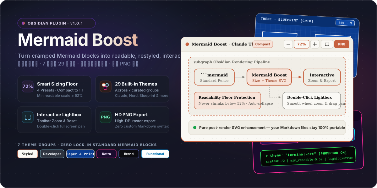
Mermaid Boost enhances Obsidian's rendered Mermaid SVGs on the fly—adding a readability floor, 29 handcrafted themes, inline zoom controls, a double-click pan/zoom lightbox, and one-click HD PNG export—while keeping your note source 100% standard ```mermaid Markdown.
| Capability | Default Obsidian Mermaid | With Mermaid Boost |
|---|---|---|
| Large Diagram Sizing | Shrinks unconstrained or overflows container | 4 Smart Presets (S / M / L / 1:1) with a strict Minimum Readable Scale floor |
| Tall Flowcharts | Pushes note content several screens down | Auto-collapses tall diagrams cleanly instead of crushing text size |
| Visual Styling | Basic default Mermaid skin | 29 curated themes across 7 groups (canvas, nodes, clusters, edges, fonts & SVG filters) |
| Navigation & Inspection | Static inline SVG | Toolbar Zoom (− / 72% / +) + Double-click Fullscreen Lightbox with smooth drag-pan |
| Sharing & Export | Manual screenshot at screen DPI | One-click HD PNG Export directly from the diagram header |
| Markdown Lock-in | Standard ```mermaid fence | 100% Standard ```mermaid fence — zero proprietary syntax |
Features
1. Smart Diagram Sizing with Readability Floor
Mermaid Boost scales diagrams to fit a comfortable reading area while enforcing a Minimum Readable Scale floor so labels never become illegible. Tall diagrams can automatically collapse with an expand toggle rather than shrinking into a thin vertical strip.
| Preset | Short | Base Scale | Max Width | Max Height | Min Readable Scale | Best For |
|---|---|---|---|---|---|---|
| Compact (default) | S | 72% | 620 px | 320 px | 52% | Dense study notes & side-by-side panes |
| Balanced | M | 85% | 740 px | 440 px | 58% | Everyday technical documentation |
| Relaxed | L | 100% | 900 px | 580 px | 65% | Wide monitors & architecture reviews |
| Original | 1:1 | 100% | 1600 px | 2400 px | 100% | Full 1:1 unconstrained presentation |
2. Interactive Controls & Fullscreen Lightbox
Every enhanced diagram card exposes quick controls in its header toolbar:
- Inline Zoom (
−/72%/+) — Adjust diagram scale on the spot or click the percentage badge to reset. - Double-Click Fullscreen Lightbox — Open any diagram in an interactive overlay with mouse-wheel zoom and click-drag panning.
- One-Click HD PNG Export — Copy or export crisp, high-resolution raster images ready for slides, papers, or chat.
3. Per-Diagram Overrides (%% mermaid-boost: ...)
Need a different theme, size preset, or collapse behavior for a specific diagram? You can override global settings directly inside standard Mermaid comments:
```mermaid
%% mermaid-boost: theme=blueprint size=relaxed collapse=false
flowchart TD
    A[Global Settings Fallback] --> B[Diagram-Specific Override]
```
[!TIP] Standard Mermaid comments (
%% ...) are completely ignored outside Obsidian, keeping your Markdown 100% portable on GitHub, GitLab, and documentation sites. Adjacent Markdown comments (<!-- mermaid-boost: ... -->) and the short prefix%%mb: ...are also supported.
Supported Override Keys
| Key | Description | Valid Values | Example |
|---|---|---|---|
theme | Override color palette & typography | Any of the 29 theme IDs (blueprint, nord, claude, etc.) | theme=blueprint |
size | Override sizing preset & readable floor | compact (s), balanced (m), relaxed (l), original (1:1) | size=relaxed |
collapse | Override auto-collapse on tall flowcharts | true / false (yes / no, 1 / 0) | collapse=false |
frame | Toggle card container border & background | true / false (none) | frame=false |
grid | Toggle dot-grid canvas background | true / false (dot / none) | grid=true |
header | Toggle top micro-toolbar | true / false | header=false |
radius | Override node & card corner radius | Number in pixels (0 to 64, e.g. 8, 12px) | radius=8 |
Precedence & Fallback Rules
- Per-diagram directive — Explicit keys in
%% mermaid-boost: ...take highest precedence. - Interactive session zoom — Temporary toolbar zoom adjustments scale on top of the diagram's base size.
- Global plugin settings — Vault-wide settings in Obsidian Settings act as the fallback for any unmentioned keys.
- Safe degradation — Unknown keys or malformed values fail safely and fall back to global settings without mutating global configuration.
29 Themes Across 7 Groups
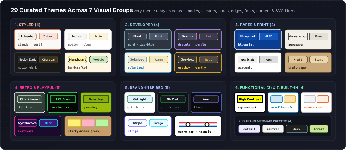
Themes restyle the entire SVG hierarchy—canvas background, primary/secondary nodes, subgraph clusters, notes, edge paths, edge labels, typography, corner radius, and decorative SVG filters (hand-drawn wobble, neon/CRT glow, blueprint grids, and corkboard textures).
| Group | Theme ID | Display Name | Palette & Typography | Signature Visual Character |
|---|---|---|---|---|
| 1. Styled (4) | claude (default) | Claude | Cream #faf9f5 · Clay #c6613f · Serif | Warm editorial card with rounded nodes & terracotta accents |
notion | Notion | Pure White #ffffff · Soft Grey #f7f6f3 · Sans | Clean, understated workspace aesthetic with warm yellow notes | |
notion-dark | Notion dark | Charcoal #191919 · Slate #252525 · Sans | Low-glare dark mode workspace styling | |
handcrafted | Handcrafted | Warm Paper #fdf6e3 · Marker #fff3b0 · Hand | Sketchbook feel with hand-drawn SVG wobble filter | |
| 2. Developer (4) | nord | Nord | Polar Night #2e3440 · Frost #88c0d0 · Sans | Arctic blue-grey developer palette |
dracula | Dracula | Dark Slate #282a36 · Purple #bd93f9 · Pink #ff79c6 | High-contrast vampire dark theme with neon pink edges | |
solarized | Solarized | Cream #fdf6e3 · Teal Blue #268bd2 · Sans | Ethan Schoonover's precision warm light palette | |
gruvbox | Gruvbox | Retro Dark #282828 · Amber #fabd2f · Sans | Warm earthy retro terminal palette | |
| 3. Paper & Print (4) | blueprint | Blueprint | Technical Blue #0b3d91 · Crisp White #ffffff · Mono | Drafting table aesthetic with 20px coordinate grid |
newspaper | Newspaper | Newsprint #f2efe8 · Press Ink #111111 · Serif | High-contrast editorial print typography | |
academic | Academic | Pure White #ffffff · Greyscale #333333 · Serif | Computer Modern / Times styling tailored for papers & theses | |
kraft-paper | Kraft paper | Brown Stock #c9a97a · Espresso #4a3520 · Mono | Stamped parcel paper look with warm kraft tones | |
| 4. Retro & Playful (5) | chalkboard | Chalkboard | Slate Green #2f3e37 · Chalk #f5f5f0 · Hand | Classroom chalkboard with wobbly hand-drawn lines |
terminal-crt | Terminal / CRT | Phosphor Black #050805 · Green #33ff66 · Mono | Retro green CRT monitor with phosphor glow filter | |
game-boy | Game Boy | DMG Olive #9bbc0f · Deep Green #0f380f · Mono | Classic 4-shade handheld LCD palette | |
synthwave | Synthwave | Midnight #1a0b2e · Neon Pink #ff2e97 · Cyan #00f0ff | Outrun 80s neon glow with cyan laser connectors | |
sticky-notes | Sticky notes | Corkboard #c89f6b · Multi-color Post-its · Hand | Radial cork texture with cycling yellow, pink & mint notes | |
| 5. Brand-Inspired (5) | github-light | GitHub light | White #ffffff · Neutral #f6f8fa · Green #1a7f37 | Familiar GitHub Primer light documentation look |
github-dark | GitHub dark | Dimmed #0d1117 · Canvas #161b22 · Green #238636 | GitHub Primer dark mode palette | |
linear | Linear | Obsidian #0b0b0f · Indigo #5e6ad2 · Sans | Near-black precision interface with subtle violet glow | |
stripe | Stripe | Crisp White #ffffff · Blurple #635bff · Cyan #00d4ff | FinTech product documentation styling | |
metro-map | Metro map | White #ffffff · Bold Station #111111 · Transit Lines | Thick 6px cycling red/blue/green transit routes & station nodes | |
| 6. Functional (3) | high-contrast | High contrast | White #ffffff · Pure Black #000000 · Yellow #ffff00 | 3px heavy borders & maximum legibility |
colorblind-safe | Colorblind-safe | White #ffffff · Okabe-Ito 6-color cycle | Scientifically distinguishable multi-category node palette | |
mono-accent | Mono + one accent | Zinc Grey #f4f4f5 · Signal Orange #e8590c | Muted greyscale baseline that spotlights key nodes in orange | |
| 7. Built-in (4) | builtin-default | default | Classic Lavender #ECECFF · Border #9370DB | Standard Mermaid default palette with Boost sizing & controls |
builtin-neutral | neutral | Neutral Grey #f4f4f4 · Border #666666 | Standard Mermaid neutral monochrome palette | |
builtin-dark | dark | Dark Charcoal #1f2020 · Steel #81B1DB | Standard Mermaid dark palette | |
builtin-forest | forest | Forest Mint #cde498 · Pine #13540c | Standard Mermaid forest green palette |
Quick Start & Installation
Option 1: Install via GitHub Release / BRAT
- From GitHub Releases (
v1.0.5): Downloadmermaid-boost-1.0.5.zipand extract its files into<Vault>/.obsidian/plugins/mermaid-boost/, or downloadmanifest.json,main.js, andstyles.cssindividually and copy them into that folder. - Via Obsidian BRAT: Add beta plugin repository
dreamfarer-space/obsidian-mermaid-boostand enable Mermaid Boost.
Option 2: Manual Installation
- Create the plugin folder inside your Obsidian vault:
<Vault>/.obsidian/plugins/mermaid-boost/ - Copy these three runtime files from the repository into that folder:
manifest.jsonmain.jsstyles.css
- Reload Obsidian (
Ctrl/Cmd + R). - Navigate to Settings → Community plugins and enable Mermaid Boost.
[!NOTE] Requires Obsidian 1.5.0+. Works across both desktop and mobile (
isDesktopOnly: false).
Usage
Write standard Mermaid fenced code blocks in any note—no custom codeblock syntax needed:
```mermaid
flowchart LR
    A[Write Standard Mermaid] --> B[Obsidian Renders SVG]
    B --> C[Mermaid Boost Applies Theme & Smart Scale]
    C --> D[Interactive Zoom, Lightbox & HD PNG]
```
Settings Reference
Configure all options under Obsidian Settings → Mermaid Boost:
| Category | Setting | Default | Description |
|---|---|---|---|
| Sizing | Size preset | compact | Choose compact (S), balanced (M), relaxed (L), or original (1:1). |
| Base scale | 0.72 | Initial display scale before container constraints are evaluated. | |
| Max width | 620 px | Target maximum width before proportional downscaling kicks in. | |
| Max height | 320 px | Target maximum height before scaling or auto-collapse applies. | |
| Min readable scale | 0.52 | Hard readability floor preventing huge diagrams from shrinking too far. | |
| Auto-collapse tall diagrams | On | Collapses overly tall diagrams behind an expand toggle. | |
| Appearance | Theme | claude | Select any of the 29 themes across 7 groups. |
| Node radius | 12 | Corner rounding radius applied to diagram nodes. | |
| Multi-tone nodes | Off | Cycles secondary/accent tones across nodes when supported by the theme. | |
| Trim pie padding | On | Strips excessive whitespace around Mermaid pie charts. | |
| Card & UI | Card frame | On | Wraps rendered diagrams in a themed card container. |
| Dot grid | Off | Adds a subtle architectural dot-grid pattern to the card background. | |
| Header bar | On | Displays the top bar with zoom buttons, scale badge, and PNG export. | |
| Interaction | Double-click fullscreen | On | Opens the interactive pan/zoom lightbox on double-click. |
| Zoom sensitivity | 1.0 | Fine-tunes wheel and button zoom step responsiveness. |
Development
Mermaid Boost uses a modular source architecture in src/ and generates the distributable runtime bundle main.js with esbuild.
# Install development dependencies
npm install

# Build the distributable main.js bundle
npm run build

# Watch mode for interactive development
npm run dev

# Verify the committed main.js bundle is up to date with src/
npm run build:check

# Run the Node.js unit test suite (requires Node.js 22+)
npm test

# Validate plugin manifest, versions.json, and documentation version consistency
npm run validate

# Run syntax validation
node --check main.js
node --check scripts/build.js
node --check scripts/validate-plugin.js
node --check src/main.js
node --check src/settings.js
node --check src/sizing.js
node --check src/themes.js
node --check src/beautify.js
node --check src/lightbox.js
node --check src/export.js
node --check tests/helpers.js
node --check tests/sizing.test.js
node --check tests/themes.test.js
node --check tests/beautify.test.js
node --check tests/plugin.test.js
node --check tests/validation.test.js
Repository Structure
| File / Directory | Responsibility |
|---|---|
src/main.js | Obsidian plugin entry point, lifecycle management, DOM observer, and block decoration |
src/settings.js | Settings presets (SIZE_PRESETS), DEFAULT_SETTINGS, and Obsidian PluginSettingTab |
src/sizing.js | Sizing calculation engine, diagram type detection, and pie padding tightening |
src/themes.js | 29 theme palettes (THEMES), theme groups (THEME_GROUPS), and theme spec resolver |
src/beautify.js | SVG DOM beautification pipeline, node styling, and topology classifier |
src/lightbox.js | Interactive fullscreen pan/zoom lightbox modal with controls |
src/export.js | 3x HD PNG export engine and live CSS color resolution |
tests/ | Automated unit and integration test suite (sizing, themes, beautify, plugin, validation) |
main.js | Generated standalone distribution bundle for Obsidian |
scripts/build.js | Fast bundling script using esbuild with --check and --watch support |
scripts/validate-plugin.js | Metadata schema, release tag, and documentation version consistency validator |
styles.css | Card containers, toolbar buttons, fullscreen lightbox modal, and theme CSS rules |
manifest.json | Obsidian plugin manifest metadata (1.0.5, minAppVersion: 1.5.0) |
assets/ | SVG visual banners and theme showcase graphics used in documentation |
Release Process
- Update version metadata in
manifest.json,package.json,versions.json,CHANGELOG.md,README.md, andREADME.zh-CN.md. - Run
npm run build,npm run build:check,npm test, andnpm run validatelocally to verify bundle freshness, tests, schema, and version synchronization. - Push a matching semantic version tag (
TAG=$(node -p "require('./manifest.json').version") && git tag "$TAG" && git push origin "$TAG"). GitHub Actions automatically runs the test suite, validates release metadata against the tag, buildsmermaid-boost-<version>.zip, and publishesmain.js,manifest.json,styles.css, and the ZIP bundle to GitHub Releases.
Contributing & License
Issues and Pull Requests are welcome! When modifying sizing math, themes, or plugin behavior in src/, please run npm run build, npm run build:check, npm test, and npm run validate to ensure all assertions pass and the bundle remains in sync.
Released under the MIT License.
For plugin developers
Search results and similarity scores are powered by semantic analysis of your plugin's README. If your plugin isn't appearing for searches you'd expect, try updating your README to clearly describe your plugin's purpose, features, and use cases.