by Haissam Makki
Choose one of twenty-nine task checkbox styles from a click menu, each with its own text effect.
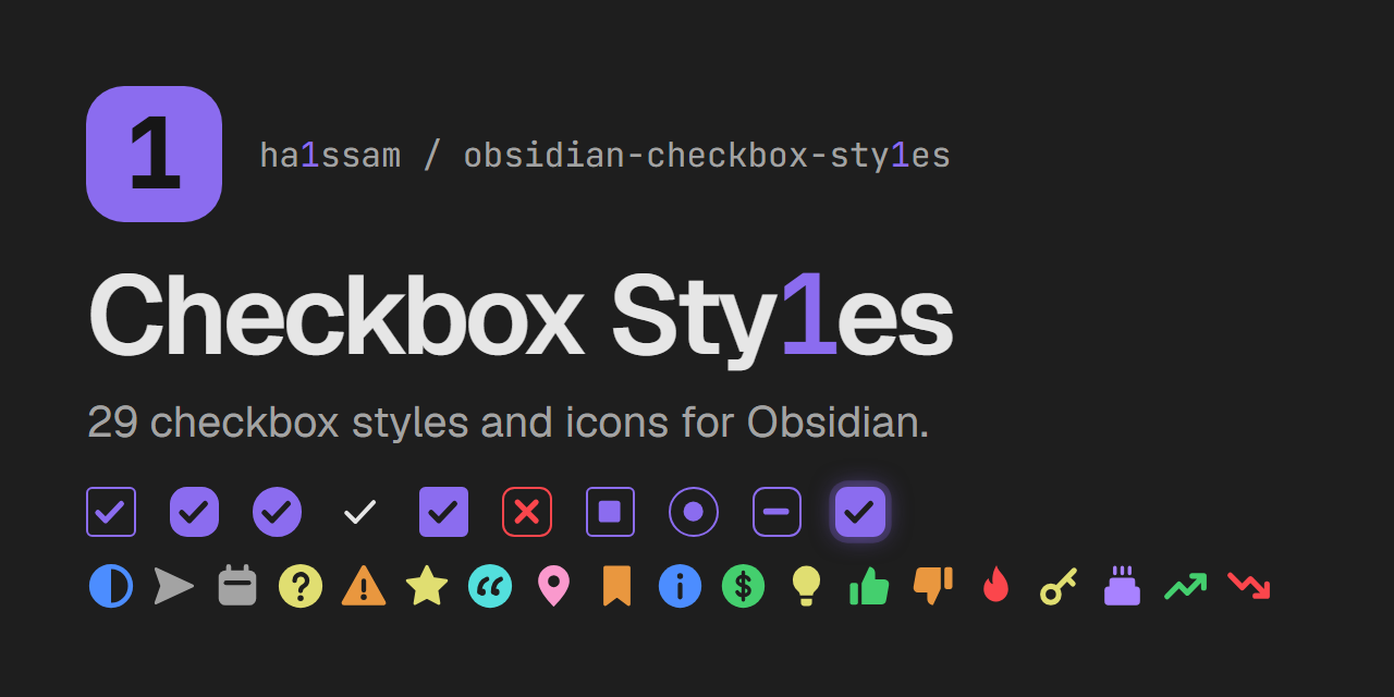
Checkbox Sty1es
Pick a visual style for each task checkbox in Obsidian. Clicking an unchecked task opens a menu with 29 styles: ten checkbox shapes and 19 colored icons. Each style changes how the checkbox looks and can apply a matching effect to the task text.
Checkbox shapes
| Style | Text effect | Written to the note |
|---|---|---|
| Classic | strikethrough | - [c] |
| Rounded | muted | - [r] |
| Circle | accent color | - [o] |
| Minimal | faint | - [m] |
| Filled | bold | - [f] |
| Cross | red strikethrough (cancelled) | - [-] |
| Square | underline | - [s] |
| Dot | italic (in progress) | - [.] |
| Dash | dashed underline (postponed) | - [~] |
| Glow | glowing text | - [g] |
Icons
Icon styles replace the checkbox with a colored icon. Most leave the text as it is.
| Style | Text effect | Written to the note |
|---|---|---|
| In progress | none | - [/] |
| Forwarded | muted | - [>] |
| Scheduled | muted | - [<] |
| Question | none | - [?] |
| Important | bold | - [!] |
| Star | none | - [*] |
| Quote | italic | - ["] |
| Location | none | - [l] |
| Bookmark | none | - [b] |
| Info | none | - [i] |
| Savings | none | - [S] |
| Idea | none | - [I] |
| Pro | none | - [p] |
| Con | none | - [C] |
| Fire | none | - [F] |
| Key | none | - [k] |
| Win | none | - [w] |
| Up | none | - [u] |
| Down | none | - [d] |
How it works
- The chosen style is stored as the character between the brackets, so tasks stay plain Markdown tasks. Nothing else in the note is changed.
- One mouse button opens the style menu and the other checks and unchecks the task. You choose which is which in the settings.
- Checking a task with the other button writes a plain
[x], shown in the default style chosen in the settings. Unchecked tasks use that style too. - Colors come from the current theme's variables, so the styles follow light and dark themes.
Uncheck all tasks
The uncheck-all action unchecks every task in the open note. Use it again right away and the tasks go back to how they were; once you change anything in the note, the saved state is dropped so nothing you edited is overwritten. It is off by default: in the settings you can turn on a button for it at the top of each note, record a keyboard shortcut for it, or both.
Settings
- Menu button — left click or right click opens the style menu; the other button checks and unchecks the task.
- Uncheck-all button — show the uncheck-all button at the top of each note.
- Uncheck-all hotkey — record a keyboard shortcut for unchecking all tasks in the current note.
- Default style — the style applied when you check a task with the other button, and the look of unchecked and
[x]tasks.
Limitations
- Plugins that only treat
[x]as done (for example Tasks or Dataview queries) may not count styled tasks as completed. - Themes that ship their own alternate checkbox icons may override some styles.
- Checkboxes inside embeds, canvas cards and callouts keep the native click behavior.
Development
npm install
npm run build
styles.css is generated from src/styles.base.css and the style registry in src/checkbox-styles.ts. To add a style, add one entry to BOX_STYLES or ICON_STYLES with a unique char.
For plugin developers
Search results and similarity scores are powered by semantic analysis of your plugin's README. If your plugin isn't appearing for searches you'd expect, try updating your README to clearly describe your plugin's purpose, features, and use cases.