Scatter Plot for Bases
pendingby Martin Seeler
Visualize notes as points on a 2D chart using any numeric properties. Find patterns, spot outliers, prioritize visually.
Obsidian Scatter
Because staring at tables until your eyes glaze over is not a productivity strategy.
A scatter plot view for Obsidian Bases. Turn your notes into dots. Watch patterns emerge. Pretend you're a data scientist.
The Problem
You've got notes. Those notes have numbers. Maybe it's effort and value. Maybe it's pages and interest. Maybe it's complexity and how-much-I-want-to-cry.
Bases shows you tables. Tables are fine. Tables are responsible. But tables make you think to find patterns. And thinking is exhausting.
What if your notes could just... show you where they belong?
The Solution
Obsidian Scatter adds a scatter plot view to Bases. Pick two numeric properties, and suddenly your notes are points on a chart. The good stuff floats to the top-left. The dumpster fires sink to the bottom-right. No math required.
It's the Eisenhower Matrix, the BCG Matrix, or whatever 2x2 framework your PM is obsessed with this quarter — except it builds itself from your actual data.
Features
What It Does
| Feature | What That Means For You |
|---|---|
| Scatter plot view | Your notes become clickable dots. Revolutionary. |
| Auto-scaling axes | No manual axis configuration. We do the math so you don't have to. |
| Color by category | Optional rainbow mode. Group by status, type, or vibe. |
| Click to open | Dots are doors. Click one, open the note. |
| Hover preview | Peek at notes without committing. Like window shopping, but for productivity. |
| Responsive design | Works in sidebars, splits, or that tiny corner you've crammed it into. |
| Graceful degradation | Missing values? We skip them and tell you how many. No crashes, no drama. |
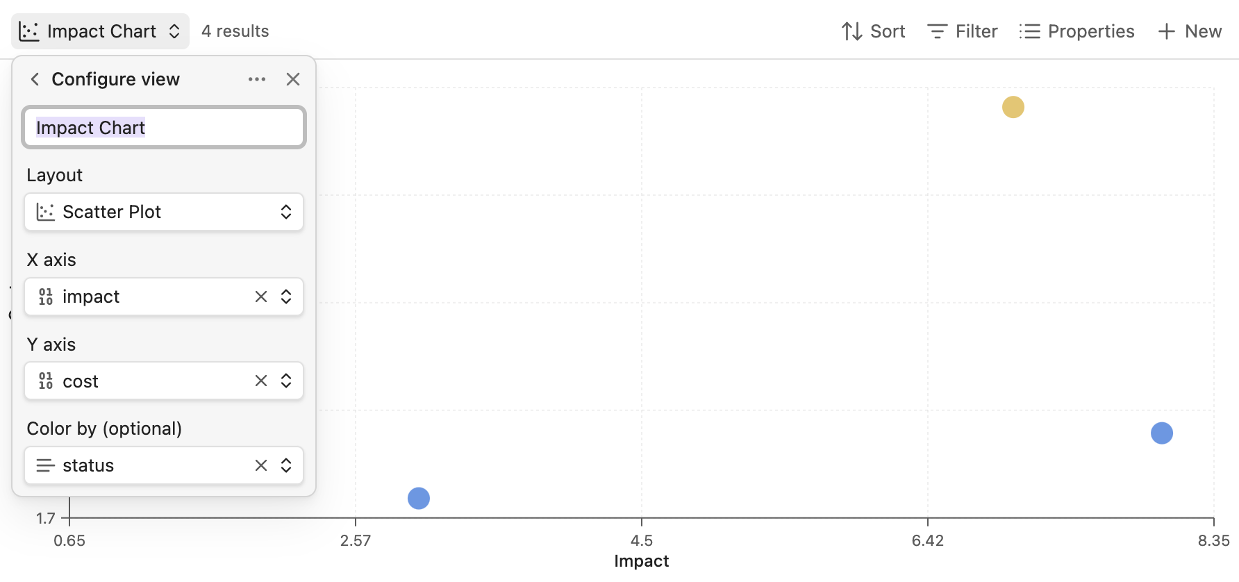
Configuration
All settings live in the standard Bases "Configure view" menu:
| Setting | Description |
|---|---|
| X axis | The property that goes sideways (must be a number) |
| Y axis | The property that goes up and down (also a number) |
| Color by | Optional property to make things colorful |
Use Cases (a.k.a. "Why Would I Want This?")
The Quick Wins Hunt
Plot tasks by effort (X) and value (Y). Sprint to the top-left quadrant. That's where the glory lives.
---
effort: 2
value: 8
status: todo
---
Low effort. High value. Chef's kiss.
The Book Stack of Shame
You bought 47 books this year. You've read 3. Plot them by pages (X) and interest (Y). Find the short, exciting ones. Pretend the 800-page biography doesn't exist.
Project Risk Bingo
Plot projects by complexity (X) and uncertainty (Y). The top-right corner is where dreams go to die. Steer clear.
The Research Paper Triage
citation_count vs relevance_score. Find papers that are both important and actually useful. Unicorns, basically.
Goal Setting for Realists
time_to_complete vs impact. See which goals are quick wins and which are "maybe next quarter."
Installation
From Community Plugins (when we're famous)
- Settings → Community plugins
- Search for "Scatter"
- Install and enable
- Celebrate
Manual Installation (for the impatient)
- Download
main.js,manifest.json, andstyles.cssfrom the latest release - Create
.obsidian/plugins/scatter-chart/ - Drop the files in
- Reload Obsidian
- Enable in Settings → Community plugins
From Source (for the brave)
git clone https://github.com/MartinSeeler/obsidian-scatter.git
cd obsidian-scatter
npm install
npm run build
# Copy main.js, manifest.json, styles.css to your vault's plugins folder
Usage
- Create a Base (or open one you've been neglecting)
- Filter to notes with numeric properties
- Click the view selector → Change layout → Scatter Plot
- Open "Configure view" and pick your axes
- Optionally pick a "Color by" property
- Marvel at your data visualization skills
Pro tip: Use Bases formulas to create computed properties:
formula.priority: value * (10 - effort)
Now you can plot against priority. Big brain energy.
Why Not Just Use Excel?
Oh, you could export your notes to Excel. You could wrestle with pivot tables. You could lose an afternoon to conditional formatting. You could email yourself a spreadsheet and never open it again.
Or you could stay in Obsidian, click three buttons, and see your data as a scatter plot.
Your call.
Roadmap
Coming Soon™
- Size by property — Bubbles! The third dimension! (v0.2)
- Quadrant lines — Draw threshold lines to create actual zones (v0.2)
- Legend — Know what the colors mean (v0.2)
- Log scale — For data that spans orders of magnitude (v0.2)
Coming Eventually™
- Drag to edit — Move points to update property values
- Lasso select — Grab multiple points for bulk operations
- Zoom controls — Buttons for people who don't trust scroll wheels
Coming Someday™
- Trend lines — Linear regression for the statistically inclined
- Animations — Smooth transitions that make you feel fancy
- Time dimension — Watch your data evolve over time
- Quadrant labels — "Quick Wins", "Big Bets", "Money Pits", "Avoid"
Contributing
Found a bug? Got a feature idea? PRs welcome — just open an issue first so we can chat.
License
MIT © Martin Seeler
Do whatever you want with it. Just don't blame me if your scatter plot reveals uncomfortable truths about your productivity.
Acknowledgments
- The obsidian-maps plugin for showing how Bases views work
- The Obsidian team for making Bases happen
- Coffee, for making everything else happen
For plugin developers
Search results and similarity scores are powered by semantic analysis of your plugin's README. If your plugin isn't appearing for searches you'd expect, try updating your README to clearly describe your plugin's purpose, features, and use cases.