Visual Blocks
unlistedby toakezg
Render flows, card grids and comparisons from readable YAML code blocks.
Visual Blocks for Obsidian
Render clean, responsive, component-based layouts — connected process flows, card grids and side-by-side comparisons — from short, readable YAML inside your Markdown notes.
The output is live HTML/CSS (not images), follows your theme in light and dark mode, and is rebuilt whenever you edit the block.
```visual-block
type: flow
title: Imogen Feature Development
steps:
  - text: main — stable version
    icon: git-branch
  - text: feature/rich-output — experiment
    icon: git-branch
  - text: Commit and push feature branch
    icon: git-commit
  - text: Open PR and review changes
    icon: git-pull-request
  - text: Merge PR into main
    icon: git-merge
    variant: success
```
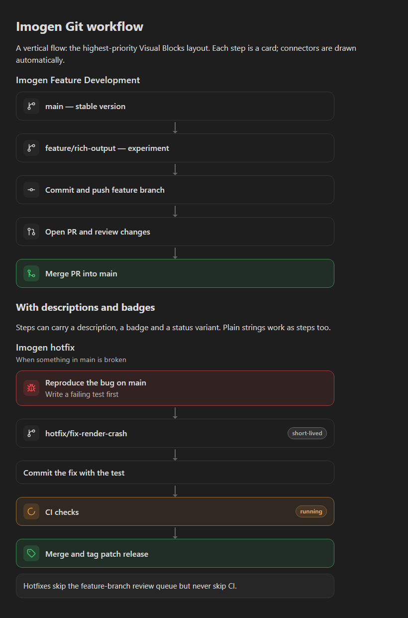
About the screenshots: they are rendered from the notes in
examples/by the browser preview harness (npm run preview). It runs the plugin's real parser, renderer andstyles.cssagainst CSS variables that approximate Obsidian's default dark theme, so they are close to, but not captures of, Obsidian itself.
Layouts
Vertical flow — type: flow
Ordered steps as cards joined by arrows. Steps take text, optional description, icon, badge and variant (success, warning, danger, info, accent, muted). A step can also be a plain string. direction: horizontal lays steps out in a row and falls back to a vertical stack when the note is narrow.
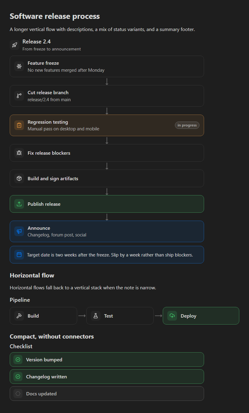
examples/04 Software release process.md
Card grid — type: grid
type: grid
title: Git Development Tools
columns: 2          # 1–4; collapses automatically on narrow notes
cards:
  - title: Git Branch
    icon: git-branch
    description: Separate feature history
  - title: Main
    icon: git-merge
    description: Stable integrated code
    variant: success
footer: Optional summary panel
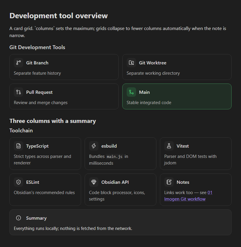
examples/03 Development tool overview.md
Comparison — type: comparison
type: comparison
title: Git branch vs Git worktree
options:
  - title: Branch
    icon: git-branch
    attributes:
      Working directories: One
      Switching cost: Stash or commit first
  - title: Worktree
    icon: folder-git-2
    recommended: true          # highlights the option and adds a badge
    attributes:
      Working directories: One per branch
      Switching cost: None
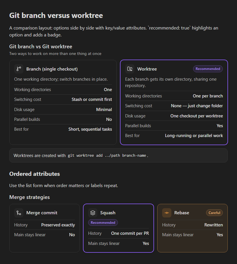
examples/02 Git branch versus worktree.md
Custom layouts — type: panel
The three presets are built from the same components, which you can also compose directly: panel, row, column, grid, card, flow, step, text, badge, icon and connector.
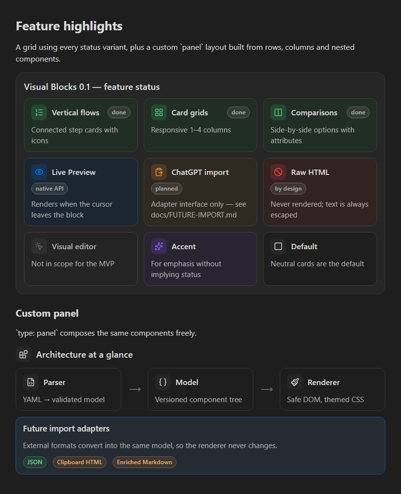
examples/05 Feature highlights.md
Text formatting
Text fields support [[Internal links]] (with |alias), [external links](https://…), **bold** and `code`. Nothing else is interpreted: HTML is always shown as literal text.
Icons
Icons are Lucide names such as git-branch, folder, circle-check. They come from Obsidian's built-in icon set, so nothing is bundled or downloaded. Common old Lucide names (check-circle, alert-triangle, …) are mapped to their current names. Unknown names show a neutral placeholder with the requested name in a tooltip.
Errors
Problems are reported inside the block, with the original source and the offending lines highlighted. Fatal problems (malformed YAML, wrong types, unknown layouts) replace the block; minor ones (unknown properties, unsupported variants) render the block with a collapsed warnings list. Typos get "did you mean" suggestions.
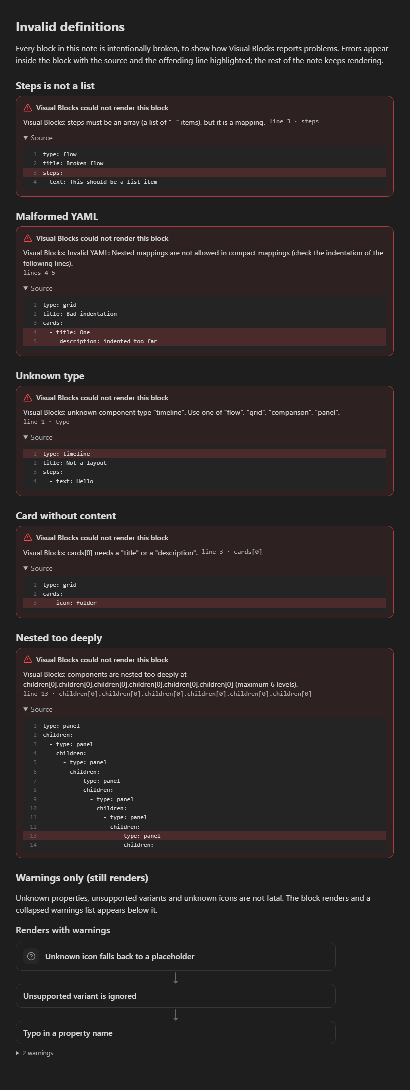
The full syntax is in the schema reference.
Commands and settings
Command palette (inserts a starter block at the cursor):
- Visual Blocks: Insert vertical flow template
- Visual Blocks: Insert card grid template
- Visual Blocks: Insert comparison template
- Visual Blocks: Insert custom panel template
Settings: default spacing (comfortable / compact), default appearance (automatic / minimal / bordered), show flow connectors, and an optional entrance animation (off by default; disabled under reduced-motion). A block can override spacing, appearance and connectors in its own YAML. Changes apply to open notes immediately.
Installation (local testing)
The plugin is not in the community catalogue. To try it in a vault:
npm installthennpm run build— producesmain.js.- Create
<your vault>/.obsidian/plugins/visual-blocks/. - Copy
main.js,manifest.jsonandstyles.cssinto that folder. - In Obsidian: Settings → Community plugins, turn off Restricted mode if needed, reload plugins, and enable Visual Blocks.
Tip: use a test vault, or symlink the folder there for development (npm run dev rebuilds on change; reload Obsidian or use the Hot Reload plugin).
Opening the example gallery
Copy the examples/ folder anywhere into the vault (for example <vault>/Visual Blocks examples/). Each note opens in Reading view or Live Preview with rendered blocks. 06 Invalid definitions.md intentionally shows the error display.
Compatibility
- Reading view and Live Preview both work through Obsidian's
registerMarkdownCodeBlockProcessorAPI. In Live Preview the block renders when the cursor is outside it, and shows the YAML while you edit it, which is standard Obsidian behaviour for code-block plugins. - Desktop and mobile. Layouts respond to the block's width (CSS container queries), so they also adapt in sidebars and split panes.
minAppVersion1.4.0. On Obsidian 1.13+ the settings are searchable through the declarative settings API; older versions use the classic settings tab.
Security model
Note content is treated as untrusted:
- Values are validated against the schema; unknown keys are ignored, with a warning.
- All text is inserted with
textContent; no user string ever reachesinnerHTML. - Styling only comes from fixed variant names mapped to CSS classes; arbitrary CSS cannot be injected.
- Icons must match
[a-z0-9-]; links allow onlyhttp,https,mailtoand internal note links. - YAML uses the core schema (no custom tags) with duplicate-key rejection and an alias-expansion limit.
- Limits: 50,000 characters per block, 100 items per list, 500 components per block, 6 levels of nesting, 2,000 characters per string (longer strings are truncated with a warning).
- No scripts, fonts or network requests.
Architecture
src/
├── main.ts                    Plugin entry: registers processor, commands, settings
├── schema/                    Versioned internal model, limits, diagnostics
├── parser/                    YAML → validated model (positions, hints, limits)
│   ├── yaml.ts                YAML parsing with source positions
│   ├── reader.ts              Typed field readers that collect diagnostics
│   ├── components.ts          Steps, cards, attributes, nested components
│   └── index.ts               Presets (flow/grid/comparison/panel), entry points
├── render/                    Model → DOM (no Obsidian imports)
│   ├── components/            panel, grid, row, column, card, flow/step, primitives
│   ├── inline.ts              Safe inline formatting and links
│   ├── icons.ts               Icon aliases and fallbacks
│   └── diagnostics.ts         Error panel and warnings
├── adapters/
│   ├── obsidian/block.ts      MarkdownRenderChild lifecycle, setIcon, link handling
│   └── import/                Future import extension point, JSON adapter, serializer
├── commands/                  Template insertion
├── settings/                  Settings model and tab
└── utils/
Data flow: source text → parser → VisualDocument → renderer → DOM. The renderer only knows the VisualDocument model. Import adapters (see docs/FUTURE-IMPORT.md) produce the same model, and serializeDocument() turns it back into visual-block YAML.
The renderer takes its host services (icon drawing, link opening, an AbortSignal for cleanup) through a RenderContext, so it runs unchanged in tests and in the preview harness. Each rendered block is an Obsidian MarkdownRenderChild: it is unloaded when its section re-renders or the note closes, which aborts its event listeners and removes it from the set of blocks that re-render on settings changes.
Development
| Command | Purpose |
|---|---|
npm run dev | Rebuild main.js on change |
npm run build | Typecheck and production build |
npm test | Vitest (parser, renderer in jsdom, examples, CSS checks) |
npm run lint | ESLint with eslint-plugin-obsidianmd |
npm run check | All of the above |
npm run preview | Build browser preview pages of every example → preview/ |
npm run screenshots -- <dir> <width> <height|auto> [prefix…] | Screenshot preview pages with local Chrome/Edge; auto crops to the content height (NOTE_WIDTH=380 for a narrow note). README images: npm run screenshots -- docs/screenshots 820 auto 0 then keep the .dark ones |
The example notes double as test fixtures: every block in examples/01–05 must parse with no warnings and render, and every block in 06 (except the last) must fail with a located error.
One lint warning is expected: obsidianmd/prefer-create-el in src/render/dom.ts. The renderer deliberately uses standard DOM APIs so it does not depend on Obsidian's DOM extensions.
License
MIT
For plugin developers
Search results and similarity scores are powered by semantic analysis of your plugin's README. If your plugin isn't appearing for searches you'd expect, try updating your README to clearly describe your plugin's purpose, features, and use cases.